loader_overlay 2.0.0-nullsafety.0  loader_overlay: ^2.0.0-nullsafety.0 copied to clipboard
A simple package to simplify screen management. When loading any async task, this package prevent the user from interacting with the screen until the async task finishes.
Introduction #
Have you ever found yourself in the situation of doing some async processing your screen and wanting to prevent the user from interacting with the screen while the application is loading? If so, this package was made just for you.
Basic Usage #
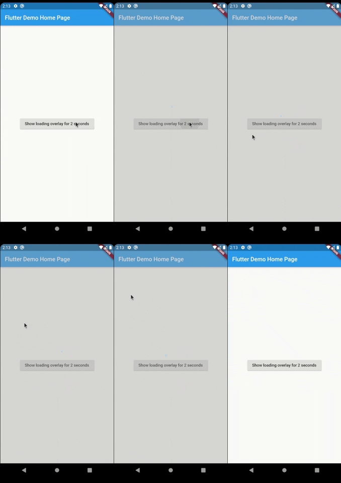
The most simple usage is just wrap the widget that you want an overlay on LoaderOverlay with the useDefaultLoader set to true.
class MyApp extends StatelessWidget {
  @override
  Widget build(BuildContext context) {
    return MaterialApp(
      title: 'Flutter Demo',
      theme: ThemeData(
        primarySwatch: Colors.blue,
      ),
      home: LoaderOverlay(
        useDefaultLoader: true,
        child: MyHomePage(title: 'Flutter Demo Home Page'),
      ),
    );
  }
}
This simple step will already configure the loader overlay for use.
After that configuration you can just run the command:
context.showLoaderOverlay()
This will show the overlay with the default loading indicator. The default loading configured is to just show a centered CircularProgressIndicator
To hide the overlay (after the async processing, for example), just run the command:
context.hideLoaderOverlay()
*Note: You will always need the context to show or hide the loader overlay

Basic Usage on Named Routes #
To use this package with named routes you can just wrap your MaterialApp with GlobalLoaderOverlay. This widget has all the features of LoaderOverlay but it is provided for all the routes of the app.
@override
Widget build(BuildContext context) {
return GlobalLoaderOverlay(
  useDefaultLoading: true,
  child: MaterialApp(
    debugShowCheckedModeBanner: false,
    title: 'Flutter Demo',
    theme: ThemeData(primarySwatch: Colors.teal, fontFamily: 'Baloo'),
    initialRoute: '/',
    routes: {
      '/': (context) => Page1(),
      '/page2': (context) => Page2(),
    },
  ),
);
}
Customisation #
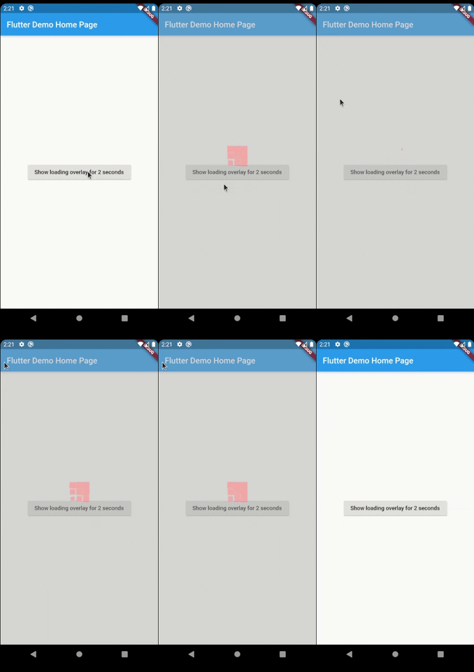
Your overlay loader widget can be any widget you want. For example you can import the package
and customise your widget like this. To do that just pass your widget to
overlayWidget.
class MyApp extends StatelessWidget {
  @override
  Widget build(BuildContext context) {
    return MaterialApp(
      title: 'Flutter Demo',
      theme: ThemeData(
        primarySwatch: Colors.blue,
      ),
      home: LoaderOverlay(
        overlayWidget: Center(
          child: SpinKitCubeGrid(
            color: Colors.red,
            size: 50.0,
          ),
        ),
        child: MyHomePage(title: 'Flutter Demo Home Page'),
      ),
    );
  }
}

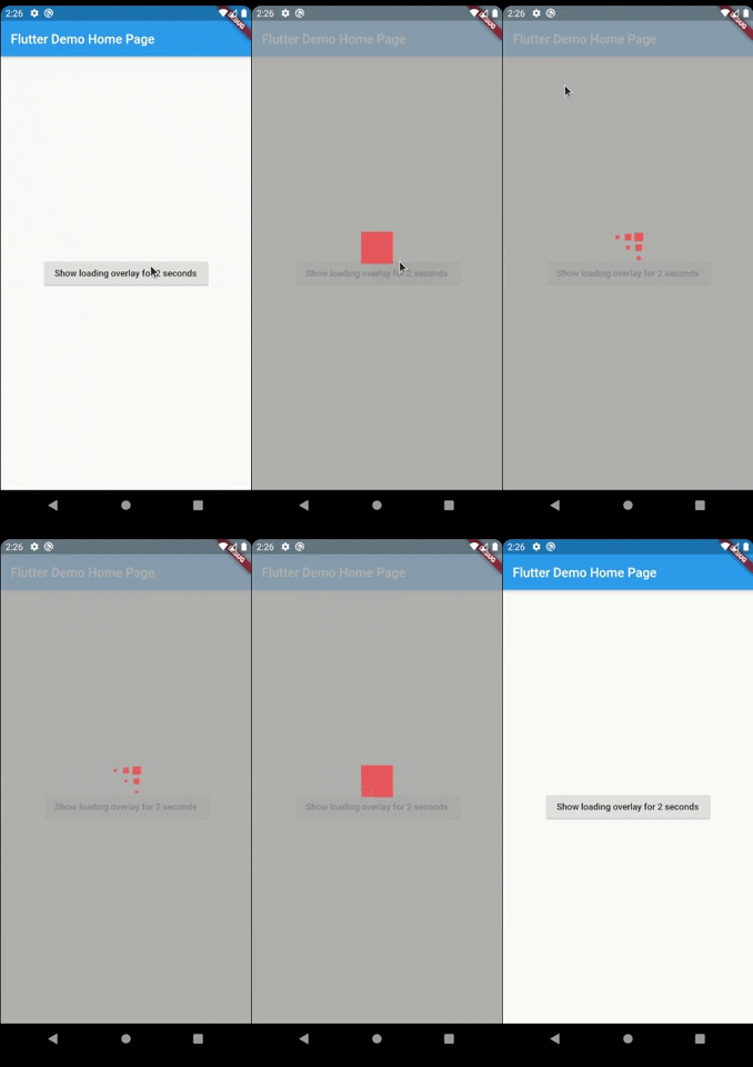
Another customisation you can do is configure the opacity of the overlay. The default opacity is 0.4, but you can pass your own opacity by setting the overlayOpacity property.
class MyApp extends StatelessWidget {
  @override
  Widget build(BuildContext context) {
    return MaterialApp(
      title: 'Flutter Demo',
      theme: ThemeData(
        primarySwatch: Colors.blue,
      ),
      home: LoaderOverlay(
        overlayWidget: Center(
          child: SpinKitCubeGrid(
            color: Colors.red,
            size: 50.0,
          ),
        ),
        overlayOpacity: 0.8,
        child: MyHomePage(title: 'Flutter Demo Home Page'),
      ),
    );
  }
}
This is a much opaque overlay:

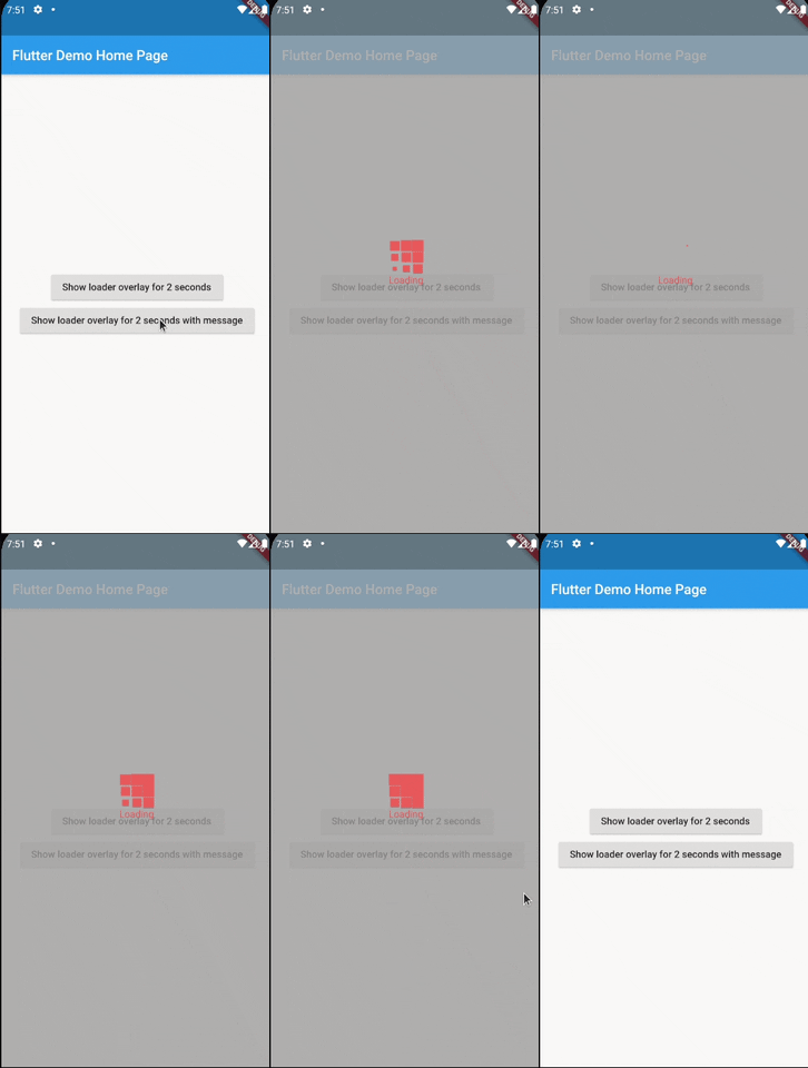
Lastly you can pass some kind of a widget to be located under the loading widget. A commom use case for this is when you want to show some kind of Text to describe the state of the loading. For example you can show a String with 'Reconnecting' or 'Loading Data' under the loader.
To be able to do this you can just pass a widget (commonly a Text widget) to showLoaderOverlay.
context.showLoaderOverlay(
  widget: Text(
    'Loading',
    style: TextStyle(
      color: Colors.red,
    ),
  ),
)
This code produces the following result:

Todo #
- ❌ Tests
Suggestions & Bugs #
For any suggestions or bug report please head to issue tracker.