list_tile_switch 0.0.1  list_tile_switch: ^0.0.1 copied to clipboard
A simple widget combines ListTile with a switch.
ListTileSwitch #
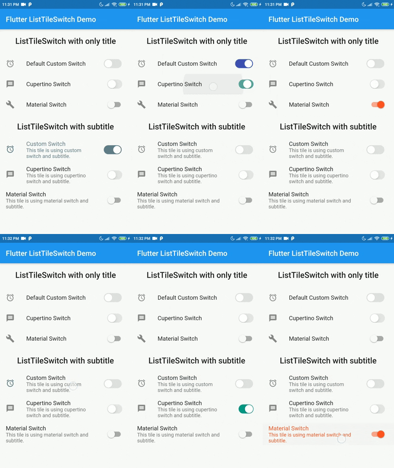
ListTileSwitch is a simple widget that combines ListTile with a switch. Offering 3 types of switch widgets:
- Switch: Material Switch from Material library on Flutter SDK.
- CupertinoSwitch: CupertinoSwitch from Cupertino library on Flutter SDK.
- A custom switch.

Tested on Android and Web but not iOS. Theoritacially it should work on iOS devices too, since this package contains nothing but pure Dart and Flutter components.
Installation #
Add dependency for package on your pubspec.yaml:
dependencies:
    list_tile_switch: <latest>
Usage #
Use it as a regular ListTile widget with a bonus: the trailing widget is a switch. Covering all aspects of the ListTile and adding more with a custom switch.
| Parameter | Definition |
|---|---|
double switchScale |
Adjusting the scale of the switch widget. |
Color switchActiveColor |
The color of the switch when the switch is active. |
bool toggleSelectedOnValueChange |
Deciding whether to color the ListTile when switch value is true, the selected color will be the switchActiveColor. |
Color switchInactiveColor |
Color when the switch is inactive. |
SwitchType switchType |
Indicating the type of switch to be displayed. |
bool value |
Current state of the switch value. |
onChanged(bool) |
Toggle callback for the widget. |
Widget leading, Widget title, Widget subtitle, Widget isThreeLine, EdgeInsetsGeometry contentPadding, VoidCallback onLongPress, VisualDensity visualDesnsity, bool dense, bool enabled, FocusNode focusNode, bool autoFocus, bool selected, Color focusColor, Color hoverColor, MouseCursor mouseCursor |
Referring to the original implementation of ListTile from Flutter SDK, all of the values are mapped directly to the ListTile widget internally. |
Example #
import 'package:flutter/material.dart';
import 'package:list_tile_switch/list_tile_switch.dart';

void main() {
  runApp(MyApp());
}

class MyApp extends StatelessWidget {
  @override
  Widget build(BuildContext context) {
  return MaterialApp(
  title: 'Flutter ListTileSwitch Demo',
  debugShowCheckedModeBanner: false,
  theme: ThemeData(
  primarySwatch: Colors.blue,
  visualDensity: VisualDensity.adaptivePlatformDensity,
 ),  home: ListTileSwitchExample(title: 'Flutter ListTileSwitch Demo'),
 ); }}

class ListTileSwitchExample extends StatefulWidget {
  ListTileSwitchExample({Key key, this.title}) : super(key: key);
  final String title;
  @override
  _ListTileSwitchExampleState createState() => _ListTileSwitchExampleState();
}

class _ListTileSwitchExampleState extends State<ListTileSwitchExample> {
  bool _value = false;
  @override
  Widget build(BuildContext context) {
    return Scaffold(
	  appBar: AppBar(
		title: Text(widget.title),
	  ),
	  body: ListTileSwitch(
	    value: _value,
		leading: Icon(Icons.access_alarms),
		onChanged: (value) {
		  setState(() {
			_value = value;
		  });
		},
		visualDensity: VisualDensity.comfortable,
		switchType: SwitchType.cupertino,
		switchActiveColor: Colors.indigo,
		title: Text('Default Custom Switch'),
	 ),
   );
}}
Todo #
The list of additional features that are considered to be implemented in the future.
- ❌ Creating more tests
- ❌ Add interactivity to custom switch widget
- ❌ Make custom switch more configurable
- ❌ Configurable thumb shape
- ❌ Configurable track shape
- ❌ Scaling animation on value change
Contribution #
Contributions are accepted via pull requests. For more information about how to contribute to this package, please check the contribution guide.
License #
This project is licensed under the MIT license, additional knowledge about the license can be found here.