liquid_kit 0.1.3  liquid_kit: ^0.1.3 copied to clipboard
Apple iOS 26 Liquid Glass UI kit for Flutter — spring-physics navigation bar, glass buttons, toolbar, search bar and shape primitives with iridescent long-press effects and gyroscope speculars.
liquid_kit #
A Flutter package implementing Apple's iOS 26 Liquid Glass design language. Glass-material UI components with spring physics, interactive lift animations, and iridescent effects.
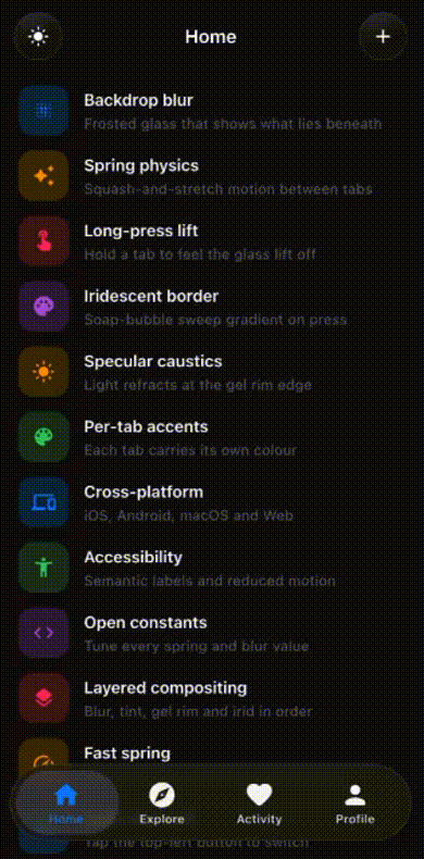
Preview #
Installation #

flutter pub add liquid_kit
```yaml
dependencies:
  liquid_kit: ^0.1.2
Then run:
flutter pub get
Setup #
No shader registration or additional setup required. Just use the components directly in your widget tree.
LiquidGlassNavigationBar #
Spring-physics tab bar with squash-and-stretch animations, long-press lift, and drag reordering.
LiquidGlassNavigationBar(
  tabs: [
    LiquidGlassTab(icon: Icons.house_rounded, label: 'Home'),
    LiquidGlassTab(icon: Icons.explore_rounded, label: 'Explore'),
    LiquidGlassTab(icon: Icons.notifications_rounded, label: 'Activity'),
    LiquidGlassTab(icon: Icons.person_rounded, label: 'Profile'),
  ],
  currentIndex: _currentIndex,
  onTabChanged: (i) => setState(() => _currentIndex = i),
)
Parameters:
| Parameter | Type | Default | Description |
|---|---|---|---|
tabs |
List<LiquidGlassTab> |
required | 2–5 tab definitions |
currentIndex |
int |
required | Currently selected tab index |
onTabChanged |
ValueChanged<int> |
required | Called when tab changes |
accentColor |
Color? |
Apple blue | Active tab icon/label colour |
blurSigma |
double? |
20.0 |
Background blur strength |
springStiffness |
double? |
300.0 |
Spring stiffness for pill travel |
springDamping |
double? |
20.0 |
Spring damping for pill travel |
collapseOnScroll |
bool |
false |
Collapse bar when scrolling down |
scrollController |
ScrollController? |
null | Required if collapseOnScroll is true |
mode |
LiquidGlassMode? |
always |
Platform rendering mode |
Interactions:
- Tap — pill springs to tapped tab with squash-and-stretch physics
- Hold selected tab — glass lifts off surface, iridescent border activates
- Drag — pill follows finger, snaps to nearest tab on release
- Hold inactive tab — glass previews over that tab, drag to slide between tabs
LiquidGlassButton #
A circular glass button with lift physics and an iridescent border on press. Defaults to a hamburger menu icon — pass any widget as child to customise it.
// Default — hamburger menu icon
LiquidGlassButton(
  onPressed: () {},
)

// Custom icon
LiquidGlassButton(
  onPressed: () {},
  child: Icon(Icons.add_rounded, color: Colors.white, size: 22),
)
Typically positioned as floating buttons over page content:
Stack(
  children: [
    YourPageContent(),

    // Top-left
    Positioned(
      top: MediaQuery.of(context).padding.top + 12,
      left: 16,
      child: LiquidGlassButton(onPressed: () {}),
    ),

    // Top-right
    Positioned(
      top: MediaQuery.of(context).padding.top + 12,
      right: 16,
      child: LiquidGlassButton(
        onPressed: () {},
        child: Icon(Icons.add_rounded, color: Colors.white, size: 22),
      ),
    ),
  ],
)
Parameters:
| Parameter | Type | Default | Description |
|---|---|---|---|
onPressed |
VoidCallback |
required | Called when button is tapped |
child |
Widget? |
Hamburger icon | Content inside the button |
size |
double |
44.0 |
Button diameter |
blurSigma |
double? |
20.0 |
Background blur strength |
isDark |
bool? |
From theme | Override light/dark mode |
Theming #
Wrap your widget tree with LiquidGlassTheme to configure all glass widgets at once:
LiquidGlassTheme(
  accentColor: Color(0xFF007AFF),
  blurSigma: 20.0,
  child: YourApp(),
)
Parameters:
| Parameter | Type | Default | Description |
|---|---|---|---|
accentColor |
Color? |
Apple blue | Active tab colour |
blurSigma |
double? |
20.0 |
Blur strength |
springStiffness |
double? |
300.0 |
Spring stiffness |
springDamping |
double? |
20.0 |
Spring damping |
performanceMode |
bool |
false |
Reduces blur to 10 for lower-end devices |
mode |
LiquidGlassMode |
always |
Platform rendering mode |
Modes:
LiquidGlassMode.always— full glass on all platforms (default)LiquidGlassMode.adaptive— glass on iOS/macOS only, falls back on Android/Windows/LinuxLiquidGlassMode.manual— you control rendering per widget via themodeparameter
Physics constants #
All spring and animation constants are exposed in liquid_glass_physics.dart:
// Tab switch spring
const double kTabSwitchStiffness = 300.0;
const double kTabSwitchDamping   = 20.0;
const double kTabSwitchMass      = 1.0;

// Long press lift
const Duration kLiftActivationDuration = Duration(milliseconds: 250);

// Nav bar dimensions
const double kOuterPillHeight = 70.0;
const double kInnerPillHeight = 59.0;
const double kOuterPillRadius = 41.0;
Full example #
import 'package:flutter/material.dart';
import 'package:liquid_kit/liquid_kit.dart';

void main() => runApp(const MyApp());

class MyApp extends StatelessWidget {
  const MyApp({super.key});

  @override
  Widget build(BuildContext context) {
    return MaterialApp(
      theme: ThemeData.dark(),
      home: const HomePage(),
    );
  }
}

class HomePage extends StatefulWidget {
  const HomePage({super.key});

  @override
  State<HomePage> createState() => _HomePageState();
}

class _HomePageState extends State<HomePage> {
  int _currentIndex = 0;

  static const _tabs = [
    LiquidGlassTab(icon: Icons.house_rounded,         label: 'Home'),
    LiquidGlassTab(icon: Icons.explore_rounded,       label: 'Explore'),
    LiquidGlassTab(icon: Icons.notifications_rounded, label: 'Activity'),
    LiquidGlassTab(icon: Icons.person_rounded,        label: 'Profile'),
  ];

  static const _pageLabels = ['Home', 'Explore', 'Activity', 'Profile'];

  @override
  Widget build(BuildContext context) {
    final isDark = Theme.of(context).brightness == Brightness.dark;
    final topPad = MediaQuery.of(context).padding.top;
    final iconColor = isDark ? Colors.white : const Color(0xFF19181D);

    return Scaffold(
      backgroundColor: isDark ? Colors.black : const Color(0xFFF2F2F7),
      body: Stack(
        children: [
          // Page content
          IndexedStack(
            index: _currentIndex,
            children: [
              Center(child: Text('Home')),
              Center(child: Text('Explore')),
              Center(child: Text('Activity')),
              Center(child: Text('Profile')),
            ],
          ),

          // Top-left menu button
          Positioned(
            top: topPad + 12,
            left: 16,
            child: LiquidGlassButton(onPressed: () {}),
          ),

          // Top-centre title
          Positioned(
            top: topPad + 12,
            left: 0,
            right: 0,
            child: Center(
              child: AnimatedSwitcher(
                duration: const Duration(milliseconds: 220),
                child: Text(
                  _pageLabels[_currentIndex],
                  key: ValueKey(_currentIndex),
                  style: TextStyle(
                    color: isDark ? Colors.white : const Color(0xFF19181D),
                    fontSize: 17,
                    fontWeight: FontWeight.w600,
                    height: 44 / 17,
                  ),
                ),
              ),
            ),
          ),

          // Top-right action button
          Positioned(
            top: topPad + 12,
            right: 16,
            child: LiquidGlassButton(
              onPressed: () {},
              child: Icon(Icons.add_rounded, color: iconColor, size: 22),
            ),
          ),

          // Navigation bar
          Positioned(
            bottom: 20,
            left: 12,
            right: 12,
            child: LiquidGlassNavigationBar(
              tabs: _tabs,
              currentIndex: _currentIndex,
              onTabChanged: (i) => setState(() => _currentIndex = i),
            ),
          ),
        ],
      ),
    );
  }
}
Requirements #
- Flutter 3.19+
- Dart 3.0+
- iOS 14+ / Android API 29+
Roadmap #
| Version | What's included |
|---|---|
| v0.1.0 | LiquidGlassNavigationBar, LiquidGlassButton |
| v1.0.0 | LiquidGlassToolbar, LiquidGlassSearchBar, LiquidGlassShape |
| v2.0.0 | LiquidGlassCard, LiquidGlassSheet, LiquidGlassSlider |
License #
MIT
Metadata
Publisher
unverified uploader
Weekly Downloads
Metadata
Apple iOS 26 Liquid Glass UI kit for Flutter — spring-physics navigation bar, glass buttons, toolbar, search bar and shape primitives with iridescent long-press effects and gyroscope speculars.
Repository (GitHub)
View/report issues
License
 unknown (license)