kalender 0.0.3  kalender: ^0.0.3 copied to clipboard
 kdab.com
A Flutter calendar UI package.
A Flutter package allows you to use a Calendar Widget that has built-in Day, MultiDay, and Month views. It also allows you to customize the appearance of the calendar widget.
Web Example #
Try it out here
Features #
-
Calendar Views - There are 3 calendar views available, Day, MultiDay, and Month. Find out more
(desktop)
(mobile)
-
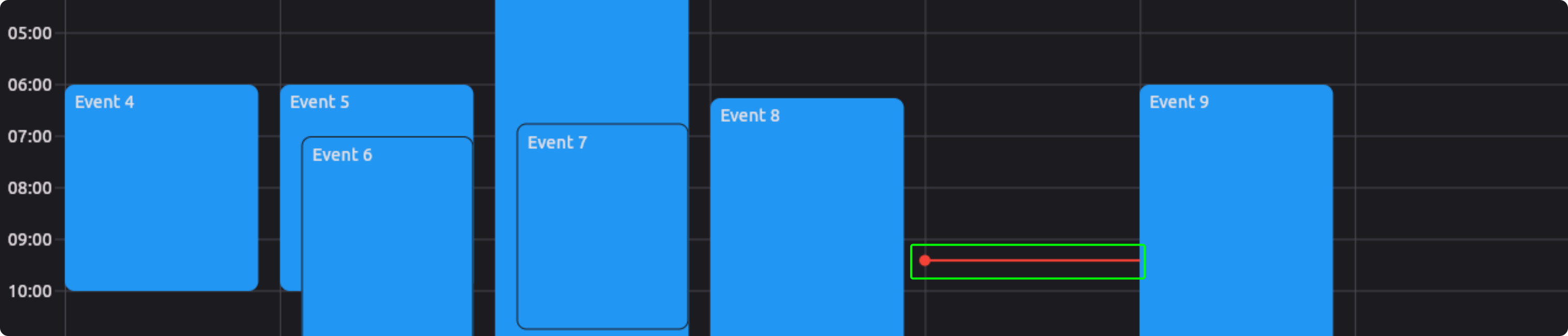
Reschedule - Drag and Drop events to your liking.
-
Resize - Resize events by dragging the edges of an event.
-
Event Handeling - When a there is interaction with a tile or component the event can be handeled by you. Find out more
-
Flexible View's - Each of the Calendar View's takes a ViewConfiguration, this has some parameters you can change, OR you can create your own. Find out more
-
Custom Object - CaledarEvent's can contain any object of your choosing. Find out more
-
Appearance - You can change the style of the calendar and default components. Find out more
-
Custom Builders - You can create your own builders for different components of the calendar. Find out more
Installation #
-
Add this to your package's pubspec.yaml file:
$ flutter pub add kalender -
Import it:
import 'package:kalender/kalender.dart';
Usage #
-
Create a custom class to store your data.
class Event { final String title; final Color color; Event(this.title, this.description); } -
Create a EventsController
final eventsController = EventsController<Event>();Add events to the controller
eventsController.addEvent( CalendarEvent( dateTimeRange: DateTimeRange() eventData: Event( title: 'Event 1', color: Colors.blue, ), ), ); -
Create a CalendarController
final calendarController = CalendarController(); -
Create tile builders
Widget _tileBuilder(event, tileConfiguration) => Widget() Widget _multiDayTileBuilder(event, tileConfiguration) => Widget() Widget _monthEventTileBuilder(event, tileConfiguration) => Widget() -
Create a CalendarView
CalendarView(
  eventsController: eventsController,
  calendarController: calendarController,
  tileBuilder: _tileBuilder(),
  multiDayTileBuilder: _multiDayTileBuilder(),
  monthTileBuilder: _monthEventTileBuilder(),
)
Additional information #
Calendar Views #
There are a few constructors that you can choose from to create a CalendarView.
-
Default Constructor - this constructor will build the correct view (Day, MultiDay, Month) based on the ViewConfiguration you pass it.
-
DayView - this constructor will build a DayView and does not need the monthTileBuilder.
-
MultiDayView - this constructor will build a MultiDayView and does not need the monthTileBuilder.
-
MonthView - this constructor will build a MonthView and does not need the tileBuilder or multiDayTileBuilder.
View Configuration #
The CaledarView takes a ViewConfiguration object.
There are 3 'Types' of ViewConfiguration's: DayViewConfiguration, MultiDayViewConfiguration, and MonthViewConfiguration.
- You can create a Custom ViewConfiguration by extending one of these 'Types'.
These are the default ViewConfiguration's:
-
DayConfiguration - This configuration is used to configure the SingleDayView.
DayConfiguration( // The width of the timeline on the left of the page. timelineWidth: 56, // The overlap between the timeline and hourlines. hourlineTimelineOverlap: 8, // The height of the multi day tiles. multidayTileHeight: 24, // The size of one slot in the calendar. slotSize: SlotSize(minutes: 15), // Allow EventTiles to snap to each other. eventSnapping: true, // Allow EventTiles snap to the time indicator. timeIndicatorSnapping: true, ), -
MultiDayConfiguration - This configuration is used to configure the MultiDayView and can display any number of days.
MultiDayConfiguration( name: 'Two Day', numberOfDays: 2, timelineWidth: 56, hourlineTimelineOverlap: 8, multidayTileHeight: 24, slotSize: SlotSize(minutes: 15), paintWeekNumber: true, eventSnapping: true, timeIndicatorSnapping: true, ), -
WeekConfiguration - This configuration is used to configure the MultiDayView and displays 7 days that starts on the firstDayOfWeek.
WeekConfiguration( timelineWidth: 56, hourlineTimelineOverlap: 8, multidayTileHeight: 24, slotSize: SlotSize(minutes: 15), paintWeekNumber: true, eventSnapping: true, timeIndicatorSnapping: true, firstDayOfWeek: DateTime.monday, ), -
WorkWeekConfiguration - This configuration is used to configure the MultiDayView and displays 5 days that starts on monday.
WorkWeekConfiguration( timelineWidth: 56, hourlineTimelineOverlap: 8, multidayTileHeight: 24, slotSize: SlotSize(minutes: 15), paintWeekNumber: true, eventSnapping: true, timeIndicatorSnapping: true, ) -
MonthConfiguration - this configuration is used to configure the MonthView.
MonthConfiguration(
  firstDayOfWeek: DateTime.monday,
  enableRezising: true,
)
Event Handling #
The CaledarView can take a CalendarEventHandlers object. The CalendarEventHandlers handles the user's interaction with the calendar. (Do not confuse the CalendarEventHandlers with the EventsController)
There are 4 events at this time that can be handeled.
-
onEventChanged: this function is called when an event displayed on the calendar is changed. (resized or moved)
-
onEventTapped: this function is called when an event displayed on the calendar is tapped.
-
onCreateEvent: this function is called when a new event is created by the calendar.
-
onDateTapped: this function is called when a date on the calendar is tapped.
CalendarEventHandlers<Event>(
  onEventChanged: (initialDateTimeRange, CalendarEvent<Event> calendarEvent) async {
    // The initialDateTimeRange is the original DateTimeRange of the event.
    // The event is a reference to the event that was changed.

    // This is a async function, so you can do any async work here.

    // Once this function is complete the calendar will rebuild.
  },
  onEventTapped: (CalendarEvent<Event> calendarEvent) async {
    // The calendarEvent is a reference to the event that was tapped.

    // This is a async function, so you can do any async work here.

    // Once this function is complete the calendar will rebuild.
  },
  onCreateEvent: (CalendarEvent<Event> calendarEvent) async {
    // The calendarEvent is a reference to the event that was created.

    // This is a async function, so you can do any async work here.


    // You must return the calendarEvent and then the calendar will rebuild.
    return calendarEvent;
  },
  onDateTapped: (date) {
    // The date is the date that was tapped. see example for use case.
  },
);
Events Controller #
The CaledarView takes a EventsController object. The EventsController is used to store and manage CalendarEvent's. (Do not confuse the EventsController with EventHandling)
| Function | Parameters | Description |
|---|---|---|
| addEvent | CalendarEvent<T> event | Adds this event to the list and rebuilds the calendar view |
| addEvents | List<CalendarEvent<T>> events | Adds these events to the list and rebuilds the calendar view |
| removeEvent | CalendarEvent<T> event | Removes this event from the list and rebuilds the calendar view |
| removeWhere | bool Function(CalendarEvent<T> element) test | Removes the event(s) where the test returns true |
| clearEvents | Clears the list of stored events | |
| updateEvent | T? newEventData, DateTimeRange? newDateTimeRange,bool Function(CalendarEvent | Updates the eventData or newDateTimeRange (if provided), of the event where the test returns true |
Calendar Controller #
The CaledarView takes a CalendarController object. The CalendarController is used to control the CalendarView.
| Function | Parameters | Description |
|---|---|---|
| animateToNextPage | Duration? duration, Curve? curve | Animates to the next page. |
| animateToPreviousPage | Duration? duration, Curve? curve | Animates to the previous page. |
| jumpToPage | int page | Jumps to the given page. |
| jumpToDate | DateTime date | Jumps to the given date. |
| animateToDate | DateTime date, {Duration? duration, Curve? curve,} | Animates to the DateTime provided. |
| adjustHeightPerMinute | double heightPerMinute | Changes the heightPerMinute of the view. |
| animateToEvent | CalendarEvent | Animates to the CalendarEvent. |
Custom Object #
The CalendarEvent can contain any object. This object can be accessed by the tileBuilders and the CalendarEventHandlers.
Custom Object Example:
CalendarEvent<Event>(
  dateTimeRange: DateTimeRange(),
  eventData: Event(
    title: 'Event 1',
    color: Colors.blue,
  ),
);
Tile Builder Example:
Widget _tileBuilder(CalendarEvent<Event> event, tileConfiguration) {
  final customObject = event.eventData;
  return Card(
    color: customObject.color,
    child: Text(customObject.title),
  );
}
Appearance #
The CalendarView consists of quite a few sub components: Each of these components can be customized in the CalendarStyle object or by passing a custom widget builder through the CalendarComponents object.
-
CalendarHeader - This is a custom widget that you can pass to the calendar to render in the header of the calendar.
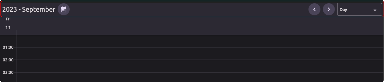
(CalendarHeader)
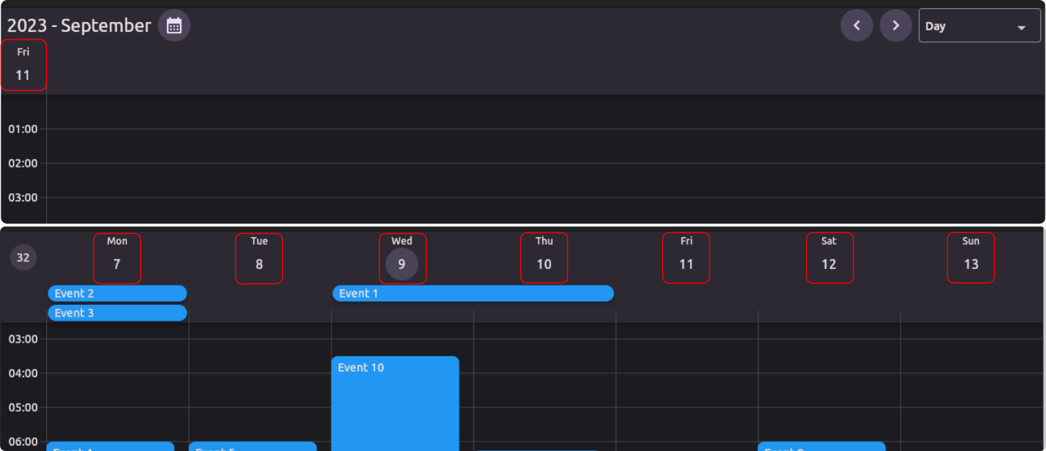
-
DayHeader - This widget is displayed above a day colum in the calendar.
(DayHeader)
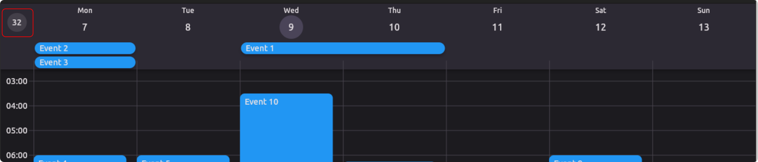
-
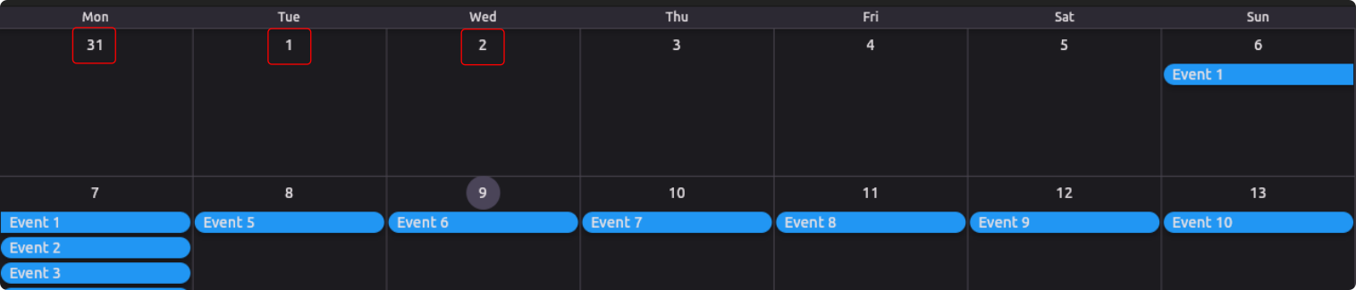
WeekNumber - This widget displays the week number of the year.
(WeekNumber)
-
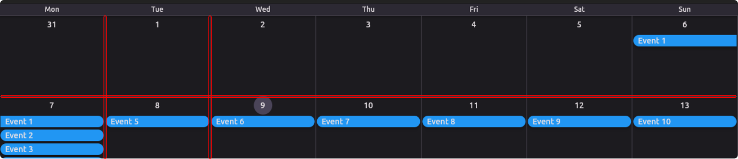
DaySeprator - This widget is displayed between days in the calendar.

(DaySeprator)
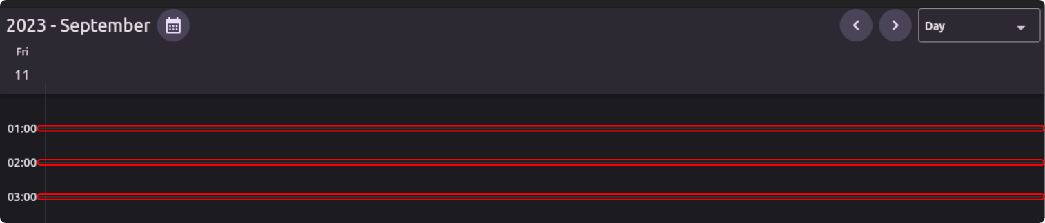
-
Hourlines - This widget is displayes the hourlines in the calendar.
(Hourlines)
-
Timeline - This widget is displayed on the left side of the calendar to show the time.
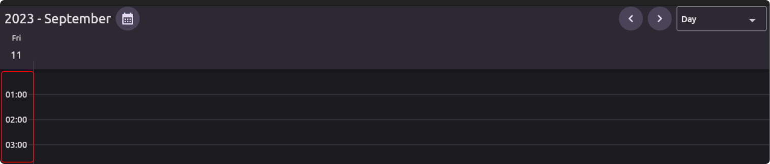
(Timeline)
-
TimeIndicator - This widget is displayed on the current day to show the current time.
(TimeIndicator)
-
MonthHeader - This widget is displayed above the month grid in the calendar header.

(MonthHeader)
-
MonthCellHeader - This widget is displayed in a month cell in the month grid.
(MonthCellHeader)
-
MonthGrid - This widget is displayed in the month view to show the grid.
(MonthGrid)
Metadata
Publisher
Metadata
A Flutter calendar UI package.
Repository (GitHub)
View/report issues
License
 unknown (license)