item_dropper 0.0.2  item_dropper: ^0.0.2 copied to clipboard
Customizable Flutter dropdowns with single and multi-select, search, keyboard navigation, accessibility, and add/delete support.
Item Dropper #
A customizable, accessible dropdown package for Flutter with powerful single-select and multi-select capabilities, built-in search filtering, and full keyboard navigation support.
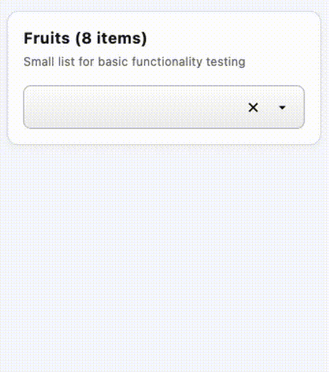
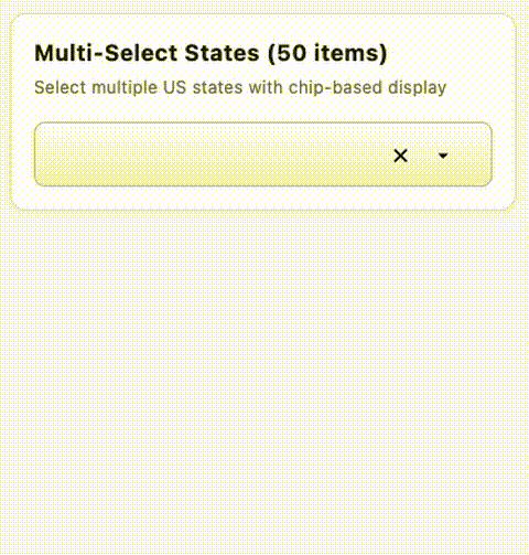
📸 Screenshots #
Single-Select Dropdown #
Multi-Select Dropdown with Chips #
✨ Features #
Core Functionality #
- ✅ Single-Select Dropdown - Traditional dropdown with single item selection
- ✅ Multi-Select Dropdown - Select multiple items displayed as chips
- ✅ Real-time Search - Filter items as you type
- ✅ Keyboard Navigation - Full support for arrow keys, Enter, and Escape
- ✅ Add New Items - Allow users to create new items on-the-fly
- ✅ Delete Items - Optional delete buttons for managing the item list
- ✅ Group Headers - Organize items with visual separators
- ✅ Smart Positioning - Automatically positions dropdown above or below based on screen space
Customization #
- 🎨 Fully Styleable - Custom text styles, decorations, and item builders
- 🎯 Max Selection Limit - Optionally limit number of selections in multi-select
- ⚙️ Flexible Configuration - Width, height, elevation, and more
- 🎭 Custom Item Rendering - Provide your own popup item builder
- 🖌️ Custom Decorations - Customize field container and chip appearance
Accessibility #
- ♿ Screen Reader Support - Full semantic labels and live region announcements
- ⌨️ Keyboard Accessible - Navigate and select without a mouse
- 🔊 Selection Announcements - Screen readers announce item selections
Performance #
- ⚡ Optimized Filtering - Cached results for fast search
- 📦 Smart Rebuilds - Efficient state management prevents unnecessary rebuilds
- 💾 Decoration Caching - Pre-computed decorations for smooth rendering
📦 Installation #
Add item_dropper to your pubspec.yaml:
dependencies:
  item_dropper: ^0.0.1
Then run:
flutter pub get
🚀 Quick Start #
Single-Select Dropdown #
import 'package:item_dropper/item_dropper.dart';

// Create your items
final items = [
  ItemDropperItem(value: '1', label: 'Apple'),
  ItemDropperItem(value: '2', label: 'Banana'),
  ItemDropperItem(value: '3', label: 'Orange'),
  ItemDropperItem(value: '4', label: 'Grapes'),
];

// Track selected item
ItemDropperItem<String>? selectedItem;

// Use in your widget tree
SingleItemDropper<String>(
  items: items,
  selectedItem: selectedItem,
  width: 300,
  onChanged: (item) {
    setState(() {
      selectedItem = item;
    });
  },
)
Multi-Select Dropdown #
import 'package:item_dropper/item_dropper.dart';

// Create your items
final items = [
  ItemDropperItem(value: '1', label: 'Red'),
  ItemDropperItem(value: '2', label: 'Blue'),
  ItemDropperItem(value: '3', label: 'Green'),
  ItemDropperItem(value: '4', label: 'Yellow'),
];

// Track selected items
List<ItemDropperItem<String>> selectedItems = [];

// Use in your widget tree
MultiItemDropper<String>(
  items: items,
  selectedItems: selectedItems,
  width: 400,
  maxSelected: 3, // Optional: limit selections
  onChanged: (items) {
    setState(() {
      selectedItems = items;
    });
  },
)
🎯 Common Use Cases #
With Search/Filter #
Both widgets automatically support search - just start typing!
SingleItemDropper<String>(
  items: longListOfItems,
  selectedItem: selectedItem,
  width: 300,
  onChanged: (item) => setState(() => selectedItem = item),
  // Search is built-in - no configuration needed!
)
With Group Headers #
final itemsWithGroups = [
  ItemDropperItem(value: 'header1', label: 'Fruits', isGroupHeader: true),
  ItemDropperItem(value: '1', label: 'Apple'),
  ItemDropperItem(value: '2', label: 'Banana'),
  ItemDropperItem(value: 'header2', label: 'Vegetables', isGroupHeader: true),
  ItemDropperItem(value: '3', label: 'Carrot'),
  ItemDropperItem(value: '4', label: 'Lettuce'),
];

SingleItemDropper<String>(
  items: itemsWithGroups,
  selectedItem: selectedItem,
  width: 300,
  onChanged: (item) => setState(() => selectedItem = item),
)
Allow Adding New Items #
SingleItemDropper<String>(
  items: items,
  selectedItem: selectedItem,
  width: 300,
  onChanged: (item) => setState(() => selectedItem = item),
  onAddItem: (searchText) {
    // Create new item from search text
    final newItem = ItemDropperItem(
      value: searchText.toLowerCase(),
      label: searchText,
    );

    // Add to your items list
    setState(() {
      items.add(newItem);
    });

    // Return the new item to auto-select it
    return newItem;
  },
)
Custom Styling #
MultiItemDropper<String>(
  items: items,
  selectedItems: selectedItems,
  width: 400,
  onChanged: (items) => setState(() => selectedItems = items),

  // Customize field text style
  fieldTextStyle: TextStyle(
    fontSize: 14,
    fontWeight: FontWeight.w500,
    color: Colors.blue.shade900,
  ),

  // Customize popup text style
  popupTextStyle: TextStyle(
    fontSize: 12,
    color: Colors.black87,
  ),

  // Customize group header style
  popupGroupHeaderStyle: TextStyle(
    fontSize: 11,
    fontWeight: FontWeight.bold,
    color: Colors.grey.shade700,
  ),

  // Custom chip decoration
  selectedChipDecoration: BoxDecoration(
    color: Colors.green.shade100,
    borderRadius: BorderRadius.circular(16),
  ),

  // Custom field decoration
  fieldDecoration: BoxDecoration(
    color: Colors.white,
    border: Border.all(color: Colors.blue, width: 2),
    borderRadius: BorderRadius.circular(12),
  ),
)
Disabled State #
SingleItemDropper<String>(
  items: items,
  selectedItem: selectedItem,
  width: 300,
  enabled: false, // Disables interaction
  onChanged: (item) => setState(() => selectedItem = item),
)
📚 Advanced Features #
Custom Item Rendering #
Provide your own popup item builder for complete control:
SingleItemDropper<String>(
  items: items,
  selectedItem: selectedItem,
  width: 300,
  onChanged: (item) => setState(() => selectedItem = item),
  popupItemBuilder: (context, item, isSelected) {
    return Container(
      padding: EdgeInsets.all(12),
      color: isSelected ? Colors.blue.shade100 : Colors.white,
      child: Row(
        children: [
          Icon(Icons.star, color: Colors.amber),
          SizedBox(width: 8),
          Text(item.label),
        ],
      ),
    );
  },
)
Programmatic Focus Control #
final inputKey = GlobalKey();

SingleItemDropper<String>(
  inputKey: inputKey,
  items: items,
  selectedItem: selectedItem,
  width: 300,
  onChanged: (item) => setState(() => selectedItem = item),
)

// Later, programmatically focus:
FocusScope.of(context).requestFocus(
  FocusNode()..requestFocus(),
);
Keyboard Navigation #
Built-in keyboard support:
- ↑/↓ Arrow Keys - Navigate through items
- Enter - Select highlighted item
- Escape - Close dropdown
- Type to search - Filter items in real-time
Localization #
All user-facing text can be customized by providing an ItemDropperLocalizations instance:
SingleItemDropper<String>(
  items: items,
  selectedItem: selectedItem,
  width: 300,
  onChanged: (item) => setState(() => selectedItem = item),
  localizations: ItemDropperLocalizations(
    addItemPrefix: 'Ajouter "',
    addItemSuffix: '"',
    noResultsFound: 'Aucun résultat trouvé',
    deleteDialogTitle: 'Supprimer "{label}"?',
    deleteDialogContent: 'Cet élément sera supprimé de la liste.',
    deleteDialogCancel: 'Annuler',
    deleteDialogDelete: 'Supprimer',
    // ... other strings
  ),
)
See ItemDropperLocalizations class for all available strings.
🎨 Customization Options #
SingleItemDropper Parameters #
| Parameter | Type | Default | Description |
|---|---|---|---|
items |
List<ItemDropperItem<T>> |
required | The items to display in the dropdown |
selectedItem |
ItemDropperItem<T>? |
null |
The currently selected item |
onChanged |
Function(ItemDropperItem<T>?) |
required | Called when the selection changes |
popupItemBuilder |
Widget Function(...)? |
null |
Optional custom builder for popup items |
width |
double |
required | The width of the dropdown field |
enabled |
bool |
true |
Whether the dropdown is enabled |
hintText |
String? |
null |
Hint/placeholder text for input field |
showKeyboard |
bool |
false |
Whether to show the mobile keyboard |
onAddItem |
ItemDropperItem<T>? Function(String)? |
null |
Callback for adding new items based on search text entered by user |
onDeleteItem |
Function(ItemDropperItem<T>)? |
null |
Callback for deleting items |
maxDropdownHeight |
double |
200.0 |
Maximum dropdown popup height |
elevation |
double |
4.0 |
Popup shadow elevation |
showScrollbar |
bool |
true |
Whether to show a vertical scrollbar in popup |
scrollbarThickness |
double |
6.0 |
Popup vertical scrollbar thickness |
fieldTextStyle |
TextStyle? |
null |
Text style for input/search field |
popupTextStyle |
TextStyle? |
null |
Text style for popup dropdown items |
popupGroupHeaderStyle |
TextStyle? |
null |
Text style for group headers in popup |
itemHeight |
double? |
null |
Height for popup dropdown items |
fieldDecoration |
BoxDecoration? |
null |
Optional BoxDecoration for field container |
showDropdownPositionIcon |
bool |
true |
Show the dropdown position arrow (down/up) |
showDeleteAllIcon |
bool |
true |
Show the clear (X) icon |
localizations |
ItemDropperLocalizations? |
null |
Localization strings for user-facing text (optional) |
inputKey |
GlobalKey? |
null |
Key for programmatic access |
MultiItemDropper Parameters #
| Parameter | Type | Default | Description |
|---|---|---|---|
items |
List<ItemDropperItem<T>> |
required | The items to display in the dropdown |
selectedItems |
List<ItemDropperItem<T>> |
required | The currently selected items |
onChanged |
Function(List<ItemDropperItem<T>>) |
required | Called when the selection changes |
popupItemBuilder |
Widget Function(...)? |
null |
Optional custom builder for popup items |
width |
double |
required | The width of the dropdown field |
enabled |
bool |
true |
Whether the dropdown is enabled |
hintText |
String? |
null |
Hint/placeholder text for input field |
maxSelected |
int? |
null |
Maximum number of items selectable in multi-select dropdown |
onAddItem |
ItemDropperItem<T>? Function(String)? |
null |
Callback for adding new items based on search text entered by user |
onDeleteItem |
Function(ItemDropperItem<T>)? |
null |
Callback for deleting items |
maxDropdownHeight |
double? |
200.0 |
Maximum dropdown popup height |
showScrollbar |
bool |
true |
Whether to show a vertical scrollbar in popup |
scrollbarThickness |
double |
6.0 |
Popup vertical scrollbar thickness |
itemHeight |
double? |
null |
Height for popup dropdown items |
popupTextStyle |
TextStyle? |
null |
Text style for popup dropdown items |
popupGroupHeaderStyle |
TextStyle? |
null |
Text style for group headers in popup |
fieldTextStyle |
TextStyle? |
null |
Text style for input/search field and chips |
selectedChipDecoration |
BoxDecoration? |
null |
Custom BoxDecoration for selected chips |
fieldDecoration |
BoxDecoration? |
null |
Optional BoxDecoration for field container |
elevation |
double? |
4.0 |
Popup shadow elevation |
inputKey |
GlobalKey? |
null |
Key for programmatic access to widget |
showDropdownPositionIcon |
bool |
true |
Show the dropdown position arrow (down/up) |
showDeleteAllIcon |
bool |
true |
Show the clear (X) icon (clears search/all selections) |
localizations |
ItemDropperLocalizations? |
null |
Localization strings for user-facing text (optional) |
ItemDropperItem Properties #
| Property | Type | Default | Description |
|---|---|---|---|
value |
T |
required | Unique identifier for the item |
label |
String |
required | Display text |
isGroupHeader |
bool |
false |
Whether item is a group header |
isEnabled |
bool |
true |
Whether item can be selected |
isDeletable |
bool |
false |
Whether item can be deleted |
📖 Full Documentation #
- Complete Working Examples - See comprehensive examples in the demo app
- API Documentation - Auto-generated API reference
- GitHub Repository - View source code and contribute
🤝 Contributing #
Contributions are welcome! Please feel free to submit a Pull Request.
- Fork the repository
- Create your feature branch (
git checkout -b feature/AmazingFeature) - Commit your changes (
git commit -m 'Add some AmazingFeature') - Push to the branch (
git push origin feature/AmazingFeature) - Open a Pull Request
🐛 Issues #
Found a bug or have a feature request? Please open an issue on GitHub.
📄 License #
This project is licensed under the MIT License - see the LICENSE file for details.
🙏 Acknowledgments #
Built with ❤️ using Flutter. Designed for developers who need powerful, accessible dropdown components.
📝 Changelog #
See CHANGELOG.md for a list of changes in each version.
⭐ Show Your Support #
If you find this package useful, please give it a ⭐ on GitHub!
Keywords: flutter, dropdown, select, multi-select, autocomplete, searchable, accessible, keyboard navigation, chips
Metadata
Documentation
Publisher
unverified uploader
Weekly Downloads
Metadata
Customizable Flutter dropdowns with single and multi-select, search, keyboard navigation, accessibility, and add/delete support.
Repository (GitHub)
View/report issues
License
 MIT (license)