introduction_screen 3.0.2  introduction_screen: ^3.0.2 copied to clipboard
Introduction/Onboarding package for flutter app with some customizations possibilities
IntroductionScreen  #
#
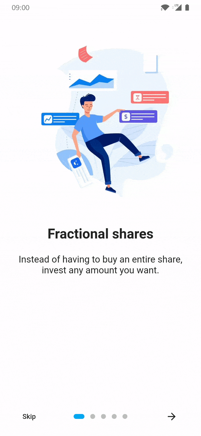
Introduction screen allow you to have a screen at launcher for example, where you can explain your app. This Widget is very customizable with a great design.
Introduction_screen use another package, dots_indicator, that I also created.
Installation #
You just need to add introduction_screen as a dependency in your pubspec.yaml file.
dependencies:
  introduction_screen: ^3.0.1
Example #
Many parameters are available, in next section of example all are not listed. To see all parameters available please check end of README. If you want to display IntroductionScreen only once (e.g: first start of your app), use SharedPreferences (or similar) to save status (already display or not). It's not responsability of this package to handle this.
In these example, listPagesViewModel is the list of pages. A page is base on PageViewModel. See example of a PageViewModel below.
PageViewModel #
Simple page #
This example only defines title, body and an image (you can define any widget)
PageViewModel(
  title: "Title of first page",
  body: "Here you can write the description of the page, to explain someting...",
  image: Center(
    child: Image.network("https://domaine.com/image.png", height: 175.0),
  ),
)
Page with custom colors #
This example shows you how to define the color of the page
PageViewModel(
  title: "Title of first page",
  body: "Here you can write the description of the page, to explain someting...",
  image: Center(child: Image.asset("res/images/logo.png", height: 175.0)),
  decoration: const PageDecoration(
    pageColor: Colors.blue,
  ),
)
Page with custom text style #
This example shows you how to define another TextStyle for the title and the body
PageViewModel(
  title: "Title of first page",
  body: "Here you can write the description of the page, to explain someting...",
  image: const Center(child: Icon(Icons.android)),
  decoration: const PageDecoration(
    titleTextStyle: TextStyle(color: Colors.orange),
    bodyTextStyle: TextStyle(fontWeight: FontWeight.w700, fontSize: 20.0),
  ),
)
Page with a footer, like a button #
This example shows you how to define a page with a footer, like a Button
PageViewModel(
  title: "Title of first page",
  body: "Here you can write the description of the page, to explain someting...",
  image: const Center(child: Icon(Icons.android)),
  footer: ElevatedButton(
    onPressed: () {
      // On button presed
    },
    child: const Text("Let's Go !"),
  ),
);
Page with widget body #
This example shows you how to define a page with a body as Widget and not a simple String
You can to the same this for title, with titleWidget parameter.
PageViewModel(
  title: "Title of first page",
  bodyWidget: Row(
    mainAxisAlignment: MainAxisAlignment.center,
    children: const [
      Text("Click on "),
      Icon(Icons.edit),
      Text(" to edit a post"),
    ],
  ),
  image: const Center(child: Icon(Icons.android)),
);
IntroductionScreen #
Note :
If you not provide next parameter, the Next button will be not displayed.
If you want to display a skip button, you must add skip parameter and showSkipButton: true.
The done parameter is required only if showDoneButton: true.
Simple intro screen #
Simple intro screen
IntroductionScreen(
  pages: listPagesViewModel,
  done: const Text("Done", style: TextStyle(fontWeight: FontWeight.w600)),
  onDone: () {
    // When done button is press
  },
); //Material App
Intro screen with skip button #
IntroductionScreen(
  pages: listPagesViewModel,
  onDone: () {
    // When done button is press
  },
  showBackButton: false,
  showSkipButton: true,
  skip: const Text("Skip"),
  done: const Text("Done", style: TextStyle(fontWeight: FontWeight.w600)),
);
Intro screen with back button #
note: back button is not visible on first page for better UX
IntroductionScreen(
  pages: listPagesViewModel,
  onDone: () {
    // When done button is press
  },
  showBackButton: true,
  showSkipButton: false,
  back: const Icon(Icons.arrow_back),
  done: const Text("Done", style: TextStyle(fontWeight: FontWeight.w600)),
);
Intro screen with custom button text and dots indicators #
IntroductionScreen(
  pages: listPagesViewModel,
  onDone: () {
    // When done button is press
  },
  onSkip: () {
    // You can also override onSkip callback
  },
  showBackButton: false
  showSkipButton: true,
  skip: const Icon(Icons.skip_next),
  next: const Icon(Icons.next),
  done: const Text("Done", style: TextStyle(fontWeight: FontWeight.w600)),
  dotsDecorator: DotsDecorator(
    size: const Size.square(10.0),
    activeSize: const Size(20.0, 10.0),
    activeColor: theme.accentColor,
    color: Colors.black26,
    spacing: const EdgeInsets.symmetric(horizontal: 3.0),
    activeShape: RoundedRectangleBorder(
      borderRadius: BorderRadius.circular(25.0)
    )
  ),
);
Intro screen with custom button style #
You can provide a baseBtnStyle, that will apply a style on all buttons (back, next, skip, done).
You provide also a specific button style (backStyle, nextStyle, skipStyle, doneStyle).
If you set a baseBtnStyle and a specific button style, the baseBtnStyle will be merge with specific style.
By default buttons has a style applied:
TextButton.styleFrom(
  shape: RoundedRectangleBorder(
    borderRadius: BorderRadius.circular(8.0),
  ),
)
You can override this using the baseBtnStyle or with specific button style.
The exemple below will display :
- All buttons with 25px circular border
- Skip button with red color
- Done button with green color
- Next button with blue color
IntroductionScreen(
  pages: listPagesViewModel,
  showSkipButton: true,
  skip: const Text("Skip"),
  done: const Text("Done", style: TextStyle(fontWeight: FontWeight.w600)),
  onDone: () {
    // When done button is press
  },
  baseBtnStyle: TextButton.styleFrom(
    shape: RoundedRectangleBorder(
      borderRadius: BorderRadius.circular(25.0),
    ),
  ),
  skipStyle: TextButton.styleFrom(primary: Colors.red),
  doneColor: TextButton.styleFrom(primary: Colors.green),
  nextColor: TextButton.styleFrom(primary: Colors.blue),
);
Parameters of IntroductionScreen widget #
Many parameters can be used to customized Intro like you want ! This is all parameters you can add :
Pages
- Page that will be display (
PageViewModel), by addingpages: [..]parameter. - Use your own pages (Widget) without using those predefined, by adding
rawPages: [..]parameter.- If you provide both
rawPagesandpagesparameter,pageswill be used.
- If you provide both
Callbacks
- Set a custom callback when done button is pressed, by adding
onDone: () {}parameter.- This param is required if you define
doneparam, EXCEPT if you setshowDoneButton: false - If you set
overrideDoneparam, it will be ignored.
- This param is required if you define
- Set a custom callback when skip button is pressed, by adding
onSkip: () {}parameter.- By default, it will go to the last page
- If you set
overrideSkipparam, it will be ignored.
- Add callback to listen page changes, by adding
onChange: (page) {}parameter.
Use pre-made buttons
- Define pre-made Done button child (Widget), by adding
done: Text('Done')- This param or
overrideDoneare required, EXCEPT if you setshowDoneButton: false - By providing
done, the parameteronDoneis also required.
- This param or
- Define pre-made Next button child (Widget), by adding
next: Text('Next')- This param is required, EXCEPT if you set
showNextButton: false
- This param is required, EXCEPT if you set
- Define pre-made Skip button child (Widget), by adding
skip: Text('Skip')- This param is required if you set
showSkipButton: trueDefine pre-made Back button child (Widget), by addingback: Text('Back') - This param is required if you set
showBackButton: true
- This param is required if you set
Use custom buttons
If you want to control pages, you can use key param. Search in issues of this repo to have more detailed informations.
- Define your custom Done button (Widget), by using
overrideDone- This param or
doneare required, EXCEPT if you setshowDoneButton: false - This parameter has priority over the
doneparameter.
- This param or
- Define your custom Next button (Widget), by using
overrideNext- This param or
nextare required, EXCEPT if you setshowNextButton: false - This parameter has priority over the
nextparameter.
- This param or
- Define your custom Skip button (Widget), by using
overrideSkip- This param or
skipare required if you setshowSkipButton: true - This parameter has priority over the
skipparameter.
- This param or
- Define your custom Back button (Widget), by using
overrideBack- This param or
backare required if you setshowBackButton: true - This parameter has priority over the
skipparameter.
- This param or
Manage display of pre-made or custom buttons
- Hide/show Skip button, by adding
showSkipButton: falseparameter.- Default
false
- Default
- Hide/show Next button, by adding
showNextButton: falseparameter.- Default
true
- Default
- Hide/show Done button, by adding
showDoneButton: falseparameter.- Default
true
- Default
- Hide/show Back button, by adding
showBackButton: falseparameter.- Default
false
- Default
Controls
- Display or not the progress dots, by adding
isProgress: falseparameter.- Default
true
- Default
- Enable or disable dots progress tap, by adding
isProgressTap: falseparameter.- Default
true
- Default
Page
- Freeze the scroll, by adding
freeze: trueparameter.- Default
false
- Default
- Duration of scrolling animation, by adding
animationDuration: 400parameter.- Default
350
- Default
- Initial page, by adding
initialPage: 2parameter.- Default
0
- Default
- You can provide a ScrollController for each page by adding
scrollControllers: [..]parameter.- If you have 5 pages, you can provide 5 differents ScrollController.
- If you want to have only one ScrollController for page 1, you can provide:
scrollControllers: [controller1] - If you want to have only one ScrollController for page 3, you can provide:
scrollControllers: [null, null, controller1] - Will be ignored for page(s) if
useScrollViewis set tofalsein PageViewModel(s)
Pages style
- Global background color, by adding
globalBackgroundColor: Colors.blueparameter.- Tips: use
Colors.transparentto display an image as background (using Stack with IntroductionScreen inside for example)
- Tips: use
- Customize dots (progression) by adding
dotsDecorator: DotsDecorator(...)- You can customize dots size, shape, colors, spacing.
- Customize dots container by adding
dotsContainerDecorator: BoxDecorator(...)- You can customize container that contain controls.
- Skip/Back button flex, by adding
skipOrBackFlex: 1parameter.- Set 0 to disable Expanded behaviour, default
1
- Set 0 to disable Expanded behaviour, default
- Dots indicator flex, by adding
dotsFlex: 1parameter.- Set 0 to disable Expanded behaviour, default
1
- Set 0 to disable Expanded behaviour, default
- Next/Done button flex, by adding
nextFlex: 1parameter.- Set 0 to disable Expanded behaviour, default
1
- Set 0 to disable Expanded behaviour, default
- Animation curve between pages, by adding
curve: Curves.elasticInparameter.- Default
Curves.easeIn
- Default
Buttons styles
- Change global style of buttons (for skip, next, done, back), by adding
baseBtnStyleparameter. - Change skip button style, by adding
skipStyle: TextButton.styleFrom(alignment: Alignment.centerLeft)parameter. - Change next button style, by adding
nextStyle: TextButton.styleFrom(alignment: Alignment.centerRight)parameter. - Change done button style, by adding
doneStyle: TextButton.styleFrom(splashFactory: NoSplash.splashFactory)parameter. - Change back button style, by adding
backStyle: TextButton.styleFrom(primary: Colors.red)parameter.
Semantic
- Change skip button semantic label, by adding
skipSemantic: 'Skip introduction'parameter. - Change next button semantic label, by adding
nextSemantic: 'Go to next page'parameter. - Change done button semantic label, by adding
doneSemantic: 'Exit introduction'parameter. - Change back button semantic label, by adding
backSemantic: 'Go to previous page'parameter.
Layout
- Enable or disable SafeArea on top, by adding
isTopSafeArea: trueparameter- Default
false
- Default
- Enable or disable SafeArea on bottom, by adding
isBottomSafeArea: trueparameter.- Default
false
- Default
- Customize controls position on screen, by adding
controlsPosition: const Position(left: 0, right: 0, bottom: 100)parameter.- Default
const Position(left: 0, right: 0, bottom: 0)
- Default
- Customize margin of controls's container, by adding
controlsMargin: EdgeInsets.all(16.0)parameter.- Default
EdgeInsets.zero
- Default
- Customize padding of controls's container, by adding
controlsPadding: EdgeInsets.all(8.0)parameter.- Default
EdgeInsets.all(16.0)
- Default
- Add global header (top), static and displayed above pages, by adding
globalHeader: Image.asset(...)parameter. - Add global footer below controls/dots, by adding
globalFooter: ElevatedButton(...)parameter. - Change axis of scroll by adding
pagesAxis: Axis.vertical.- Default
Axis.horizontal
- Default
- Change default scroll physics of PageView by adding
scrollPhysics: ClampingScrollPhysics().- Default
BouncingScrollPhysics()
- Default
- You can also enable right-to-left behavious by adding
rtl: true.- Default
false
- Default
Parameters of PageViewModel (each pages) #
You can also provide many parameter to customize each pages :
title: "Title of the page"ortitleWidget: Text("Custom widget for title")body: "Body of the page"orbodyWidget: Text("Custom widget for body")image: Image.asset(...)image of the page.- It's expecting a Widget, so if you want to pass a Video, Text, or anything else, you can.
footer: ElevatedButton(...), display a widget below body- Like image param, it's expecting a Widget, you can pass what you want.
decoration: PageDecoration(...), page decoration to customize page- See next section for all parameters you can pass
reverse: true, reverse order of image and content (title/body). (Default:false)useScrollView: false, by default pages use a Scrollview to handle small screen or long body text. You can remove ScrollView by setting to false.
Parameters of PageDecoration (decoration of a page) #
pageColor: Colors.white, background color of the page- You cannot use both pageColor and boxDecoration params
titleTextStyle: TextStyle(...), TextStyle of the titlebodyTextStyle: TextStyle(...), TextStyle of the bodyboxDecoration: BoxDecoration(...), BoxDecoration of page container- You cannot use both pageColor and boxDecoration params
imageFlex: 2, flex ratio of the imagebodyFlex: 3, flex ratio of the content (title/body)imagePadding: EdgeInsets.only(bottom: 12.0), padding of the image Widget. (DefaultEdgeInsets.only(bottom: 24.0))contentPadding: EdgeInsets.only(all: 24.0), padding of the content (title/body/footer) Widget. (DefaultEdgeInsets.all(16))titlePadding: EdgeInsets.only(bottom: 24.0), padding of the title text/Widget. (DefaultEdgeInsets.only(top: 16.0, bottom: 24.0))descriptionPadding: EdgeInsets.only(bottom: 24.0), padding of the body text/Widget. (DefaultEdgeInsets.zero)footerPadding: EdgeInsets.only(top: 24.0), padding of the footer text/Widget. (DefaultEdgeInsets.symmetric(vertical: 24.0))bodyAlignment: Align.center, content (title, body, footer) alignment. (DefaultAlign.topCenter)imageAlignment: Align.center, image alignment. (DefaultAlign.bottomCenter)fullScreen: true, Set image as fullscreen (background). (Defaultfalse)
Metadata
Publisher
unverified uploader
Metadata
Introduction/Onboarding package for flutter app with some customizations possibilities
Repository (GitHub)
View/report issues
License
 unknown (LICENSE)
Dependencies
collection, dots_indicator, flutter