infinite_loading 1.0.1  infinite_loading: ^1.0.1 copied to clipboard
A Flutter package for rendering an infinite oscillating loading widget with smooth completion animations.
infinite_loading #
A modern Flutter package for rendering a highly customizable infinite oscillating loading widget with smooth completion animations.
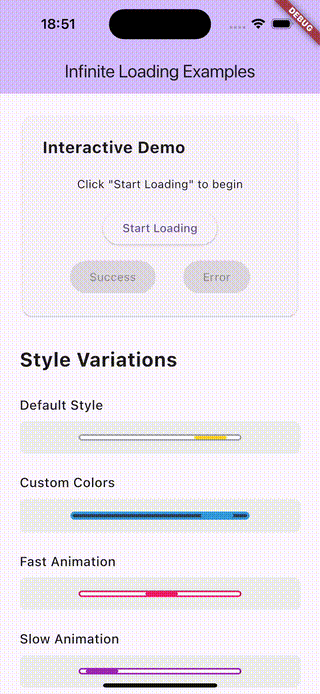
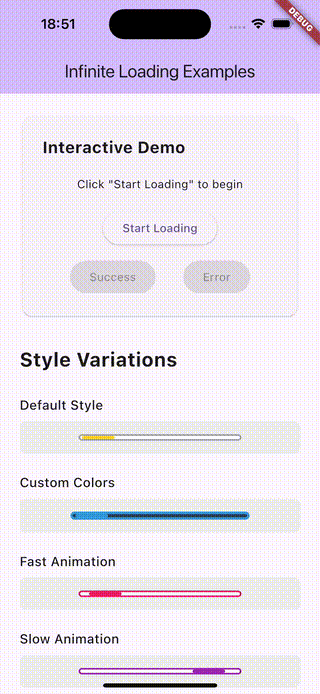
Demo #
| Success | Error | Variations |
|---|---|---|
 |
 |
 |
Features #
✨ Smooth Oscillating Animation - A progress bar that moves back and forth infinitely (left-right-left) 🎨 Fully Customizable - Configure colors, sizes, borders, speeds, and more ✅ Completion States - Beautiful animations for success (green checkmark) and error (red X) states 🚀 Zero Dependencies - Uses only Flutter's built-in animation framework 📱 Modern & Null-Safe - Built with Flutter 3.0+ and null safety
Installation #
Add this to your package's pubspec.yaml file:
dependencies:
  infinite_loading: ^1.0.0
Or install it from the command line:
flutter pub add infinite_loading
Usage #
Basic Example #
import 'package:infinite_loading/infinite_loading.dart';

InfiniteLoading(
  width: 200,
  height: 8,
)
Interactive Example #
class MyWidget extends StatefulWidget {
  @override
  State<MyWidget> createState() => _MyWidgetState();
}

class _MyWidgetState extends State<MyWidget> {
  bool? _completeWithSuccess;

  void _simulateAsyncOperation() async {
    // Start loading (set to null for infinite loading)
    setState(() => _completeWithSuccess = null);

    // Simulate some work
    await Future.delayed(Duration(seconds: 2));

    // Complete with success
    setState(() => _completeWithSuccess = true);

    // Or complete with error
    // setState(() => _completeWithSuccess = false);
  }

  @override
  Widget build(BuildContext context) {
    return InfiniteLoading(
      width: 200,
      height: 8,
      completeWithSuccess: _completeWithSuccess,
    );
  }
}
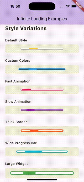
Customization Examples #
Custom Colors
InfiniteLoading(
  width: 220,
  height: 10,
  trackColor: Color(0xFF2C3E50),
  progressColor: Color(0xFF3498DB),
  borderColor: Color(0xFF3498DB),
  borderWidth: 3,
)
Custom Speed
// Fast animation
InfiniteLoading(
  width: 200,
  height: 8,
  oscillationDuration: Duration(milliseconds: 600),
)

// Slow animation
InfiniteLoading(
  width: 200,
  height: 8,
  oscillationDuration: Duration(milliseconds: 2400),
)
Custom Progress Bar Size
InfiniteLoading(
  width: 240,
  height: 10,
  progressBarWidth: 80, // Wider progress bar
)
Parameters #
| Parameter | Type | Default | Description |
|---|---|---|---|
width |
double |
200.0 |
Width of the loading widget container |
height |
double |
8.0 |
Height of the loading widget container |
trackColor |
Color |
Colors.white |
Background color of the track |
progressColor |
Color |
Color(0xFFFFD421) |
Color of the oscillating progress bar |
borderColor |
Color |
Colors.grey |
Color of the border during loading |
borderWidth |
double |
2.0 |
Width of the border |
borderRadius |
double |
14.0 |
Border radius for rounded corners |
oscillationDuration |
Duration |
Duration(milliseconds: 1200) |
Duration for one complete oscillation cycle |
progressBarWidth |
double |
40.0 |
Width of the moving progress bar |
completeWithSuccess |
bool? |
null |
Completion state: null = infinite, true = success, false = error |
successColor |
Color |
Color(0xFF4CAF50) |
Color for success state |
errorColor |
Color |
Color(0xFFF44336) |
Color for error state |
completionAnimationDuration |
Duration |
Duration(milliseconds: 400) |
Duration for completion animation |
Completion States #
The widget supports three states controlled by the completeWithSuccess parameter:
null- Infinite loading (default) - the bar oscillates continuouslytrue- Success - animates to a green checkmark iconfalse- Error - animates to a red X icon
When transitioning to a completion state, the widget smoothly animates into a circular shape with the appropriate icon.
Example App #
Check out the /example folder for a complete demo app showcasing all features and customization options.
To run the example:
cd example
flutter pub get
flutter run
Migration from 0.x #
If you're upgrading from version 0.x, note these breaking changes:
- Null safety: The package now requires Dart 3.0+
- No external dependencies:
simple_animationsis no longer needed - Icon-based completion: Uses Flutter's built-in icons instead of image assets
- New parameters: Many new customization options available
- Constructor changes:
@requiredis now replaced with named optional parameters
Contributing #
Contributions are welcome! Please feel free to submit a Pull Request.
License #
This project is licensed under the MIT License - see the LICENSE file for details.
Author #
Created and maintained by dmvvilela
Metadata
Publisher
unverified uploader
Weekly Downloads
Metadata
A Flutter package for rendering an infinite oscillating loading widget with smooth completion animations.
Repository (GitHub)
View/report issues
Topics
#loading #animation #progress #widget
Documentation
License
 BSD-3-Clause (license)