hyper_snackbar 0.7.0  hyper_snackbar: ^0.7.0 copied to clipboard
A highly customizable and animated snackbar package for Flutter.


HyperSnackbar 🚀 #
A highly customizable, animated, and powerful snackbar package for Flutter. Designed to be "Hyper" flexible — supports Stack/Queue modes, custom animations (Scale, Slide, Fade), progress bars, and highly interactive actions.
Now with Presets and GetX-style aliases for easier migration!
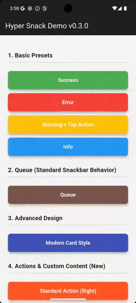
👉 Try the Interactive Playground!
✨ Features #
- Flexible Positioning: Top or Bottom.
- Display Modes: Stack (overlay) or Queue (sequential).
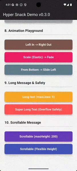
- Rich Animations: Slide, Fade, and New! Scale (Elastic Zoom).
- Presets System: Define reusable styles and inherit/override them easily.
- Progress Bar: Line or Wipe effects.
- Interactive: Tap callbacks, Action buttons, and Dismissible swipes.
- GetX Migration Aids: Supports parameters like
duration,snackPosition, andcolorText. - No Context Required: Uses
NavigatorKeyfor easy calling from anywhere.
🚀 Installation #
Add this to your package's pubspec.yaml file:
dependencies:
  hyper_snackbar: ^0.7.0
🛠 Setup #
Register the navigatorKey in your MaterialApp to show snackbars without a BuildContext.
import 'package:hyper_snackbar/hyper_snackbar.dart';

void main() {
  runApp(const MyApp());
}

class MyApp extends StatelessWidget {
  const MyApp({super.key});

  @override
  Widget build(BuildContext context) {
    return MaterialApp(
      // Important: Register the key here to show snackbars without BuildContext
      navigatorKey: HyperSnackbar.navigatorKey,
      home: const HomePage(),
    );
  }
}
📖 Usage #
Basic Usage #
The simplest way to show a message.
HyperSnackbar.show(
  title: 'Hello World',
  message: 'This is the simplest usage.',
);
Built-in Presets #
Quickly show styled messages for common scenarios.
// Success
HyperSnackbar.showSuccess(
  title: 'Success!',
  message: 'Operation completed successfully.',
);

// Error
HyperSnackbar.showError(
  title: 'Error',
  message: 'Something went wrong.',
);

// Warning & Info
HyperSnackbar.showWarning(title: 'Low Storage');
HyperSnackbar.showInfo(title: 'New Message');
🎨 Creating Custom Presets (New!) #
Stop repeating yourself! Define reusable styles using HyperSnackbar.preset and reuse them across your app.
// 1. Define a base preset (e.g., in your constants file)
static final myBrandPreset = HyperSnackbar.preset(
  backgroundColor: Colors.deepPurple,
  icon: Icon(Icons.star, color: Colors.amber),
  borderRadius: 16,
  animationType: HyperSnackAnimationType.scale, // Sets both enter & exit
);

// 2. Use it anywhere
HyperSnackbar.show(
  title: 'Welcome!',
  preset: myBrandPreset,
);

// 3. Override specific properties on the fly
HyperSnackbar.show(
  title: 'Welcome!',
  preset: myBrandPreset,
  backgroundColor: Colors.red, // Overrides the purple color
);
You can even inherit and extend presets using copyWith:
final darkPreset = myBrandPreset.copyWith(
  backgroundColor: Colors.black,
  textColor: Colors.white,
);
⚡ GetX Migration Guide #
Coming from GetX? HyperSnackbar now supports familiar parameter aliases to assist with migration.
| HyperSnackbar Param | GetX Alias |
|---|---|
displayDuration |
duration |
position |
snackPosition |
textColor |
colorText |
enter/exitAnimationDuration |
animationDuration |
// You can use GetX-style parameters directly:
HyperSnackbar.show(
  title: 'Familiar?',
  message: 'It works just like you expect.',
  snackPosition: HyperSnackPosition.bottom, // Alias for position
  duration: Duration(seconds: 3),           // Alias for displayDuration
  colorText: Colors.white,                  // Alias for textColor
);
Advanced Features #
Progress Bar Effects
Visualize the remaining duration.
HyperSnackbar.show(
  title: 'Loading...',
  progressBarWidth: 4.0, // Line effect
  // progressBarWidth: 0.0, // Wipe effect (background fill)
  displayDuration: const Duration(seconds: 5),
);
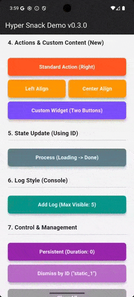
Action Button & Custom Content
Add interactive buttons or fully custom widgets.
HyperSnackbar.show(
  title: 'Item Deleted',
  action: HyperSnackAction(
    label: 'UNDO',
    onPressed: () => undoAction(),
  ),
);

// Or use a custom widget
HyperSnackbar.show(
  title: 'Cart Updated',
  content: Row(
    children: [
      TextButton(onPressed: () {}, child: Text('View Cart')),
      TextButton(onPressed: () {}, child: Text('Checkout')),
    ],
  ),
);
Overlay Control (Embedded Mode)
By default, snackbars render on the root overlay (covering modals). Set useLocalOverlay: true to render inside the nearest active Navigator (e.g., inside a tab or bottom sheet).
HyperSnackbar.show(
  title: 'Embedded Message',
  useLocalOverlay: true,
  backgroundColor: Colors.indigo,
);
📚 API Reference #
HyperSnackbar Methods #
All methods are static and can be called from anywhere.
| Method | Description |
|---|---|
show(...) |
Displays a fully customizable snackbar. |
preset(...) |
(New) Creates a reusable configuration object. |
showSuccess(...) |
Preset: Green background, Check icon. |
showError(...) |
Preset: Red background, Error icon. |
showWarning(...) |
Preset: Orange background, Warning icon. |
showInfo(...) |
Preset: Blue background, Info icon. |
dismissById(id) |
Dismisses a specific snackbar by its ID. |
clearAll({animated}) |
Dismisses all currently visible snackbars. |
isSnackbarOpen |
Returns true if any snackbar is visible. |
isSnackbarOpenById(id) |
Returns true if the specific snackbar is visible. |
⚙️ Configuration Parameters #
HyperSnackbar is highly customizable. You can configure it using the HyperConfig object, HyperSnackbar.preset, or directly via parameters in HyperSnackbar.show.
🎨 General & Appearance #
| Parameter | Type | Default | Description |
|---|---|---|---|
preset |
HyperConfig? |
null |
(New) Base configuration to apply/override. |
title |
String? |
null |
The title of the snackbar. |
message |
String? |
null |
The main message body. |
icon |
Widget? |
null |
Custom icon widget displayed on the left. |
useAdaptiveLoader |
bool |
false |
If true, displays a platform-adaptive loading indicator instead of the icon. |
backgroundColor |
Color? |
null |
Background color (defaults to dark grey). |
textColor |
Color? |
null |
Color for title and message text (alias: colorText). |
borderRadius |
double |
12.0 |
Corner radius of the snackbar. |
elevation |
double |
4.0 |
Shadow elevation. |
border |
BoxBorder? |
null |
Custom border for the snackbar container. |
margin |
EdgeInsetsGeometry |
zero |
Margin around the snackbar. |
padding |
EdgeInsetsGeometry |
16, 12 |
Internal padding. |
useLocalOverlay |
bool |
false |
If false, renders on the root overlay. If true, renders on the nearest overlay. |
👆 Actions & Interaction #
| Parameter | Type | Default | Description |
|---|---|---|---|
action |
HyperSnackAction? |
null |
Action button configuration (label, callback, colors). |
actionAlignment |
MainAxisAlignment |
.end |
Alignment of the action button (e.g., .start, .center). |
content |
Widget? |
null |
Custom widget to replace the action button area. |
onTap |
VoidCallback? |
null |
Callback when the snackbar itself is tapped. |
showCloseButton |
bool |
true |
Whether to show the "X" close button. |
enableSwipe |
bool |
true |
Allow dismissing the snackbar by swiping horizontally. |
⏱️ Behavior & Positioning #
| Parameter | Type | Default | Description |
|---|---|---|---|
id |
String? |
null |
Unique ID. Updating a snackbar with the same ID modifies the existing one. |
displayDuration |
Duration? |
4s |
How long the snackbar stays visible (alias: duration). null means persistent. |
position |
HyperSnackPosition |
.top |
Vertical position (alias: snackPosition). |
displayMode |
HyperSnackDisplayMode |
.stack |
.stack (overlays on top) or .queue (shows one by one). |
newestOnTop |
bool |
true |
(Stack mode) If true, new snackbars appear on top of the stack. |
maxVisibleCount |
int |
3 |
Maximum number of snackbars visible at once (Stack mode). |
📝 Text Handling #
| Parameter | Type | Default | Description |
|---|---|---|---|
titleStyle |
TextStyle? |
null |
Custom style for the title text. |
messageStyle |
TextStyle? |
null |
Custom style for the message text. |
maxLines |
int? |
5 |
Maximum lines for the message text. |
scrollable |
bool |
false |
If true, the message becomes scrollable within constraints. |
messageMaxHeight |
double? |
null |
Max height for the scrollable message area. |
✨ Animation #
| Parameter | Type | Default | Description |
|---|---|---|---|
animationType |
HyperSnackAnimationType? |
null |
(New) Sets both enter and exit animation types simultaneously. |
enterAnimationType |
HyperSnackAnimationType |
.top |
Animation style for entry (scale, fade, left, etc.). |
exitAnimationType |
HyperSnackAnimationType |
.left |
Animation style for exit. |
animationDuration |
Duration? |
null |
(New) Sets both enter and exit durations simultaneously. |
enterAnimationDuration |
Duration |
300ms |
Duration of entry animation. |
exitAnimationDuration |
Duration |
500ms |
Duration of exit animation. |
enterCurve |
Curve |
easeOutQuart |
Animation curve for entry. |
exitCurve |
Curve |
easeOut |
Animation curve for exit. |
📊 Progress Bar #
| Parameter | Type | Default | Description |
|---|---|---|---|
progressBarWidth |
double? |
null |
Height of the progress bar. 0.0 creates a background "wipe" effect. null disables it. |
progressBarColor |
Color? |
null |
Color of the progress bar. Defaults to a semi-transparent contrast color. |
📄 License #
MIT License
Metadata
Publisher
unverified uploader
Weekly Downloads
Metadata
A highly customizable and animated snackbar package for Flutter.
Repository (GitHub)
View/report issues
License
 unknown (license)