hyper_snackbar 0.2.4  hyper_snackbar: ^0.2.4 copied to clipboard
A highly customizable and animated snackbar package for Flutter.


Hyper Snackbar 🚀 #
A highly customizable, animated, and stackable snackbar manager for Flutter. Designed for modern apps that need more than just a simple toast.

✨ Features #
- Stackable: Display multiple notifications simultaneously without overlap.
- Highly Customizable: Custom borders, margins, fonts, shadows, and tap actions.
- Smart Updates: Update the content (text, icon, color) of an existing snackbar by ID without animation glitches.
- Interactive: Support for action buttons (e.g., "Undo") and tap gestures on the bar itself.
- Flexible Positioning: Show at the Top or Bottom of the screen.
- Log Style: Option to append new notifications to the bottom of the list (console log style).
- Presets: Ready-to-use methods for Success, Error, Warning, and Info.
- Smart Layout: Optimized for both short and long messages. The action button is placed below the text to ensure readability on all screen sizes.
- Flexible Text Handling: Titles are automatically truncated to one line, while messages support configurable line limits (or full display via
maxLines: null). - Auto-Dismiss Actions: Actions automatically close the snackbar by default, simplifying your interaction logic.
- Polished UI: Supports bold action text, custom colors, and top-aligned close buttons for a modern look.
📦 Installation #
Add this to your package's pubspec.yaml file:
dependencies:
  hyper_snackbar: ^0.2.4
🚀 Setup (Important) #
To use HyperSnackbar from anywhere in your code (e.g., ViewModels, BLoCs), you must register the navigatorKey in your MaterialApp.
import 'package:hyper_snackbar/hyper_snackbar.dart';

void main() {
  runApp(const MyApp());
}

class MyApp extends StatelessWidget {
  const MyApp({super.key});

  @override
  Widget build(BuildContext context) {
    return MaterialApp(
      title: 'My App',
      // ▼ If you want to show snackbars without `BuildContext`, register the key here.
      navigatorKey: HyperSnackbar.navigatorKey,
      home: const HomePage(),
    );
  }
}
💡 Usage #
Basic Usage #
The API is static, so you can call it directly without creating an instance. The show method uses named parameters for a more intuitive experience.
// Simply call the static method `show`!
HyperSnackbar.show(
  title: 'Success!',
  message: 'Data has been saved successfully.',
  backgroundColor: Colors.green,
);
Using BuildContext #
For cases where you need to use a local BuildContext (e.g., to navigate from a snackbar tap), you can pass it as an optional parameter.
// The snackbar will use the theme from this context
HyperSnackbar.show(
  title: 'Tap Me!',
  onTap: () {
    // This navigation requires the local context
    Navigator.of(context).push(...);
  },
  context: context, // Pass the context here
);
Using Extension (Optional) #
The convenient extension method on BuildContext is also available.
context.showHyperSnackbar(
  title: 'Hello from a Widget!',
  message: 'This is easy, right?',
);
1. Basic Presets #
Simple one-liners for common scenarios.
import 'package:hyper_snackbar/hyper_snackbar.dart';

// Success
HyperSnackbar.showSuccess(title: 'Saved successfully');

// Error
HyperSnackbar.showError(
  title: 'Connection Failed',
  message: 'Please check your internet connection.'
);

// Warning
HyperSnackbar.showWarning(title: 'Low Storage');

// Info
HyperSnackbar.showInfo(title: 'New Message Received');
2. Advanced Customization & Reusability #
Option A: Direct Customization (Recommended for one-offs)
Customize everything directly in the show method.
HyperSnackbar.show(
  title: 'Modern Notification',
  message: 'With custom border, font, and tap action.',
  backgroundColor: Color(0xFF212121),

  // Custom Design
  border: Border.all(color: Colors.white24, width: 1),
  borderRadius: 8,
  margin: EdgeInsets.all(16),
  titleStyle: TextStyle(fontSize: 18, fontWeight: FontWeight.bold),

  // Action Button
  action: HyperSnackAction(
    label: 'UNDO',
    textColor: Colors.amber,
    onPressed: () => print('Undo pressed'),
  ),
  context: context,
);
Option B: Reusing Configuration (For consistent styling)
If you need to reuse a style across your app, define a HyperConfig object and use the showFromConfig method.
// 1. Define your base style
final warningStyle = HyperConfig(
  backgroundColor: Colors.orange,
  icon: Icon(Icons.warning, color: Colors.white),
  position: HyperSnackPosition.bottom,
);

// 2. Use it anywhere, overriding only what you need
HyperSnackbar.showFromConfig(
  warningStyle.copyWith(
    title: 'Low Battery',
    message: 'Only 15% remaining.',
  ),
);
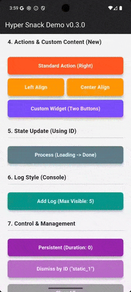
3. Update by ID (Loading -> Done) ⚡ #
This is the killer feature. You can update the state of a snackbar by providing a unique id.
const String processId = 'upload_process';

// 1. Show Loading state
HyperSnackbar.show(
  id: processId, // Unique ID
  title: 'Uploading...',
  displayDuration: null, // Keep it visible
  icon: CircularProgressIndicator(color: Colors.white),
);

// ... do some work ...

// 2. Update to "Done" state (using the same ID)
HyperSnackbar.show(
  id: processId, // Same ID replaces the content
  title: 'Upload Complete!',
  backgroundColor: Colors.green,
  icon: Icon(Icons.check_circle, color: Colors.white),
  displayDuration: Duration(seconds: 3), // Auto-dismiss after 3s
);
4. Log Style (Stacking Direction) #
By default, new items appear at the top. You can append them to the bottom like a chat or log.
HyperSnackbar.show(
  title: 'System Log',
  message: 'Newest item is at the bottom.',
  position: HyperSnackPosition.top,
  newestOnTop: false, // <--- Append to bottom
  enterAnimationType: HyperSnackAnimationType.top, // Animate from top
);
5. Manually Dismissing #
You can dismiss a specific snackbar by ID, or clear all of them at once.
// Dismiss specific snackbar
HyperSnackbar.dismissById('upload_process');

// Clear all snackbars with animation (default)
HyperSnackbar.clearAll();

// Clear all snackbars immediately without animation
HyperSnackbar.clearAll(animated: false);
6. Fine-tuning Animations #
You can control the speed, direction, and curve for entry and exit.
HyperSnackbar.show(
  title: 'Custom Fade Effect',
  message: 'Using linear curve for smooth fade.',
  backgroundColor: Colors.black,

  // Time: 0.6 seconds
  enterAnimationDuration: const Duration(milliseconds: 600),

  // Type: Fade In (Overrides default slide)
  enterAnimationType: HyperSnackAnimationType.fade,
  exitAnimationType: HyperSnackAnimationType.fade,

  // Curve: Slow start, ideal for visibility during short fades
  enterCurve: Curves.easeIn,
);
Advanced Usage #
Displaying Long Messages
By default, the message is limited to 5 lines to keep the UI clean. To display the full content without truncation (e.g., for error logs), set maxLines to null.
HyperSnackbar.show(
  context: context,
  title: 'System Log',
  message: 'Connection failed.\nRetrying...\nError code: 503\n(See console for details)',
  maxLines: null, // Show full text
  backgroundColor: Colors.grey[900],
);
Keep Snackbar Open After Action
Actions automatically dismiss the notification when tapped. If you need the snackbar to remain visible after an interaction (e.g., for repeated actions), set autoDismiss to false.
HyperSnackbar.show(
  context: context,
  title: 'Upload Paused',
  action: HyperSnackAction(
    label: 'Resume',
    autoDismiss: false, // Keep open
    onPressed: () {
      // Resume upload logic...
    },
  ),
);
Using with GoRouter #
If you are using go_router, simply assign HyperSnackbar.navigatorKey to the navigatorKey property of your GoRouter configuration.
final _router = GoRouter(
  navigatorKey: HyperSnackbar.navigatorKey, // Add this line
  routes: [ ... ],
);
⚙️ Configuration (HyperConfig) #
| Property | Type | Default | Description |
|---|---|---|---|
| Content | |||
title |
String |
Required | The main title text. |
message |
String? |
null |
The subtitle text. |
maxLines |
int? |
5 |
Max lines for message. Set null for unlimited. |
icon |
Widget? |
null |
Icon widget displayed on the left. |
action |
HyperSnackAction? |
null |
Action definition (label, callback, & autoDismiss). |
| Style | |||
backgroundColor |
Color |
Grey[800] |
Background color of the snackbar. |
textColor |
Color |
White |
Color for title and message. |
borderRadius |
double |
12.0 |
Corner radius. |
border |
BoxBorder? |
null |
Border around the snackbar. |
margin |
EdgeInsets |
zero |
Outer margin (e.g., for floating effect). |
padding |
EdgeInsets |
16, 12 |
Inner padding. |
elevation |
double |
4.0 |
Shadow elevation. |
titleStyle |
TextStyle? |
null |
Custom style for the title. |
messageStyle |
TextStyle? |
null |
Custom style for the message. |
| Behavior | |||
id |
String? |
null |
Unique ID for updating content dynamically. |
onTap |
VoidCallback? |
null |
Callback when the entire bar is tapped. |
displayDuration |
Duration? |
4s |
Set null for persistent (sticky) notification. |
enableSwipe |
bool |
true |
Allow users to swipe to dismiss. |
showCloseButton |
bool |
true |
Show 'X' button on the right. |
newestOnTop |
bool |
true |
false appends new items to the bottom. |
| Animation | |||
enterAnimationType |
Enum |
.top |
Animation type for entry (e.g., slide from top, fade in). |
exitAnimationType |
Enum |
.left |
Animation type for exit (e.g., slide to left, fade out). |
enterAnimationDuration |
Duration |
300ms |
Duration of entry animation. |
exitAnimationDuration |
Duration |
500ms |
Duration of exit animation. |
enterCurve |
Curve |
easeOutQuart |
Animation curve for entry. |
exitCurve |
Curve |
easeOut |
Animation curve for exit. |
🛠 Methods #
| Method | Description |
|---|---|
show(...) |
Shows a new snackbar using named parameters. |
showFromConfig(HyperConfig config) |
Shows a snackbar from a pre-defined HyperConfig object. |
showSuccess(...) |
Preset for success messages (Green). |
showError(...) |
Preset for error messages (Red). |
showWarning(...) |
Preset for warning messages (Orange). |
showInfo(...) |
Preset for info messages (Blue). |
dismissById(String id) |
Dismisses the snackbar with the specified ID. |
clearAll({bool animated = true}) |
Dismisses all currently visible snackbars. |
isSnackbarOpen |
Returns true if any snackbar is currently visible. |
isSnackbarOpenById(String id) |
Returns true if the snackbar with the specified ID is currently visible. |
❤️ Contributing #
Contributions are welcome! Please feel free to submit a Pull Request.
📄 License #
MIT License
Metadata
Publisher
unverified uploader
Weekly Downloads
Metadata
A highly customizable and animated snackbar package for Flutter.
Repository (GitHub)
View/report issues
License
 unknown (license)