glassy_real_navbar 1.0.2  glassy_real_navbar: ^1.0.2 copied to clipboard
The world's most beautiful glassmorphism navigation bar for Flutter. Features realistic glass physics, liquid lens effects, 17+ animation presets, drag-to-select, and complete customization. Perfect f [...]
🔮 Glassy Real Navbar
The world's most beautiful glassmorphism navigation bar for Flutter
Author: Salauddin Majumder • salauddinmajumder01@gmail.com • Portfolio • GitHub
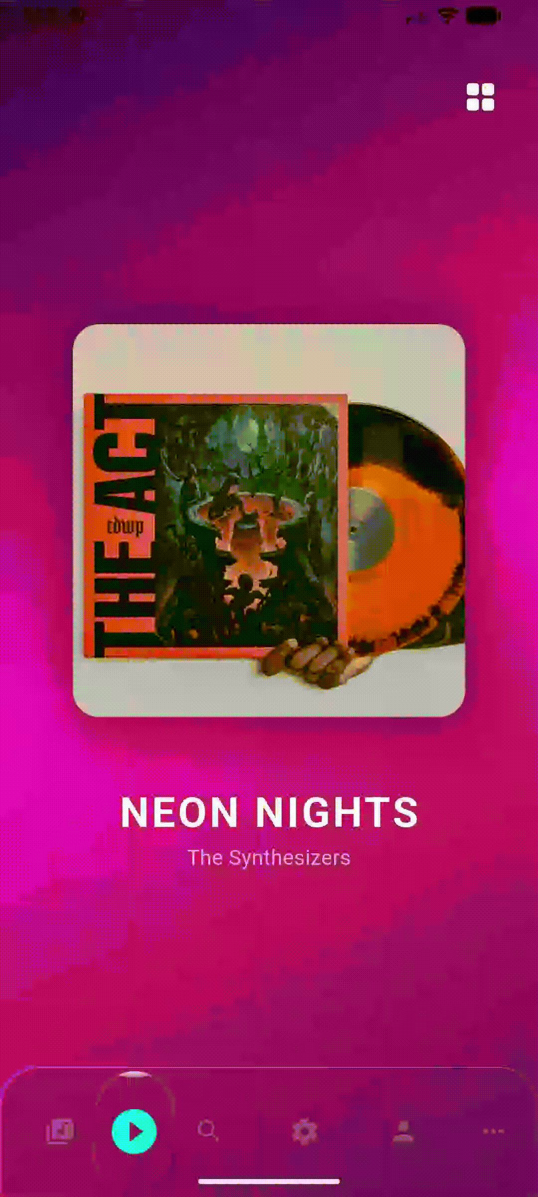
✨ Features #
| Feature | Description |
|---|---|
| 🔮 Realistic Glass Physics | True optical refraction with backdrop magnification effect |
| 💧 Liquid Lens Effect | Smooth, physics-based lens that follows selection |
| 🎭 17+ Animation Presets | From bouncy water to heavy glass to quantum jitter |
| 🖐️ Drag to Select | Swipe the lens directly to navigate |
| 🎨 Complete Customization | Every pixel is configurable |
| ♿ Accessibility Ready | Full semantic labels and screen reader support |
| 📱 Cross Platform | iOS, Android, Web, macOS, Windows, Linux |
| 🌙 Theme Support | Built-in light/dark themes and presets |
| ⚡ 60fps Performance | Optimized painters with minimal rebuilds |
| 🧩 Standalone Glass Container | Use GlassContainer anywhere in your app |
📦 Installation #
Add to your pubspec.yaml:
dependencies:
  glassy_real_navbar: ^1.0.2
Then run:
flutter pub get
🚀 Quick Start #
import 'package:glassy_real_navbar/glassy_real_navbar.dart';

class MyApp extends StatefulWidget {
  @override
  State<MyApp> createState() => _MyAppState();
}

class _MyAppState extends State<MyApp> {
  int _selectedIndex = 0;

  @override
  Widget build(BuildContext context) {
    return Scaffold(
      body: Stack(
        children: [
          // Your content here
          YourPageContent(index: _selectedIndex),

          // The magic navbar ✨
          Align(
            alignment: Alignment.bottomCenter,
            child: Padding(
              padding: const EdgeInsets.all(20),
              child: GlassNavBar(
                selectedIndex: _selectedIndex,
                onItemSelected: (index) => setState(() => _selectedIndex = index),
                items: [
                  GlassNavBarItem(icon: Icons.home, title: 'Home'),
                  GlassNavBarItem(icon: Icons.search, title: 'Search'),
                  GlassNavBarItem(icon: Icons.person, title: 'Profile'),
                ],
              ),
            ),
          ),
        ],
      ),
    );
  }
}
🎨 Customization #
Basic Styling #
GlassNavBar(
  // Dimensions
  height: 70,
  margin: EdgeInsets.symmetric(horizontal: 20, vertical: 30),
  borderRadius: BorderRadius.circular(35),

  // Glass Effect
  blur: 10,              // Backdrop blur intensity
  opacity: 0.1,          // Glass tint opacity
  refraction: 1.25,      // Magnification (1.0 = none)
  glassiness: 1.2,       // Border shine intensity

  // Colors
  backgroundColor: Colors.black,
  selectedItemColor: Colors.cyanAccent,
  unselectedItemColor: Colors.white54,

  // ...
)
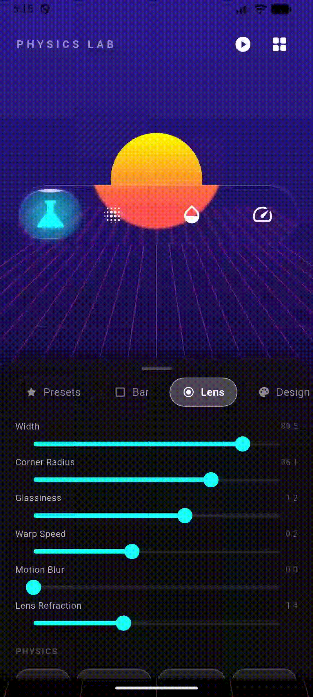
Lens Customization #
The "lens" is the floating indicator that highlights the selected item:
GlassNavBar(
  // Lens Shape
  lensWidth: 60,                              // Fixed width (null = auto)
  lensHeight: 50,                             // Fixed height (null = auto)
  lensBorderRadius: BorderRadius.circular(16), // Square-ish lens

  // Lens Glass Effect
  lensBlur: 5,           // Static blur on lens
  lensRefraction: 1.5,   // Lens magnification
  glassiness: 1.5,       // Lens shine/glow

  // Lens Border
  lensBorderColor: Colors.cyanAccent.withOpacity(0.5), // Neon glow

  // Motion Effects
  lensMotionBlurStrength: 15,  // Blur when moving
  lensVelocityRefraction: 0.1, // Extra refraction when fast

  // ...
)
Item Styling #
GlassNavBar(
  showLabels: true,
  itemIconSize: 28,
  itemTextStyle: TextStyle(
    fontSize: 12,
    fontWeight: FontWeight.w600,
    letterSpacing: 0.5,
  ),

  // Item Animation
  activeItemAnimation: GlassActiveItemAnimation.spark, // Glow effect

  // ...
)
🎬 Animation Presets #
Choose from 17 physics-based animations:
GlassNavBar(
  animationEffect: GlassAnimation.bouncyWater, // Pick your style!
  // ...
)
| Animation | Description | Best For |
|---|---|---|
elasticRubber |
Balanced bounce (default) | General use |
bouncyWater |
High bounce, playful | Gaming, social apps |
heavyGlass |
Smooth, premium feel | Luxury, finance apps |
sharpSnap |
Instant, no overshoot | Productivity apps |
softDrift |
Floaty, dreamy | Creative apps |
lazyHoney |
Viscous, slow | Relaxation apps |
viscousFluid |
Thick, oily, stretchy | Experimental |
magneticLock |
Snappy with shape morph | Tech apps |
zeroGravity |
Weightless drift | Space themes |
hyperQuantum |
Jittery teleportation | Sci-fi games |
wobblyJelly |
Maximum wobble | Kids apps |
heavyMetal |
Heavy momentum | Industrial |
slowMotion |
Cinematic | Showcase |
furiousSpring |
High energy bounce | Action games |
glassCannon |
Fast launch, hard stop | Competitive |
pillowySoft |
Soft landing | Wellness apps |
orbitalDrift |
Massive, planetary | Astronomy apps |
Custom Physics #
Override with your own spring physics:
GlassNavBar(
  animationPhysics: SpringDescription(
    mass: 1.5,      // Higher = heavier feel
    stiffness: 80,  // Higher = faster snap
    damping: 15,    // Higher = less bounce
  ),
  // ...
)
🎭 Active Item Animations #
Control how the selected icon reacts:
GlassNavBar(
  activeItemAnimation: GlassActiveItemAnimation.zoom,
  // ...
)
| Effect | Description |
|---|---|
zoom |
Icon scales up smoothly (default) |
shimmer |
Gradient shine sweeps across |
spark |
Glowing aura around icon |
none |
Just color change |
🌗 Themes #
Built-in Theme Presets #
// Minimal Light (like iOS)
GlassNavBar.preset(
  preset: GlassNavBarPreset.minimal,
  items: [...],
  selectedIndex: _index,
  onItemSelected: (i) => setState(() => _index = i),
)

// Cyberpunk Neon
GlassNavBar.preset(
  preset: GlassNavBarPreset.cyberpunk,
  items: [...],
  selectedIndex: _index,
  onItemSelected: (i) => setState(() => _index = i),
)

// Luxury Gold
GlassNavBar.preset(
  preset: GlassNavBarPreset.luxury,
  items: [...],
  selectedIndex: _index,
  onItemSelected: (i) => setState(() => _index = i),
)
Available presets:
GlassNavBarPreset.minimal- Clean, subtle, iOS-inspiredGlassNavBarPreset.cyberpunk- Neon colors, high contrastGlassNavBarPreset.luxury- Gold accents, heavy feelGlassNavBarPreset.gaming- Bouncy, vibrantGlassNavBarPreset.zen- Soft, muted, calming
🧩 GlassContainer Widget #
Use the glass effect anywhere in your app:
GlassContainer(
  width: 200,
  height: 200,
  blur: 10,
  opacity: 0.1,
  refraction: 1.2,
  borderRadius: BorderRadius.circular(20),
  glassiness: 1.5,
  child: Center(
    child: Text('Hello Glass!'),
  ),
)
📖 API Reference #
GlassNavBar #
| Property | Type | Default | Description |
|---|---|---|---|
items |
List<GlassNavBarItem> |
required | Navigation items |
selectedIndex |
int |
required | Currently selected index |
onItemSelected |
ValueChanged<int> |
required | Selection callback |
height |
double |
70 |
Bar height |
blur |
double |
5 |
Backdrop blur sigma |
opacity |
double |
0.08 |
Glass tint opacity |
refraction |
double |
1.25 |
Bar magnification factor |
lensRefraction |
double |
1.5 |
Lens magnification factor |
backgroundColor |
Color |
Colors.black |
Glass tint color |
selectedItemColor |
Color |
Colors.white |
Selected icon color |
unselectedItemColor |
Color |
Colors.white54 |
Unselected icon color |
borderRadius |
BorderRadius? |
capsule | Bar shape |
lensWidth |
double? |
auto | Lens width |
lensHeight |
double? |
auto | Lens height |
lensBorderRadius |
BorderRadius? |
capsule | Lens shape |
lensBorderColor |
Color? |
null | Lens glow color |
lensBlur |
double |
0 |
Static lens blur |
glassiness |
double |
1.0 |
Lens shine intensity |
barGlassiness |
double |
1.0 |
Bar border shine |
showLabels |
bool |
false |
Show text labels |
animationEffect |
GlassAnimation |
elasticRubber |
Physics preset |
animationPhysics |
SpringDescription? |
null | Custom physics |
activeItemAnimation |
GlassActiveItemAnimation |
zoom |
Icon effect |
margin |
EdgeInsets? |
null | Outer margin |
barPadding |
EdgeInsets? |
null | Inner padding |
itemIconSize |
double |
24 |
Icon size |
itemTextStyle |
TextStyle |
... | Label style |
GlassNavBarItem #
| Property | Type | Description |
|---|---|---|
icon |
IconData |
Default icon |
activeIcon |
IconData? |
Icon when selected |
title |
String |
Label text |
semanticLabel |
String? |
Accessibility label |
GlassContainer #
| Property | Type | Default | Description |
|---|---|---|---|
child |
Widget? |
null | Content |
width |
double? |
null | Container width |
height |
double? |
null | Container height |
blur |
double |
3 |
Backdrop blur |
opacity |
double |
0.05 |
Tint opacity |
refraction |
double |
1.25 |
Magnification |
color |
Color |
Colors.white |
Tint color |
borderRadius |
BorderRadius? |
20 |
Shape |
glassiness |
double |
1.0 |
Border shine |
padding |
EdgeInsets? |
null | Inner padding |
margin |
EdgeInsets? |
null | Outer margin |
🎯 Best Practices #
Performance Tips #
- Use over colorful backgrounds - The glass effect looks best over images or gradients
- Avoid excessive refraction - Values above 1.5 may cause visual artifacts
- Limit items to 5-6 - More items reduce the lens effect visibility
Design Tips #
- Match your app's aesthetic - Use
glassiness: 0.5for subtle,1.5for dramatic - Consider accessibility - Ensure sufficient color contrast
- Test on real devices - Blur effects vary across platforms
🤝 Contributing #
Contributions are welcome! Please read our contributing guidelines.
📄 License #
Made by the Salauddin Majumder
pub.dev • GitHub • Report Bug
Metadata
Publisher
unverified uploader
Weekly Downloads
Metadata
The world's most beautiful glassmorphism navigation bar for Flutter. Features realistic glass physics, liquid lens effects, 17+ animation presets, drag-to-select, and complete customization. Perfect for iOS, Android, web & desktop.
Repository (GitHub)
View/report issues
Topics
#navigation #glassmorphism #ui #animation #navbar
License
 unknown (license)