glassy_navbar 0.0.7  glassy_navbar: ^0.0.7 copied to clipboard
A glassy-style customizable bottom navigation bar for Flutter with blur and transparency effects.
🌫️ glassy_navbar #
A beautiful and customizable glassmorphic bottom navigation bar for Flutter apps with blur and transparency effects.
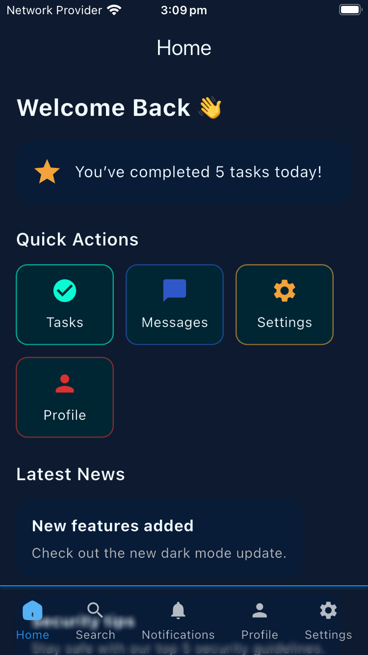
📸 Preview #
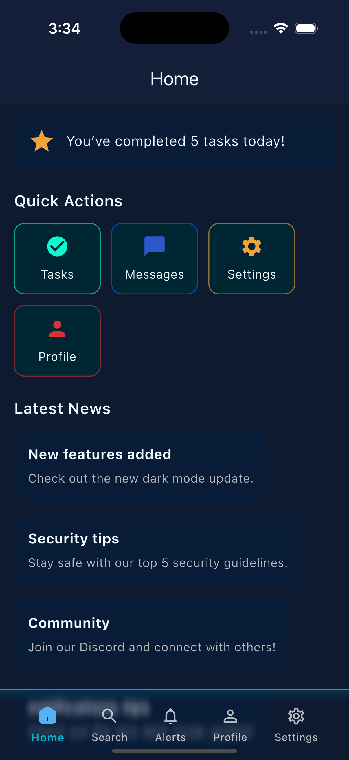
📸 Preview #
✨ Features #
✅ Fully customizable (icons, labels, colors, blur, opacity)
✅ Supports custom SVG or standard Flutter icons
✅ Optional top border with custom style
✅ Blur effect using BackdropFilter
✅ Works well with Stack layout for layered glass effect
✅ Lightweight and easy to integrate
✅ Compatible with flutter_svg for SVG icons
🚀 Installation #
Add to your pubspec.yaml:
dependencies:
  glassy_navbar: ^0.0.7
⚙️ Usage #
Important:
- Wrap the
GlassyNavBarinside aStack.- Set
resizeToAvoidBottomInset: falsein yourScaffold.- Do not use it in
bottomNavigationBarto preserve the blur effect.
✅ Example #
import 'package:flutter/material.dart';
import 'package:flutter_svg/svg.dart';
import 'package:glassy_navbar/glassy_navbar.dart';

class BottomNavBarView extends StatefulWidget {
  const BottomNavBarView({super.key});

  @override
  State<BottomNavBarView> createState() => _BottomNavBarViewState();
}

class _BottomNavBarViewState extends State<BottomNavBarView> {
  int currentIndex = 0;

  final List<GlassyNavBarItem> navBarItems = [
    GlassyNavBarItem(
      customUnselectedIcon: SvgPicture.asset('assets/home_unselected.svg'),
      customSelectedIcon: SvgPicture.asset('assets/home_selected.svg'),
      label: 'Home',
    ),
    const GlassyNavBarItem(icon: Icons.search, label: 'Search'),
    const GlassyNavBarItem(icon: Icons.notifications, label: 'Notifications'),
    const GlassyNavBarItem(icon: Icons.person, label: 'Profile'),
    const GlassyNavBarItem(icon: Icons.settings, label: 'Settings'),
  ];

  final List<Widget> screens = [
    Container(),
    Container(),
    Container(),
    Container(),
    Container(),
  ];

  @override
  Widget build(BuildContext context) {
    return Scaffold(
      resizeToAvoidBottomInset: false,
      body: Stack(
        children: [
          screens[currentIndex],
          GlassyNavBar(
            currentIndex: currentIndex,
            onItemTap: onNavItemTap,
            items: navBarItems,
            backgroundColor: const Color(0xFF00425C),
            blurSigma: 3,
            height: 70,
            opacity: 0.0,
            showLabels: true,
            selectedLabelStyle: const TextStyle(
              color: Colors.blue,
              fontSize: 12,
            ),
            unselectedLabelStyle: const TextStyle(
              color: Colors.white70,
              fontSize: 12,
            ),
            selectedIconTheme: const IconThemeData(
              color: Colors.blue,
              size: 22,
            ),
            unselectedIconTheme: const IconThemeData(
              color: Colors.white70,
              size: 22,
            ),
            showTopBorder: true,
            topBorderStyle: const TopBorderStyle(
              color: Color.fromARGB(255, 0, 157, 255),
              height: 1,
            ),
          ),
        ],
      ),
    );
  }

  void onNavItemTap(int index) {
    setState(() {
      currentIndex = index;
    });
  }
}
🎨 Parameters #
| Parameter | Description |
|---|---|
currentIndex |
Index of the currently selected item |
onItemTap |
Function to handle tap on item |
items |
List of GlassmorphicNavBarItem |
blurSigma |
Blur intensity of the glass effect |
backgroundColor |
Base background color of the navbar |
height |
Height of the navigation bar |
opacity |
Opacity of the background (0.0 = transparent) |
showLabels |
Whether to show labels below icons |
selectedLabelStyle |
Text style for selected label |
unselectedLabelStyle |
Text style for unselected labels |
selectedIconTheme |
Icon theme for selected item |
unselectedIconTheme |
Icon theme for unselected items |
showTopBorder |
Whether to show the top border |
topBorderStyle |
Custom style for the top border |
📦 Assets #
If using custom SVG icons, declare them in pubspec.yaml:
flutter:
  assets:
    - assets/home_selected.svg
    - assets/home_unselected.svg
❗ Assertion Rules #
To avoid runtime errors when using GlassmorphicNavBarItem, follow one of these valid setups:
✅ Option 1 (Material icon):
GlassmorphicNavBarItem(
  icon: Icons.home,
  label: 'Home',
);
✅ Option 2 (Custom icons):
GlassmorphicNavBarItem(
  customUnselectedIcon: SvgPicture.asset('...'),
  customSelectedIcon: SvgPicture.asset('...'),
  label: 'Home',
);
🚫 Do not mix both Material icons and custom icons. The following assertions will protect from misconfiguration:
assert(
  customUnselectedIcon == null || customSelectedIcon != null,
  '\n\ncustomSelectedIcon must also be provided\n',
),
assert(
  customSelectedIcon == null || customUnselectedIcon != null,
  '\n\ncustomUnselectedIcon must also be provided\n',
),
assert(
  (icon != null && customUnselectedIcon == null && customSelectedIcon == null) ||
  (icon == null && customUnselectedIcon != null && customSelectedIcon != null),
  '\nError: Must provide either:\n'
  '1. Just an icon (for Material icons) OR\n'
  '2. Both customUnselectedIcon AND customSelectedIcon (for custom icons)\n'
  'Do not mix both approaches.\n',
);
💡 Tips #
- Use
opacity: 0.0for full glass feel. - Use inside a
Stackfor best visual layering. - Avoid placing over solid opaque containers.
- Add animations or
Herotransitions for smoother experience.
📃 License #
MIT License © 2025 — Ammar Ayman
Metadata
Publisher
unverified uploader
Weekly Downloads
Metadata
A glassy-style customizable bottom navigation bar for Flutter with blur and transparency effects.
Repository (GitHub)
View/report issues
License
 unknown (license)