giffy_dialog 2.0.0+2  giffy_dialog: ^2.0.0+2 copied to clipboard
A Flutter package for a quick, handy and beautiful giffy dialogs and bottom sheets.
Giffy Dialog #
A beautiful and custom alert dialog for flutter highly inspired from FancyAlertDialog-Android.
Show some ❤️ and star the repo to support the project
Live Demo: https://xsahil03x.github.io/giffy_dialog
Migration from v1 to v2 #
Please refer to the migration guide to migrate from v1 to v2.
Installation #
Add the following to your pubspec.yaml and replace [version] with the latest version:
dependencies:
  giffy_dialog: ^[version]
Usage #
Import the package:
import 'package:giffy_dialog/giffy_dialog.dart';
Use it like a dialog:
 showDialog(
   context: context,
   builder: (BuildContext context) {
     return GiffyDialog.image(
       Image.network(
         "https://raw.githubusercontent.com/Shashank02051997/FancyGifDialog-Android/master/GIF's/gif14.gif",
         height: 200,
         fit: BoxFit.cover,
       ),
       title: Text(
         'Image Animation',
         textAlign: TextAlign.center,
       ),
       content: Text(
         'This is a image animation dialog box. This library helps you easily create fancy giffy dialog.',
         textAlign: TextAlign.center,
       ),
       actions: [
         TextButton(
           onPressed: () => Navigator.pop(context, 'CANCEL'),
           child: const Text('CANCEL'),
         ),
         TextButton(
           onPressed: () => Navigator.pop(context, 'OK'),
           child: const Text('OK'),
         ),
       ],
     );
   },
 );
Or use it like a bottom sheet:
 showModalBottomSheet(
   context: context,
   clipBehavior: Clip.antiAlias,
   isScrollControlled: true,
   shape: RoundedRectangleBorder(
     borderRadius: BorderRadius.vertical(
       top: Radius.circular(useMaterial3 ? 32 : 4),
     ),
   ),
   builder: (BuildContext context) {
     return GiffyBottomSheet.image(
       Image.network(
         "https://raw.githubusercontent.com/Shashank02051997/FancyGifDialog-Android/master/GIF's/gif14.gif",
         height: 200,
         fit: BoxFit.cover,
       ),
       title: Text(
         'Image Animation',
         textAlign: TextAlign.center,
       ),
       content: Text(
         'This is a image animation bottom sheet. This library helps you easily create fancy giffy bottom sheet.',
         textAlign: TextAlign.center,
       ),
       actions: [
         TextButton(
           onPressed: () => Navigator.pop(context, 'CANCEL'),
           child: const Text('CANCEL'),
         ),
         TextButton(
           onPressed: () => Navigator.pop(context, 'OK'),
           child: const Text('OK'),
         ),
       ],
     );
   },
 );
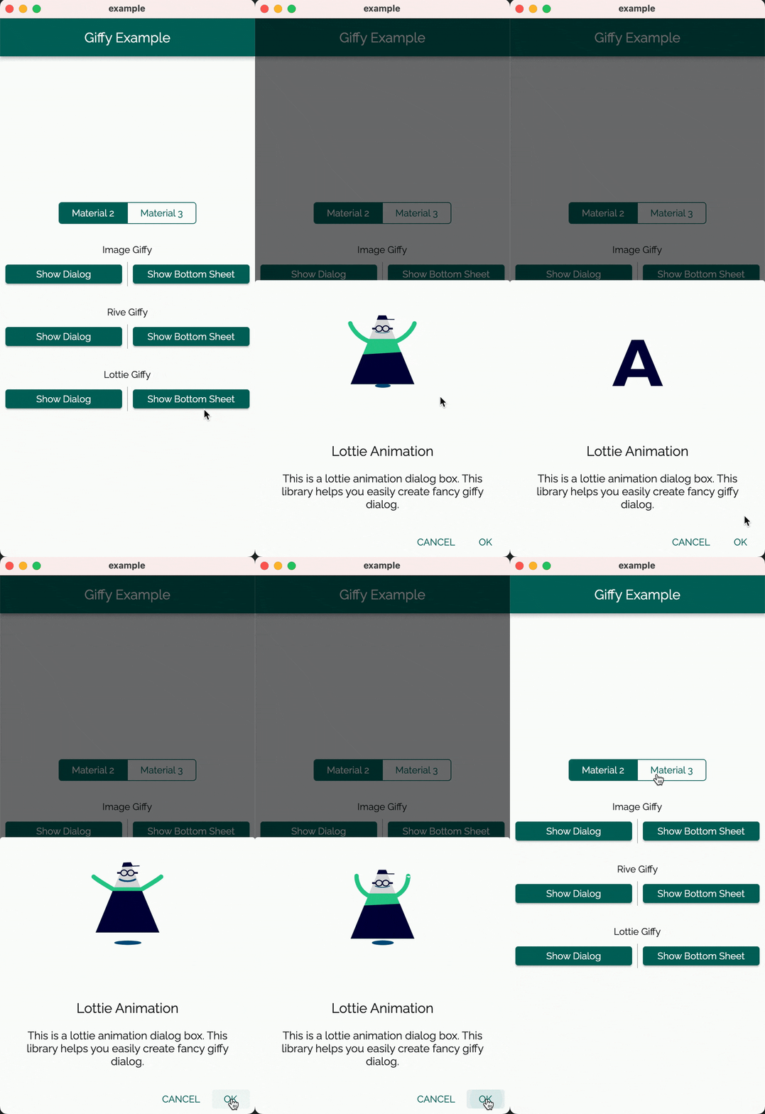
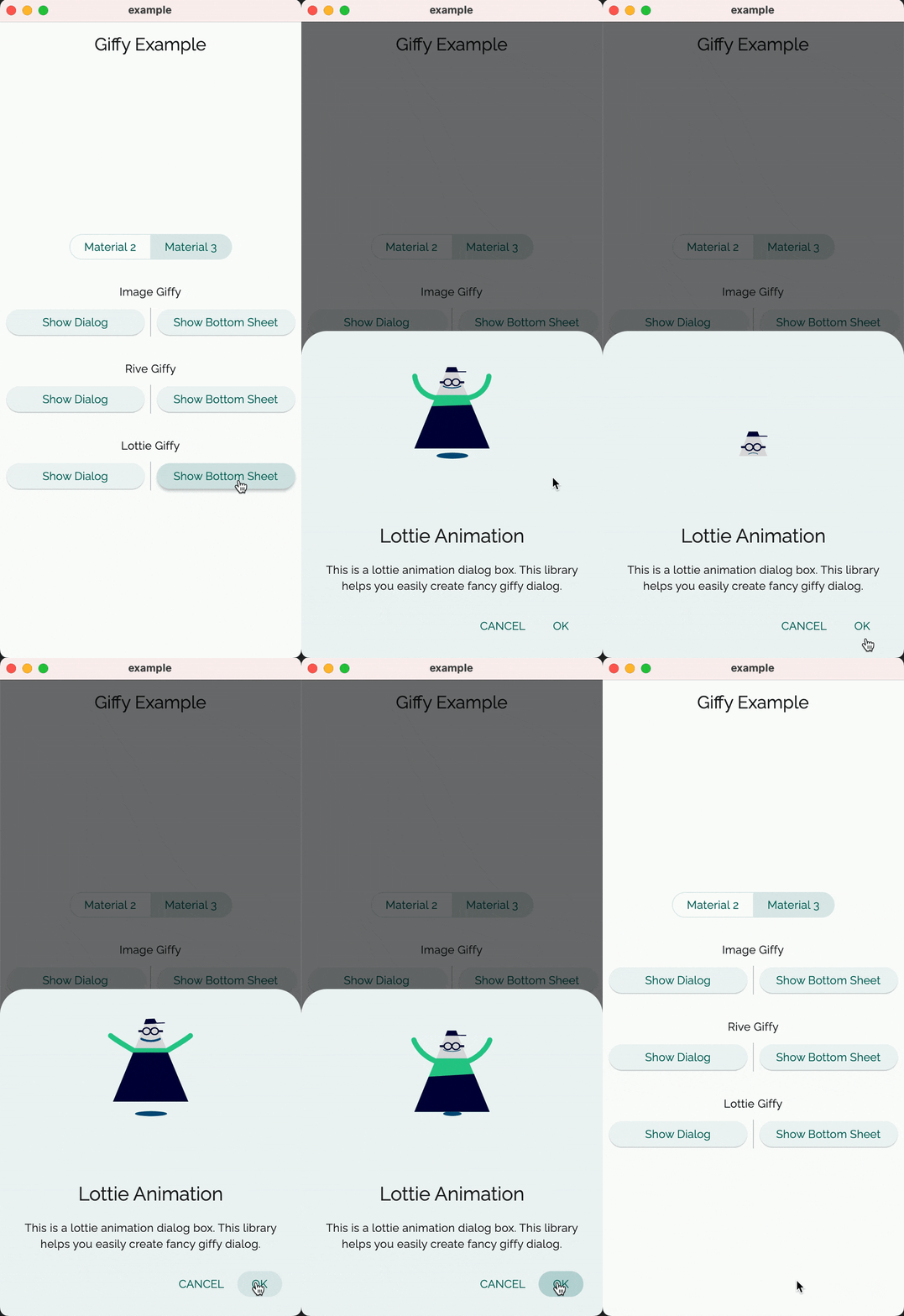
Demo #
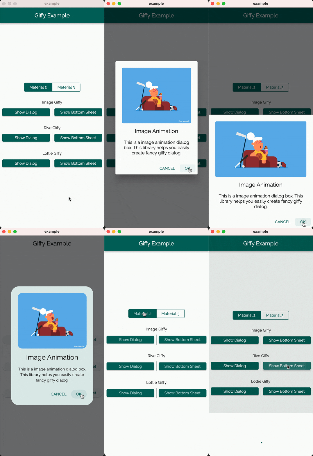
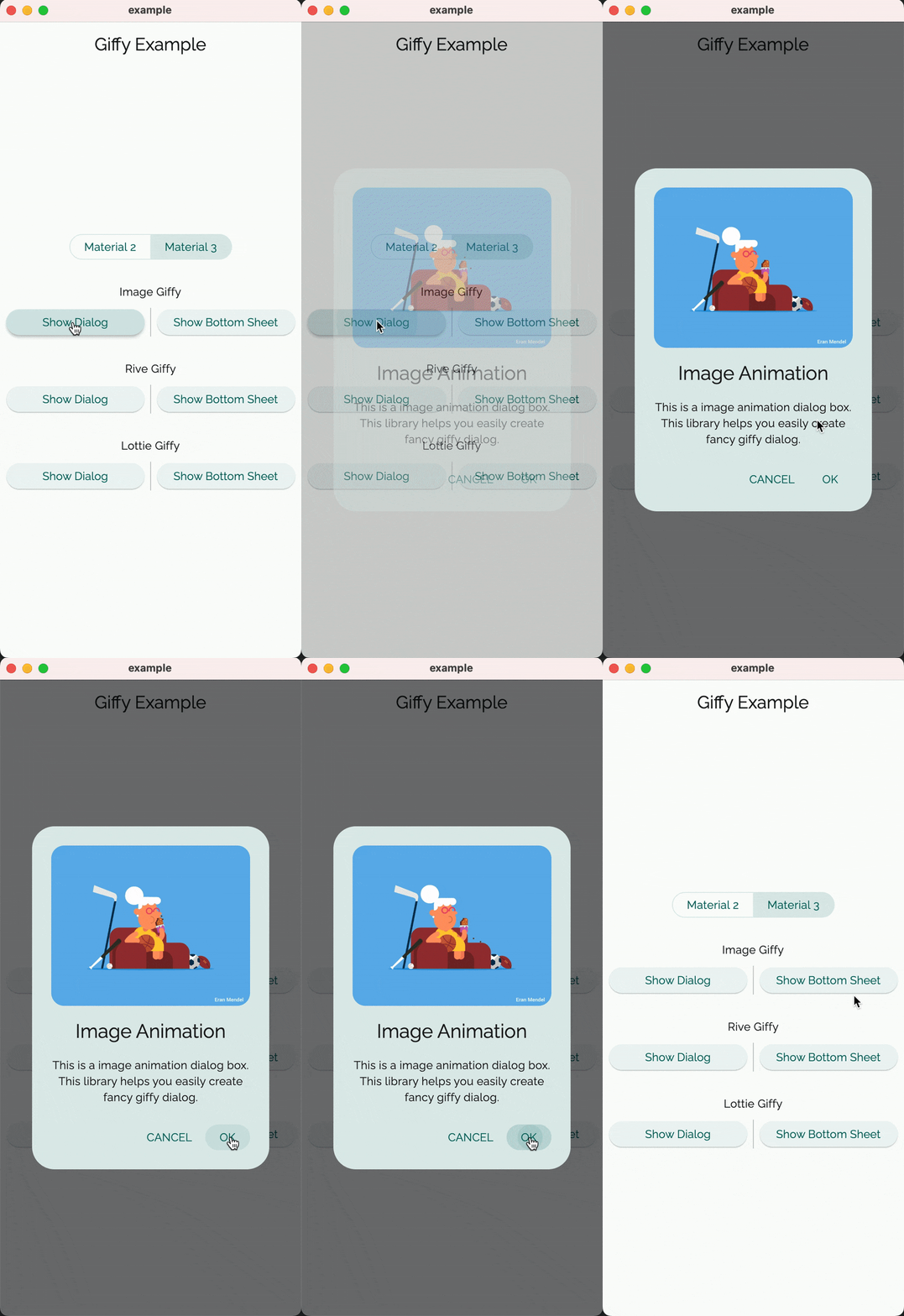
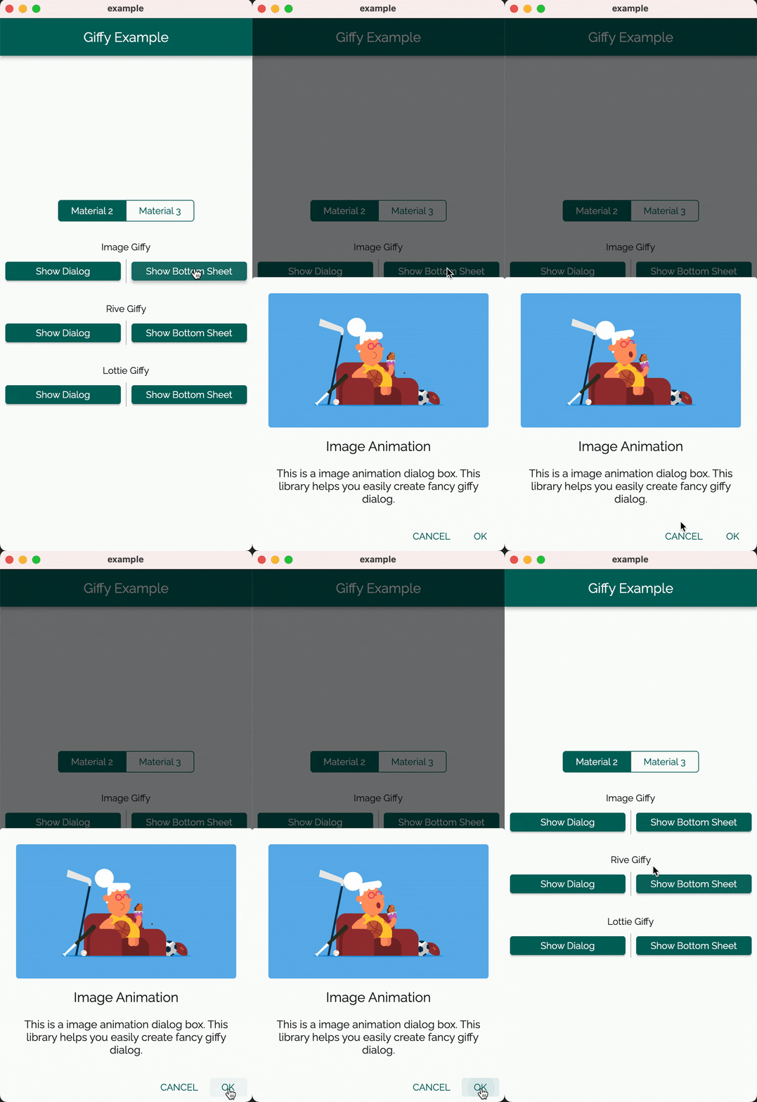
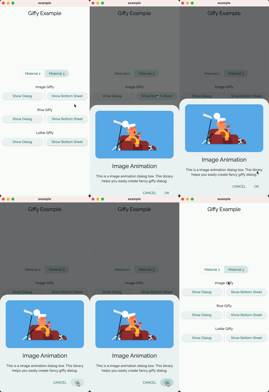
| Giffy Dialog | Giffy BottomSheet | |||||||
|---|---|---|---|---|---|---|---|---|
| Material 2 | Material 3 | Material 2 | Material 3 | |||||
| Image Giffy |  |
 |
 |
 |
||||
| Rive Giffy |  |
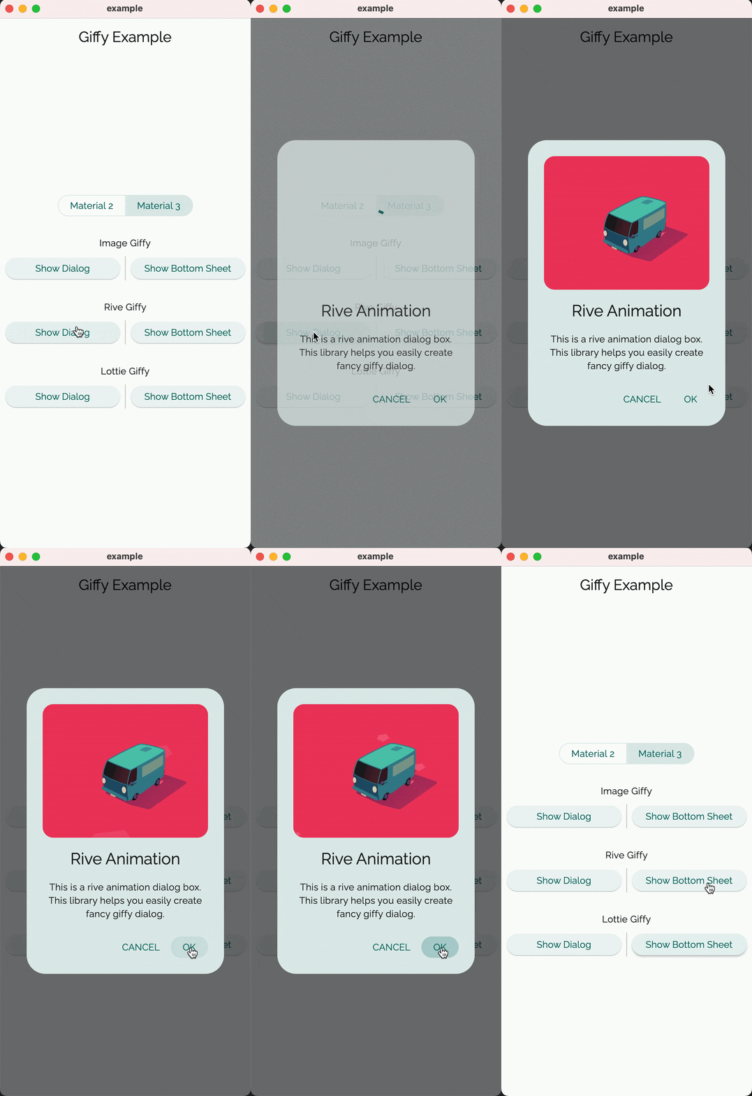 |
 |
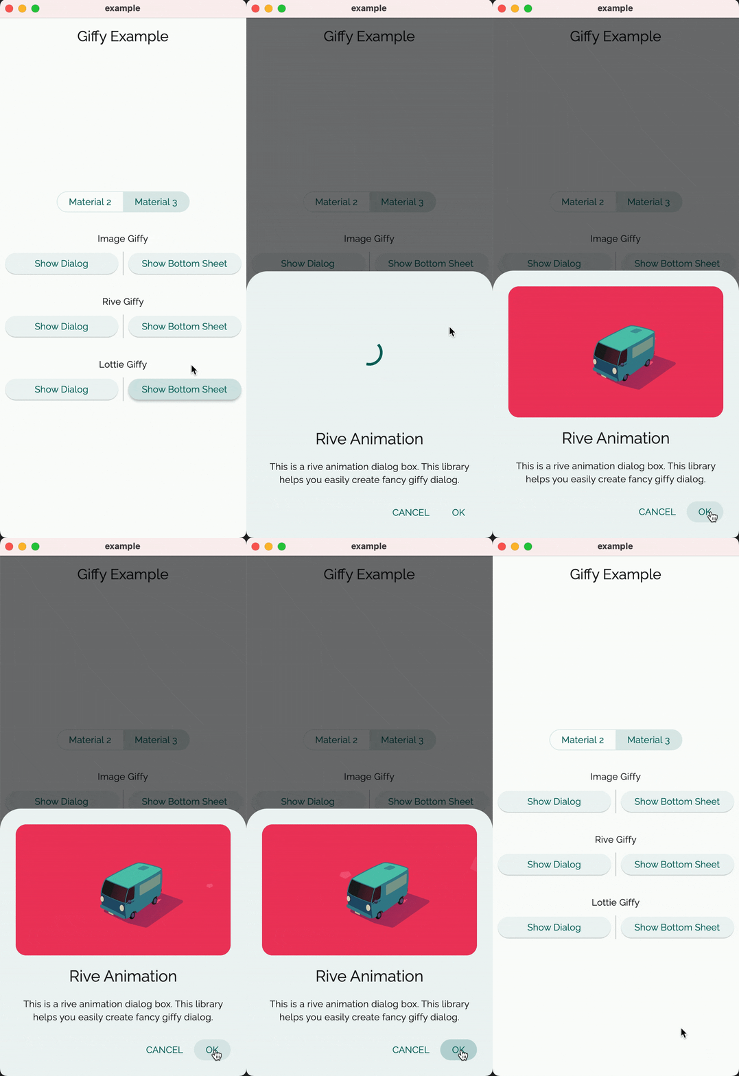 |
||||
| Lottie Giffy | 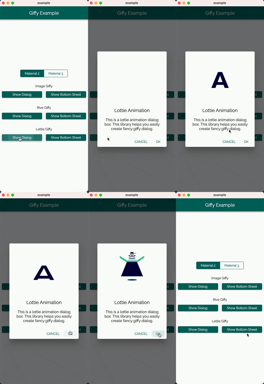 |
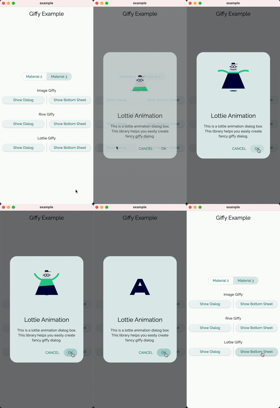 |
 |
 |
||||
Customization #
The GiffyDialog widget provides several customization options, such as the dialog title, description, buttons, animations, and more. Please refer to the documentation for a complete list of available options.
Contributors #
Thanks goes to these wonderful people (emoji key):
ArtemKolichenkov 📖 🤔 |
Alex Fierro 💻 |
Kasidech C. 💻 |
Jai Sachdeva 💬 |
Tarekk Mohamed Abdalla 💻 |
madhukesh_048 ⚠️ |
dpedrinha 💻 |
Nate 💻 💡 |
Alex 💻 |
jritchie 💻 |
Saad Bin Shahid 💻 |
This project follows the all-contributors specification. Contributions of any kind welcome!


