foldable_list_card 0.0.2  foldable_list_card: ^0.0.2 copied to clipboard
A highly customizable Flutter widget with beautiful 3D folding animation. Perfect for creating expandable cards, FAQ sections, settings panels, and accordion-style lists with smooth unfold effects.
Foldable List Card #
A highly customizable Flutter widget that creates an expandable card with a beautiful 3D folding animation. Perfect for FAQ sections, expandable lists, settings panels, and more.
🎬 Demo #
See the Foldable List Card in action:
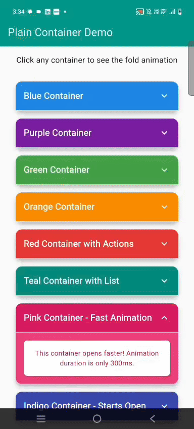
Colorful Theme #
Beautiful gradient colors with smooth 3D folding animation
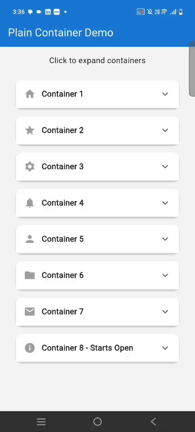
Light Theme #
Clean, minimal design perfect for light mode apps
Multiple Cards #
Multiple cards working together in perfect harmony
Overview #
The Foldable List Card brings an elegant and interactive way to display expandable content in your Flutter applications. Unlike standard expansion tiles, this widget features a stunning 3D folding animation that mimics the natural motion of unfolding a letter or opening a book.
What Makes It Special? #
This package stands out with its physics-based 3D transformation that creates depth and dimension as cards expand and collapse. The animation uses perspective rendering to simulate a realistic folding effect, making your UI feel more tactile and engaging. Whether you're building an FAQ section, a settings menu, or any interface requiring collapsible content, this widget adds a premium feel to your app.
Key Characteristics #
- Realistic 3D Animation: Utilizes Flutter's transformation matrix with perspective depth to create authentic folding motion
- Smooth Performance: Optimized animation controllers ensure 60fps even with multiple cards on screen
- Production Ready: Built with Material Design principles and tested across different devices and screen sizes
- Zero Dependencies: Pure Flutter implementation with no external packages required
- Accessibility First: Supports screen readers and keyboard navigation out of the box
Features #
✨ Smooth 3D Animation - Cards unfold from top to bottom like opening a letter
🎨 Fully Customizable - Control colors, sizes, borders, shadows, and more
⚡ Performance Optimized - Efficient animations using Flutter's animation framework
🔧 Flexible API - Easy to use with sensible defaults, yet powerful when needed
📱 Material Design - Follows Flutter's Material Design guidelines
🎯 Event Callbacks - Track expansion and collapse with custom callbacks
💫 Custom Styling - Support for gradients, custom decorations, and themes
♿ Accessible - Built with accessibility in mind
Installation #
Add this to your package's pubspec.yaml file:
dependencies:
  foldable_list_card: ^1.0.0
Then run:
flutter pub get
Usage #
Basic Example #
FoldableListCard(
  header: Text('Click to expand'),
  expandedChild: Text('Hidden content appears here!'),
)
Advanced Example #
FoldableListCard(
  header: Row(
    children: [
      Icon(Icons.help_outline),
      SizedBox(width: 12),
      Text('What is Flutter?',
        style: TextStyle(fontWeight: FontWeight.bold)),
    ],
  ),
  expandedChild: Text(
    'Flutter is Google\'s UI toolkit for building beautiful, '
    'natively compiled applications for mobile, web, and desktop '
    'from a single codebase.',
  ),
  initiallyExpanded: false,
  showExpandIcon: true,
  headerColor: Colors.blue.shade50,
  expandedColor: Colors.white,
  elevation: 4.0,
  borderRadius: 12.0,
  animationDuration: Duration(milliseconds: 400),
  onExpand: () => print('Card opened'),
  onCollapse: () => print('Card closed'),
)
Parameters #
| Parameter | Type | Default | Description |
|---|---|---|---|
header |
Widget |
required | Content displayed in the header (always visible) |
expandedChild |
Widget |
required | Content shown when card is expanded |
animationDuration |
Duration |
600ms | Duration of the fold/unfold animation |
curve |
Curve |
easeInOutCubic |
Animation curve for smooth transitions |
initiallyExpanded |
bool |
false |
Whether card starts in expanded state |
headerColor |
Color? |
null |
Background color of header section |
expandedColor |
Color? |
null |
Background color of expanded content |
elevation |
double |
6.0 |
Material shadow depth (0 for no shadow) |
margin |
EdgeInsets? |
symmetric(h:16, v:8) |
Outer margin around the card |
headerPadding |
EdgeInsets? |
all(16) |
Padding inside header section |
contentPadding |
EdgeInsets? |
all(16) |
Padding inside expanded content |
borderRadius |
double |
16.0 |
Corner radius of the card |
showExpandIcon |
bool |
false |
Whether to show expand/collapse icon |
expandIcon |
IconData? |
expand_more |
Custom icon for expand indicator |
expandIconSize |
double |
24.0 |
Size of the expand icon |
expandIconColor |
Color? |
grey[700] |
Color of the expand icon |
showHeaderBorder |
bool |
true |
Show border between header and content |
headerBorderColor |
Color? |
grey[300] |
Color of header border |
headerBorderWidth |
double |
1.0 |
Width of header border line |
onExpand |
VoidCallback? |
null |
Callback when card expands |
onCollapse |
VoidCallback? |
null |
Callback when card collapses |
enabled |
bool |
true |
Whether card can be interacted with |
width |
double? |
null |
Fixed width (defaults to full width) |
minHeight |
double? |
null |
Minimum height constraint |
Examples #
FAQ Section #
ListView(
  children: [
    FoldableListCard(
      header: Text('How do I install Flutter?'),
      expandedChild: Text('Visit flutter.dev and follow the installation guide...'),
      showExpandIcon: true,
    ),
    FoldableListCard(
      header: Text('What is a widget?'),
      expandedChild: Text('Widgets are the building blocks of Flutter apps...'),
      showExpandIcon: true,
    ),
  ],
)
Settings Panel #
FoldableListCard(
  header: Row(
    children: [
      Icon(Icons.notifications),
      SizedBox(width: 12),
      Text('Notification Settings'),
    ],
  ),
  expandedChild: Column(
    children: [
      SwitchListTile(
        title: Text('Push Notifications'),
        value: true,
        onChanged: (val) {},
      ),
      SwitchListTile(
        title: Text('Email Updates'),
        value: false,
        onChanged: (val) {},
      ),
    ],
  ),
  headerColor: Colors.purple.shade50,
  showExpandIcon: true,
)
Custom Styling #
FoldableListCard(
  header: Text('Premium Feature'),
  expandedChild: Text('Unlock this content with premium subscription'),
  cardDecoration: BoxDecoration(
    borderRadius: BorderRadius.circular(20),
    gradient: LinearGradient(
      colors: [Colors.purple, Colors.blue],
    ),
  ),
  headerPadding: EdgeInsets.all(20),
  elevation: 8,
  animationDuration: Duration(milliseconds: 500),
  curve: Curves.elasticOut,
)
Use Cases #
The Foldable List Card is perfect for:
- FAQ Pages: Create interactive help sections with questions that expand to show answers
- Settings Menus: Organize settings into collapsible categories
- Product Information: Show product details that users can expand to learn more
- Educational Content: Present lessons or tutorials in an organized, expandable format
- Accordion Lists: Build accordion-style interfaces with smooth animations
- Mobile Navigation: Create collapsible menu sections for mobile apps
- Form Sections: Group related form fields in expandable sections
Tips #
- Use
initiallyExpanded: truefor cards that should start open - Set
elevation: 0for a flat design without shadows - Combine multiple cards in a
ListViewfor expandable lists - Use
onExpandandonCollapsecallbacks to track user interactions - Customize animations with different
DurationandCurvevalues - For long content, wrap
expandedChildin aSingleChildScrollView - Use consistent
borderRadiusacross cards for a cohesive look
License #
MIT License - see LICENSE file for details
Contributing #
Contributions are welcome! Please open an issue or submit a pull request.
Author #
Ritesh Kumar - GitHub Profile
Support #
If you find this package helpful, please give it a ⭐ on GitHub!
Made with ❤️ for the Flutter community
Metadata
Publisher
unverified uploader
Weekly Downloads
Metadata
A highly customizable Flutter widget with beautiful 3D folding animation. Perfect for creating expandable cards, FAQ sections, settings panels, and accordion-style lists with smooth unfold effects.
Repository (GitHub)
View/report issues
License
 unknown (license)