flutter_ui_toolkit 0.0.2+5  flutter_ui_toolkit: ^0.0.2+5 copied to clipboard
Flutter UI Toolkit is a pre-built collection of the most used widgets to create apps. The idea is that you can use these widgets the way you use classes in HTML and CSS.
Flutter UI Toolkit #
The development of this  package is still in progress. More widgets are to come.
However because the widgets are purely Flutter widgets, you can use it with no fear :)
Flutter UI Toolkit is a pre-built collection of the most used widgets to create apps. The idea is that you can use these widgets the way you use classes in HTML and CSS.
The widgets can receive an argument called as that will carry the widget's styles.
The advantage of this approach is that we don't need to repeat styling every time we create a new widget.
In addition to custom styles, this package also provides native look and feel to the widgets.
This is useful when you want to have one widget that displays the right look and feel based on the Platform.
Widgets and Roadmap #
| Widget | Status |
| Buttons | done |
| Headings | done |
| Text Inputs | done |
| Dialogs | done |
| Action Sheets | done |
| Modals | in progress |
| Bottom Sheets | in progress |
Examples #
 |
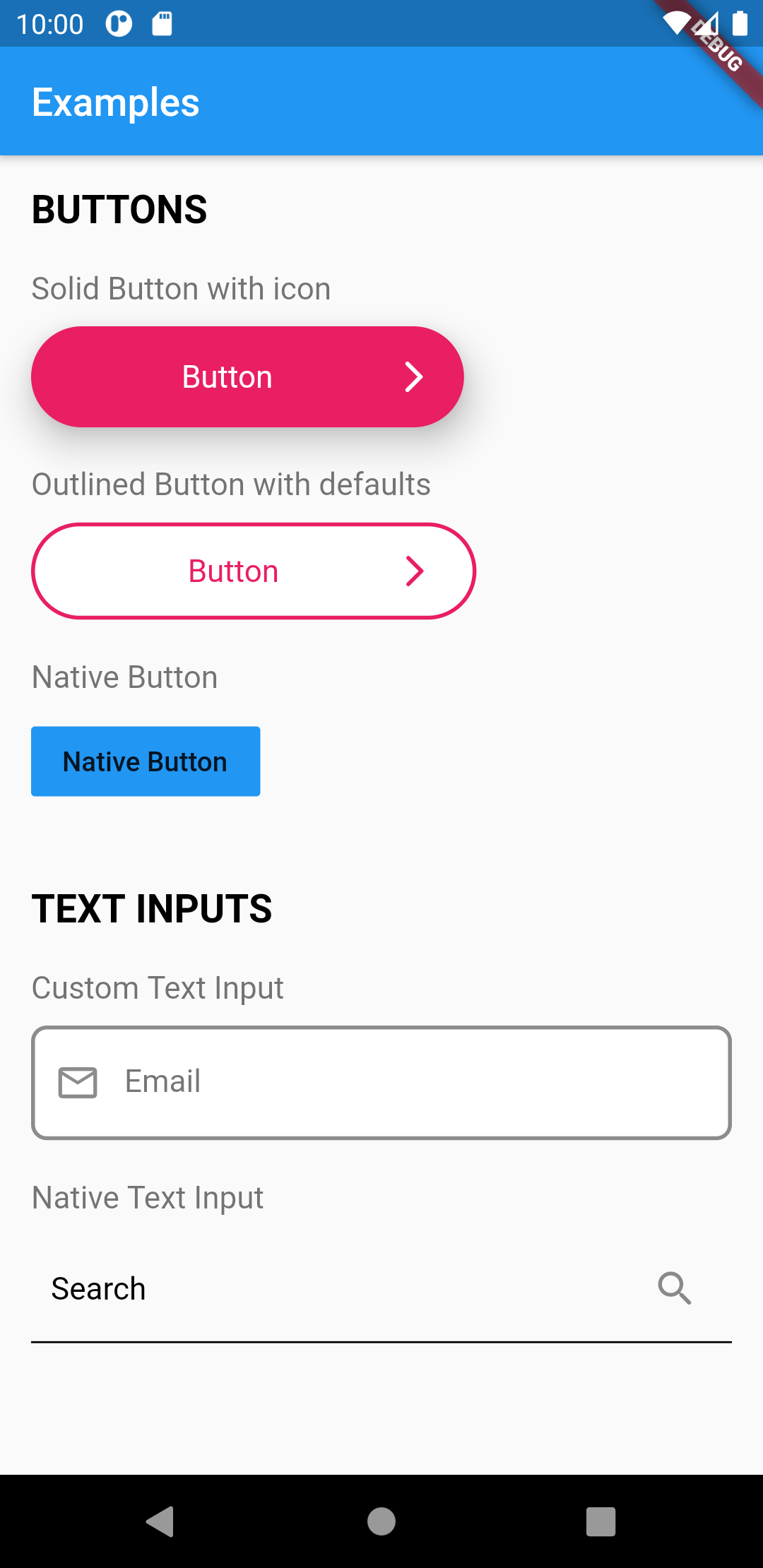 |
Outlined button with default styles
/// Set primary button styles

final primary = UIButtonDefaults(
  elevation: 10.0,
  borderRadius: 50.0,
  borderColor: Colors.purple,
  borderWidth: 2.0,
  labelColor: Colors.purple,
  bgColor: Colors.white,
  widthFactor: 0.5, // sets the button width
);

UIButton.outlined(
    as: primary,
    label: "Button",
    onPressed: () => print('Call API'),
    //
    // You can override styles set in primary
    // by defining it again here
    labelColor: Colors.blue,
),
Native button
UIButton.native(
    label: "Button",
    onPressed: () => print('Call API'),
),
Heading
/// Set article title styles

final articleTitle = UIHeadingDefaults(
    heading: 2,
    color: Colors.pink,
    fontWeight: FontWeight.bold,
);

UIHeading(
    as: articleTitle,
    text: 'Heading 2',
),
Text input
/// Set primary text input styles

final primaryInput = UITextFieldDefaults(
  borderColor: Colors.black,
  borderRadius: 20,
  borderType: UIBorderType.outlineBorder,
  borderWidth: 2.0,
  focusBorderColor: Colors.green,
  hintColor: Colors.white,
  bgColor: Colors.purple.withOpacity(0.6),
);

UITextField(
    as: primaryInput,
    hint: 'Email',
),
Native text input
UITextField.native(
    hint: 'Email',
),
Action Sheets
/// Creates a Native Action Sheet Factory

void _openActionSheet(BuildContext context) {
  UIActionSheet.show(
    context,
    title: UIHeading(
      text: 'Select you favorite color',
      color: Colors.blue,
      textAlign: TextAlign.center,
      heading: 5,
    ),
    content: Text('We will use the color on your profile.'),
    // forceAndroid: true,
    actions: [
      ActionSheetAction(
        child: Text('Red'),
        onPressed: () => Navigator.of(context).pop(),
      ),
      ActionSheetAction(
        child: Text('Green'),
        onPressed: () => Navigator.of(context).pop(),
      ),
      ActionSheetAction(
        child: Text('Bue'),
        onPressed: () => Navigator.of(context).pop(),
      ),
      ActionSheetAction(
        child: Text('Pink'),
        onPressed: () => Navigator.of(context).pop(),
      ),
    ],
    cancel: ActionSheetAction(
      child: UIHeading(
        text: 'Cancel',
        color: Colors.red,
        heading: 4,
      ),
      onPressed: () => print('Cancel'),
    ),
  );
}

/// Will open  action sheet based on the current OS

UIButton.solid(
    as: solidButtonStyles,
    label: "Open Action SHeet",
    onPressed: () => _openActionSheet(context),
),
Dialogs
/// Creates a Native Dialog Factory

void _openDialog(BuildContext context) {
  DialogFactory.showAlertDialog(
    context,
    title: Text('Are you sure?'),
    content: Text('You cannot reverse this action.'),
    actions: [
      DialogAction(
        child: Text('YES'),
        onPressed: () {
          ///
          /// Call API
          callApi();

          ///
          /// Close dialog
          Navigator.of(context).pop();
        },
      ),
      DialogAction(
        child: Text('NO'),
        onPressed: () => Navigator.of(context).pop(),
      ),
    ],
  );
}

/// Will open a dialog based on the current OS

UIButton.solid(
    as: solidButtonStyles,
    label: "Open Dialog",
    onPressed: () => _openDialog(context),
),
Metadata
Publisher
unverified uploader
Metadata
Flutter UI Toolkit is a pre-built collection of the most used widgets to create apps. The idea is that you can use these widgets the way you use classes in HTML and CSS.
Repository (GitHub)
View/report issues
License
 unknown (LICENSE)