flutter_status_overlay 0.0.4  flutter_status_overlay: ^0.0.4 copied to clipboard
A versatile and easy-to-use package for displaying customizable status messages in Flutter apps. Enhance user feedback with elegant overlays for both error and success notifications.
Flutter Status Overlay #
Flutter Status Overlay is a customizable, easy-to-use package for displaying status messages and notifications in Flutter applications. It provides an elegant way to show both success and error messages with a smooth animation overlay.
Features #
- Display temporary overlay messages for both success and error states
- Customizable appearance including colors and text styles
- Adjustable display duration
- Smooth slide-in and slide-out animations
- Easy to integrate into any Flutter application
- Dismissible by tapping outside the message area
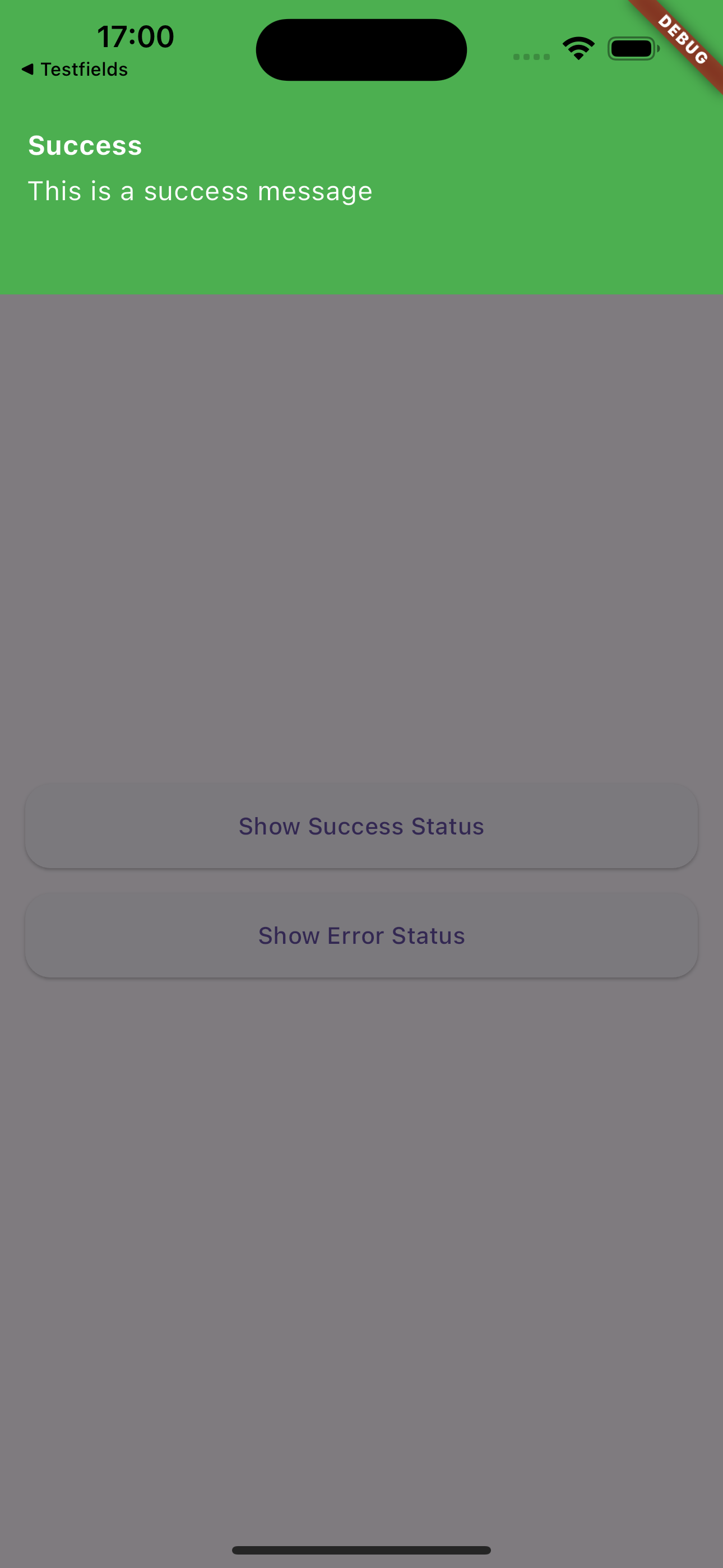
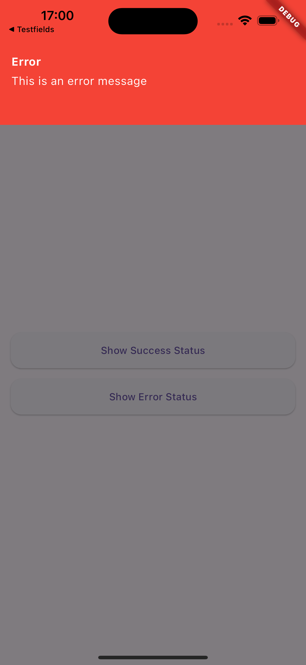
Screenshots & Demo #

|

|

|
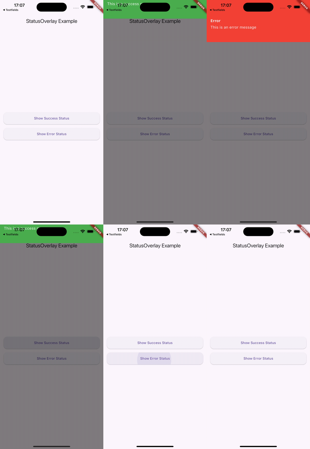
This demonstration showcases the key features of Flutter Status Overlay:
-
First, two status messages are displayed:
- A success message
- An error message Both automatically close after a set duration (5 seconds in this example)
-
Next, two more status messages are shown:
- Another success message
- Another error message These can be dismissed by tapping anywhere on the screen
This demo illustrates the flexibility of Flutter Status Overlay, allowing for both timed and user-initiated dismissal of status messages.
Installation #
Add this to your package's pubspec.yaml file:
dependencies:
  flutter_status_overlay: ^0.0.1
Then run: #
$ flutter pub get
Usage #
Import the package in your Dart code:
import 'package:flutter_status_overlay/flutter_status_overlay.dart';
To display a status message, use the StatusOverlay.show() method:
StatusOverlay.show(
  context,
  title: 'Success',
  message: 'Operation completed successfully!',
  type: StatusType.success,
  duration: const Duration(seconds: 3),
);
To display an error message:
StatusOverlay.show(
  context,
  title: 'Error',
  message: 'An error occurred during the operation.',
  type: StatusType.error,
  duration: const Duration(seconds: 3),
);
Parameters #
The StatusOverlay.show() method accepts the following parameters:
context:The build context (required)title:The title of the status message (required)message:The content of the status message (required)type:The type of status (StatusType.success or StatusType.error) (required)duration:The duration for which the overlay should be displayed (optional, defaults to 5 seconds)
Example #
Here’s a simple example of how to use Flutter Status Overlay in your app:
import 'package:flutter_status_overlay/flutter_status_overlay.dart';

void main() {
  runApp(const MyApp());
}

class MyApp extends StatelessWidget {
  const MyApp({Key? key}) : super(key: key);

  @override
  Widget build(BuildContext context) {
    return MaterialApp(
      home: Scaffold(
        appBar: AppBar(title: const Text('StatusOverlay Example')),
        body: Center(
          child: Column(
            mainAxisAlignment: MainAxisAlignment.center,
            children: [
              ElevatedButton(
                child: const Text('Show Success Status'),
                onPressed: () {
                  StatusOverlay.show(
                    context,
                    title: 'Success',
                    message: 'This is a success message',
                    type: StatusType.success,
                    duration: const Duration(seconds: 3),
                  );
                },
              ),
              const SizedBox(height: 20),
              ElevatedButton(
                child: const Text('Show Error Status'),
                onPressed: () {
                  StatusOverlay.show(
                    context,
                    title: 'Error',
                    message: 'This is an error message',
                    type: StatusType.error,
                    duration: const Duration(seconds: 3),
                  );
                },
              ),
            ],
          ),
        ),
      ),
    );
  }
}
Customization #
The appearance of the status overlay is customized based on the StatusType. Success messages are displayed with a green background, while error messages have a red background. The text color is white for both types.
Contributions #
Contributions are welcome! If you encounter any issues or have suggestions for improvements, please file an issue on the GitHub repository.
License #
This project is licensed under the MIT License - see the LICENSE file for details.