flutter_staggered_grid_view 0.5.0-dev.1  flutter_staggered_grid_view: ^0.5.0-dev.1 copied to clipboard
Provides a collection of Flutter grids layouts (staggered, masonry, quilted, woven, etc.).
flutter_staggered_grid_view #
Provides a collection of Flutter grids layouts.
Getting started #
In the pubspec.yaml of your flutter project, add the following dependency:
dependencies:
  ...
  flutter_staggered_grid_view: <latest_version>
In your library add the following import:
import 'package:flutter_staggered_grid_view/flutter_staggered_grid_view.dart';
For help getting started with Flutter, view the online documentation.
Layouts #
This package contains various grid layouts. In the following section, you'll discover each one of them. The explanation of the layout will always considered a top-to-bottom and left-to-right directions to simplify the description. However it is possible to change these directions in the code.
Staggered #

This layout is intended for a small number of items.
Grid properties
- Evenly divided in n columns
- Small number of items
- Not scrollable
Tile properties
- Must occupy 1 to n columns
Placement algorithm
- Top-most and then left-most
Example
Below you'll find the code to create this grid layout:
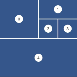
StaggeredGrid.count(
  crossAxisCount: 4,
  mainAxisSpacing: 4,
  crossAxisSpacing: 4,
  children: const [
    StaggeredGridTile.count(
      crossAxisCellCount: 2,
      mainAxisCellCount: 2,
      child: Tile(index: 0),
    ),
    StaggeredGridTile.count(
      crossAxisCellCount: 2,
      mainAxisCellCount: 1,
      child: Tile(index: 1),
    ),
    StaggeredGridTile.count(
      crossAxisCellCount: 1,
      mainAxisCellCount: 1,
      child: Tile(index: 2),
    ),
    StaggeredGridTile.count(
      crossAxisCellCount: 1,
      mainAxisCellCount: 1,
      child: Tile(index: 3),
    ),
    StaggeredGridTile.count(
      crossAxisCellCount: 4,
      mainAxisCellCount: 2,
      child: Tile(index: 4),
    ),
  ],
);
Masonry #

This layout facilitates the browsing of uncropped peer content. Container heights are sized based on the widget size.
Grid properties
- Evenly divided in n columns
Tile properties
- Must occupy 1 column only
Placement algorithm
- Top-most and then left-most
Example
Below you'll find the code to create this grid layout:
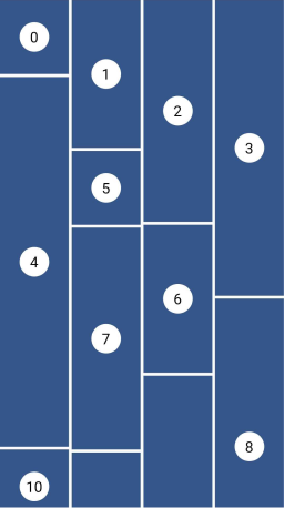
MasonryGridView.count(
  crossAxisCount: 4,
  mainAxisSpacing: 4,
  crossAxisSpacing: 4,
  itemBuilder: (context, index) {
    return Tile(
      index: index,
      extent: (index % 5 + 1) * 100,
    );
  },
);
Quilted #

This layout emphasizes certain items over others in a collection. It creates hierarchy using varied container sizes and ratios.
Grid properties
- Evenly divided in n columns
- The height of each row is equal to the width of each column
- A pattern defines the size of the tiles and different mode of repetition are possible
Tile properties
- Must occupy 1 to n columns
- Must occupy 1 or more entire rows
Placement algorithm
- Top-most and then left-most
Example
Below you'll find the code to create this grid layout:
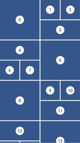
GridView.custom(
  gridDelegate: SliverQuiltedGridDelegate(
    crossAxisCount: 4,
    mainAxisSpacing: 4,
    crossAxisSpacing: 4,
    repeatPattern: QuiltedGridRepeatPattern.inverted,
    pattern: [
      QuiltedGridTile(2, 2),
      QuiltedGridTile(1, 1),
      QuiltedGridTile(1, 1),
      QuiltedGridTile(1, 2),
    ],
  ),
  childrenDelegate: SliverChildBuilderDelegate(
    (context, index) => Tile(index: index),
  ),
);
Woven #

This layout facilitates the browsing of peer content. The items are displayed in containers of varying ratios to create a rhythmic layout.
Grid properties
- Evenly divided in n columns
- The height the rows is the maximum height of the tiles
- A pattern defines the size of the tiles
- The size of the tiles follows the pattern in a 'z' sequence.
Tile properties
- The height is defined by an
aspectRatio(width/height) - The width is defined by a
crossAxisRatio(width/column's width) between 0 (exclusive) and 1 (inclusive) - Each tile can define how it is aligned within the available space
Placement algorithm
- Top-most and then left-most
Example
Below you'll find the code to create this grid layout:
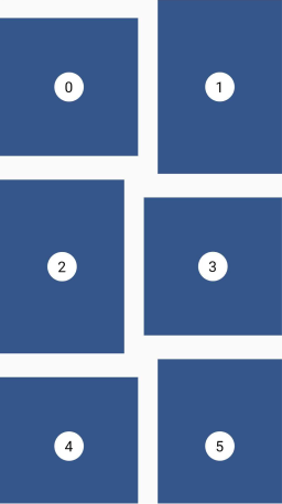
GridView.custom(
  gridDelegate: SliverWovenGridDelegate.count(
    crossAxisCount: 2,
    mainAxisSpacing: 8,
    crossAxisSpacing: 8,
    pattern: [
      WovenGridTile(1),
      WovenGridTile(
        5 / 7,
        crossAxisRatio: 0.9,
        alignment: AlignmentDirectional.centerEnd,
      ),
    ],
  ),
  childrenDelegate: SliverChildBuilderDelegate(
    (context, index) => Tile(index: index),
  ),
);
Staired #

This layout uses alternating container sizes and ratios to create a rhythmic effect. It's another kind of woven grid layout.
Grid properties
- A pattern defines the size of the tiles
- Each tile is shifted from the previous one by a margin in both axis
- The placement follows a 'z' sequence
Tile properties
- The height is defined by an
aspectRatio(width/height) - The width is defined by a
crossAxisRatio(width/available horizontal space) between 0 (exclusive) and 1 (inclusive)
Placement algorithm
- In a 'z' sequence
Example
Below you'll find the code to create this grid layout:
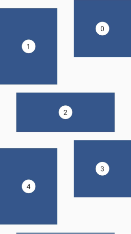
GridView.custom(
  gridDelegate: SliverStairedGridDelegate(
    crossAxisSpacing: 48,
    mainAxisSpacing: 24,
    startCrossAxisDirectionReversed: true,
    pattern: [
      StairedGridTile(0.5, 1),
      StairedGridTile(0.5, 3 / 4),
      StairedGridTile(1.0, 10 / 4),
    ],
  ),
  childrenDelegate: SliverChildBuilderDelegate(
    (context, index) => Tile(index: index),
  ),
);
Sponsoring #
I'm working on my packages on my free-time, but I don't have as much time as I would. If this package or any other package I created is helping you, please consider to sponsor me so that I can take time to read the issues, fix bugs, merge pull requests and add features to these packages.
Sponsors #
I want to thank Tommy for sponsoring this package. Thanks to him, I took the time to investigate in the previous performance issues and refactor this library to make it how is it today.
Tom3652 |
Contributions #
Feel free to contribute to this project.
If you find a bug or want a feature, but don't know how to fix/implement it, please fill an issue.
If you fixed a bug or implemented a feature, please send a pull request.

