flutter_spreadsheet_table 0.0.1  flutter_spreadsheet_table: ^0.0.1 copied to clipboard
 sanjaylive.tech
A customizable Flutter package for creating editable spreadsheet-like UIs.
📊 flutter_spreadsheet_table #
A highly customizable and robust spreadsheet table widget for Flutter, designed for data entry and data display.
It comes with row dismissal, flexible column types (editable text & dropdowns), built-in validation, and a responsive UI — perfect for building powerful data-driven apps. 🚀
✨ Features #
- 🗑️ Dismissible Rows – Swipe to delete rows with smooth custom animations.
- 🔤 Flexible Columns – Supports editable TextFields and dropdown menus for predefined options.
- 🎨 Seamless UI – Consistent look & feel across all cells, including borders and padding.
- ✅ Built-in Validation – Add custom validation rules per column with:
- Red border highlight on error.
- SnackBar with detailed error messages.
- 📐 Scalable – Handles dynamic rows & columns without layout overflow issues.
- ⚡ Row-Specific Actions – Add custom leading and trailing buttons (e.g., edit, view details).
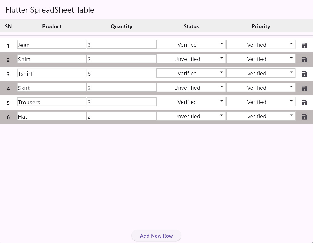
📸 Preview #
Simple Table with DropDownMenuOption
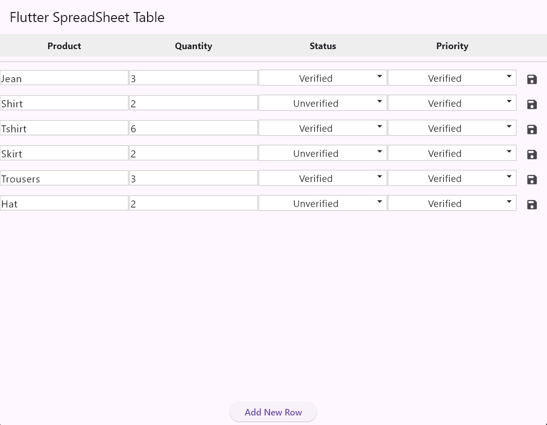
Table with Auto Generated Symbol Number(SN)
autoLeadingSN: true
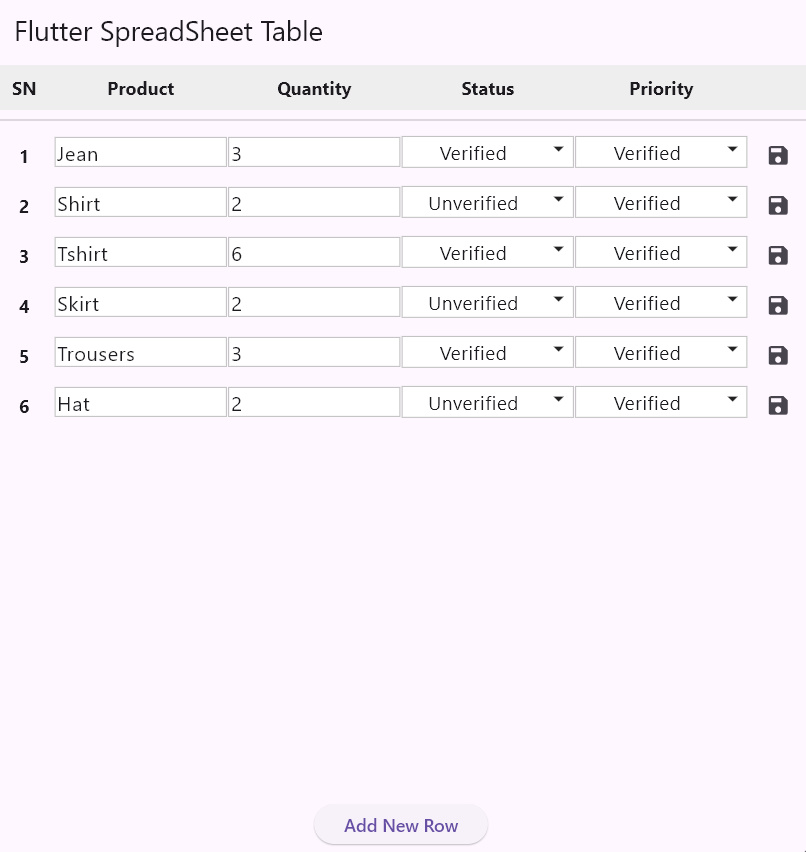
Table with Zebra Stripe with custom colors
zebraStripe: true,
stripeColors: const [Colors.white, Color(0xFFF5F5F5)]
🚀 Installation #
Add the package to your pubspec.yaml:
dependencies:
  flutter_spreadsheet_table: ^0.0.1
flutter pub get
🛠️ Usage #
Here’s a simple example:
import 'package:flutter/material.dart';
import 'package:flutter_spreadsheet_table/flutter_spreadsheet_table.dart';

void main() {
  runApp(const MyApp());
}

class MyApp extends StatefulWidget {
  const MyApp({super.key});

  @override
  State<MyApp> createState() => _MyAppState();
}

class _MyAppState extends State<MyApp> {
  final List<SpreadsheetRow> _data = [
    SpreadsheetRow(id: UniqueKey().toString(), cells: {
      "Product": "Jean",
      "Quantity": "3",
      "Status": "Verified",
      "Priority": "Verified",
    }),
    SpreadsheetRow(id: UniqueKey().toString(), cells: {
      "Product": "Shirt",
      "Quantity": "2",
      "Status": "Unverified",
      "Priority": "Verified",
    }),
  ];

  @override
  Widget build(BuildContext context) {
    return MaterialApp(
      home: Scaffold(
        appBar: AppBar(title: const Text('Flutter Spreadsheet Table')),
        body: Column(
          children: [
            Expanded(
              child: SpreadsheetTable(
                  zebraStripe: true,
                  autoLeadingSN: true,
                  cellContentPadding: const EdgeInsets.symmetric(
                      horizontal: 2.0, vertical: 4.0),
                  columnAlignments: const {
                    'Product': TextAlign.start,
                    'Status': TextAlign.center,
                    'Priority': TextAlign.center,
                  },
                  dropdownOptions: const {
                    // Define dropdown options for 'Status' and 'Priority' columns
                    'Status': ['Unverified', 'Verified', 'Closed'],
                    'Priority': ['Unverified', 'Verified', 'Closed'],
                  },
                  initialData: _data,
                  headers: const ['Product', 'Quantity', 'Status', "Priority"],
                  onDataChanged: (newData) {
                    print('Full data changed: $_data');
                  },
                  onRowDataChanged: (updatedRow) {
                    print('Row data changed: ${updatedRow.cells}');
                  },
                  trailingButtonBuilder: (context, row) => IconButton(
                        icon: const Icon(Icons.save, size: 20),
                        onPressed: () {
                          print(row);
                        },
                      ),
                  validators: {
                    'Product': (value) {
                      if (value == null || value.isEmpty) {
                        return 'No Empty field';
                      }
                      return null;
                    },
                    'Quantity': (value) {
                      if (value == null || int.tryParse(value) == null) {
                        return 'Number only';
                      }
                      if (int.parse(value) <= 0) {
                        return '+ Number only';
                      }
                      return null;
                    },
                  }),
            ),
          ],
        ),
      ),
    );
  }
}
⚙️ Customizable Parameters #
The SpreadsheetTable widget offers extensive customization through its constructor parameters:
| Parameter | Type | Description |
|---|---|---|
initialData |
List<SpreadsheetRow> |
The initial data to populate the table. |
headers |
List<String> |
The list of column headers. |
onDataChanged |
ValueChanged<List<SpreadsheetRow>>? |
Callback triggered when data is changed. |
onRowDismissed |
ValueChanged<SpreadsheetRow>? |
Callback when a row is dismissed. |
validators |
Map<String, CellValidator> |
Map of validation rules for text fields. |
dropdownOptions |
Map<String, List<String>> |
Map of dropdown options for specific headers. |
autoLeadingSN |
bool |
Enables an automatic serial number column. |
zebraStripe |
bool |
Enables alternating row colors. |
trailingButtonBuilder |
SpreadsheetButtonBuilder? |
A builder for a custom trailing button in each row. |
leadingButtonBuilder |
SpreadsheetButtonBuilder? |
A builder for a custom leading button in each row. |
🤝 Contributing #
Contributions are welcome! Feel free to open issues or submit PRs to improve the package.
📄 License #
This project is licensed under the MIT License.
💡 Built with ❤️ in Flutter to make data entry easier and more powerful.
Metadata
Documentation
Publisher
Weekly Downloads
Metadata
A customizable Flutter package for creating editable spreadsheet-like UIs.
Repository (GitHub)
View/report issues
License
 MIT (license)