flutter_smart_dialog 4.9.8+4  flutter_smart_dialog: ^4.9.8+4 copied to clipboard
An elegant Flutter Dialog solution, Easily implement Toast, Loading and custom Dialog, Make the use of the dialog easier!
Feature and Usage(Must read!):super detailed guide
功能和用法(必看!): 超详细指南
Language: English | 中文
Migrate doc:3.x migrate 4.0 | 3.x 迁移 4.0
Flutter 2:Please use flutter_smart_dialog: 4.2.5
Introduction #
An elegant Flutter Dialog solution.
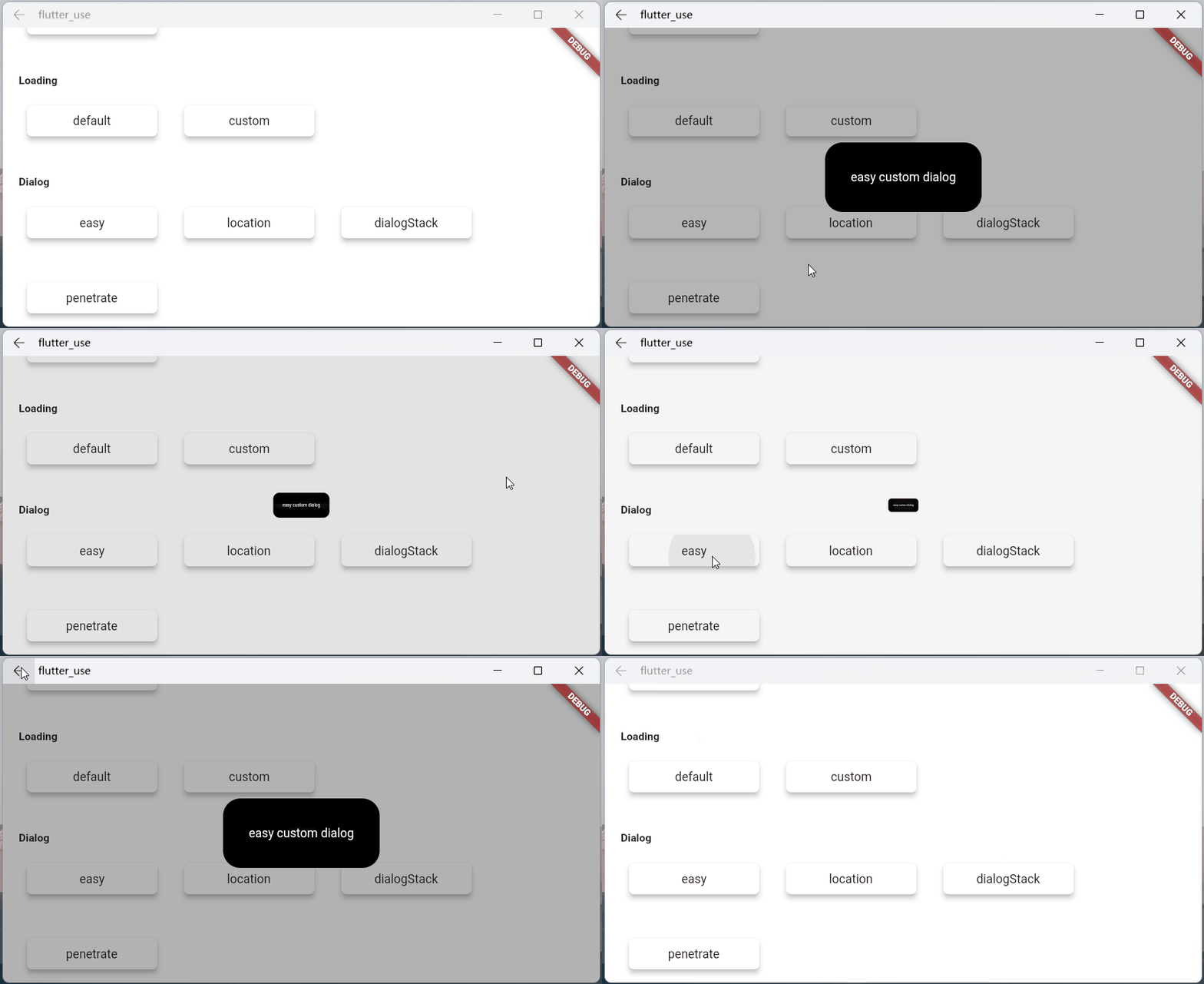
Some Effect #
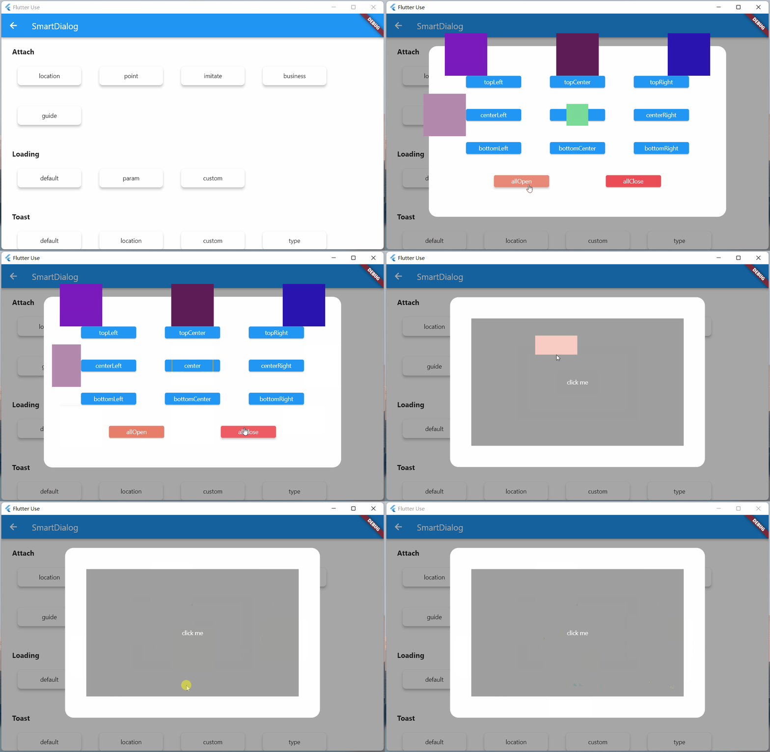
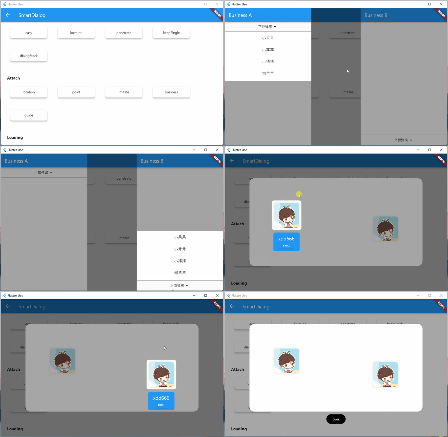
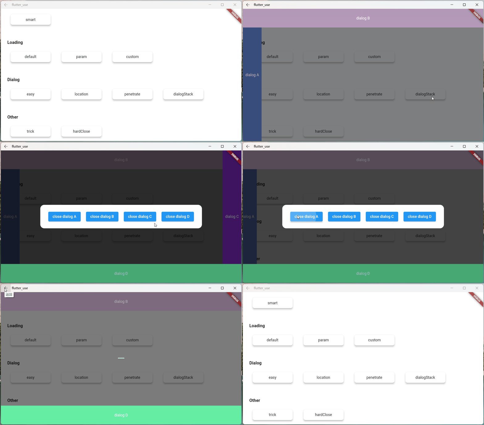
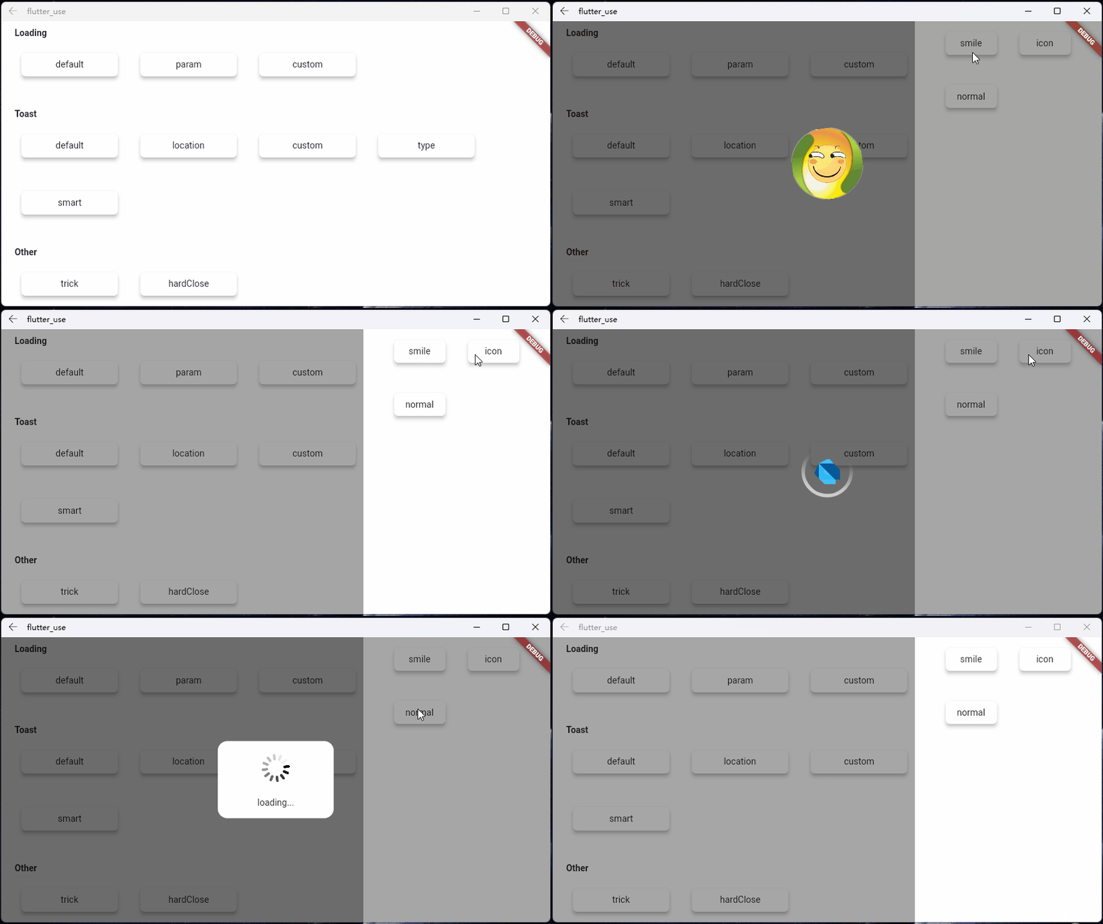
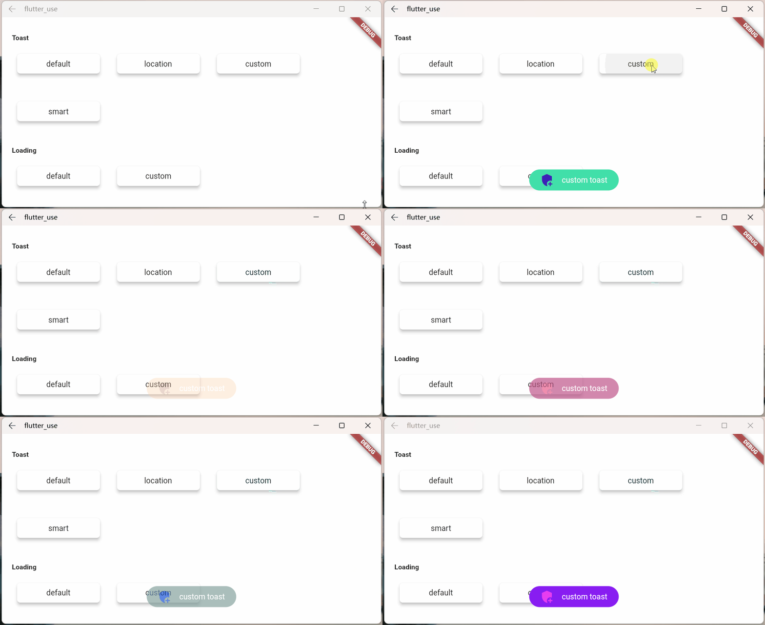
Advantage #
-
Do not need BuildContext
-
Can penetrate dark background, click on the page behind dialog
-
Support dialog stack,close the specified dialog
-
Support positioning widget, display the specified location dialog
-
Support highlight feature,dissolve the specified location mask
-
Easily implement toast,loading,attach dialog,custome dialog,custome notify
Quick start #
Install #
- latest version:install pub
Initialization #
initialization
void main() => runApp(MyApp());

class MyApp extends StatelessWidget {
  @override
  Widget build(BuildContext context) {
    return MaterialApp(
      home: HomePage,
      // here
      navigatorObservers: [FlutterSmartDialog.observer],
      // here
      builder: FlutterSmartDialog.init(),
    );
  }
}
Advanced initialization: configure global custom Loading and Toast
SmartDialog's showLoading and showToast provide a default style. Of course, custom param are definitely supported.
- SmartDialog custom Loading or Toast is very simple: However, when using it, it may make you feel a little troublesome
- for example
- Use custom Loading:
SmartDialog.showLoading(builder: (_) => CustomLoadingWidget); - The effect we want must be like this:
SmartDialog.showLoading();
- Use custom Loading:
- In view of the above considerations, I added the function of setting custom default Loading and Toast styles at the entrance
Let me show you the following
- The entry needs to be configured: implement toastBuilder and loadingBuilder, and pass in custom Toast and Loading
void main() => runApp(MyApp());

class MyApp extends StatelessWidget {
  @override
  Widget build(BuildContext context) {
    return MaterialApp(
      home: HomePage,
      // here
      navigatorObservers: [FlutterSmartDialog.observer],
      // here
      builder: FlutterSmartDialog.init(
        //custom default toast widget
        toastBuilder: (String msg) => CustomToastWidget(msg: msg),
        //custom default loading widget
        loadingBuilder: (String msg) => CustomLoadingWidget(msg: msg),
        //custom default notify widget
        notifyStyle: FlutterSmartNotifyStyle(
          successBuilder: (String msg) => CustomSuccessWidget(msg: msg),
          failureBuilder: (String msg) => CustomFailureWidget(msg: msg),
          warningBuilder: (String msg) => CustomWarningWidget(msg: msg),
          alertBuilder: (String msg) => CustomAlertWidget(msg: msg),
          errorBuilder: (String msg) => CustomErrorWidget(msg: msg),
        ),
      ),
    );
  }
}
- SmartDialog supports default global configuration
SmartDialog.config
  ..custom = SmartConfigCustom(
    maskColor: Colors.black.withOpacity(0.35),
    useAnimation: true,
  )
  ..attach = SmartConfigAttach(
    animationType: SmartAnimationType.scale,
    usePenetrate: false,
  )
  ..loading = SmartConfigLoading(
    clickMaskDismiss: false,
    leastLoadingTime: const Duration(milliseconds: 0),
  )
  ..toast = SmartConfigToast(
    intervalTime: const Duration(milliseconds: 100),
    displayTime: const Duration(milliseconds: 2000),
  );
Easy usage #
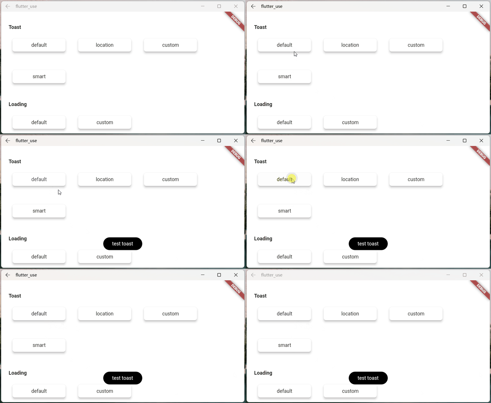
- toast usage💬
SmartDialog.showToast('test toast');
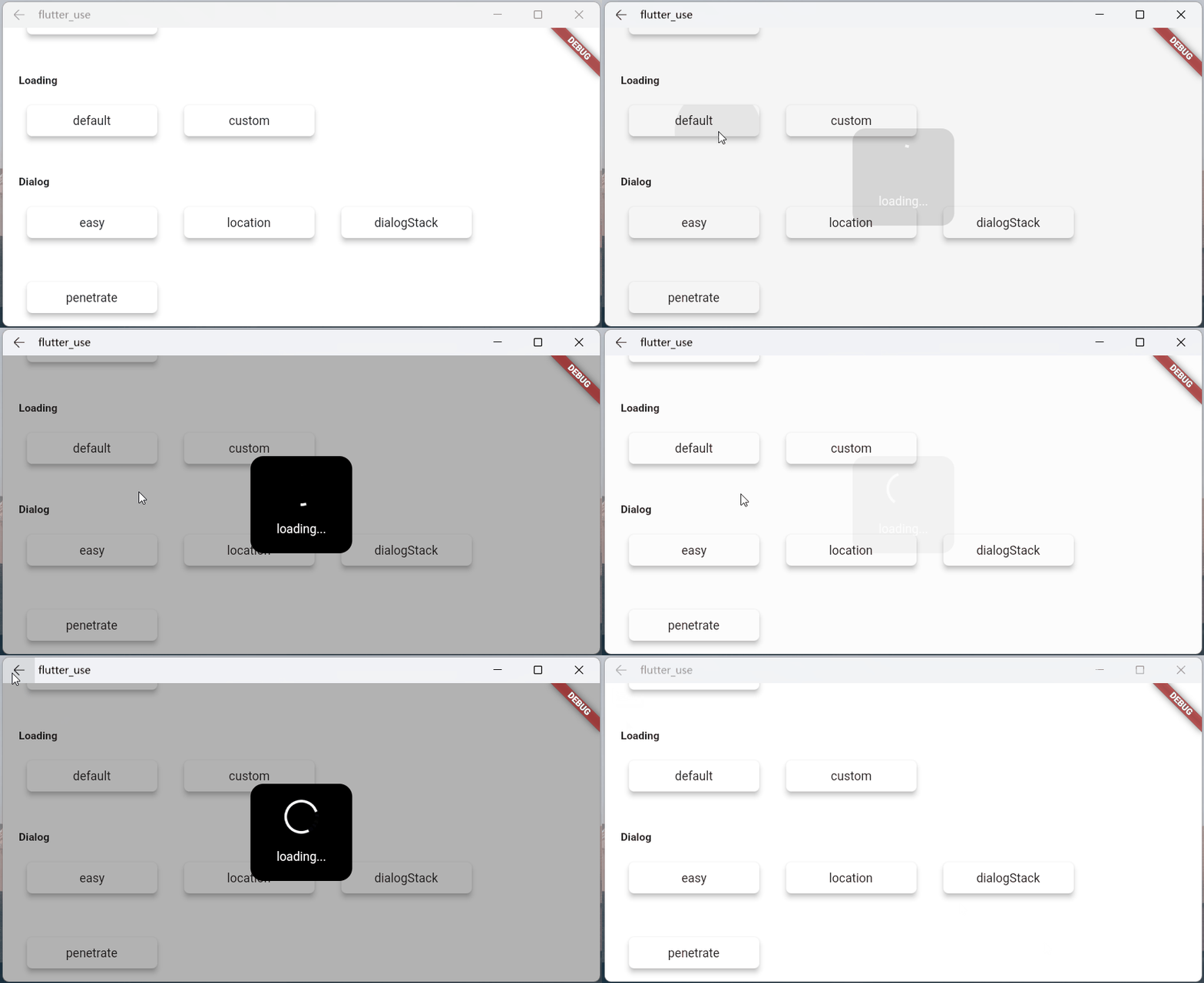
- loading usage⏳
SmartDialog.showLoading();
await Future.delayed(Duration(seconds: 2));
SmartDialog.dismiss();
- dialog usage🎨
SmartDialog.show(builder: (context) {
  return Container(
    height: 80,
    width: 180,
    decoration: BoxDecoration(
      color: Colors.black,
      borderRadius: BorderRadius.circular(10),
    ),
    alignment: Alignment.center,
    child:
    Text('easy custom dialog', style: TextStyle(color: Colors.white)),
  );
});
