flutter_smart_dialog 3.3.7  flutter_smart_dialog: ^3.3.7 copied to clipboard
An elegant Flutter Dialog solution, Easily implement Toast, Loading and custom Dialog, Make the use of the dialog easier!
Language: English | 中文
Introduction #
An elegant Flutter Dialog solution.
Some Effect #

Advantage #
-
Do not need BuildContext
-
Can penetrate dark background, click on the page behind dialog
-
Support dialog stack,close the specified dialog
-
Support positioning widget, display the specified location dialog
-
Support highlight feature,dissolve the specified location mask
-
Easily implement toast,loading,attach dialog,custome dialog
Quick start #
Install #
- latest version:install pub
Initialization #
initialization
void main() => runApp(MyApp());

class MyApp extends StatelessWidget {
  @override
  Widget build(BuildContext context) {
    return MaterialApp(
      home: HomePage,
      // here
      navigatorObservers: [FlutterSmartDialog.observer],
      // here
      builder: FlutterSmartDialog.init(),
    );
  }
}
Advanced initialization: configure global custom Loading and Toast
SmartDialog's showLoading and showToast provide a default style. Of course, custom param are definitely supported.
- SmartDialog custom Loading or Toast is very simple: However, when using it, it may make you feel a little troublesome
- for example
- Use custom Loading:
SmartDialog.showLoading(widget: CustomLoadingWidget); - The effect we want must be like this:
SmartDialog.showLoading();
- Use custom Loading:
- In view of the above considerations, I added the function of setting custom default Loading and Toast styles at the entrance
Let me show you the following
- The entry needs to be configured: implement toastBuilder and loadingBuilder, and pass in custom Toast and Loading
void main() => runApp(MyApp());

class MyApp extends StatelessWidget {
  @override
  Widget build(BuildContext context) {
    return MaterialApp(
      home: HomePage,
      // here
      navigatorObservers: [FlutterSmartDialog.observer],
      // here
      builder: FlutterSmartDialog.init(
        //default toast widget
        toastBuilder: (String msg, AlignmentGeometry alignment) {
          return CustomToastWidget(msg: msg, alignment: alignment);
        },
        //default loading widget
        loadingBuilder: (String msg, Color background) {
          return CustomLoadingWidget(msg: msg, background: background);
        },
      ),
    );
  }
}
Easy usage #
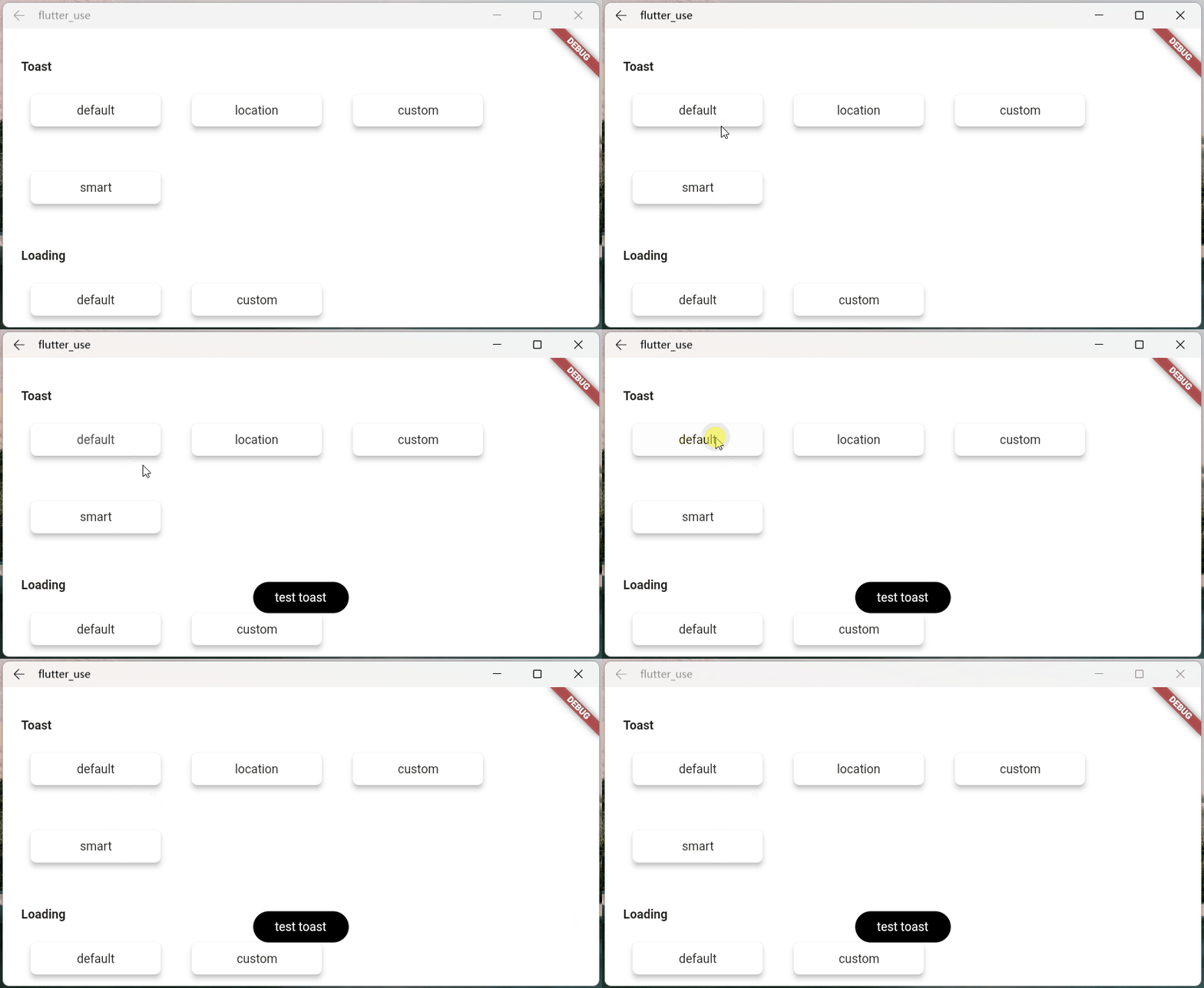
- toast usage💬
SmartDialog.showToast('test toast');
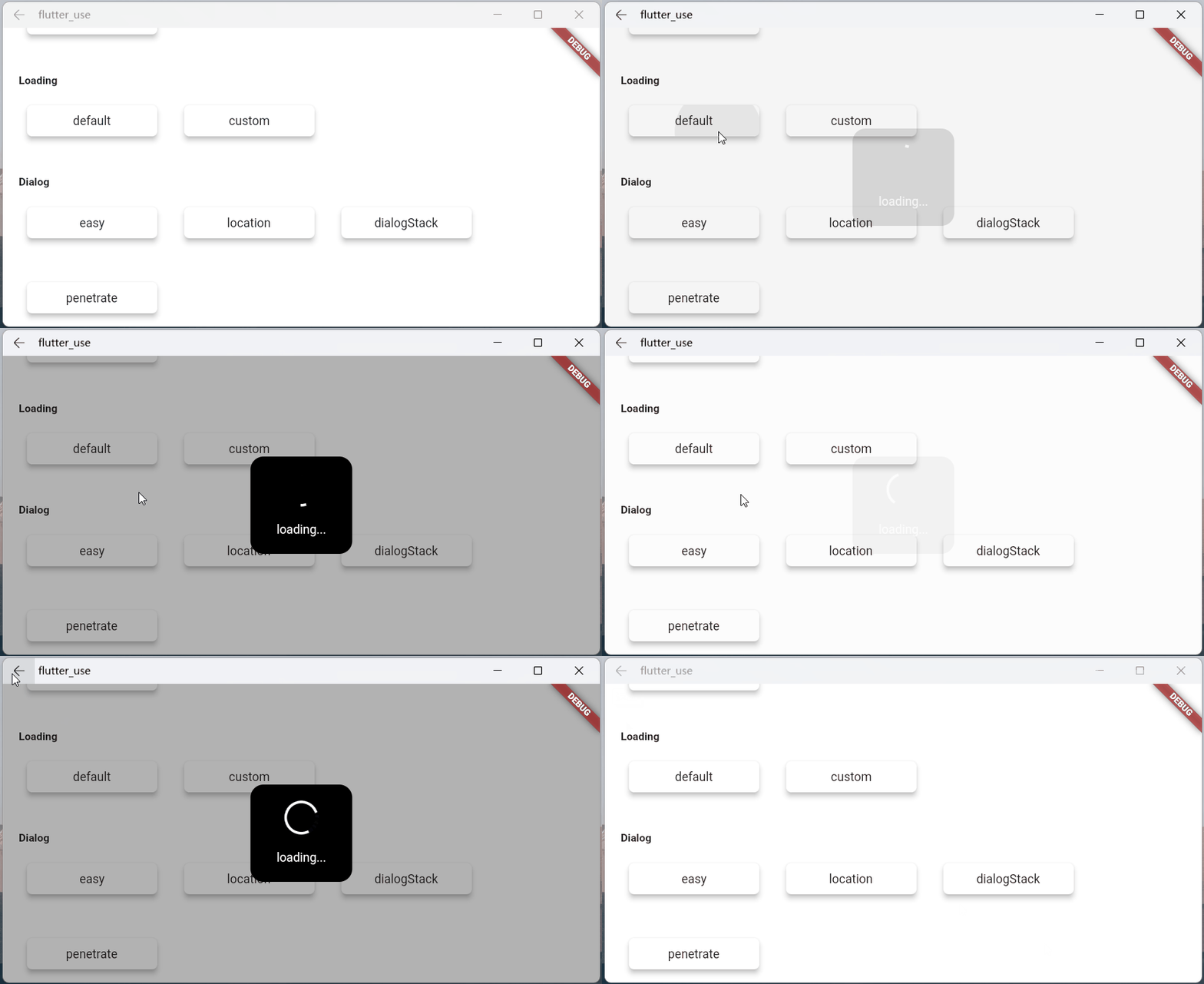
- loading usage⏳
SmartDialog.showLoading();
await Future.delayed(Duration(seconds: 2));
SmartDialog.dismiss();
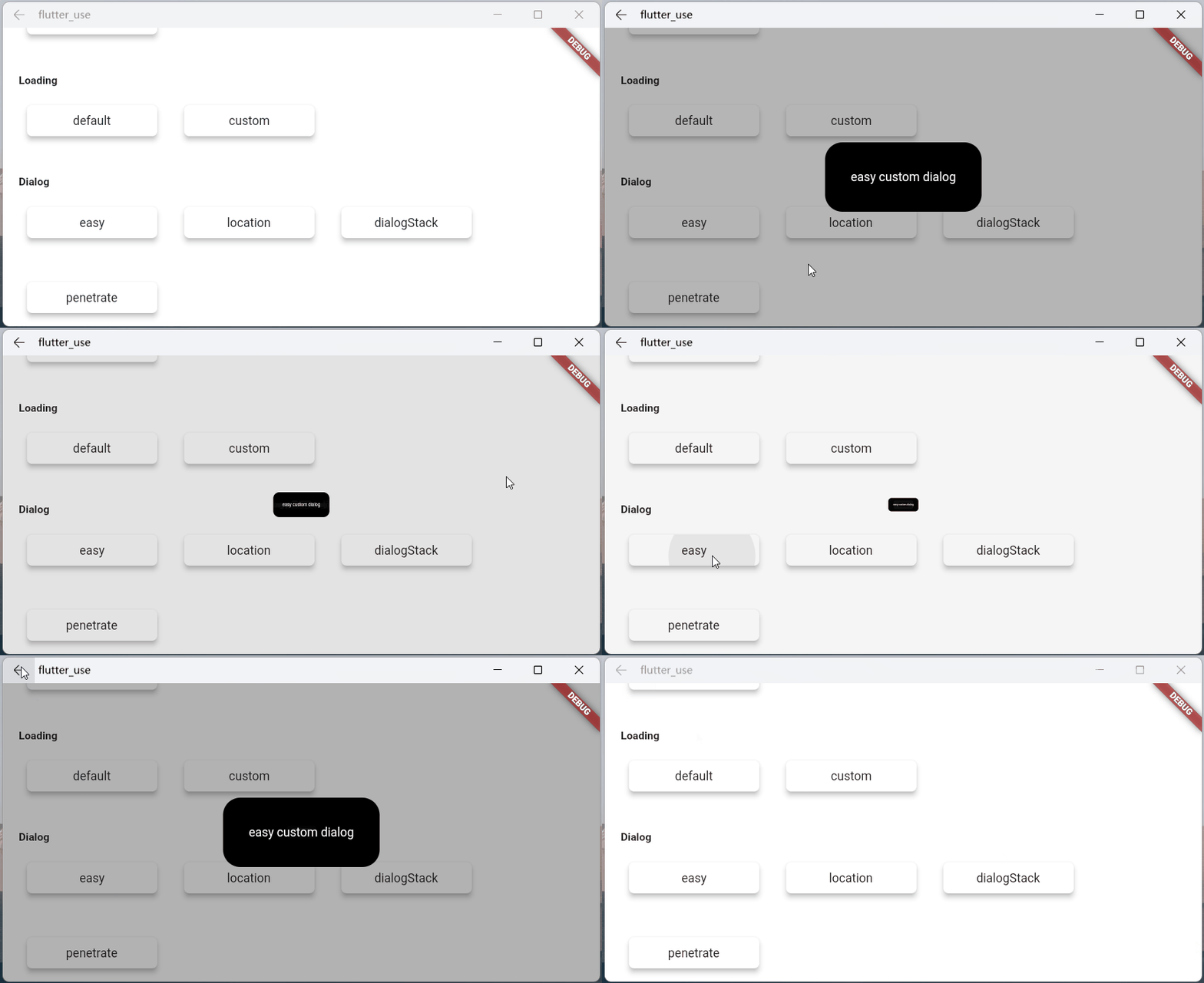
- dialog usage🎨
var custom = Container(
    height: 80,
    width: 180,
    decoration: BoxDecoration(
        color: Colors.black,
        borderRadius: BorderRadius.circular(20),
    ),
    alignment: Alignment.center,
    child: Text('easy custom dialog', style: TextStyle(color: Colors.white)),
);
// here
SmartDialog.show(widget: custom, isLoadingTemp: false);
You may have questions #
About FlutterSmartDialog.init()
This method does not take up your builder parameters. The builder is called back in init
- For example: continue to set Bloc global instance 😄
class MyApp extends StatelessWidget {
  @override
  Widget build(BuildContext context) {
    return MaterialApp(
      home: HomePage,
      navigatorObservers: [FlutterSmartDialog.observer],
      builder: FlutterSmartDialog.init(builder: _builder),
    );
  }
}

Widget _builder(BuildContext context, Widget? child) {
  return MultiBlocProvider(
    providers: [
      BlocProvider.value(value: BlocSpanOneCubit()),
    ],
    child: child!,
  );
}
Entity Return Key
The monitoring of the back button is very important and can basically cover most situations
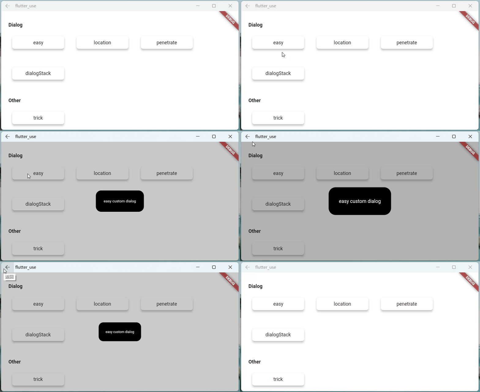
pop routing
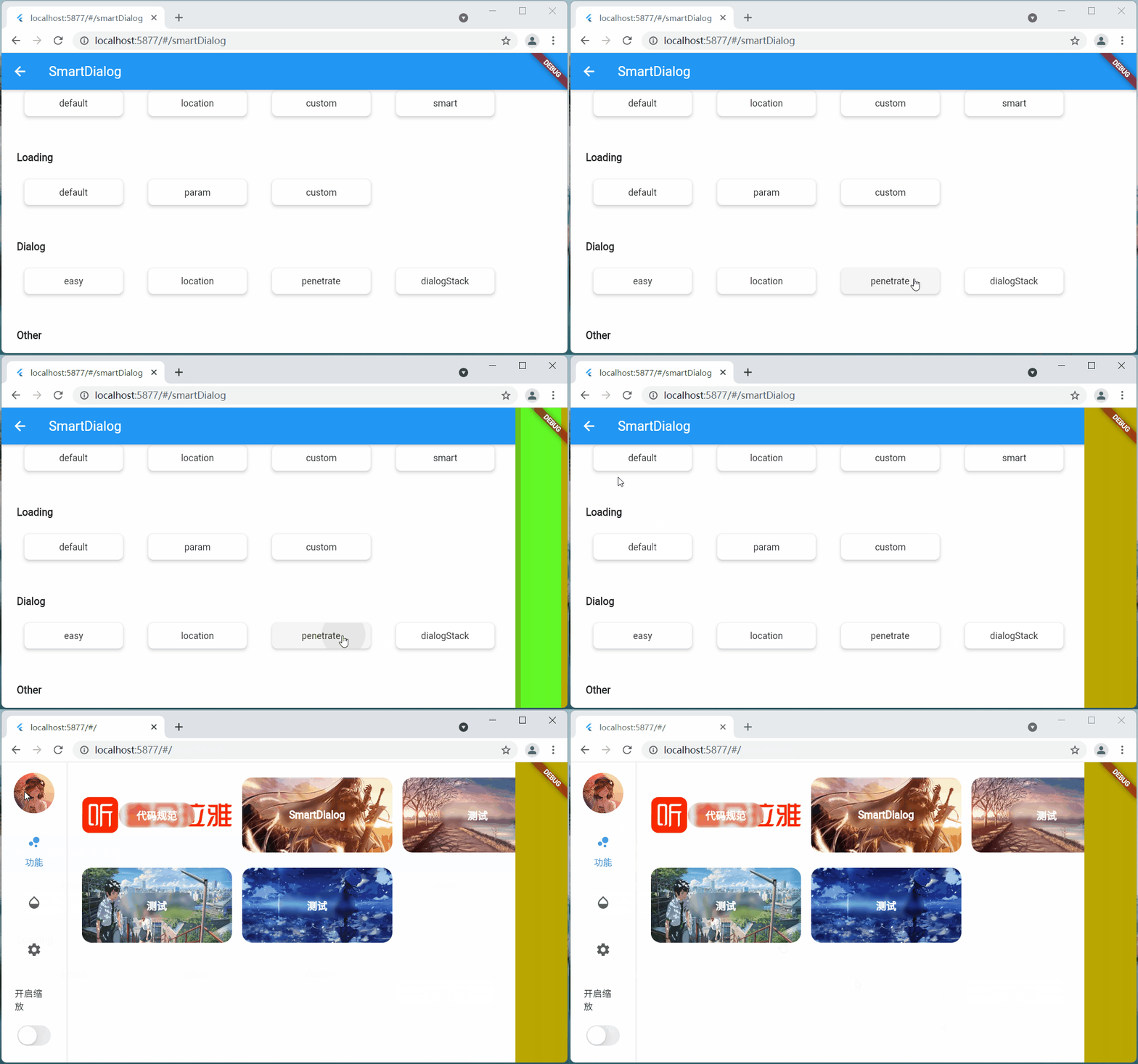
Although the monitoring of the return button can cover most scenes, some manual pop scenes need to add parameter monitoring
- Do not add
FlutterSmartDialog.observer- If the penetration parameter is turned on (you can interact with the page after the dialog), then manually close the page
- There will be such an embarrassing situation
-
Add
FlutterSmartDialog.observer, it can be handled more reasonably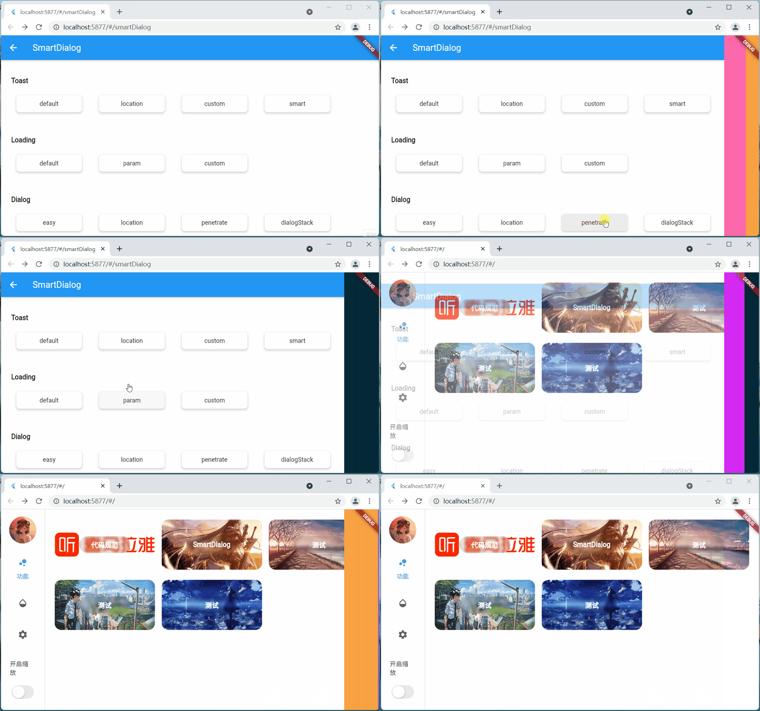
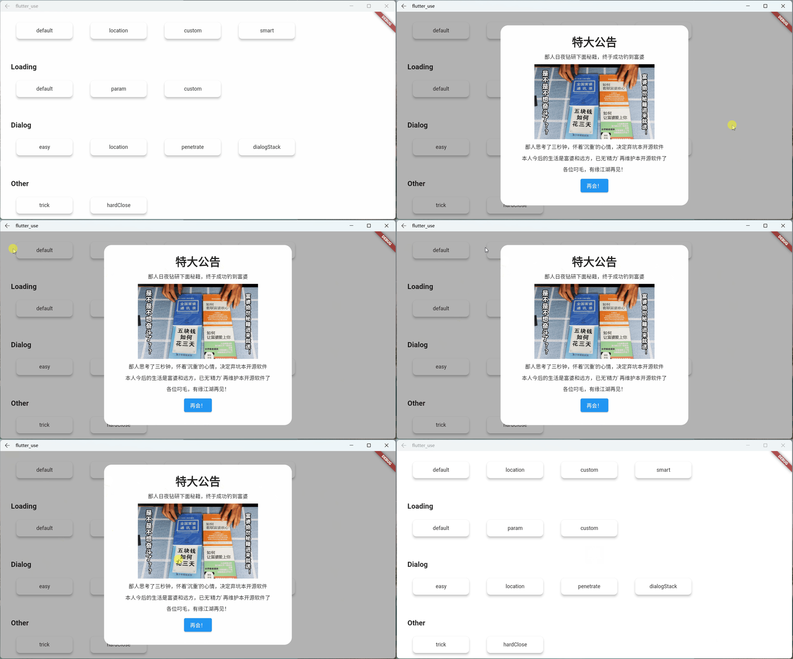
Super practical parameter: backDismiss
- This parameter is set to
trueby default, and the dialog will be closed by default when returning; if it is set tofalse, the page will not be closed- In this way, an emergency dialog can be made very easily, prohibiting the user's next operation
- Let’s look at a scenario: Suppose an open source author decides to abandon the software and does not allow users to use the software’s dialog
Set Global Parameters
you can modify the global parameters that meet your own requirements
SmartDialog.config
  ..alignment = Alignment.center
  ..isPenetrate = false
  ..clickBgDismiss = true
  ..maskColor = Colors.black.withOpacity(0.35)
  ..maskWidget = null
  ..animationDuration = Duration(milliseconds: 260)
  ..isUseAnimation = true
  ..isLoading = true
  ..debounce = false
  ..debounceTime = Duration(milliseconds: 300);
Attach Chapter #
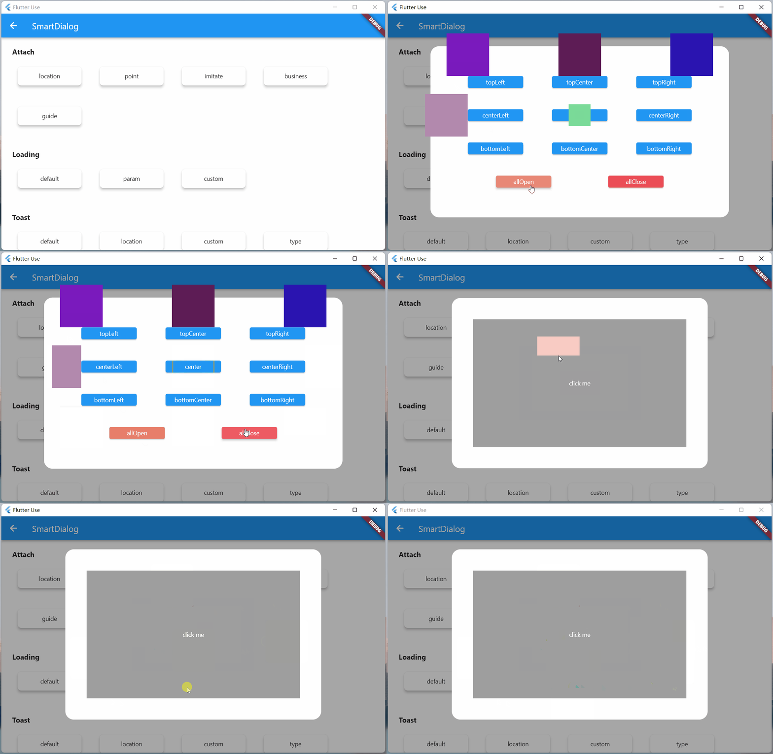
This is a very important function. I wanted to add it a long time ago, but it was busy and has been shelved; New Year's Day (2022.1.1) started, and it took some time to complete this function and related demos.
position #
It is not difficult to locate the coordinates of the target widget; however, we must get the size of the custom widget that we passed in, so that the custom widget can be stacked to a more appropriate position of the target widget (by some calculations, get the center point)
- In fact, Flutter provides a very suitable component
CustomSingleChildLayout, this component also provides offset coordinate function, logically very suitable - However,
CustomSingleChildLayoutandSizeTransitionanimation controls have a footprint conflict, so you can only use theAnimatedOpacityfade animation - Displacement animation can't be used, I can't bear it, I abandon
CustomSingleChildLayout; after using various operations, I finally get the size of the custom widget, which achieves the effect perfectly
Locate the dialog, use the showAttach method, the parameter comments are written in quite detail, if you don’t understand the usage, just look at the comments
Powerful positioning function
- The BuildContext of the target widget must be passed, and the coordinates and size of the target widget need to be calculated through this
var attach = (BuildContext context, AlignmentGeometry alignment) async {
  SmartDialog.showAttach(
    targetContext: context,
    isPenetrateTemp: true,
    alignmentTemp: alignment,
    clickBgDismissTemp: false,
    widget: Container(width: 100, height: 100, color: randomColor()),
  );
  await Future.delayed(Duration(milliseconds: 350));
};

//target widget
List<BuildContext> contextList = [];
List<Future Function()> funList = [
  () async => await attach(contextList[0], Alignment.topLeft),
  () async => await attach(contextList[1], Alignment.topCenter),
  () async => await attach(contextList[2], Alignment.topRight),
  () async => await attach(contextList[3], Alignment.centerLeft),
  () async => await attach(contextList[4], Alignment.center),
  () async => await attach(contextList[5], Alignment.centerRight),
  () async => await attach(contextList[6], Alignment.bottomLeft),
  () async => await attach(contextList[7], Alignment.bottomCenter),
  () async => await attach(contextList[8], Alignment.bottomRight),
];
var btn = ({
  required String title,
  required Function(BuildContext context) onTap,
}) {
  return Builder(builder: (context) {
    Color? color = title.contains('all') ? randomColor() : null;
    contextList.add(context);
    return Container(
      width: 130,
      child: ElevatedButton(
        style: ButtonStyle(
          backgroundColor: ButtonStyleButton.allOrNull<Color>(color),
        ),
        onPressed: () => onTap(context),
        child: Text('$title'),
      ),
    );
  });
};

SmartDialog.show(
  isLoadingTemp: false,
  widget: Container(
    width: 700,
    padding: EdgeInsets.all(70),
    decoration: BoxDecoration(
      borderRadius: BorderRadius.circular(20),
      color: Colors.white,
    ),
    child: Wrap(
      spacing: 50,
      runSpacing: 50,
      alignment: WrapAlignment.spaceEvenly,
      children: [
        btn(title: 'topLeft', onTap: (context) => funList[0]()),
        btn(title: 'topCenter', onTap: (context) => funList[1]()),
        btn(title: 'topRight', onTap: (context) => funList[2]()),
        btn(title: 'centerLeft', onTap: (context) => funList[3]()),
        btn(title: 'center', onTap: (context) => funList[4]()),
        btn(title: 'centerRight', onTap: (context) => funList[5]()),
        btn(title: 'bottomLeft', onTap: (context) => funList[6]()),
        btn(title: 'bottomCenter', onTap: (context) => funList[7]()),
        btn(title: 'bottomRight', onTap: (context) => funList[8]()),
        btn(
          title: 'allOpen',
          onTap: (_) async {
            for (var item in funList) {
              await item();
            }
          },
        ),
        btn(
          title: 'allClose',
          onTap: (_) => SmartDialog.dismiss(status: SmartStatus.allAttach),
        ),
      ],
    ),
  ),
);
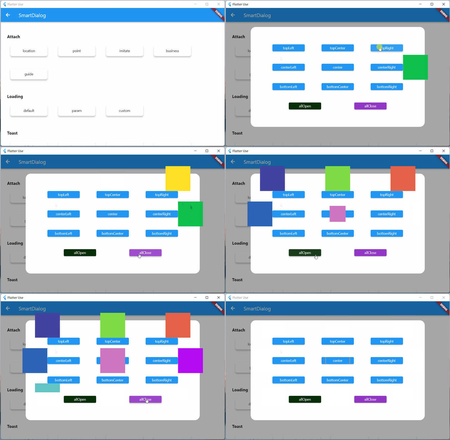
- The animation effect and the show method are almost the same. For this consistent experience, a lot of targeted optimizations have been made internally
Custom coordinate points
- In most cases, targetContext is basically used
SmartDialog.showAttach(
  targetContext: context,
  widget: Container(width: 100, height: 100, color: Colors.red),
);
- Of course, there are a few cases where custom coordinates need to be used. The target parameter is also provided here: if the target parameter is set, the targetContext will automatically become invalid
- targetContext is very common to the scene, so it is set here as a required parameter, but you can set it to null
SmartDialog.showAttach(
  targetContext: null,
  target: Offset(100, 100);,
  widget: Container(width: 100, height: 100, color: Colors.red),
);
- It seems that the effect of custom coordinate points
var attach = (Offset offset) {
  var random = Random().nextInt(100) % 5;
  var alignment = Alignment.topCenter;
  if (random == 0) alignment = Alignment.topCenter;
  if (random == 1) alignment = Alignment.centerLeft;
  if (random == 2) alignment = Alignment.center;
  if (random == 3) alignment = Alignment.centerRight;
  if (random == 4) alignment = Alignment.bottomCenter;
  SmartDialog.showAttach(
    targetContext: null,
    target: offset,
    isPenetrateTemp: true,
    clickBgDismissTemp: false,
    alignmentTemp: alignment,
    keepSingle: true,
    widget: ClipRRect(
      borderRadius: BorderRadius.circular(10),
      child: Container(width: 100, height: 100, color: randomColor()),
    ),
  );
};

SmartDialog.show(
  isLoadingTemp: false,
  widget: Container(
    width: 600,
    height: 400,
    alignment: Alignment.center,
    decoration: BoxDecoration(
      borderRadius: BorderRadius.circular(20),
      color: Colors.white,
    ),
    child: GestureDetector(
      onTapDown: (detail) => attach(detail.globalPosition),
      child: Container(
        width: 500,
        height: 300,
        color: Colors.grey,
        alignment: Alignment.center,
        child: Text('click me', style: TextStyle(color: Colors.white)),
      ),
    ),
  ),
);
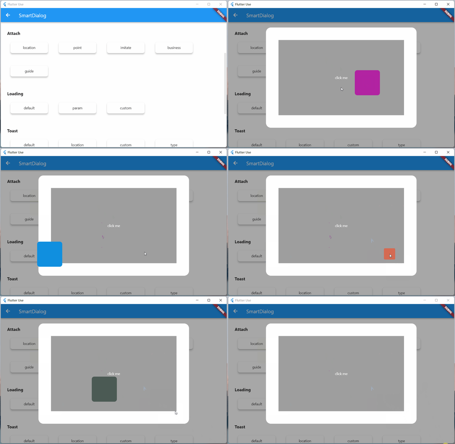
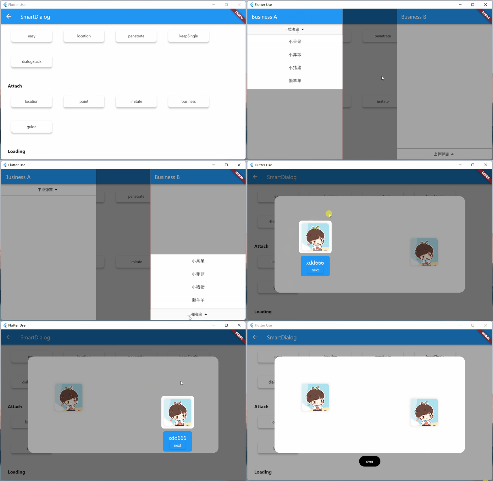
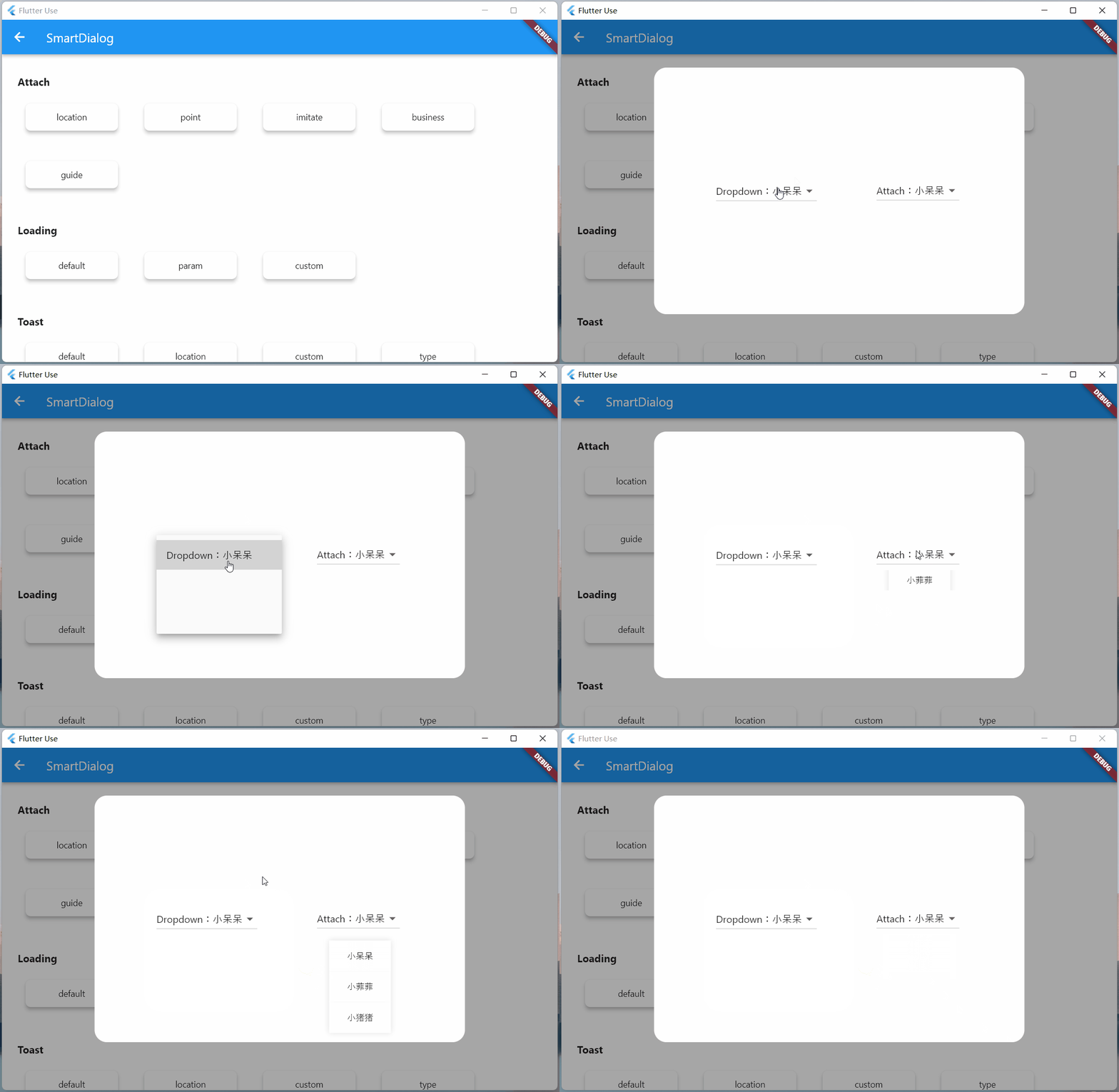
Imitate DropdownButton
-
Actually imitating DropdownButton is not easy
-
First calculate the position of the DropdownButton control, and display the clicked fold control on its position
-
Need to handle the click event of the area outside the DropdownButton (click outside the area to close the DropdownButton)
-
You also need to listen to the return event and manually pop the routing event; for this type of event, you need to turn off the DropdownButton
-
-
This thing needs to be customized, which is quite daunting; however, now you can use
SmartDialog.showAttachto imitate one easily, and the above matters needing attention are all taken care of for you
//模仿DropdownButton
var imitate = (BuildContext context) {
  var list = ['小呆呆', '小菲菲', '小猪猪'];
  SmartDialog.showAttach(
    targetContext: context,
    isPenetrateTemp: true,
    widget: Container(
      margin: EdgeInsets.all(10),
      decoration: BoxDecoration(
        boxShadow: [
          BoxShadow(color: Colors.black12, blurRadius: 8, spreadRadius: 0.2)
        ],
      ),
      child: Column(
        children: List.generate(list.length, (index) {
          return Material(
            color: Colors.white,
            child: InkWell(
              onTap: () => SmartDialog.dismiss(),
              child: Container(
                height: 50,
                width: 100,
                alignment: Alignment.center,
                child: Text('${list[index]}'),
              ),
            ),
          );
        }),
      ),
    ),
  );
};

//imitate widget
var dropdownButton = ({String title = 'Dropdown'}) {
  return DropdownButton<String>(
    value: '1',
    items: [
      DropdownMenuItem(value: '1', child: Text('$title:小呆呆')),
      DropdownMenuItem(value: '2', child: Text('小菲菲')),
      DropdownMenuItem(value: '3', child: Text('小猪猪'))
    ],
    onChanged: (value) {},
  );
};
var imitateDropdownButton = () {
  return Builder(builder: (context) {
    return Stack(children: [
      dropdownButton(title: 'Attach'),
      GestureDetector(
        onTap: () => imitate(context),
        child: Container(height: 50, width: 140, color: Colors.transparent),
      )
    ]);
  });
};
SmartDialog.show(
  isLoadingTemp: false,
  widget: Container(
    width: 600,
    height: 400,
    alignment: Alignment.center,
    padding: EdgeInsets.symmetric(horizontal: 100),
    decoration: BoxDecoration(
      borderRadius: BorderRadius.circular(20),
      color: Colors.white,
    ),
    child: MaterialApp(
      debugShowCheckedModeBanner: false,
      home: Row(
        mainAxisAlignment: MainAxisAlignment.spaceBetween,
        children: [dropdownButton(), imitateDropdownButton()],
      ),
    ),
  ),
);
Highlight #
This time, the function of highlighting a specific area of the mask has been added, which is a very practical function!
-
You only need to set the
highlightparameter-
Define the highlighted area, it must be an impenetrable Widget, such as Contaienr, and a color must be set (the color value is not required)
- It is also possible to use all kinds of weird pictures, so that you can display the highlighted areas of various complex graphics
-
The highlight type is Positioned, you can position the area that needs to be highlighted on the screen arbitrarily
-
SmartDialog.showAttach(
  targetContext: context,
  alignmentTemp: Alignment.bottomCenter,
  highlight: Positioned(
    right: 190,
    bottom: 190,
    child: Container(
      height: 120,
      width: 120,
      decoration: BoxDecoration(
        borderRadius: BorderRadius.circular(10),
        color: Colors.white,
      ),
    ),
  ),
  widget: Container(width: 100, height: 100, color: Colors.red),
);
Actual business scenario
- Here are two common examples. The code is a little bit too much, so I won’t post it. If you’re interested, please check it out:flutter_use

The above two business scenarios are very common, we need the target widget above or below or a specific area, not covered by a mask
If you do it yourself, you can make it, but it will be very troublesome; now you can use the highlight parameter in showAttach to easily achieve this requirement
Guide Operation
Guided operation is still very common on the app, you need to highlight the designated area, and then introduce its function
- Using the
highlightparameter inshowAttach, this requirement can also be easily achieved, let's see the effect- The code is also a little bit more, if you are interested, please check: flutter_use

Dialog #
Fancy #
- alignmentTemp: The animation effect will be different if the parameter setting is different
var location = ({
  double width = double.infinity,
  double height = double.infinity,
}) {
  return Container(width: width, height: height, color: randomColor());
};

//left
SmartDialog.show(
  widget: location(width: 70),
  alignmentTemp: Alignment.centerLeft,
);
await Future.delayed(Duration(milliseconds: 500));
//top
SmartDialog.show(
  widget: location(height: 70),
  alignmentTemp: Alignment.topCenter,
);
await Future.delayed(Duration(milliseconds: 500));
//right
SmartDialog.show(
  widget: location(width: 70),
  alignmentTemp: Alignment.centerRight,
);
await Future.delayed(Duration(milliseconds: 500));
//bottom
SmartDialog.show(
  widget: location(height: 70),
  alignmentTemp: Alignment.bottomCenter,
);
await Future.delayed(Duration(milliseconds: 500));
//center
SmartDialog.show(
  widget: location(height: 100, width: 100),
  alignmentTemp: Alignment.center,
  isLoadingTemp: false,
);
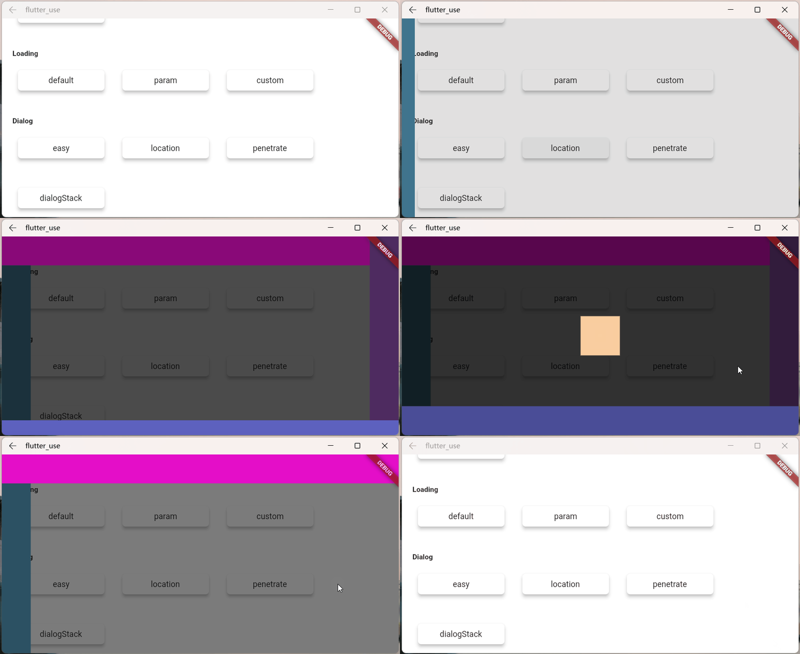
- isPenetrateTemp: Interaction event penetration mask
SmartDialog.show(
    alignmentTemp: Alignment.centerRight,
    isPenetrateTemp: true,
    clickBgDismissTemp: false,
    widget: Container(
        width: 80,
        height: double.infinity,
        color: randomColor(),
    ),
);

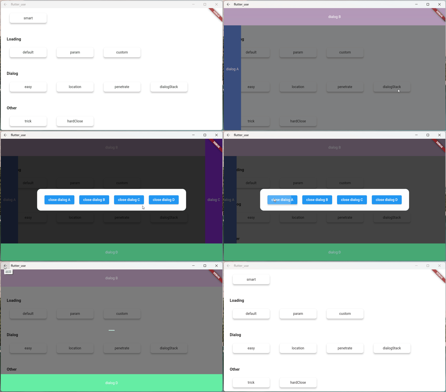
dialog stack #
- This is a powerful and useful feature!
- You can easily close a dialog at a fixed point
var stack = ({
  double width = double.infinity,
  double height = double.infinity,
  String? msg,
}) {
  return Container(
    width: width,
    height: height,
    color: randomColor(),
    alignment: Alignment.center,
    child: Text('dialog $msg', style: TextStyle(color: Colors.white)),
  );
};

//left
SmartDialog.show(
  tag: 'A',
  widget: stack(msg: 'A', width: 70),
  alignmentTemp: Alignment.centerLeft,
);
await Future.delayed(Duration(milliseconds: 500));
//top
SmartDialog.show(
  tag: 'B',
  widget: stack(msg: 'B', height: 70),
  alignmentTemp: Alignment.topCenter,
);
await Future.delayed(Duration(milliseconds: 500));
//right
SmartDialog.show(
  tag: 'C',
  widget: stack(msg: 'C', width: 70),
  alignmentTemp: Alignment.centerRight,
);
await Future.delayed(Duration(milliseconds: 500));
//bottom
SmartDialog.show(
  tag: 'D',
  widget: stack(msg: 'D', height: 70),
  alignmentTemp: Alignment.bottomCenter,
);
await Future.delayed(Duration(milliseconds: 500));

//center:the stack handler
SmartDialog.show(
  alignmentTemp: Alignment.center,
  isLoadingTemp: false,
  widget: Container(
    decoration: BoxDecoration(
        color: Colors.white, borderRadius: BorderRadius.circular(15)),
    padding: EdgeInsets.symmetric(horizontal: 30, vertical: 20),
    child: Wrap(spacing: 20, children: [
      ElevatedButton(
        child: Text('close dialog A'),
        onPressed: () => SmartDialog.dismiss(tag: 'A'),
      ),
      ElevatedButton(
        child: Text('close dialog B'),
        onPressed: () => SmartDialog.dismiss(tag: 'B'),
      ),
      ElevatedButton(
        child: Text('close dialog C'),
        onPressed: () => SmartDialog.dismiss(tag: 'C'),
      ),
      ElevatedButton(
        child: Text('close dialog D'),
        onPressed: () => SmartDialog.dismiss(tag: 'D'),
      ),
    ]),
  ),
);
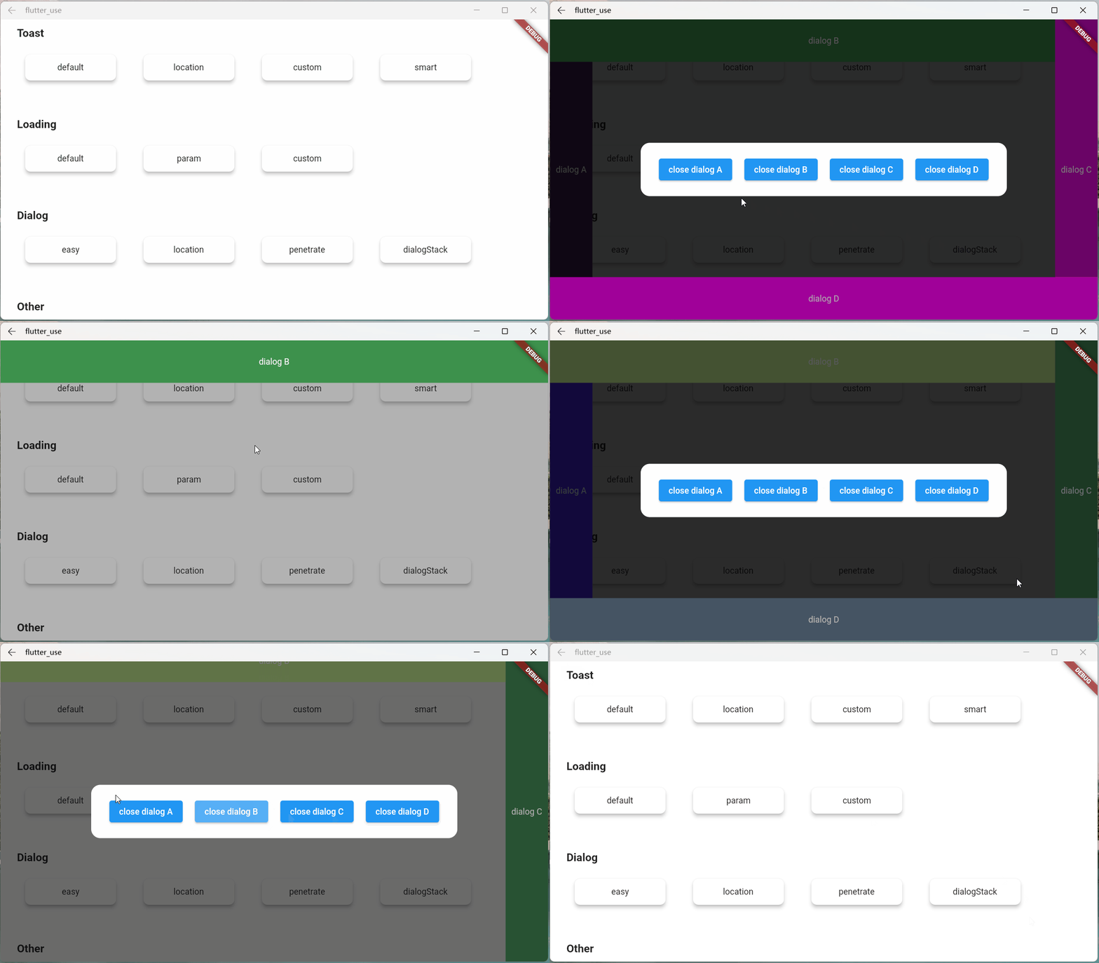
Loading Chapter #
Parameter Description #
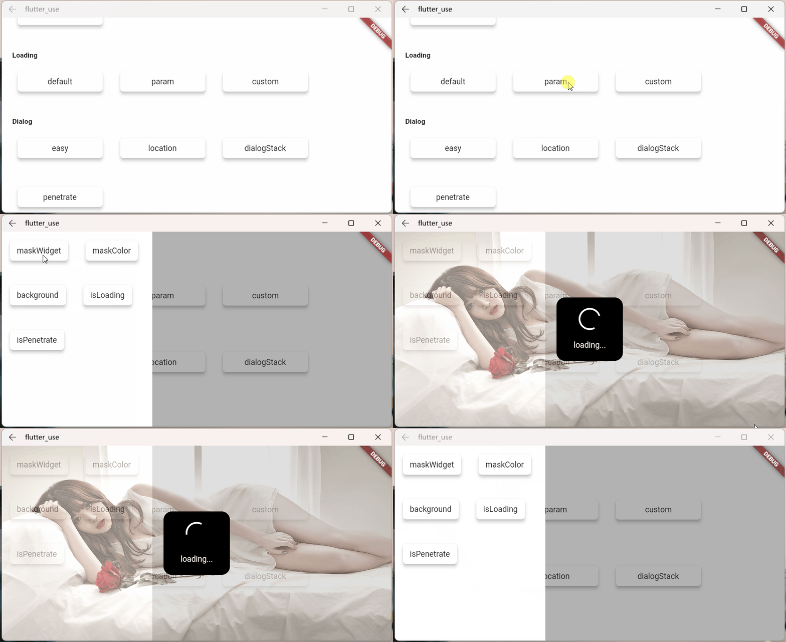
- maskWidgetTemp: powerful mask customization function😆, use your brain. . .
var maskWidget = Container(
  width: double.infinity,
  height: double.infinity,
  child: Opacity(
    opacity: 0.6,
    child: Image.network(
      'https://cdn.jsdelivr.net/gh/xdd666t/MyData@master/pic/flutter/blog/20211101103911.jpeg',
      fit: BoxFit.fill,
    ),
  ),
);
SmartDialog.showLoading(maskWidgetTemp: maskWidget);
- maskColorTemp: support quick custom mask color
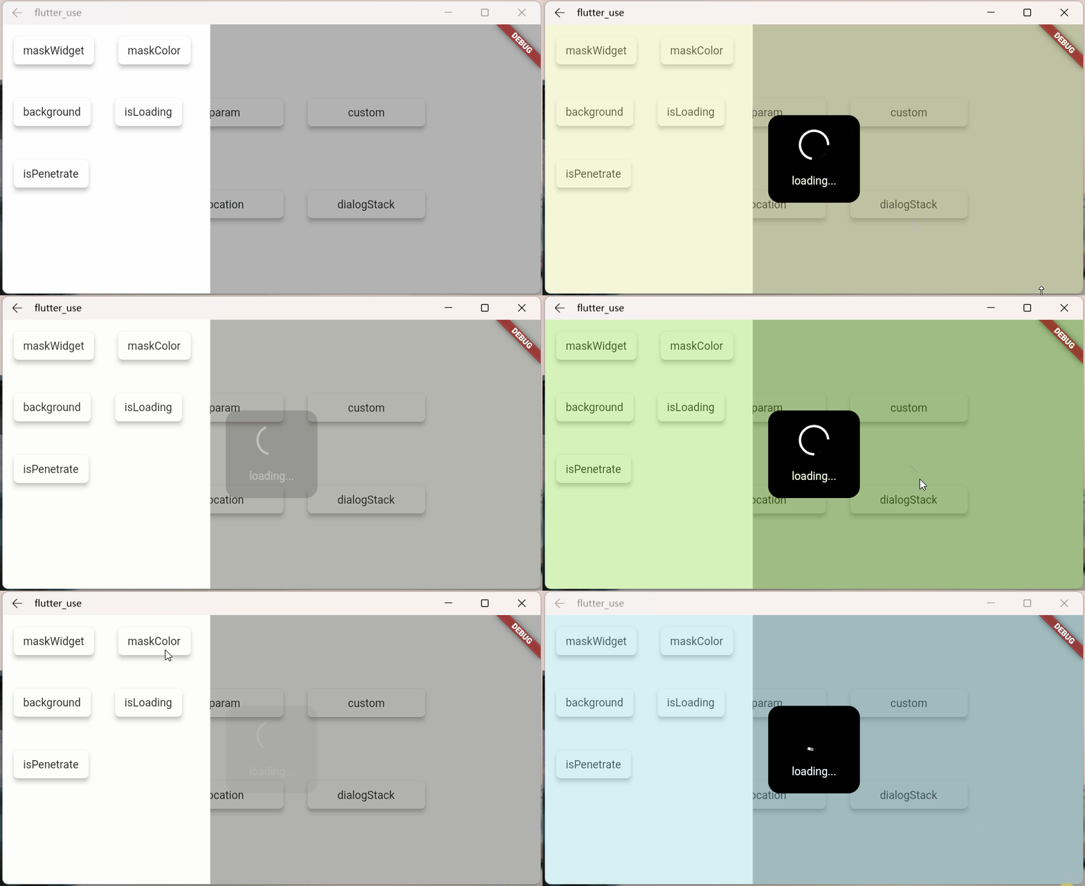
SmartDialog.showLoading(maskColorTemp: randomColor().withOpacity(0.3));

/// random color
Color randomColor() => Color.fromRGBO(
    Random().nextInt(256), Random().nextInt(256), Random().nextInt(256), 1);
- background: support loading background customization
SmartDialog.showLoading(background: randomColor());

/// random color
Color randomColor() => Color.fromRGBO(
    Random().nextInt(256), Random().nextInt(256), Random().nextInt(256), 1);

- isLoadingTemp: Animation effect switch
SmartDialog.showLoading(isLoadingTemp: false);

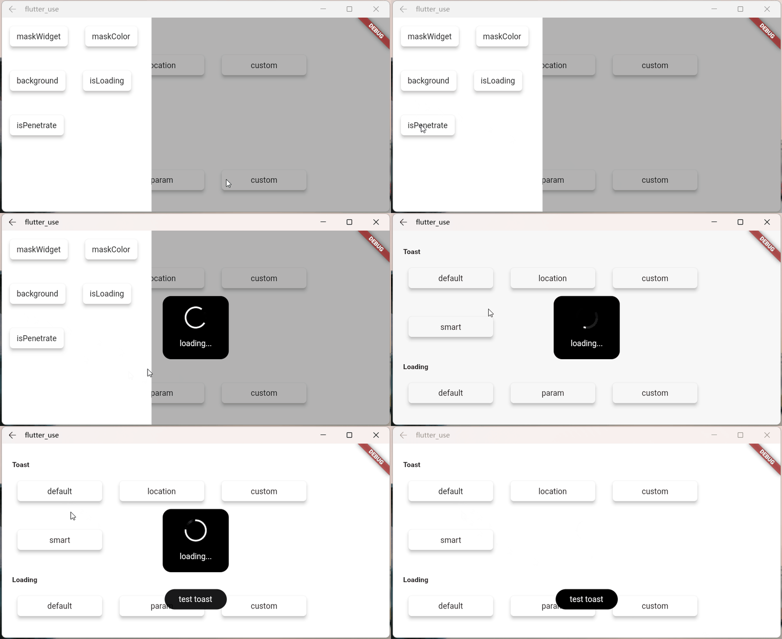
- isPenetrateTemp: Interaction events can penetrate the mask, which is a very useful function, which is very important for some special demand scenes
SmartDialog.showLoading(isPenetrateTemp: true);
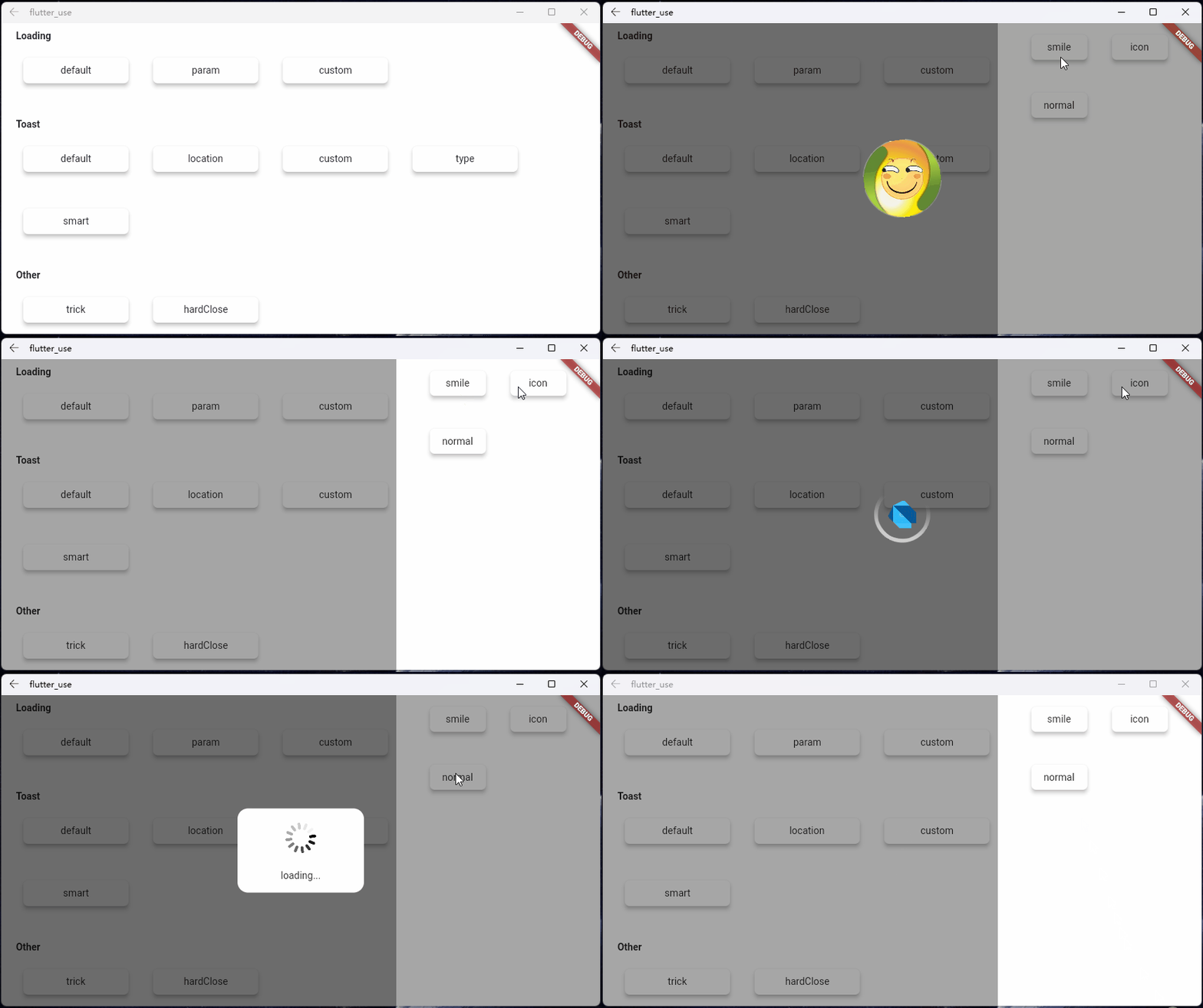
Custom Loading #
Use showLoading to easily customize the powerful loading dialog; I have limited brains, just demonstrate it briefly
Customize a loading layout
class CustomLoading extends StatefulWidget {
  const CustomLoading({Key? key, this.type = 0}): super(key: key);

  final int type;

  @override
  _CustomLoadingState createState() => _CustomLoadingState();
}

class _CustomLoadingState extends State<CustomLoading>
    with TickerProviderStateMixin {
  late AnimationController _controller;

  @override
  void initState() {
    _controller = AnimationController(
      duration: const Duration(milliseconds: 800),
      vsync: this,
    );
    _controller.forward();
    _controller.addStatusListener((status) {
      if (status == AnimationStatus.completed) {
        _controller.reset();
        _controller.forward();
      }
    });
    super.initState();
  }

  @override
  Widget build(BuildContext context) {
    return Stack(children: [
      // smile
      Visibility(visible: widget.type == 0, child: _buildLoadingOne()),

      // icon
      Visibility(visible: widget.type == 1, child: _buildLoadingTwo()),

      // normal
      Visibility(visible: widget.type == 2, child: _buildLoadingThree()),
    ]);
  }

  Widget _buildLoadingOne() {
    return Stack(alignment: Alignment.center, children: [
      RotationTransition(
        alignment: Alignment.center,
        turns: _controller,
        child: Image.network(
          'https://cdn.jsdelivr.net/gh/xdd666t/MyData@master/pic/flutter/blog/20211101174606.png',
          height: 110,
          width: 110,
        ),
      ),
      Image.network(
        'https://cdn.jsdelivr.net/gh/xdd666t/MyData@master/pic/flutter/blog/20211101181404.png',
        height: 60,
        width: 60,
      ),
    ]);
  }

  Widget _buildLoadingTwo() {
    return Stack(alignment: Alignment.center, children: [
      Image.network(
        'https://cdn.jsdelivr.net/gh/xdd666t/MyData@master/pic/flutter/blog/20211101162946.png',
        height: 50,
        width: 50,
      ),
      RotationTransition(
        alignment: Alignment.center,
        turns: _controller,
        child: Image.network(
          'https://cdn.jsdelivr.net/gh/xdd666t/MyData@master/pic/flutter/blog/20211101173708.png',
          height: 80,
          width: 80,
        ),
      ),
    ]);
  }

  Widget _buildLoadingThree() {
    return Center(
      child: Container(
        height: 120,
        width: 180,
        decoration: BoxDecoration(
          color: Colors.white,
          borderRadius: BorderRadius.circular(15),
        ),
        alignment: Alignment.center,
        child: Column(mainAxisSize: MainAxisSize.min, children: [
          RotationTransition(
            alignment: Alignment.center,
            turns: _controller,
            child: Image.network(
              'https://cdn.jsdelivr.net/gh/xdd666t/MyData@master/pic/flutter/blog/20211101163010.png',
              height: 50,
              width: 50,
            ),
          ),
          Container(
            margin: EdgeInsets.only(top: 20),
            child: Text('loading...'),
          ),
        ]),
      ),
    );
  }

  @override
  void dispose() {
    _controller.dispose();
    super.dispose();
  }
}
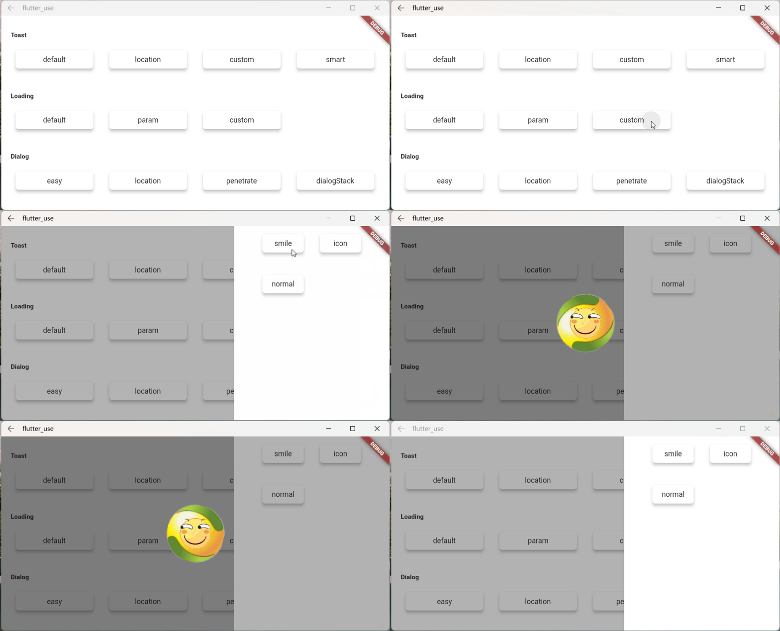
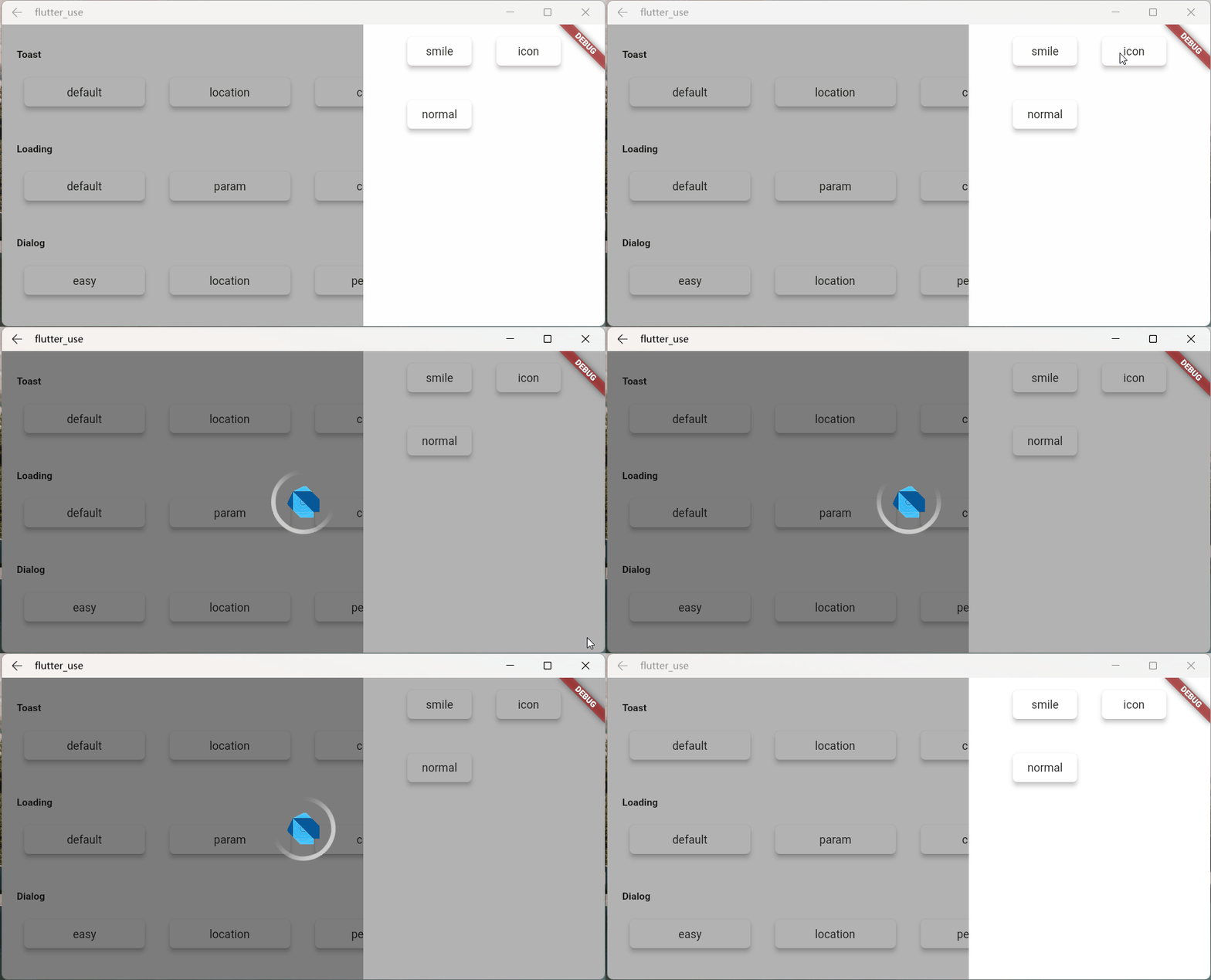
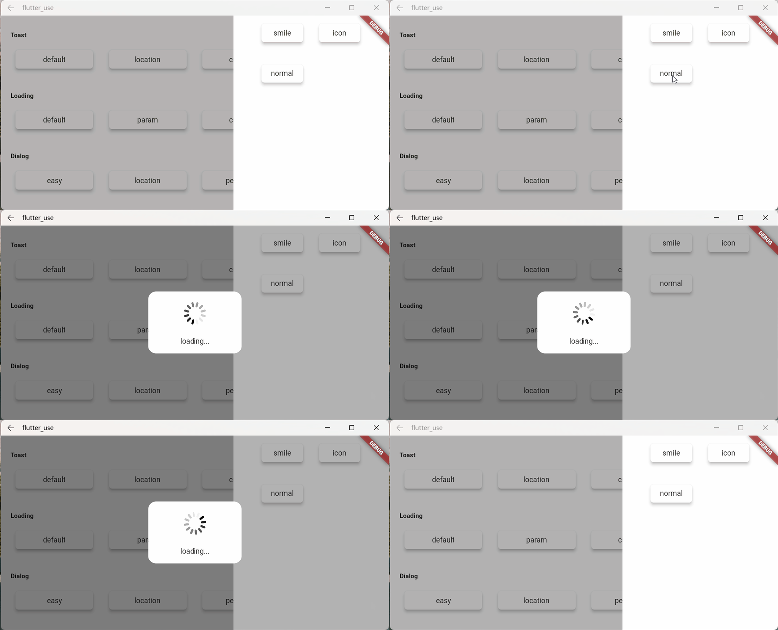
Let's see the effect
- Effect one
SmartDialog.showLoading(isLoadingTemp: false, widget: CustomLoading());
await Future.delayed(Duration(seconds: 2));
SmartDialog.dismiss();
- Effect two
SmartDialog.showLoading(
    isLoadingTemp: false,
    widget: CustomLoading(type: 1),
);
await Future.delayed(Duration(seconds: 2));
SmartDialog.dismiss();
- Effect three
SmartDialog.showLoading(widget: CustomLoading(type: 2));
await Future.delayed(Duration(seconds: 2));
SmartDialog.dismiss();
Toast Chapter #
The particularity of toast #
Strictly speaking, toast is a very special dialog, I think it should have the following characteristics
Toast messages should be displayed one by one, and subsequent messages should not top off the previous toast
- This is a pit point. If the frame is not processed inside, it is easy to cause the back toast to directly top off the front toast.
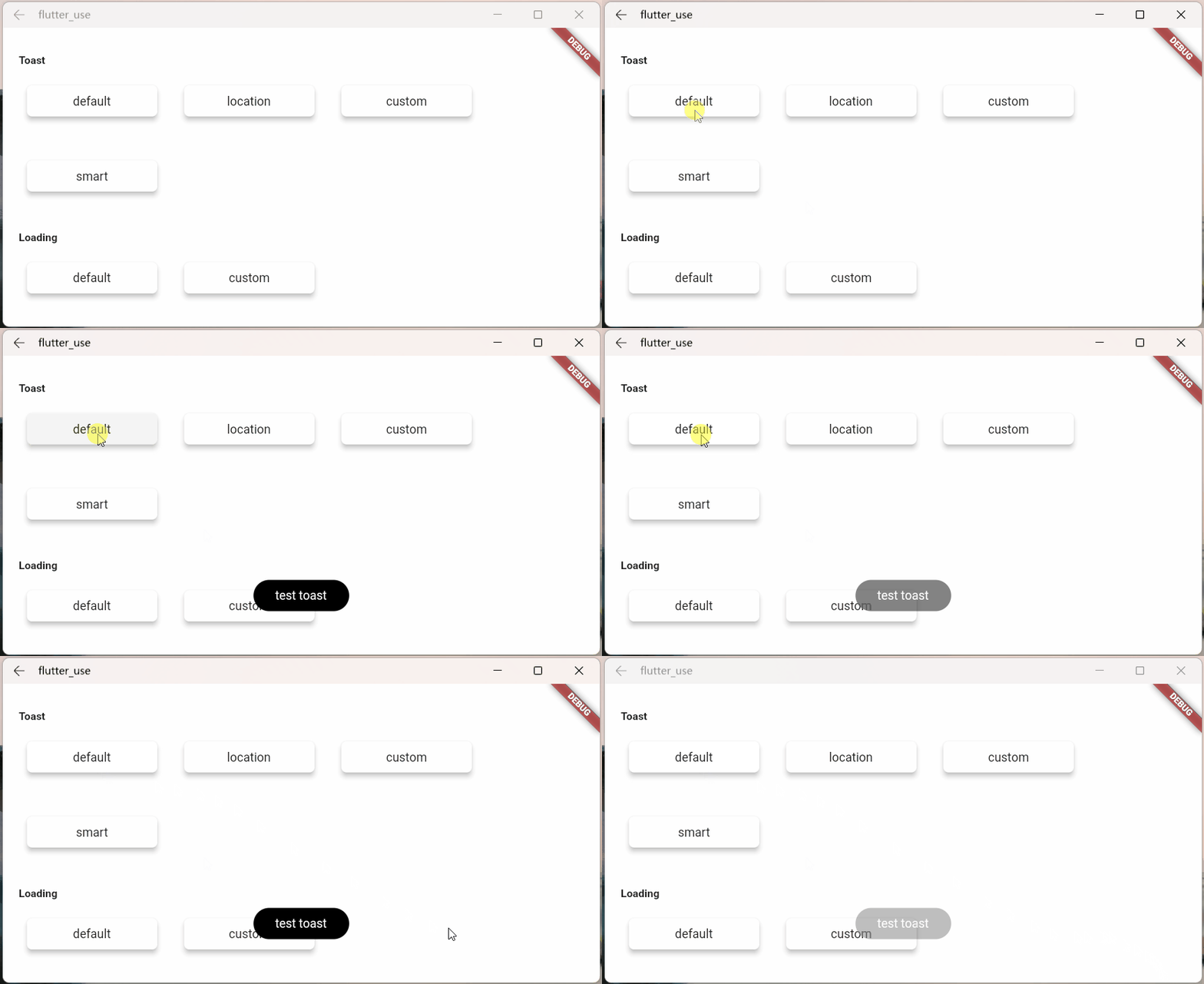
Displayed on the top level of the page, should not be blocked by some other dialog
- You can find layouts such as loading and dialog masks, none of which obscures the toast information

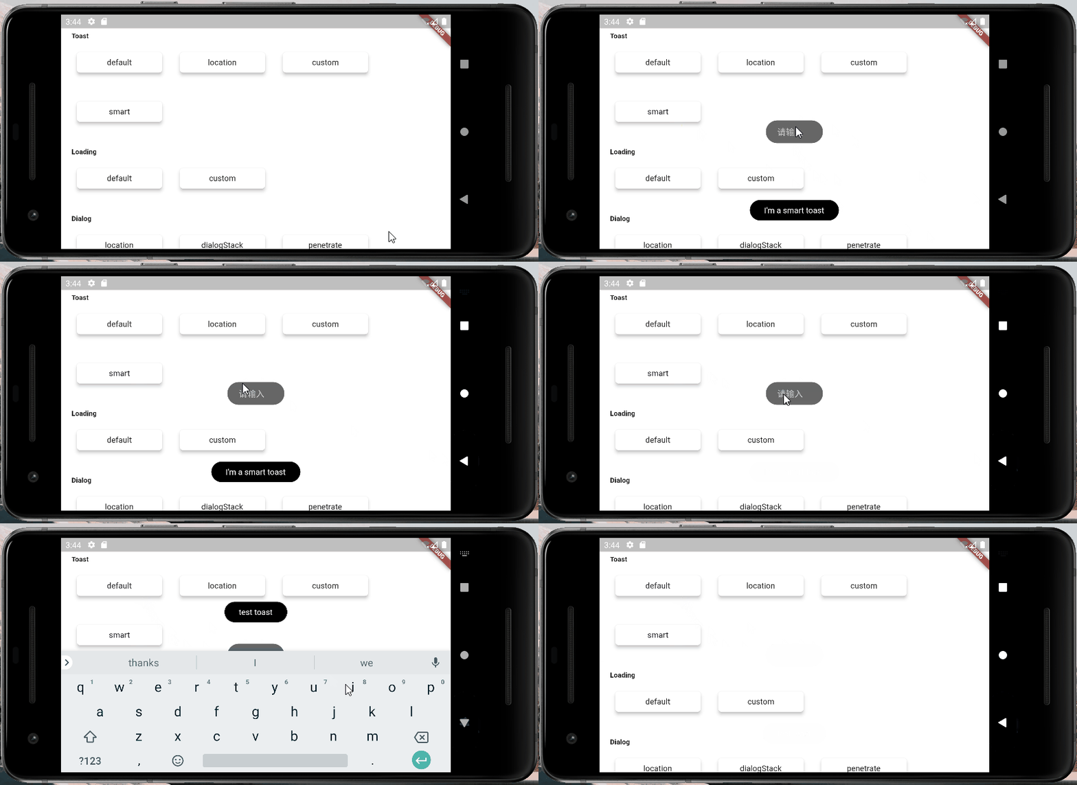
Handle the occlusion of the keyboard
- The keyboard is a bit tricky, it will directly obscure all layouts
- when the keyboard is awakened, toast will dynamically adjust the distance between itself and the bottom of the screen
- This will have the effect that the keyboard will not block the toast
Custom Toast #
- First, a custom toast
class CustomToast extends StatelessWidget {
  const CustomToast(this.msg, {Key? key}): super(key: key);

  final String msg;

  @override
  Widget build(BuildContext context) {
    return Align(
      alignment: Alignment.bottomCenter,
      child: Container(
        margin: EdgeInsets.only(bottom: 30),
        padding: EdgeInsets.symmetric(horizontal: 20, vertical: 7),
        decoration: BoxDecoration(
          color: _randomColor(),
          borderRadius: BorderRadius.circular(100),
        ),
        child: Row(mainAxisSize: MainAxisSize.min, children: [
          //icon
          Container(
            margin: EdgeInsets.only(right: 15),
            child: Icon(Icons.add_moderator, color: _randomColor()),
          ),

          //msg
          Text('$msg', style: TextStyle(color: Colors.white)),
        ]),
      ),
    );
  }

  Color _randomColor() {
    return Color.fromRGBO(
      Random().nextInt(256),
      Random().nextInt(256),
      Random().nextInt(256),
      1,
    );
  }
}
- use
SmartDialog.showToast('', widget: CustomToast('custom toast'));
- Effect

Little tricks of anger #
There is a scene that compares the egg cone
- We encapsulated a small component using StatefulWidget
- In a special situation, we need to trigger a method inside this component outside the component
- There are many implementation methods for this kind of scene, but it may be a little troublesome to make it
Here is a simple idea, which can be triggered very easily, a method inside the component
- Create a widget
class OtherTrick extends StatefulWidget {
  const OtherTrick({Key? key, this.onUpdate}): super(key: key);

  final Function(VoidCallback onInvoke)? onUpdate;

  @override
  _OtherTrickState createState() => _OtherTrickState();
}

class _OtherTrickState extends State<OtherTrick> {
  int _count = 0;

  @override
  void initState() {
    // here
    widget.onUpdate?.call(() {
      _count++;
      setState(() {});
    });

    super.initState();
  }

  @override
  Widget build(BuildContext context) {
    return Center(
      child: Container(
        padding: EdgeInsets.symmetric(horizontal: 50, vertical: 20),
        decoration: BoxDecoration(
          color: Colors.white,
          borderRadius: BorderRadius.circular(10),
        ),
        child: Text('Counter: $_count', style: TextStyle(fontSize: 30.0)),
      ),
    );
  }
}
- Show this component and then trigger it externally
VoidCallback? callback;

// display
SmartDialog.show(
  alignmentTemp: Alignment.center,
  widget: OtherTrick(
    onUpdate: (VoidCallback onInvoke) => callback = onInvoke,
  ),
);

await Future.delayed(Duration(milliseconds: 500));

// handler
SmartDialog.show(
  alignmentTemp: Alignment.centerRight,
  maskColorTemp: Colors.transparent,
  widget: Container(
    height: double.infinity,
    width: 150,
    color: Colors.white,
    alignment: Alignment.center,
    child: ElevatedButton(
      child: Text('add'),
      onPressed: () => callback?.call(),
    ),
  ),
);
- Let's see the effect


