flutter_sliding_up_panel 1.1.0+1  flutter_sliding_up_panel: ^1.1.0+1 copied to clipboard
 tookit.cn
A sliding up panel widget which can be used to show or hide content, beautiful and simple.
flutter_sliding_up_panel #
A sliding up panel widget which can be used to show or hide content, beautiful and simple.
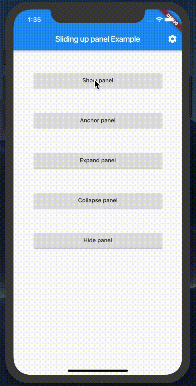
demo #
Getting Started #
dependencies:
  flutter_sliding_up_panel: ^1.1.0+1
import 'package:flutter_sliding_up_panel/flutter_sliding_up_panel.dart';
Stack(
  children: <Widget>[
    Scaffold(
      appBar: AppBar(
        title: Text(widget.title),
        actions: <Widget>[
          IconButton(
            icon: Icon(Icons.settings),
            onPressed: () {
              widget.onSetting?.call();
            },
          )
        ],
      ),
      body: Container(
        child:Center(
          child:Text('This is content'),
        ),
      ),
    ),
    SlidingUpPanelWidget(
      child: Container(
        margin: EdgeInsets.symmetric(horizontal: 15.0),
        decoration: ShapeDecoration(
          color: Colors.white,
          shadows: [BoxShadow(blurRadius: 5.0,spreadRadius: 2.0,color: const Color(0x11000000))],
          shape: RoundedRectangleBorder(
            borderRadius: BorderRadius.only(
              topLeft: Radius.circular(10.0),
              topRight: Radius.circular(10.0),
            ),
          ),
        ),
        child: Column(
          children: <Widget>[
            Container(
              color: Colors.white,
              alignment: Alignment.center,
              height: 50.0,
              child: Row(
                children: <Widget>[
                  Icon(Icons.menu,size: 30,),
                  Padding(
                    padding: EdgeInsets.only(left: 8.0,),
                  ),
                  Text(
                    'click or drag',
                  )
                ],
                mainAxisAlignment: MainAxisAlignment.center,
              ),
            ),
            Divider(
              height: 0.5,
              color: Colors.grey[300],
            ),
            Flexible(
              child: Container(
                child: ListView.separated(
                  controller: scrollController,
                  physics: ClampingScrollPhysics(),
                  itemBuilder: (context, index) {
                    return ListTile(
                      title: Text('list item $index'),
                    );
                  },
                  separatorBuilder: (context, index) {
                    return Divider(
                      height: 0.5,
                    );
                  },
                  shrinkWrap: true,
                  itemCount: 20,
                ),
                color: Colors.white,
              ),
            ),
          ],
          mainAxisSize: MainAxisSize.min,
        ),
      ),
      controlHeight: 50.0,
      anchor: 0.4,
      panelController: panelController,
      onTap: (){
         ///Customize the processing logic
         if(SlidingUpPanelStatus.expanded==panelController.status){
            panelController.collapse();
         }else{
            panelController.expand();
         }
      },  //Pass a onTap callback to customize the processing logic when user click control bar.
      enableOnTap: true,//Enable the onTap callback for control bar.
    ),
  ],
);
SlidingUpPanelWidget param #
| property | description |
|---|---|
| child | Widget (Not Null)(required) (Child widget) |
| controlHeight | double (Not Null)(required) (The height of the control bar which could be used to drag or click to control this panel) |
| animationController | AnimationController (The animation that controls the bottom sheet's position.) |
| panelController | SlidingUpPanelController (Not Null)(required) (The controller to control panel) |
| onStatusChanged | OnSlidingUpPanelStatusChanged (Called when the this panel status changed) |
| elevation | double (default 8.0) (Elevation of the panel) |
| panelStatus | SlidingUpPanelStatus (default SlidingUpPanelStatus.collapsed) (Panel status) |
| anchor | double (default 0.5) (The fraction of anchor position, which is from 0 to 1.0) |
| onTap | VoidCallback (default is a build-in callback) (Void callback when click control bar) |
| enableOnTap | bool (Not Null)(default is true) (Enable or disable the tap callback for control bar) |
Example #
Metadata
144
likes
0
pub points
94%
popularity
Publisher
Metadata
A sliding up panel widget which can be used to show or hide content, beautiful and simple.
Repository (GitHub)
View/report issues
License
 unknown (license)