flutter_skeleton_shimmer 0.1.1  flutter_skeleton_shimmer: ^0.1.1 copied to clipboard
A hybrid shimmer skeleton loading widget for Flutter. Auto-detects Text, Icon, Image widgets and supports explicit Bone() markers.
flutter_skeleton_shimmer #
A hybrid shimmer skeleton loading widget for Flutter. Wrap any widget tree with Shimmerize to automatically replace Text, Icon, Image, and CircleAvatar widgets with animated shimmer bones — no manual skeleton layout needed. For full control, drop in explicit Bone() markers.
Features #
- Auto-detects
Text,RichText,Icon,Image, andCircleAvatarwidgets and replaces them with shimmering skeleton bones - Explicit
Bone()widget for custom skeleton placeholders with precise dimensions - Themeable via
ShimmerThemeandShimmerThemeData - Smooth animated shimmer effect powered by
CustomPainter - Zero external dependencies
Installation #
Add to your pubspec.yaml:
dependencies:
  flutter_skeleton_shimmer: ^0.1.1
Then run:
flutter pub get
Quick Start #
import 'package:flutter_skeleton_shimmer/flutter_skeleton_shimmer.dart';

bool _isLoading = true;

Shimmerize(
  enabled: _isLoading,
  child: Card(
    child: Padding(
      padding: const EdgeInsets.all(16),
      child: Row(
        children: [
          const CircleAvatar(child: Icon(Icons.person)),
          const SizedBox(width: 16),
          Column(
            crossAxisAlignment: CrossAxisAlignment.start,
            children: [
              Text('John Doe', style: Theme.of(context).textTheme.titleMedium),
              const Text('john.doe@example.com'),
            ],
          ),
        ],
      ),
    ),
  ),
)
When enabled is true, all Text, Icon, and CircleAvatar widgets inside the tree are automatically replaced with animated shimmer bones sized to match the original widgets.
API Reference #
Shimmerize #
The main wrapper widget. Apply it anywhere in your tree to enable the shimmer effect.
| Property | Type | Required | Description |
|---|---|---|---|
enabled |
bool |
yes | Whether to show the skeleton shimmer |
child |
Widget |
yes | The widget tree to shimmerize |
When enabled is false, the child is rendered normally with no shimmer overhead.
Bone #
An explicit skeleton placeholder. Use it when auto-detection is not sufficient or when you want a specific size/shape.
// Rectangular bone
Bone(width: 200, height: 16)

// Full-width bone
const Bone(width: double.infinity, height: 120)

// Circular bone (avatar placeholder)
const Bone.circle(size: 48)
| Property | Type | Default | Description |
|---|---|---|---|
width |
double? |
— | Width of the bone (double.infinity for full-width) |
height |
double? |
— | Height of the bone |
borderRadius |
double? |
— | Corner radius (overrides theme default) |
isCircle |
bool |
false |
Render as a circle (set via Bone.circle) |
Bone.circle named constructor:
| Property | Type | Required | Description |
|---|---|---|---|
size |
double |
yes | Diameter of the circle |
ShimmerTheme #
An InheritedWidget that provides ShimmerThemeData to the widget subtree. Place it above Shimmerize to customise the shimmer appearance globally.
ShimmerTheme(
  data: ShimmerThemeData(
    baseColor: Colors.grey.shade300,
    highlightColor: Colors.grey.shade100,
    duration: const Duration(milliseconds: 1200),
    borderRadius: 8.0,
  ),
  child: MyScreen(),
)
| Property | Type | Required | Description |
|---|---|---|---|
data |
ShimmerThemeData |
yes | Theme configuration to apply |
child |
Widget |
yes | Subtree that inherits theme |
ShimmerThemeData #
Immutable configuration object for the shimmer appearance.
| Property | Type | Default | Description |
|---|---|---|---|
baseColor |
Color |
Color(0xFFE0E0E0) |
Base (dark) color of the shimmer wave |
highlightColor |
Color |
Color(0xFFF5F5F5) |
Highlight (bright) color of the wave |
duration |
Duration |
Duration(milliseconds: 1500) |
One full shimmer cycle duration |
borderRadius |
double |
4.0 |
Default corner radius for bones |
Use copyWith to derive a modified theme:
const ShimmerThemeData().copyWith(duration: const Duration(seconds: 2))
Auto-Detected Widgets #
The following widget types are automatically replaced with shimmer bones when Shimmerize(enabled: true):
| Widget | Bone dimensions |
|---|---|
Text |
Sized to the text's rendered bounding box |
RichText |
Sized to the rich text's rendered bounding box |
Icon |
Sized to the icon's rendered bounding box |
Image |
Sized to the image's rendered bounding box |
CircleAvatar |
Sized to the avatar's rendered bounding box, rendered as a circle |
Limitations #
-
SvgPicture(fromflutter_svg) is not auto-detected because it renders as a custom render object. UseBone()as a manual placeholder instead:Shimmerize( enabled: _isLoading, child: _isLoading ? const Bone(width: 48, height: 48) : SvgPicture.asset('assets/logo.svg', width: 48, height: 48), ) -
Shimmer bones are collected after the first frame. On the very first frame, the skeleton may briefly appear blank before the bone positions are measured.
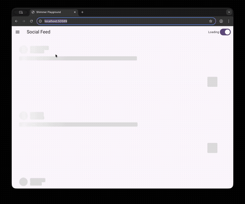
Example #
A full Shimmer Playground app is available in the example/ directory, featuring:
- 6 real-world scenarios — Social Feed, User Profile, Product Cards, Chat, Settings List, Article
- Interactive Sandbox — tweak shimmer colors, speed, and border radius in real time
- Drawer navigation to browse all demos
cd example
flutter run
Toggle the switch in the app bar to animate between loading and loaded states.
License #
MIT
Metadata
Documentation
Publisher
unverified uploader
Weekly Downloads
Metadata
A hybrid shimmer skeleton loading widget for Flutter. Auto-detects Text, Icon, Image widgets and supports explicit Bone() markers.
Repository (GitHub)
View/report issues
Topics
#widget #shimmer #skeleton #loading #placeholder
License
 MIT (license)