flutter_settings 1.0.2  flutter_settings: ^1.0.2 copied to clipboard
This package provides some settings widget to use it in settings screen.
flutter_settings #

This package provides some settings widget to use it in your settings screen.
- it has the most widgets which have been used in any settings screen, now you can customize yours.
- it offers full LTR and RTL support for apps of all languages.
Package Presentation #
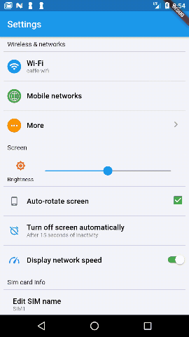
You can check out the whole code of this exmaple through this link.
Break it out
I'll break it out and show you the different widget which you can use and customize your widget.
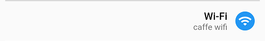
SettingsButton Widget
Button widget is the most important widget at any screen, it has some properties like:
- Title (required): title for your button to make it your button behavior clear to your end user.
- caption (optional): a small explanation which provide more info about your button behavior.
- icon (optional): that makes your button more pretty and descriptive, its background and IconDate and its color are changeable, feel free to make your Icon.
- onPressed (required): call back function which delegete the pressing action.
- direction (optional): which specify the arrangement of the widgets in the button, it will be LTR or RTL, by default its value is LTR.
- titleStyle (optional): customize your button title.
- captionStyle (optional): customize your button caption.
Example
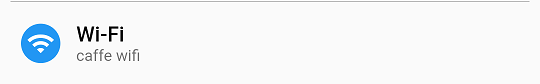
import 'package:flutter_settings/widgets/SettingsButton.dart';
 SettingsButton(
                title: "Wi-Fi",
                caption: "caffe wifi",
                icon: new SettingsIcon(
                  icon: Icons.wifi,
                  backgroundColor: Colors.blue,
                ),
                onPressed: () {
                  //Toast.show("Wi-Fi is pressed", context);
                },
              )
SettingsCheckBox Widget
SettingsCheckBox is widget which provides [on, off] choose, it has some properties SettingsButton and an additional properties like:
- value (required): init value for widget to make it on or off
- type (optional): which shape you need to use in your widget(CheckBox , Switch).[there is some shapes will be made in the future], it is CheckBox by default.
Example
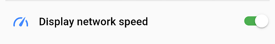
import 'package:flutter_settings/widgets/SettingsCheckBox.dart';
 SettingsCheckBox(
                title: 'Display network speed',
                icon: new SettingsIcon(
                    //a custom icon please check out this custom_icons.dart
                  icon: CustomIcons.gauge,
                  color: Colors.blueAccent,
                ),
                onPressed: (bool value) {
                  //Toast.show("Display network speed is " + value.toString(),
                  //    context);
                },
                value: true,
                type: CheckBoxWidgetType.Switch,
              ),
SettingsNavigatorButton Widget
SettingsNavigatorButton is widget which navigate to another widget once the user press on it, it also has properties like SettingsButton except
onPressproperty, it has an additional properity:
- context (required): your current context which the widget uses it
- targetWidget (required): the widget you need to move on once clicking on the widget.
Example
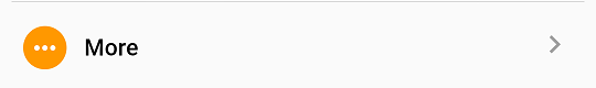
import 'package:flutter_settings/widgets/SettingsNavigatorButton.dart';
  SettingsNavigatorButton(
                title: SettingsLocalizations.of(context).translate('More'),
                icon: new SettingsIcon(
                  icon: Icons.more_horiz,
                  backgroundColor: Colors.orange,
                ),
                context: context,
                //replace it with your widget which need to move on.
                targetWidget: WireLessNetworkAllSettings(),
              ),
SettingsInputField Widget
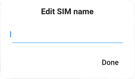
SettingsInputField is a widget that gets input from the user through dialog and returns the user input to do the related app business logic, it has properties like SettingsButton, it has an additional properity:
- context (required): your current context which the widget uses it
- dialogTitle (optional): title for input dialog widget.
- dialogButtonText (optional): text of the button that confirm user input.
- keyboardType (optional): TextInputType which decides the type that will be used to take input from the user.
Example
- Settings Input field Button
- Settings Input field Dialog
import 'package:flutter_settings/widgets/SettingsInputField.dart';
SettingsInputField(
dialogButtonText: 'Done',
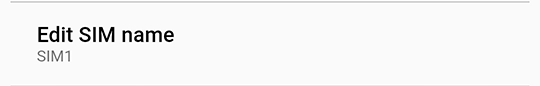
title: 'Edit SIM name',
caption: 'SIM 1' //_simCaption,
onPressed: (value) {
if (value.toString().isNotEmpty) {
//Toast.show("You have Entered " + value, context);
//setState(() {
// _simCaption = value; } );
}
},
context: context,
),
SettingsSelectionList Widget
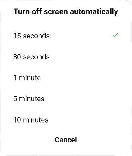
SettingsSelectionList is a widget that gets one choose from the user through a dialog which has a list of choices and returns it with its index, to do the related app business logic, it has properties like SettingsButton except OnPress() callback, it has an additional properity:
- context (required): your current context which the widget uses it.
- onSelect(item , idex) (required): function callback to receive the chosen item and its index.
- chosenItemIndex (optional): default selected item, it will be the first item by default.
- dialogTitle (optional): title for selection list dialog widget, it takes the title of button by default.
- dismissTitleText (optional): text of the button that cancels choosing, it takes the "Cancel" value by default.
Example
- Settings Input field Button
- Settings Input field Dialog
import 'package:flutter_settings/widgets/SettingsSelectionList.dart';
Create List of items
    var turnOffList = new List<SettingsSelectionItem<int>>();
    turnOffList.add(SettingsSelectionItem<int>(0, "15 seconds"));
    turnOffList.add(SettingsSelectionItem<int>(1, "30 seconds"));
    turnOffList.add(SettingsSelectionItem<int>(2, "1 minute"));
    turnOffList.add(SettingsSelectionItem<int>(3, "5  minutes"));
    turnOffList.add(SettingsSelectionItem<int>(4, "10 minutes"));
Set the created list to the widget
SettingsSelectionList<int>(
items: turnOffList,
chosenItemIndex: 1,
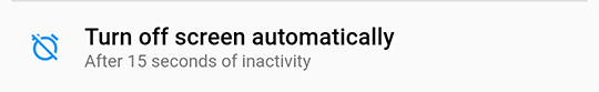
title: 'Turn off screen automatically',
dismissTitle: 'Cancel',
caption: _caption,
icon: new SettingsIcon(
icon: Icons.alarm_off,
color: Colors.blue,
),
onSelect: (value, index) {
// Toast.show("You have selected " + value.text.toString(),
// context);
/* setState(() {
_selectionIndex = index;
_caption = "After " + value.text +" of inactivity";
});*/
},
context: context,
),
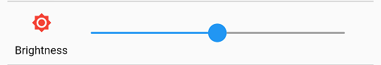
SettingsSlider Widget
SettingsSlider can be used to select a continuous value from 0.0 to 1.0, it has an special properities like:
- value (required): The currently selected value for this widget.
- onChange (required): Callback which called during a drag when the user is selecting a new value.
- onChangeEnd (optional): Callback which called when the user is done selecting a new value.
- onChangeStart (optional): Callback which called when the user starts selecting a new value.
- activeColor(optianal): The color to use for the portion of the slider track that is active.
- icon (optional): that makes your button more pretty and descriptive, its background and IconDate and its color are changeable, feel free to make your Icon.
- direction (optional): which specify the arrangement of the widgets in the button, it will be LTR or RTL, by default its value is LTR. Example
import 'package:flutter_settings/widgets/SettingsNavigatorButton.dart';
  SettingsSlider(
                value: 0.5,
                activeColor: Colors.blue,
                icon: new SettingsIcon(
                  icon: Icons.brightness_7,
                  color: Colors.red,
                  text:'Brightness',
                ),
                onChange: (value) {
                  //Toast.show("now the brightness value becomes " +
                    //      value.toString(), context);
                },
              ),
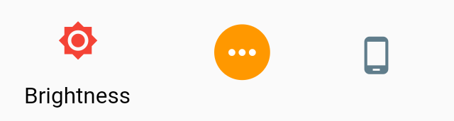
SettingsIcon Widget
SettingsIcon which could be used in all Settings widgets, it provides some shapes to could use it in a lot of cases, it has some properties that make it customizable like:
- icon (required): The icon to display, it IconData object.
- color (optional): The color to use when drawing the icon, it uses white color by default.
- backgroundColor (optional): The background color to the Icon.
- text (optional): text to make your icon more descriptive if it need that.
Example
import 'package:flutter_settings/widgets/SettingsIcon.dart';
- First Icon
SettingsIcon( icon: Icons.brightness_7, color: Colors.red, text: 'Brightness', ), - Second Icon
SettingsIcon( icon: Icons.more_horiz, backgroundColor: Colors.orange, ), - Third Icon
SettingsIcon(
        icon: Icons.phone_android,
        color: Colors.blueGrey,
        ),
``
Its offers LTR and RTL support for apps of all languages. #
If your app uses LTR in language and RTL in another languuage like[Arabic], don't worry it handle this case, just let's take an example.
Left to Right
just assign direction property in your widget to WidgetDirection.ltr or don't assign anything, it WidgetDirection.ltr by default.
Example
Right to Left
here, you need to assign direction property in your widget to WidgetDirection.rtl.
Example
How can I collaborate on this package? #
I'll tell you soon. #
License #
MIT
Metadata
Publisher
unverified uploader
Weekly Downloads
Metadata
This package provides some settings widget to use it in settings screen.
Repository (GitHub)
View/report issues
License
 MIT (license)