flutter_scalify 3.0.0  flutter_scalify: ^3.0.0 copied to clipboard
The Ultimate Responsive Layout System. Features smart scaling, 6-tier grids, adaptive flex layouts, container queries, and 4K protection with zero-allocation math.
Flutter Scalify 🚀 #

The Intelligent Scaling Engine for Flutter.
A complete, high-performance responsive system — not just a sizing tool. Scale your entire UI across Mobile, Web, and Desktop with simple extensions, smart container queries, and zero overhead.
Why Scalify? ⚡️ #
| Feature | Scalify |
|---|---|
| O(1) Inline Math (vm:prefer-inline) | ✅ |
| Container Queries (Rebuild by parent size) | ✅ |
| 4K/Ultra-Wide Smart Dampening | ✅ |
| Responsive Grid System (6-Tier) | ✅ |
| Builder Pattern (Above MaterialApp) | ✅ |
| InheritedModel (Granular Rebuild) | ✅ |
| Debounce on Resize (Desktop/Web) | ✅ |
| Section Scaling (ScalifySection) | ✅ |
| Local Scaler (ScalifyBox) | ✅ |
| 6 Screen Types (Watch → Large Desktop) | ✅ |
| Theme Auto-Scaling (One line) | ✅ |
| Percentage Scaling (.pw .hp) | ✅ |
| Zero External Dependencies | ✅ |
| 208 Tests Passing | ✅ |
Features ✨ #
- 🎯 Simple API —
16.fz,20.s,24.iz,300.w— just add an extension - 📐 Responsive Layouts — Built-in
ResponsiveGrid,ResponsiveFlex,ResponsiveLayout - 📦 Container Queries —
ContainerQuery&AdaptiveContainerrebuild based on parent size - 🛡️ 4K Protection — Smart dampening prevents UI explosion on ultra-wide screens
- 📱 6-Tier System — Watch, Mobile, Tablet, Small Desktop, Desktop, Large Desktop
- ⚡ Hyper Performance —
vm:prefer-inline, Quantized IDs, InheritedModel, Debounce - 🔡 Font Clamping — Configurable min/max font bounds (never too small or too big)
- 🎨 Theme Scaling —
ThemeData.scale(context)— one line, entire theme scaled - 🧱 Local Scaling —
ScalifyBoxscales elements relative to their container - 🧩 Section Scaling —
ScalifySectioncreates independent scaling per section for split layouts - 📊 Percentage Scaling —
50.pw= 50% of screen width,25.hp= 25% of height
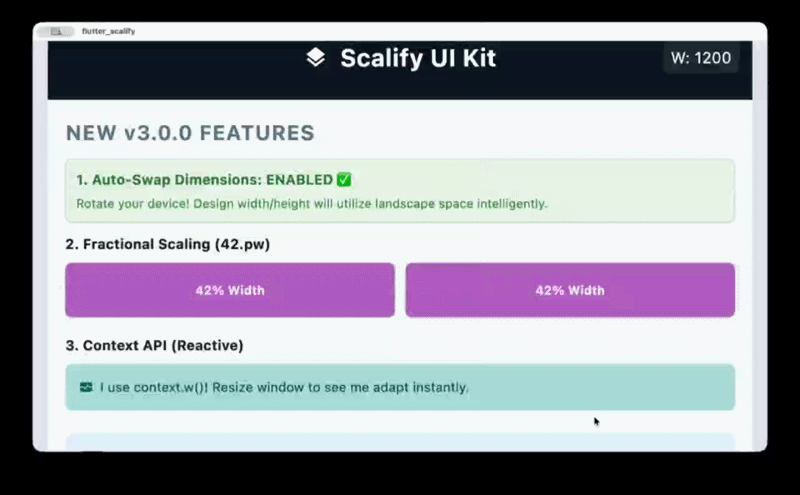
Responsive Preview #

Installation #
dependencies:
  flutter_scalify: ^3.0.0
flutter pub get
Quick Start #
✅ Recommended: Builder Pattern (ScalifyProvider wraps MaterialApp) #
This is the best practice for maximum performance. Placing ScalifyProvider above MaterialApp prevents cascading rebuilds when screen size changes.
import 'package:flutter/material.dart';
import 'package:flutter_scalify/flutter_scalify.dart';

void main() => runApp(const MyApp());

class MyApp extends StatelessWidget {
  const MyApp({super.key});

  @override
  Widget build(BuildContext context) {
    return ScalifyProvider(
      config: const ScalifyConfig(
        designWidth: 375,    // Your Figma/XD design width
        designHeight: 812,   // Your Figma/XD design height
      ),
      builder: (context, child) => MaterialApp(
        theme: ThemeData.light().scale(context), // 🎨 Auto-scale theme
        home: child,
      ),
      child: const HomeScreen(),
    );
  }
}
Alternative: Child Pattern (ScalifyProvider inside MaterialApp) #
MaterialApp(
  builder: (context, child) {
    return ScalifyProvider(
      config: const ScalifyConfig(designWidth: 375, designHeight: 812),
      child: child ?? const SizedBox(),
    );
  },
  home: const HomeScreen(),
);
💡 Tip: The builder pattern is recommended because it puts
ScalifyProvideraboveMaterialApp, so changing window size doesn't rebuildMaterialAppitself.
📚 API Cheat Sheet #
1. Size & Font #
| Extension | Example | Description |
|---|---|---|
.w |
100.w |
Width — Scales based on screen width ratio |
.h |
50.h |
Height — Scales based on screen height ratio |
.s |
20.s |
Size — General scaling (min of width/height) |
.fz |
16.fz |
Font Size — Scaled + clamped + accessibility |
.iz |
24.iz |
Icon Size — Proportional icon scaling |
.r |
12.r |
Radius — Based on min(scaleWidth, scaleHeight) |
.si |
10.si |
Scaled Int — Rounded integer for native APIs |
.sc |
16.sc |
Scale — Alias for .s |
.ui |
16.ui |
UI — Alias for .s |
2. Percentage Scaling #
| Extension | Example | Description |
|---|---|---|
.pw |
50.pw |
50% of screen width |
.hp |
25.hp |
25% of screen height |
3. Spacing (SizedBox) #
| Extension | Example | Output |
|---|---|---|
.sbh |
20.sbh |
SizedBox(height: 20.h) |
.sbw |
10.sbw |
SizedBox(width: 10.w) |
.sbhw() |
20.sbhw(width: 10) |
SizedBox(height: 20.h, width: 10.w) |
.sbwh() |
10.sbwh(height: 20) |
SizedBox(width: 10.w, height: 20.h) |
4. Padding (EdgeInsets) #
| Extension | Example | Output |
|---|---|---|
.p |
16.p |
EdgeInsets.all(16.s) |
.ph |
16.ph |
EdgeInsets.symmetric(horizontal: 16.w) |
.pv |
16.pv |
EdgeInsets.symmetric(vertical: 16.h) |
.pt |
16.pt |
EdgeInsets.only(top: 16.h) |
.pb |
16.pb |
EdgeInsets.only(bottom: 16.h) |
.pl |
16.pl |
EdgeInsets.only(left: 16.w) |
.pr |
16.pr |
EdgeInsets.only(right: 16.w) |
List Shorthand:
[20, 10].p      // EdgeInsets.symmetric(horizontal: 20.w, vertical: 10.h)
[10, 5, 10, 5].p // EdgeInsets.fromLTRB(10.w, 5.h, 10.w, 5.h)
5. Border Radius #
| Extension | Example | Output |
|---|---|---|
.br |
12.br |
BorderRadius.circular(12.r) |
.brt |
12.brt |
Top corners only |
.brb |
12.brb |
Bottom corners only |
.brl |
12.brl |
Left corners only |
.brr |
12.brr |
Right corners only |
6. Context API (for const widgets) #
When widgets are inside a const tree and can't use global extensions, use context:
context.w(100)    // Width scaling
context.h(50)     // Height scaling
context.r(12)     // Radius (min of scaleWidth/scaleHeight)
context.sp(16)    // Scale factor
context.fz(18)    // Font size (clamped + accessibility)
context.iz(24)    // Icon size
context.s(10)     // General scale
context.pw(50)    // 50% of screen width
context.hp(25)    // 25% of screen height
💻 Complete Example #
Container(
  padding: [20, 10].p,           // Symmetric padding
  width: 300.w,                   // Responsive width
  height: 200.h,                  // Responsive height
  decoration: BoxDecoration(
    color: Colors.white,
    borderRadius: 20.brt,         // Top border radius
    boxShadow: [
      BoxShadow(
        color: Colors.black12,
        offset: Offset(0, 4.s),   // Scaled offset
        blurRadius: 10.s,
      )
    ],
  ),
  child: Column(
    children: [
      Icon(Icons.star, size: 32.iz),                                  // Scaled icon
      16.sbh,                                                          // Spacing
      Text("Scalify", style: TextStyle(fontSize: 24.fz)),             // Scaled font
      8.sbh,
      Row(
        mainAxisAlignment: MainAxisAlignment.center,
        children: [
          Text("Start", style: TextStyle(fontSize: 14.fz)),
          8.sbw,                                                       // Width spacing
          Icon(Icons.arrow_forward, size: 16.iz),
        ],
      )
    ],
  ),
)
🚀 Responsive Widgets #
ResponsiveGrid — The Ultimate Grid #
Supports Manual Columns (per screen type) and Auto-Fit (dynamic data).
Manual Mode:
ResponsiveGrid(
  spacing: 16,
  runSpacing: 16,
  watch: 1,
  mobile: 2,
  tablet: 3,
  smallDesktop: 3,
  desktop: 4,
  largeDesktop: 5,
  children: [/* widgets */],
)
Auto-Fit Mode (API data):
ResponsiveGrid(
  minItemWidth: 150,
  itemCount: products.length,
  itemBuilder: (context, index) => ProductCard(data: products[index]),
)
Sliver Mode (infinite scroll):
CustomScrollView(
  slivers: [
    ResponsiveGrid(
      useSliver: true,
      mobile: 2,
      desktop: 4,
      itemCount: 100,
      itemBuilder: (context, i) => ItemCard(i),
    ),
  ],
)
ResponsiveFlex — Row ↔ Column #
Automatically switches between Row and Column based on screen width.
ResponsiveFlex(
  switchOn: ScreenType.mobile,    // Column on mobile, Row on larger
  spacing: 20,
  flipOnRtl: true,                // RTL support
  children: [
    UserAvatar(),
    UserInfo(),
  ],
)
Custom breakpoint:
ResponsiveFlex(
  breakpoint: 600,                // Column when width < 600
  children: [Widget1(), Widget2()],
)
ResponsiveLayout — Orientation Switch #
ResponsiveLayout(
  portrait: Column(children: [Image(), Bio()]),
  landscape: Row(children: [Image(), Bio()]),
)
ResponsiveVisibility — Show/Hide by Screen Type #
// Whitelist: Show ONLY on mobile
ResponsiveVisibility(
  visibleOn: [ScreenType.mobile],
  child: MobileNavBar(),
)

// Blacklist: Hide on desktop
ResponsiveVisibility(
  hiddenOn: [ScreenType.desktop, ScreenType.largeDesktop],
  replacement: DesktopSidebar(),   // Optional replacement widget
  child: MobileDrawer(),
)
ResponsiveBuilder — Direct Data Access #
ResponsiveBuilder(
  builder: (context, data) {
    return Text("Screen: ${data.screenType} — ${data.width.toInt()}px");
  },
)
Conditional Logic — valueByScreen #
final columns = context.valueByScreen<int>(
  mobile: 2,
  tablet: 3,
  desktop: 4,
  largeDesktop: 6,
);
📦 Container Queries #
ContainerQuery — Rebuild by Parent Size #
Unlike MediaQuery which reads the screen size, ContainerQuery reads the parent widget's size. Perfect for reusable components.
ContainerQuery(
  breakpoints: [200, 400, 800],
  onChanged: (prev, current) => print("Tier: ${current.tier}"),
  builder: (context, query) {
    if (query.isMobile) return CompactCard();
    if (query.isTablet) return MediumCard();
    return FullCard();
  },
)
QueryTier values: xs, sm, md, lg, xl, xxl
AdaptiveContainer — Tier-Based Widgets #
AdaptiveContainer(
  breakpoints: [200, 500],
  xs: Icon(Icons.home),                    // < 200px
  sm: Column(children: [Icon(), Text()]),  // 200-500px
  lg: Row(children: [Icon(), Text(), Button()]),  // > 500px
)
🧱 ScalifyBox — Local Scaling #
Scale elements relative to a specific container instead of the screen. Perfect for credit cards, game UIs, and embedded components.
ScalifyBox(
  referenceWidth: 320,
  referenceHeight: 200,
  fit: ScalifyFit.contain,    // width | height | contain | cover
  builder: (context, ls) {
    return Container(
      width: ls.w(300),         // Local width scaling
      height: ls.h(180),        // Local height scaling
      padding: ls.p(20),        // Local padding
      decoration: BoxDecoration(
        borderRadius: ls.br(12), // Local border radius
      ),
      child: Column(
        children: [
          Text("VISA", style: TextStyle(fontSize: ls.fz(18))),
          ls.sbh(10),            // Local spacing
        ],
      ),
    );
  },
)
LocalScaler API:
| Method | Description |
|---|---|
ls.w(value) |
Local width scaling |
ls.h(value) |
Local height scaling |
ls.s(value) |
Local general scaling |
ls.fz(value) |
Local font size (clamped) |
ls.iz(value) |
Local icon size |
ls.si(value) |
Rounded int |
ls.p(value) |
EdgeInsets.all |
ls.ph(value) |
Horizontal padding |
ls.pv(value) |
Vertical padding |
ls.br(value) |
BorderRadius.circular |
ls.r(value) |
Radius.circular |
ls.sbh(value) |
SizedBox(height:) |
ls.sbw(value) |
SizedBox(width:) |
ls.scaleFactor |
Current scale value |
🧩 ScalifySection — Independent Section Scaling #
Creates an independent scaling context for any part of your UI. Essential for split-screen / master-detail layouts where each section should scale based on its own width.
Row(
  children: [
    // Sidebar: scales based on 300px width
    SizedBox(
      width: 300,
      child: ScalifySection(child: Sidebar()),
    ),
    // Main content: scales based on remaining width
    Expanded(
      child: ScalifySection(child: MainContent()),
    ),
  ],
)
💡 Tip: Inside a
ScalifySection, use context-based extensions (context.fz(16),context.w(100)) instead of global extensions (16.fz,100.w) for accurate section-local scaling.
Full Master-Detail Example:
class MasterDetailLayout extends StatelessWidget {
  @override
  Widget build(BuildContext context) {
    final width = MediaQuery.sizeOf(context).width;

    // Mobile: bottom navigation
    if (width < 900) {
      return Scaffold(
        body: MainPages(),
        bottomNavigationBar: BottomNav(),
      );
    }

    // Desktop: sidebar + content — each scales independently
    return Row(
      children: [
        SizedBox(
          width: 300,
          child: ScalifySection(child: Sidebar()),
        ),
        Expanded(
          child: ScalifySection(child: MainPages()),
        ),
      ],
    );
  }
}
🛡️ AppWidthLimiter — Ultra-Wide Protection #
Centers and constrains your app on ultra-wide monitors.
AppWidthLimiter(
  maxWidth: 1400,
  minWidth: 360,               // Enables horizontal scroll below 360px
  horizontalPadding: 16,
  backgroundColor: Color(0xFFE2E8F0),
  child: YourApp(),
)
📏 Best Practices — Consistent UI #
Use the right extension for each element to maintain a consistent UI across all screen sizes:
| Element | Use | Why |
|---|---|---|
| Text / Fonts | .fz |
Scaled + clamped + accessibility |
| Icons | .iz / .s |
Proportional to screen |
| Button height | .s |
❌ Never .h — distorts on wide screens |
| Input field height | .s |
❌ Never .h — text overflows |
| Container width | .w |
Follows screen width |
| Container height | .s |
Stays proportional |
| Horizontal padding | .w |
Follows width |
| Vertical spacing | .h |
Adapts to screen height |
| General spacing | .s |
Balanced proportional |
| Border radius | .r / .br |
Uses min(scaleW, scaleH) |
⚠️ Common Mistake: Using
.hfor button/input heights causes them to shrink on wide screens (where height < width), making text overflow.✅ Fix: Use
.s— it usesmin(scaleWidth, scaleHeight)which stays balanced.
// ❌ Wrong — height shrinks on wide screens
SizedBox(height: 48.h, child: ElevatedButton(...))

// ✅ Correct — stays proportional everywhere
SizedBox(height: 48.s, child: ElevatedButton(...))
🎨 Theme Auto-Scaling #
Scale your entire app theme with one line — no need to add .fz to every text widget.
ScalifyProvider(
  builder: (context, child) => MaterialApp(
    theme: ThemeData.light().scale(context),  // ✨ One line!
    home: child,
  ),
  child: const HomeScreen(),
)
💡 Automatically skips scaling when
scaleFactor == 1.0for zero overhead.
🔄 Live Resizing (Desktop & Web) #
For instant UI updates while dragging the window:
Option 1: ResponsiveBuilder (Recommended)
ResponsiveBuilder(
  builder: (context, data) {
    return Scaffold(
      body: Center(
        child: Text("${data.width.toInt()}px", style: TextStyle(fontSize: 20.fz)),
      ),
    );
  },
)
Option 2: Direct Subscription
@override
Widget build(BuildContext context) {
  context.responsiveData;  // 👈 Subscribe to resize events
  return Scaffold(/* ... */);
}
⚙️ ScalifyConfig — Full Reference #
ScalifyConfig(
  // 📐 Design Baseline
  designWidth: 375.0,             // Figma/XD design width
  designHeight: 812.0,            // Figma/XD design height

  // 📱 Breakpoints (Customizable)
  watchBreakpoint: 300.0,         // < 300 = Watch
  mobileBreakpoint: 600.0,        // 300-600 = Mobile
  tabletBreakpoint: 900.0,        // 600-900 = Tablet
  smallDesktopBreakpoint: 1200.0,  // 900-1200 = Small Desktop
  desktopBreakpoint: 1800.0,      // 1200-1800 = Desktop
  //                               // > 1800 = Large Desktop

  // 🔡 Font Control
  minFontSize: 6.0,               // Floor for .fz
  maxFontSize: 256.0,             // Ceiling for .fz
  respectTextScaleFactor: true,   // System accessibility support

  // 📏 Scale Bounds
  minScale: 0.5,                  // Minimum scale factor
  maxScale: 4.0,                  // Maximum scale factor

  // 🛡️ 4K Protection
  memoryProtectionThreshold: 1920.0,  // Where dampening kicks in
  highResScaleFactor: 0.65,           // Dampening strength (0-1)

  // ⚡ Performance
  debounceWindowMillis: 120,          // Resize debounce (ms)
  rebuildScaleThreshold: 0.01,        // Min scale change to rebuild
  rebuildWidthPxThreshold: 4.0,       // Min px change to rebuild
  enableGranularNotifications: false, // InheritedModel aspects

  // 🔄 Orientation
  autoSwapDimensions: false,          // Swap design W/H in landscape

  // 🔧 Minimum Window Width
  minWidth: 0.0,                      // Enables horizontal scroll below this

  // 🏷️ Legacy
  legacyContainerTierMapping: false,  // v1 compatibility
  showDeprecationBanner: true,        // Debug banner for legacy mode
)
📱 Screen Breakpoints #
┌──────────────┬─────────────────┬──────────────────────────┐
│  Screen Type │   Width Range   │        Enum Value        │
├──────────────┼─────────────────┼──────────────────────────┤
│  Watch       │     < 300px     │  ScreenType.watch        │
│  Mobile      │  300px - 600px  │  ScreenType.mobile       │
│  Tablet      │  600px - 900px  │  ScreenType.tablet       │
│  Small DT    │  900px - 1200px │  ScreenType.smallDesktop │
│  Desktop     │ 1200px - 1800px │  ScreenType.desktop      │
│  Large DT    │    > 1800px     │  ScreenType.largeDesktop │
└──────────────┴─────────────────┴──────────────────────────┘
🧠 Advanced: How the Engine Works #
Configurable Rebuild Tolerance #
Scalify uses a dual-tolerance system to prevent unnecessary rebuilds:
rebuildWidthPxThreshold(default 4.0px) — Ignores sub-pixel size changesrebuildScaleThreshold(default 0.01) — Ignores scale changes < 1%
Screen: 375px → 377px (2px diff < 4px threshold)
Scale:  1.000 → 1.005 (0.005 diff < 0.01 threshold)
→ No rebuild! ✅
Internally, Quantized IDs (×1000) are still used for InheritedModel aspect-based comparisons to ensure fast integer equality checks.
InheritedModel Aspects #
Enable granular notifications to rebuild widgets only when specific data changes:
// Only rebuilds when screen TYPE changes (not on every pixel resize)
ScalifyProvider.of(context, aspect: ScalifyAspect.type);

// Only rebuilds when scale FACTOR changes
ScalifyProvider.of(context, aspect: ScalifyAspect.scale);

// Only rebuilds when text scale changes (accessibility)
ScalifyProvider.of(context, aspect: ScalifyAspect.text);
Enable in config:
ScalifyConfig(enableGranularNotifications: true)
Debounce on Resize #
On Desktop/Web, window resizing fires hundreds of events per second. Scalify debounces platform-driven resize events with a configurable window (debounceWindowMillis, default 120ms), calculating the layout once after the user stops dragging. Parent-driven updates (e.g., didChangeDependencies) remain synchronous for instant response.
// Disable debounce for instant updates:
ScalifyConfig(debounceWindowMillis: 0)

// Increase debounce for weaker devices:
ScalifyConfig(debounceWindowMillis: 200)
Nested Providers & Performance (observeMetrics) #
When nesting ScalifyProvider (e.g., for a split-screen section), the inner provider should not listen to window resize events directly, as this creates a "double debounce" race condition with the parent provider, causing UI lag.
To fix this, set observeMetrics: false on the nested provider:
ScalifyProvider(
  config: sectionConfig,
  observeMetrics: false, // ⚡️ Disables internal resize listener
  child: SectionContent(),
)
This ensures the inner provider updates synchronously when its parent rebuilds, resulting in 60fps performance during window resizing. ScalifySection handles this automatically.
4K Smart Dampening #
For screens wider than memoryProtectionThreshold (default 1920px):
Normal: scale = screenWidth / designWidth
4K:     scale = thresholdScale + (excessWidth / designWidth × dampFactor)
This prevents text from becoming 5× the intended size on ultra-wide monitors.
📋 Migration from v2.x → v3.0.0 #
1. Builder Pattern (Recommended) #
- MaterialApp(
-   builder: (context, child) => ScalifyProvider(child: child),
-   home: HomeScreen(),
- )
+ ScalifyProvider(
+   builder: (context, child) => MaterialApp(home: child),
+   child: const HomeScreen(),
+ )
2. Context API for const Widgets #
- // Won't update in const trees
- Text("Hi", style: TextStyle(fontSize: 16.fz))

+ // Always updates via context
+ Builder(
+   builder: (context) => Text(
+     "Hi",
+     style: TextStyle(fontSize: context.sp(16)),
+   ),
+ )
3. Percentage Scaling (New) #
SizedBox(width: 50.pw)   // 50% of screen width
SizedBox(height: 25.hp)  // 25% of screen height
4. Theme Scaling (New) #
MaterialApp(
  theme: ThemeData.light().scale(context),
)
🧪 Testing #
The package includes 208 comprehensive tests covering all widgets, extensions, and edge cases:
flutter test --reporter compact
# 00:02 +208: All tests passed!
Author #
Alaa Hassan Damad
- Email: alaahassanak772@gmail.com
- Country: Iraq
License #
MIT License — see LICENSE for details.
Metadata
Publisher
unverified uploader
Weekly Downloads
Metadata
The Ultimate Responsive Layout System. Features smart scaling, 6-tier grids, adaptive flex layouts, container queries, and 4K protection with zero-allocation math.
Repository (GitHub)
View/report issues
Topics
#responsive #scaling #grid #layout #container-queries
Documentation
License
 MIT (license)