flutter_otp_animation 0.0.3  flutter_otp_animation: ^0.0.3 copied to clipboard
Flutter Otp Animation is OTP text field having worm type animation with full customization which hse provision of directionality as well.
Flutter Otp Animation is OTP text field having worm type animation with full customization which hse provision of directionality as well.
Inspired from #
Text Field Interaction by Oleg Frolov
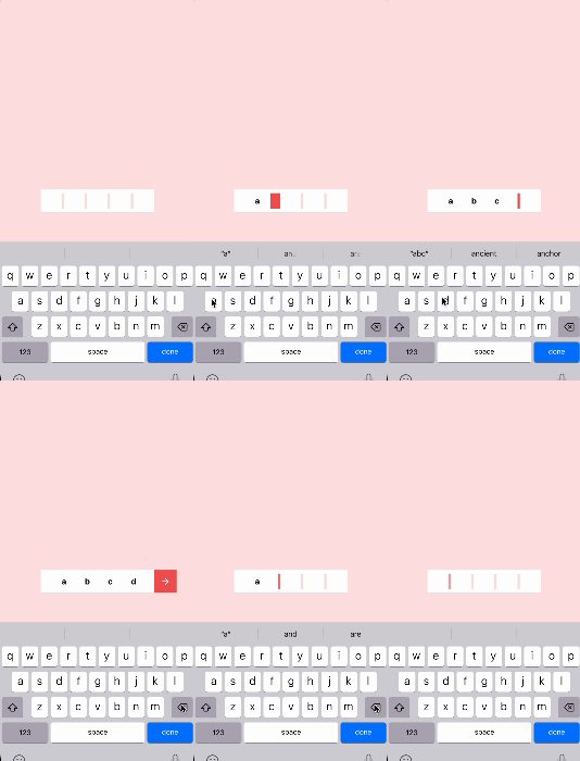
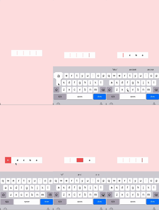
Screenshots and Screen recording #
Flutter Otp Animation with direction left-to-right direction: Direction.ltr

Flutter Otp Animation with direction right-to-left direction: Direction.rtl

Usage #
Installation
Add flutter_otp_animation: any to your pubspec.yaml dependencies. And import it:
import 'package:flutter_otp_animation/flutter_otp_animation.dart';
Example
FlutterOtpAnimation(
      onChange: (value) {
        debugPrint('value :: $value');
      },
      onButtonTap: () {},
      onEnd: () {},
      separatedBorderRadius: true,
      autoDismissKeyboard: true,
      direction: Direction.rtl,
    ),
Parameters #
Optional Parameters #
backgroundHeight:
- backgroundHeight is used to set the height of the OTP field, by default it is set to 50.0
backgroundWidth:
- backgroundWidth is used to set the width of the OTP field, by default it is set to 250.0
fieldWidth:
- fieldWidth property is use to set the width of the unselected field where every text will be entered
verticalPadding:
- Vertical padding can be set from here by giving the value in this it will leave the space symmetrically from top and bottom
fontSize:
- fontSize is used to set the font size of the entered text
otpFieldBorderRadius:
- otpFieldBorderRadius can be use to give the borderRadius to OTP field as well as the button if it is enabled
buttonBorderRadius:
- buttonBorderRadius can be use to give the borderRadius to the button if it is enabled
buttonPaddingFromField:
- buttonPaddingFromField will allow to give the space between button and OTP field
fontWeight:
- This is used to set the bg color of the otp field
backgroundColour:
- The unselected field color can be set from this property
fieldColour:
- sliderColour can be use to give the color to the sliding animation widget this same color will be applied when the slider is stable and blinking
sliderColour:
- buttonColour is used to set the color of the button if it is enabled
buttonColour:
- defaultButtonIconColour is used to set the color of the buttonIcon if it is enabled
defaultButtonIconColour:
- textColor is use to set color of the entered text
textColor:
- numberOfFields will indicate how many number of fields will be there in OTP field
numberOfFields:
- fontFamily can be used to set the fontFamily of entered text
textInputType:
- If user wants keyboard to appear as soon as the screen arrives it can be done from here
direction:
- showButton can toggle whether the button will be shown after every field is entered or not
autoFocus:
- enableAutoFill will be used to to auto fill the otp that comes to the text via SMS or any other mode
showButton:
- autoDismissKeyboard will dismisses the keyboard once every field is entered
enableAutoFill:
- autoDisposeControllers if set true then it will automatically dispose the TextEditingController once user leave that screen
autoDismissKeyboard:
- readOnly by setting this to true it will only allow user to read and not to write
autoDisposeControllers:
- separatedBorderRadius can be used to give border radius to OTP field and button separately
readOnly:
- This will allow to set the weight of the fonts
separatedBorderRadius:
- textInputType will determine which kind of keyboard will appear whether it is numeric, alphanumeric or any other else
textEditingController:
- direction can be used to determine in which direction will OTP widget will appear that is from left-to-right or right-to-left
onChange:
- This can bes used to set the widget inside the button it could be any widget, by default it is set to Icons.arrow_back_outlined
onButtonTap:
- onButtonTap is called when user taps the button that appears once every fields are filled
onEnd:
- onEnd is called once every text fields are entered and there is nothing left to enter anymore
buttonContent:
- onChange is exactly like TextField's onChange as soon as any user enters any text field those changes can be listened in this callback function
fontFamily:
- textEditingController is a controller of the entered texts
slideAnimationDuration:
- slideAnimationDuration can be used to define the duration of sliding animation(animation between two text fields)
blinkAnimationDuration:
- blinkAnimationDuration determines the animation duration of blinking of cursor
buttonAnimationDuration:
- buttonAnimationDuration can be used to set the duration of button appearance by animation
inputFormatters:
- inputFormatters Default it has LengthLimitingTextInputFormatter and user can also add their own inputFormatters as well
onEditingComplete:
- onEditingComplete is TextField's onEditingComplete property
onSubmitted:
- onSubmitted is TextField's onSubmitted property
keyboardAppearance:
- keyboardAppearance can be used to set the light or dark mode for iOS keyboard.
Guideline for contributors #
Contribution towards our repository is always welcome, we request contributors to create a pull request to the development branch only.
Guideline to report an issue/feature request #
- It would be great for us if the reporter can share the below things to understand the root cause of the issue.
- Library version
- Code snippet
- Logs if applicable
- Device specification like (Manufacturer, OS version, etc)
- Screenshot/video with steps to reproduce the issue
LICENSE #
FlutterOtpAnimation is MIT-licensed.
