flutter_nav_toggle 1.2.2  flutter_nav_toggle: ^1.2.2 copied to clipboard
A dual-mode navigation toggle widget that smoothly morphs between sidebar and tab bar layouts with clip-path animations.
flutter_nav_toggle #
A dual-mode navigation widget for Flutter that smoothly morphs between sidebar, icon rail, and tab bar layouts with clip-path animations.
Installation #
Add flutter_nav_toggle to your pubspec.yaml:
dependencies:
  flutter_nav_toggle: ^1.2.0
Then run:
flutter pub get
Features #
- Three navigation modes — sidebar, icon rail, and tab bar with smooth animated transitions
- Morphing toggle button — cursor-tracking directional arrows with branding support (logo + label), powered by
morphing_button - Badge support — per-item badge counts with automatic aggregation on parent items
- Header branding —
NavHeaderwith logo, title, and subtitle merged into the toggle button - Page transitions —
.withPages()constructor with fade, slide, and fadeThrough transitions viaAnimatedSwitcher - Keyboard shortcuts — press
Tto toggle navigation mode - Hierarchical items — expand/collapse in sidebar, overlay dropdowns in tab bar
- Status panel — CPU/MEM/DISK progress bars with color-coded thresholds, tappable warning count, optional time and userName display,
copyWithfor partial updates - User info — avatar panel with optional
onTapcallback, hover feedback, and flyout menu support - Auto-responsive — opt-in breakpoint system that auto-switches between sidebar/icon rail/tab bar based on screen width
- Overlay sidebar — on narrow screens with auto-responsive enabled, toggle shows sidebar as a floating overlay with scrim dismiss
- Per-item icon color —
iconColoronNavItemfor custom icon tinting - Route restoration —
initialSelectedIdto restore the last selected page on startup - Initial mode —
initialModeto start in sidebar, icon rail, or tab bar - 4 built-in themes — Light, Dark, Ocean, Sunset (or build your own with
NavToggleTheme.copyWith) - Fully configurable — dimensions, durations, easing curves, colors, fonts, border radii
- Accessibility — respects
MediaQuery.disableAnimations
Quick Start #
import 'package:flutter_nav_toggle/flutter_nav_toggle.dart';

NavToggleScaffold(
  items: [
    NavItem(id: 'home', label: 'Home', icon: Icons.home_outlined),
    NavItem(id: 'settings', label: 'Settings', icon: Icons.settings_outlined, badge: 3),
  ],
  header: NavHeader(
    logo: Icon(Icons.dashboard, size: 24),
    title: 'My App',
  ),
  onItemSelected: (id) => print('Selected: $id'),
  child: Center(child: Text('Content')),
)
Hierarchical Items #
NavItem(
  id: 'products',
  label: 'Products',
  icon: Icons.inventory_outlined,
  children: [
    NavItem(id: 'electronics', label: 'Electronics', icon: Icons.devices_outlined),
    NavItem(id: 'clothing', label: 'Clothing', icon: Icons.checkroom_outlined),
  ],
)
Parents expand/collapse in sidebar mode and open overlay dropdowns in tab bar mode.
Route Restoration #
Use initialSelectedId to restore the user's last page on startup. Works with both constructors:
NavToggleScaffold.withPages(
  items: items,
  pages: pages,
  initialSelectedId: 'settings', // starts on Settings instead of the first item
  initialMode: NavMode.iconRail, // start in icon rail mode (default: sidebar)
)
Combine with your own persistence (SharedPreferences, Hive, etc.) to save and restore the selected page across sessions.
Page Transitions #
Use .withPages() to let the scaffold manage content switching with animated transitions:
NavToggleScaffold.withPages(
  items: items,
  pages: {
    'home': HomePage(),
    'settings': SettingsPage(),
  },
  pageTransitionType: PageTransitionType.fadeThrough,
  showPageHeader: true,
  enableKeyboardShortcuts: true,
)
Available transition types: fade, slideHorizontal, fadeThrough.
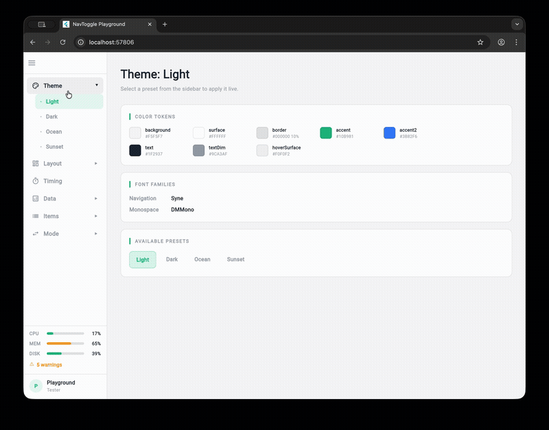
Theming #
// Use a built-in preset
NavToggleScaffold(
  theme: const NavToggleTheme.ocean(),
  // ...
)

// Or customize
NavToggleScaffold(
  theme: const NavToggleTheme.dark().copyWith(
    sidebarWidth: 260,
    accent: Color(0xFFFF6B6B),
    collapseDuration: Duration(milliseconds: 300),
  ),
  // ...
)
Available presets: NavToggleTheme() (light), .dark(), .ocean(), .sunset()
System Status & User Info #
NavToggleScaffold(
  systemStatus: SystemStatus(
    cpu: 0.42,        // 0.0–1.0, color-coded: green <60%, amber 60-80%, red >=80%
    memory: 0.67,
    disk: 0.55,
    warnings: 3,      // warning count displayed in status panel
    time: '14:32:05', // optional time string
    userName: 'admin', // optional user name in status panel
    onWarningTap: () => print('Navigate to alerts'), // makes warning row tappable
  ),
  userInfo: UserInfo(name: 'Alice', role: 'Admin', onTap: () => print('User tapped')),
  // ...
)
Status displays as progress bars (sidebar) or compact chips (tab bar). User info shows as an avatar panel (sidebar) or chip (tab bar).
SystemStatus supports copyWith() for efficient partial updates:
final status = SystemStatus(cpu: 0.5, memory: 0.7, disk: 0.3);
final updated = status.copyWith(cpu: 0.8); // only changes CPU
For high-frequency updates (e.g., real-time CPU monitoring), use NavToggleController.updateStatusSilent() to avoid excessive rebuilds:
controller.updateStatusSilent(newStatus); // no rebuild
// ... later, when ready to repaint:
controller.updateStatus(newStatus); // triggers rebuild
User Flyout Menu #
Provide menuItems on UserInfo to show a flyout popup when the avatar is tapped, instead of firing onTap directly:
userInfo: UserInfo(
  name: 'Alice',
  role: 'Admin',
  menuItems: [
    UserMenuItem(label: 'View Profile', icon: Icons.person_outline, onTap: () {}),
    UserMenuItem(label: 'Sign Out', icon: Icons.logout, onTap: () {}),
  ],
),
The flyout pops right in sidebar/icon rail mode and drops down in tab bar mode. When menuItems is null or empty, the widget falls back to the onTap callback.
Per-Item Icon Color #
Use iconColor on NavItem for custom icon tinting (e.g., brand-colored icons). Selection is indicated by background highlight instead of icon color change:
NavItem(
  id: 'alerts',
  label: 'Alerts',
  icon: Icons.warning_amber_outlined,
  iconColor: Color(0xFFEF4444), // always red, regardless of selection state
)
Auto-Responsive Mode #
Enable autoResponsive on the theme to auto-switch navigation mode based on screen width:
NavToggleScaffold(
  theme: const NavToggleTheme().copyWith(
    autoResponsive: true,
    breakpointSidebar: 1024, // >= 1024px → sidebar (default)
    breakpointRail: 768,     // >= 768px  → icon rail (default)
                             // < 768px   → tab bar
  ),
  // ...
)
When autoResponsive is false (default), mode only changes via the toggle button — existing behavior unchanged.
Overlay Sidebar #
With auto-responsive enabled, pressing the toggle button on a narrow screen (below breakpointSidebar) shows the sidebar as a floating overlay instead of pushing content:
- Semi-transparent scrim darkens the background
- Tap the scrim or select a nav item to dismiss
- Keyboard shortcut
Talso toggles the overlay - Content stays full-width underneath
This follows the Material Design drawer pattern for tablet/mobile users who want full navigation access without losing their current view.
Run the Playground #
cd example
flutter run -d chrome
The example app is an interactive playground that lets you tweak every property live.
Metadata
Publisher
unverified uploader
Weekly Downloads
Metadata
A dual-mode navigation toggle widget that smoothly morphs between sidebar and tab bar layouts with clip-path animations.
Repository (GitHub)
View/report issues
Documentation
License
 MIT (license)
Dependencies
flutter, morphing_button, provider