flutter_introduction_tooltip 0.0.1  flutter_introduction_tooltip: ^0.0.1 copied to clipboard
A new Flutter plugin to show introduction tooltip for first time app open
Flutter Introduction Tooltip #
A new Flutter plugin to show introduction tooltip for first timer user of the app.
It should support both Android and iOS since it's pure written in Dart.
Getting Started #
For help getting started with Flutter, view our online documentation.
For help on editing plugin code, view the documentation.
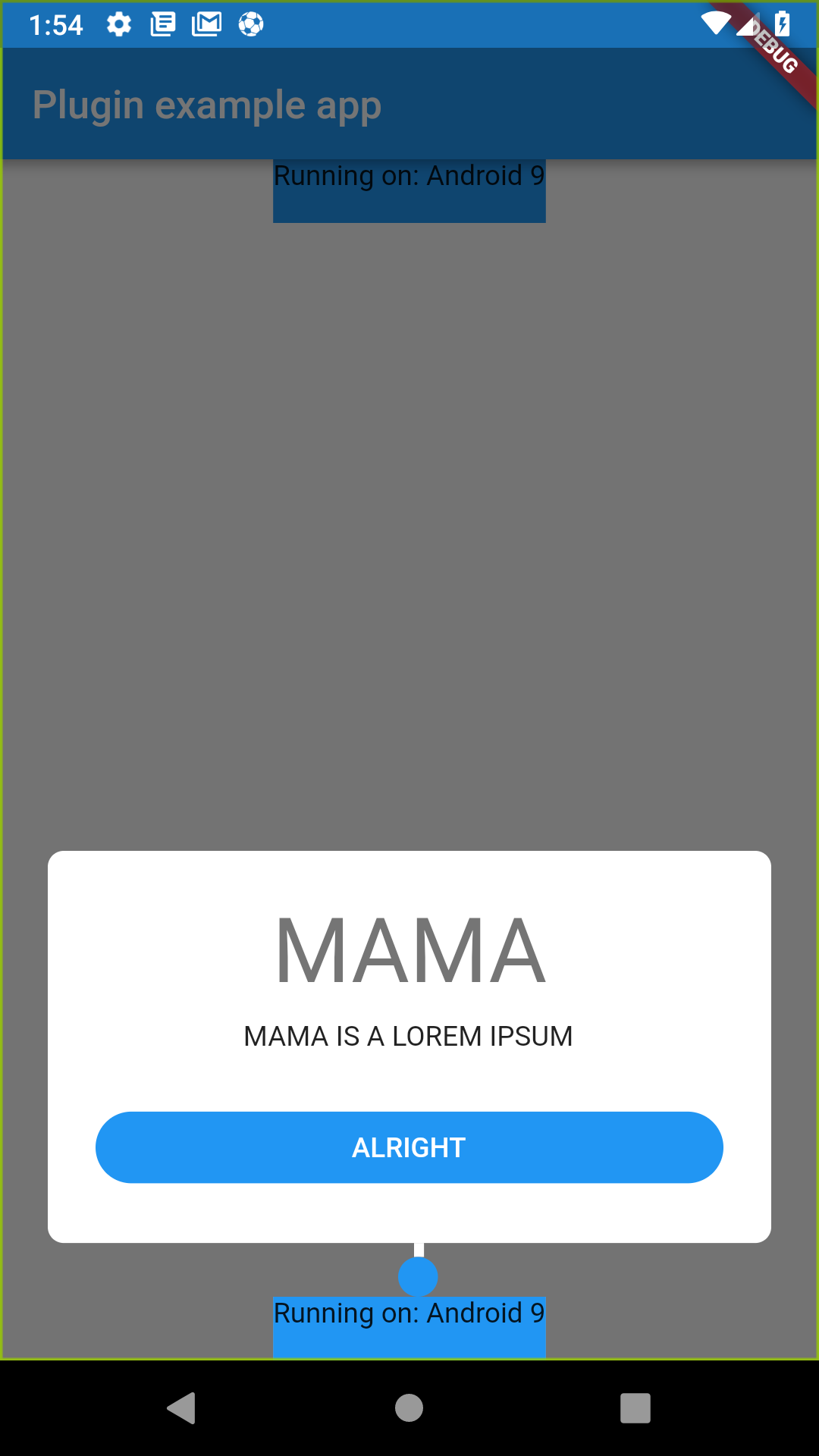
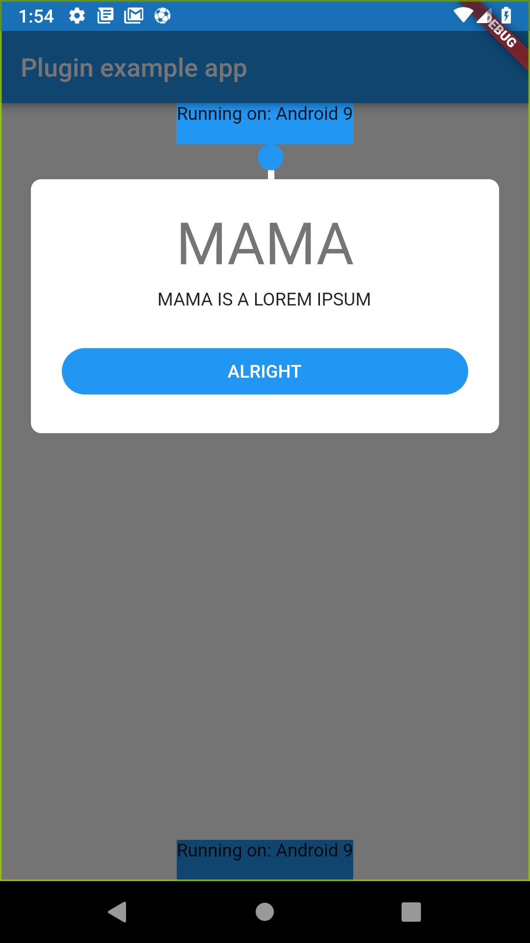
Screenshots #


Installation and Usage #
To install this package, you need to add flutter_introduction_tooltip (0.1.0 or higher) to the dependencies
list of the pubspec.yaml file as follow:
dependencies:
  flutter:
    sdk: flutter

  flutter_introduction_tooltip: ^0.1.0
Then run command flutter packages get on the console.
How to use #
Add the import to flutter_introduction_tooltip/flutter_introduction_tooltip.dart
Create a global key and attach to the widget you preferred.
import 'package:flutter_introduction_tooltip/flutter_introduction_tooltip.dart

GlobalKey globalKey = GlobalKey();
bool isShowing = false;

@override
  Widget build(BuildContext context) {
    showTutorial(context);
    return MaterialApp(
      home: Scaffold(
        appBar: AppBar(
          title: const Text('Plugin example app'),
        ),
        body: Builder(
            builder: (BuildContext context) {
              showTutorial(context);
              return Stack(
                children: <Widget> [
                  Container(
                    width: MediaQuery
                        .of(context)
                        .size
                        .width,
                    alignment: Alignment.bottomCenter,
                    child: Container(
                      color: Colors.blue,
                      key: globalKey,
                      child: Text(
                        'Running on: $_platformVersion\n',
                      ),
                    ),
                  ),
                ],
              );
            }
        ),
      ),
    );

void showTutorial(BuildContext context) async {
    if (!isShowing) {
      new Timer(Duration(milliseconds: 100), () async {
        try {
          FlutterIntroductionTooltip.showTopTutorialOnWidget(
              context,
              globalKey,
              Colors.blue,
                  () => popAndNextTutorial(context),
              "MAMA",
              "MAMA IS A LOREM IPSUM",
              "ALRIGHT");
          print("SHOWING");
          setState(() {
            isShowing = true;
          });
        } catch (e) {
          print("ERROR $e");
        }
      });
    }
  }
If you want the dialog to be on top of the widget, use showTopTutorialOnWidget, If you want the dialog to be on bottom of the widget, use showBottomTutorialOnWidget
The reason i use delay for the execution is because i run the function on the build method, and the build hasn't done yet so i can't draw the tutorial right there, so i delayed it.
Other alternative for doing this is to use library like https://pub.dartlang.org/packages/after_layout
Call Parameters #
MANDATORY
- BuildContext (current context)
- GlobalKey (globalkey attached to your widget)
- Color primaryColor (primary color used for the button and circle pointer)
- VoidCallback positiveCallback (positive callback used when the positive button is clicked)
- String title (title of the dialog)
- String subtitlte (subtitle of the dialog)
- String positiveBtn (title of the positive btn)
OPTIONAL
- LineHorizontalPosition lineHorizontalPosition (where you want the line to be, the options is Left, Center, and Right)
- Widget childBoxWidget (the custom widget if you don't want to use the dialog i provided)
- bool showLine *defaults to true (whether you want to show the line on top of the dialog or not)
- double lineHeight *defaults to 7.0 (the height of the line you desired)
- Widget circleWidget (the circle widget at the end of the line if you want to customize it)
- bool barrierDismissable *defaults to true (whether you want the background click will dismiss it or not)
Contributors #
- Angga Dwi Arifandi github
Contributions #
Any contributions is very welcomed in this package, just fork this repository to your own github account and create a pull request with the changes description.