flutter_intro 3.0.3  flutter_intro: ^3.0.3 copied to clipboard
 30x.link
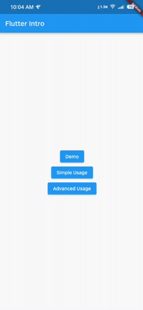
A better way for new feature introduction and step-by-step users guide for your Flutter project.
flutter_intro #

A better way for new feature introduction and step-by-step users guide for your Flutter project.
Since I no longer work at Tal, the repository has been moved from https://github.com/tal-tech/flutter_intro to here. #
This is 3.0.0 version, if you find 2.x documentation, click here. #
I completely rewritten the 3.0 version, and the usage is clearer and more concise.
Automatically adapt when the device screen orientation is switched.
Usage #
To use this package, add flutter_intro as a dependency in your pubspec.yaml file.
Init #
Wrap the app root widget with Intro, also you can set some global properties on Intro.
import 'package:flutter_intro/flutter_intro.dart';
Intro(
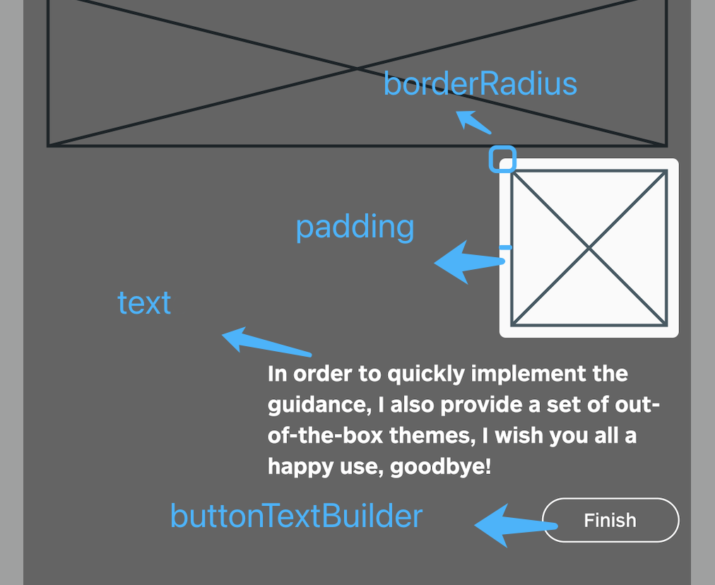
/// The padding of the highlighted area and the widget
padding: const EdgeInsets.all(8),
/// Border radius of the highlighted area
borderRadius: BorderRadius.all(Radius.circular(4)),
/// The mask color of step page
maskColor: const Color.fromRGBO(0, 0, 0, .6);
/// No animation
noAnimation: false;
/// Click on whether the mask is allowed to be closed.
maskClosable: false;
/// Custom button text
buttonTextBuilder: (order) =>
order == 3 ? 'Custom Button Text' : 'Next',
child: const YourApp(),
)
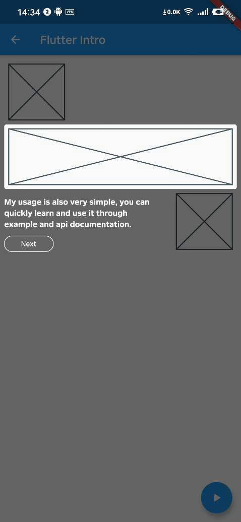
Add guided widget #
This time, the IntroStepBuilder class is added to do this, which solves the problem that the previous version could not dynamically add a guide.
IntroStepBuilder(
  /// Guide order, can not be repeated with other
  order: 1,
  /// At least one of text and overlayBuilder
  /// Use text to quickly add leading text
  text: 'guide text',
  /// Using overlayBuilder can be more customized, please refer to advanced usage in example
  overlayBuilder: (params) {
    ///
  }
  /// You can specify configuration for individual guide here
  borderRadius: const BorderRadius.all(Radius.circular(64)),
  builder: (context, key) => NeedGuideWidget(
    /// You should bind key here.
    key: key,
  ),
)
Run #
That's it!
Intro.of(context).start();
Advanced Usage #
IntroStepBuilder(
  ...,
  overlayBuilder: (StepWidgetParams params) {
    return YourOverlay();
  },
)
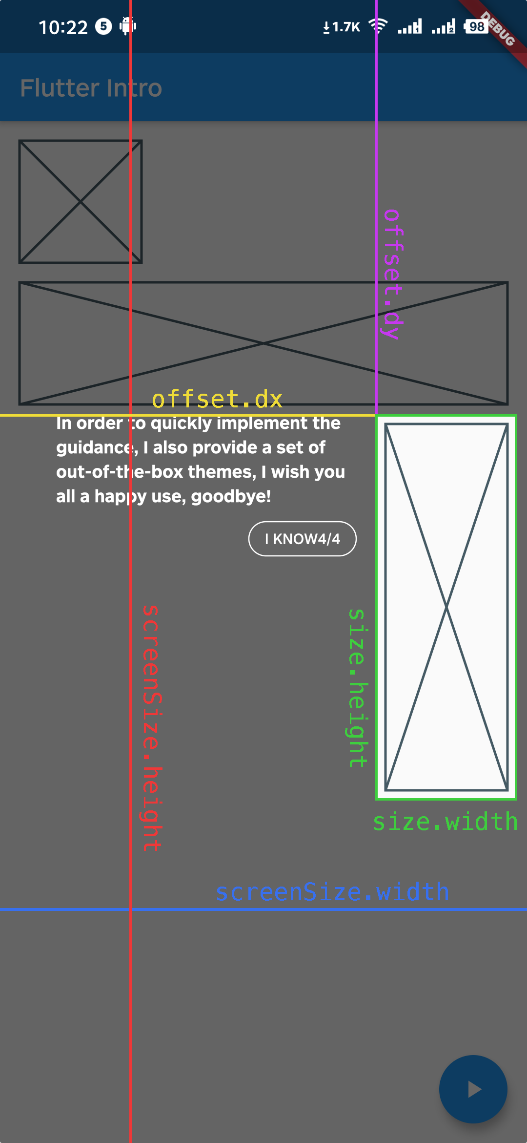
StepWidgetParams provides all the parameters needed to generate the guide overlay.
Troubleshoot #
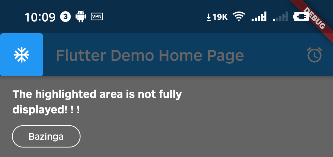
Q1. What if the highlighted area is not displayed completely?
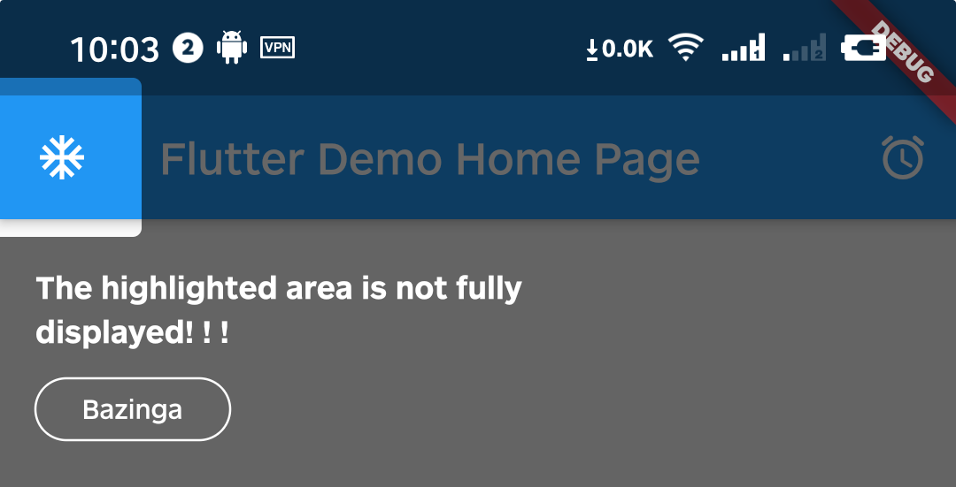
A1. That's because Intro provides 8px padding by default.
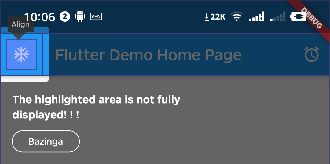
We can change it by setting the value of padding.
Intro(
  ...,
  /// Set it to zero
  padding: EdgeInsets.zero,
  child: const YourApp(),
);
Q2. Can I set different configurations for each step?
A2. Yes, you can set in every IntroStepBuilder.
IntroStepBuilder(
  ...,
  padding: const EdgeInsets.symmetric(
    vertical: -5,
    horizontal: -5,
  ),
  borderRadius: const BorderRadius.all(Radius.circular(64)),
  builder: (context, key) => YourWidget(),
)
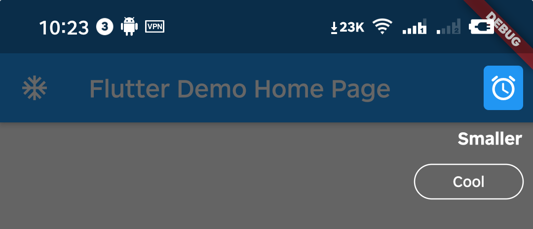
Q3. Can I make the highlight area smaller?
A3. You can do it by setting padding to a negative number.
IntroStepBuilder(
  ...,
  padding: const EdgeInsets.symmetric(
    vertical: -5,
    horizontal: -5,
  ),
  builder: (context, key) => YourWidget(),
)
Q4. How can I manually destroy the guide page, such as the user pressing the back button?
A4. You can call the dispose method of the intro instance.
WillPopScope(
  child: Scaffold(...),
  onWillPop: () async {
    Intro intro = Intro.of(context);

    if (intro.status.isOpen == true) {
      intro.dispose();
      return false;
    }
    return true;
  },
)
Example #
Please check the example in example/lib/main.dart.
Metadata
Publisher
Metadata
A better way for new feature introduction and step-by-step users guide for your Flutter project.
Repository (GitHub)
View/report issues
License
 unknown (license)