flutter_easyloading 3.0.5  flutter_easyloading: ^3.0.5 copied to clipboard
A clean and lightweight loading/toast widget for Flutter, Easy to use without context, Support iOS、Android and Web
Flutter EasyLoading #
English | 简体中文


Live Preview #
👉 https://nslogx.github.io/flutter_easyloading
Installing #
Add this to your package's pubspec.yaml file:
dependencies:
  flutter_easyloading: ^latest
Import #
import 'package:flutter_easyloading/flutter_easyloading.dart';
How to use #
First, initialize EasyLoading in your MaterialApp/CupertinoApp:
class MyApp extends StatelessWidget {
  // This widget is the root of your application.
  @override
  Widget build(BuildContext context) {
    return MaterialApp(
      title: 'Flutter EasyLoading',
      theme: ThemeData(
        primarySwatch: Colors.blue,
      ),
      home: MyHomePage(title: 'Flutter EasyLoading'),
      builder: EasyLoading.init(),
    );
  }
}
Then, enjoy yourself:
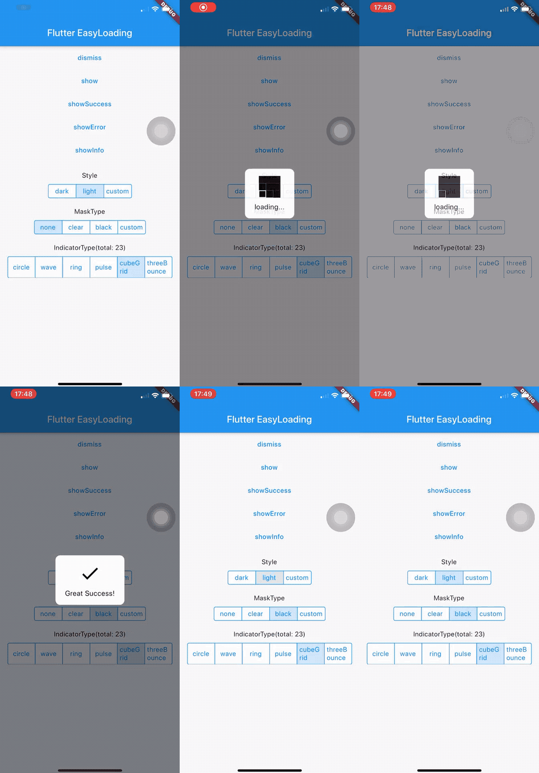
EasyLoading.show(status: 'loading...');

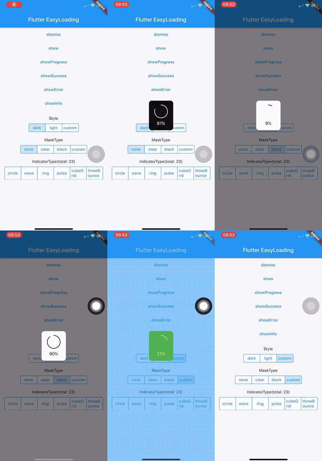
EasyLoading.showProgress(0.3, status: 'downloading...');

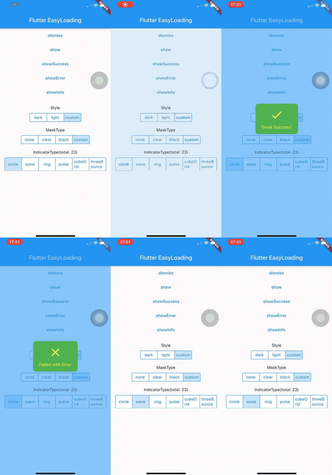
EasyLoading.showSuccess('Great Success!');

EasyLoading.showError('Failed with Error');

EasyLoading.showInfo('Useful Information.');

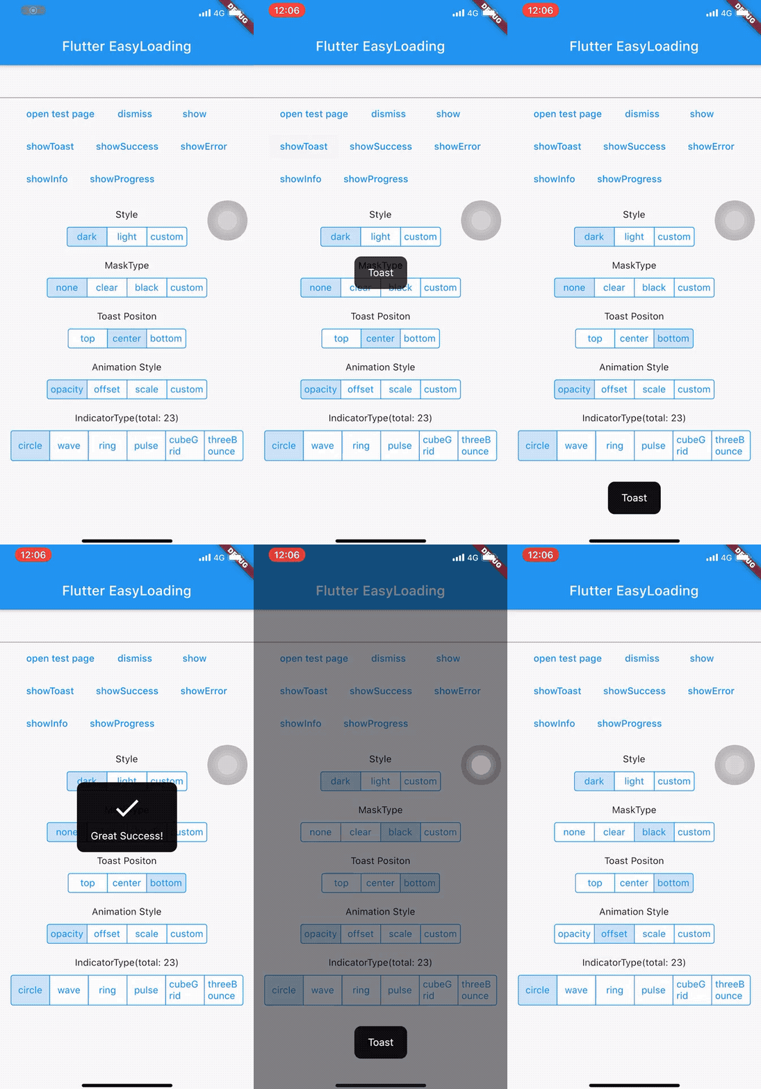
EasyLoading.showToast('Toast');

EasyLoading.dismiss();
Add loading status callback
EasyLoading.addStatusCallback((status) {
  print('EasyLoading Status $status');
});
Remove loading status callback(s)
EasyLoading.removeCallback(statusCallback);

EasyLoading.removeAllCallbacks();
Customize #
❗️Note:
-
textColor、indicatorColor、progressColor、backgroundColoronly used forEasyLoadingStyle.custom. -
maskColoronly used forEasyLoadingMaskType.custom.
/// loading style, default [EasyLoadingStyle.dark].
EasyLoadingStyle loadingStyle;

/// loading indicator type, default [EasyLoadingIndicatorType.fadingCircle].
EasyLoadingIndicatorType indicatorType;

/// loading mask type, default [EasyLoadingMaskType.none].
EasyLoadingMaskType maskType;

/// toast position, default [EasyLoadingToastPosition.center].
EasyLoadingToastPosition toastPosition;

/// loading animationStyle, default [EasyLoadingAnimationStyle.opacity].
EasyLoadingAnimationStyle animationStyle;

/// loading custom animation, default null.
EasyLoadingAnimation customAnimation;

/// textAlign of status, default [TextAlign.center].
TextAlign textAlign;

/// textStyle of status, default null.
TextStyle textStyle;

/// content padding of loading.
EdgeInsets contentPadding;

/// padding of [status].
EdgeInsets textPadding;

/// size of indicator, default 40.0.
double indicatorSize;

/// radius of loading, default 5.0.
double radius;

/// fontSize of loading, default 15.0.
double fontSize;

/// width of progress indicator, default 2.0.
double progressWidth;

/// width of indicator, default 4.0, only used for [EasyLoadingIndicatorType.ring, EasyLoadingIndicatorType.dualRing].
double lineWidth;

/// display duration of [showSuccess] [showError] [showInfo], default 2000ms.
Duration displayDuration;

/// animation duration of indicator, default 200ms.
Duration animationDuration;

/// color of loading status, only used for [EasyLoadingStyle.custom].
Color textColor;

/// color of loading indicator, only used for [EasyLoadingStyle.custom].
Color indicatorColor;

/// progress color of loading, only used for [EasyLoadingStyle.custom].
Color progressColor;

/// background color of loading, only used for [EasyLoadingStyle.custom].
Color backgroundColor;

/// mask color of loading, only used for [EasyLoadingMaskType.custom].
Color maskColor;

/// should allow user interactions while loading is displayed.
bool userInteractions;

/// should dismiss on user tap.
bool dismissOnTap;

/// indicator widget of loading
Widget indicatorWidget;

/// success widget of loading
Widget successWidget;

/// error widget of loading
Widget errorWidget;

/// info widget of loading
Widget infoWidget;
Because of EasyLoading is a singleton, so you can custom loading style any where like this:
EasyLoading.instance
  ..displayDuration = const Duration(milliseconds: 2000)
  ..indicatorType = EasyLoadingIndicatorType.fadingCircle
  ..loadingStyle = EasyLoadingStyle.dark
  ..indicatorSize = 45.0
  ..radius = 10.0
  ..progressColor = Colors.yellow
  ..backgroundColor = Colors.green
  ..indicatorColor = Colors.yellow
  ..textColor = Colors.yellow
  ..maskColor = Colors.blue.withOpacity(0.5)
  ..userInteractions = true
  ..dismissOnTap = false
  ..customAnimation = CustomAnimation();
More indicatorType can see in 👉 flutter_spinkit showcase
Custom Animation #
example: 👉 Custom Animation
Todo #
- ✅
add progress indicator
- ✅
add custom animation
Changelog #
License #
❤️❤️❤️ #
Thanks to flutter_spinkit ❤️
Supported by JetBrains Open Source


