flutter_easy_search_bar 0.0.3  flutter_easy_search_bar: ^0.0.3 copied to clipboard
AppBar with animated search functionality that can be used as regular or floating AppBar
Easy Search Bar #
A Flutter plugin to help you handle search inside your application. Can be used inside appBar or inside your application body depending on your necessities.
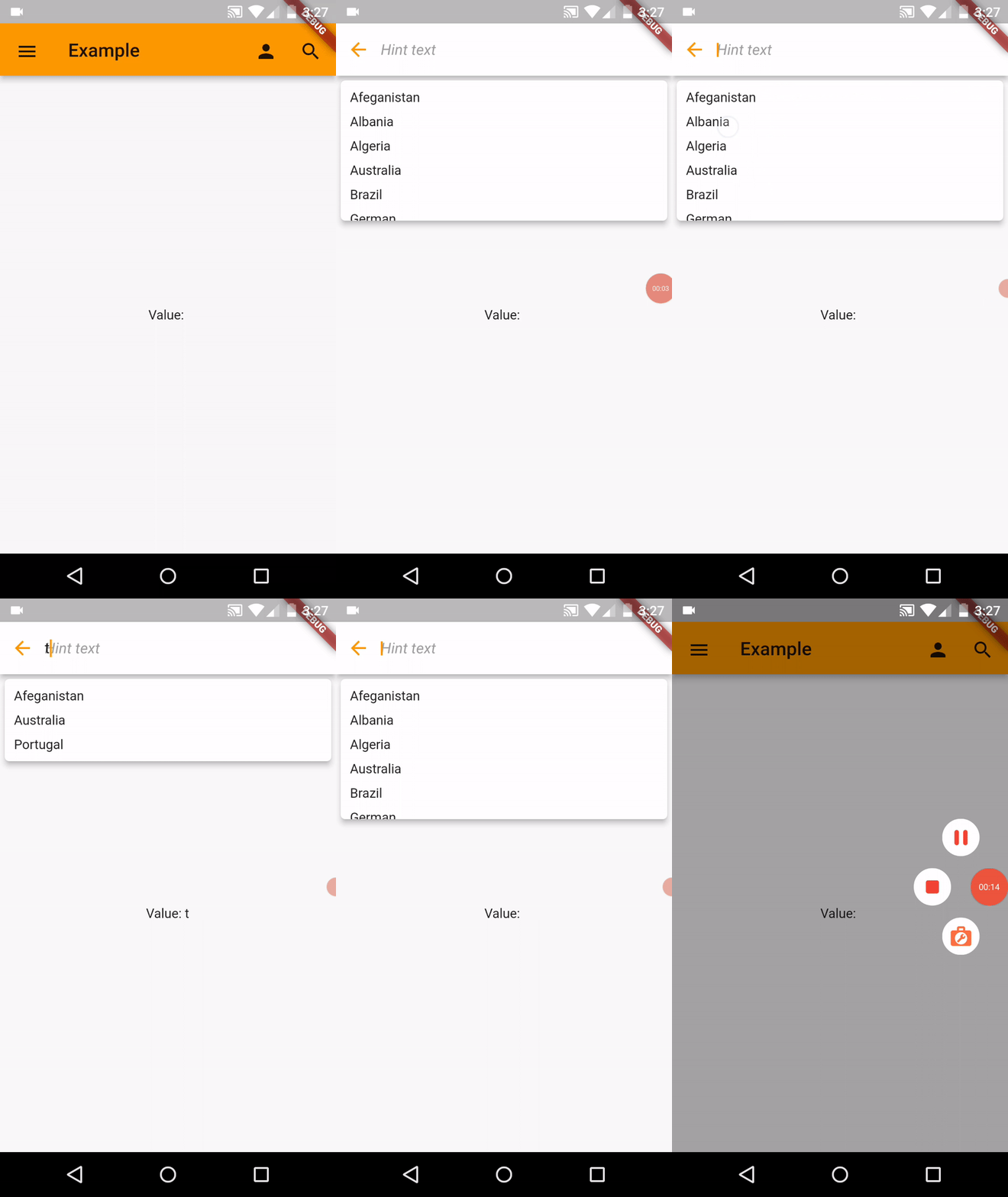
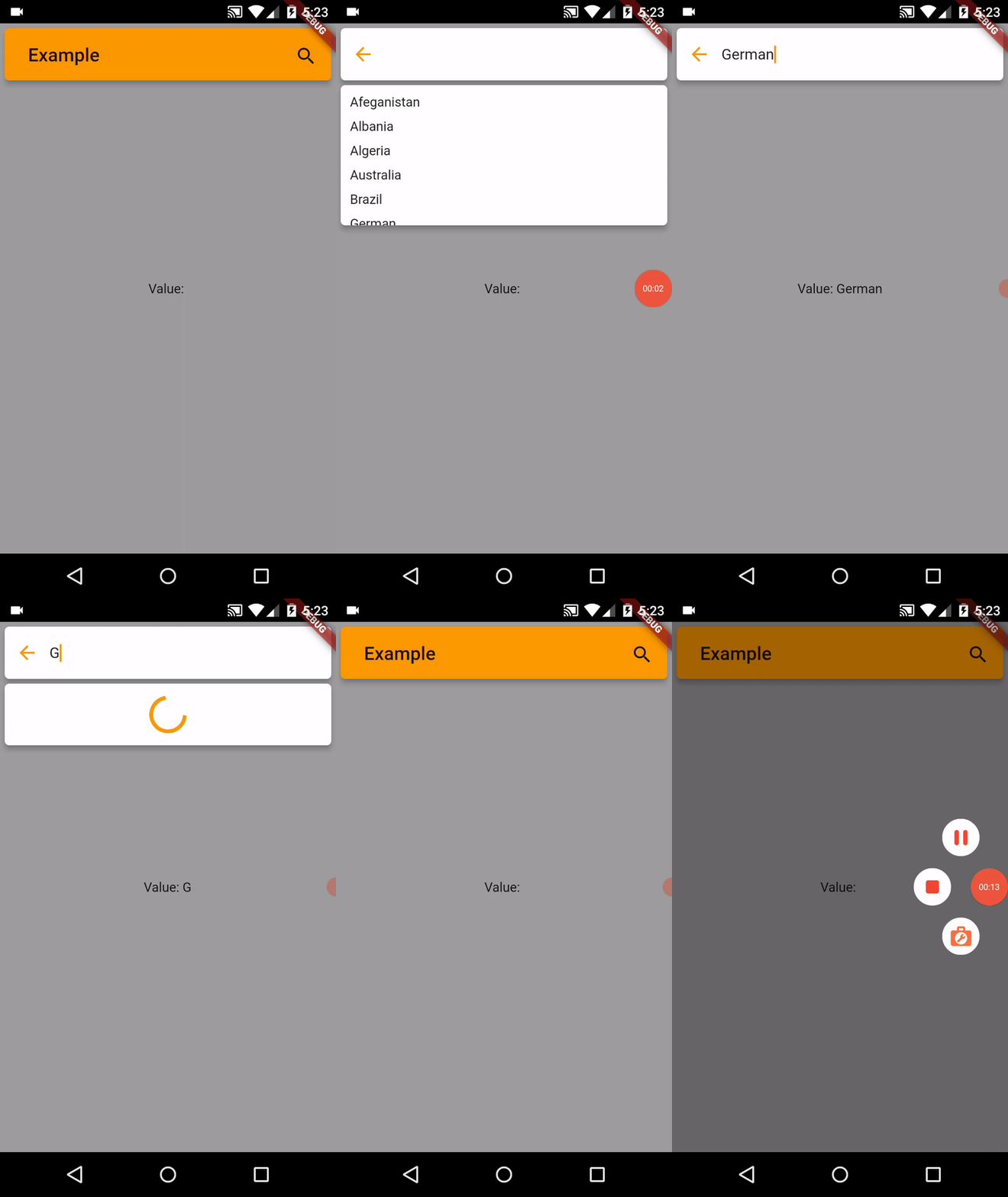
Preview #


Installation #
In the pubspec.yaml of your flutter project, add the following dependency:
dependencies:
  flutter_easy_search_bar: ^0.0.1
Basic example with suggestions #
You can create a simple searchbar example widget with suggestions with the following example:
import 'package:easy_search_bar/easy_search_bar.dart';
import 'package:flutter/material.dart';

void main() {
  runApp(const MyHomePage());
}

class MyHomePage extends StatefulWidget {
  const MyHomePage({Key? key}) : super(key: key);

  @override
  State<MyHomePage> createState() => _MyHomePageState();
}

class _MyHomePageState extends State<MyHomePage> {
  String searchValue = '';
  final List<String> _suggestions = ['Afeganistan', 'Albania', 'Algeria', 'Australia', 'Brazil', 'German', 'Madagascar', 'Mozambique', 'Portugal', 'Zambia'];

  @override
  Widget build(BuildContext context) {
    return  MaterialApp(
      title: 'Example',
      theme: ThemeData(
        primarySwatch: Colors.orange
      ),
      home: Scaffold(
        appBar: EasySearchBar(
          title: const Text('Example'),
          onSearch: (value) => setState(() => searchValue = value),
          suggestions: _suggestions
        ),
        drawer: Drawer(
          child: ListView(
            padding: EdgeInsets.zero,
            children: [
              const DrawerHeader(
                decoration: BoxDecoration(
                  color: Colors.blue,
                ),
                child: Text('Drawer Header'),
              ),
              ListTile(
                title: const Text('Item 1'),
                onTap: () => Navigator.pop(context)
              ),
              ListTile(
                title: const Text('Item 2'),
                onTap: () => Navigator.pop(context)
              )
            ]
          )
        ),
        body: Center(
          child: Text('Value: $searchValue')
        )
      )
    );
  }
}
Note: If you want to create a FloatingAppBar and want the body content to go behind the AppBar you need to set extendBodyBehindAppBar Scaffold property to true. And it's also recommended to wrap your Scaffold inside a SafeArea.
API #
| Attribute | Type | Required | Description | Default value |
|---|---|---|---|---|
| title | Widget |
✔️ | The title to be displayed inside AppBar | |
| onSearch | Function(String) |
✔️ | Returns the current search value.When search is closed, this method returns an empty value to clear the current search | |
| actions | List<Widget> |
❌ | Extra custom actions that can be displayed inside AppBar | |
| leading | Widget |
❌ | Can be used to add leading icon to AppBar | |
| backgroundColor | Color |
❌ | Can be used to change AppBar background color | |
| foregroundColor | Color |
❌ | Can be used to change AppBar foreground color | |
| elevation | double |
❌ | Can be used to change AppBar elevation | 5 |
| iconTheme | IconThemeData |
❌ | Can be used to set custom icon theme for AppBar icons | |
| appBarHeight | double |
❌ | Can be used to change AppBar height | 56 |
| animationDuration | Duration |
❌ | Can be used to set a duration for the AppBar search show and hide animation | Duration(milliseconds: 450) |
| isFloating | bool |
❌ | Can be used to determine if it will be a normal or floating AppBar | false |
| openOverlayOnSearch | bool |
❌ | Can be used to determine if the suggestions overlay will be opened when clicking search | false |
| titleTextStyle | TextStyle |
❌ | Can be used to set the AppBar title style | |
| searchBackgroundColor | Color |
❌ | Can be used to set the search input background color | |
| searchCursorColor | Color |
❌ | Can be used to set search textField cursor color | |
| searchHintText | String |
❌ | Can be used to set search textField hint text | |
| searchHintStyle | TextStyle |
❌ | Can be used to set search textField hint style | |
| searchTextStyle | TextStyle |
❌ | Can be used to set search textField text style | |
| searchTextKeyboardType | KeyboardType |
❌ | Can be used to set search textField keyboard type | |
| searchBackIconTheme | IconThemeData |
❌ | Can be used to set custom icon theme for the search textField back button | |
| systemOverlayStyle | SystemUiOverlayStyle |
❌ | Can be used to set SystemUiOverlayStyle to the AppBar | |
| suggestions | List<String> |
❌ | Can be used to create a suggestions list | |
| asyncSuggestions | Future<List<String>> Function(String value) |
❌ | Can be used to set async suggestions list | |
| suggestionsElevation | double |
❌ | Can be used to change suggestion list elevation | 5 |
| suggestionLoaderBuilder | Widget Function() |
❌ | A function that can be used to create a widget to display a custom suggestions loader | |
| suggestionTextStyle | TextStyle |
❌ | Can be used to change the suggestions text style | |
| suggestionBackgroundColor | Color |
❌ | Can be used to change suggestions list background color | |
| suggestionBuilder | Widget Function(String data) |
❌ | Can be used to create custom suggestion item widget | |
| onSuggestionTap | Function(String data) |
❌ | Instead of using the default suggestion tap action that fills the textField, you can set your own custom action for it | |
| debounceDuration | Duration |
❌ | Can be used to set the debounce time for async data fetch | Duration(milliseconds: 400) |
| showClearSearchIcon | bool |
❌ | Can be used to show search clear textField button | false |
| searchClearIconTheme | IconThemeData |
❌ | Can be used to set custom icon theme for the search clear textField button | |
| searchTextDirection | TextDirection |
❌ | Can be used to change text direction | TextDirection.ltr |
| putActionsOnRight | bool |
❌ | Can be used to determine if the actions button will be placed at right of the appbar | false |
| cancelableSuggestions | bool |
❌ | Can be used to allow the user to cancel the suggestions overlay by pressing escape or the back button on mobile | false |
Issues & Suggestions #
If you encounter any issue you or want to leave a suggestion you can do it by filling an issue.