flutter_data_table 0.1.0  flutter_data_table: ^0.1.0 copied to clipboard
A new Flutter Data Table Package. By this package a developer can implement a table widget which can be highly customizable.
Features #
- Support Android, IOS.
- This package is used to create a complete customizable and dynamic data table;
- Works fine on any Widget;
- Does not affect the functionality or performance of the application;
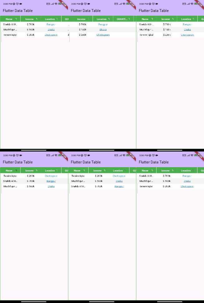
- This table has a dynamic sort function which add a sort functionality to the data table and it can sort any type of data in the table and re-arrange the table according to it;
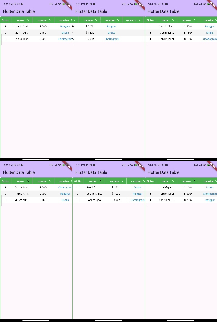
- Auto Generated serial number for each row
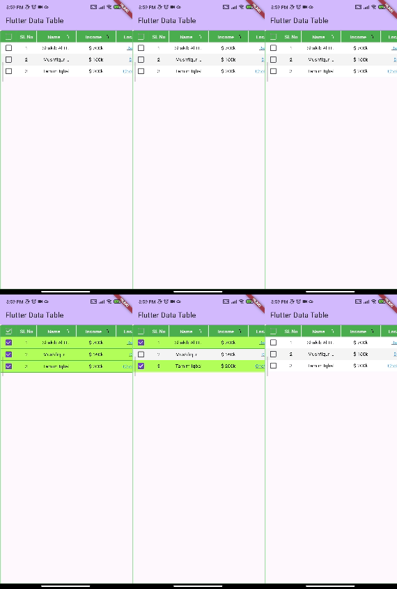
- Table has Multi-Select feature
- Table has infinity scroll mode with Load more mode
- Table has pull to refresh feature
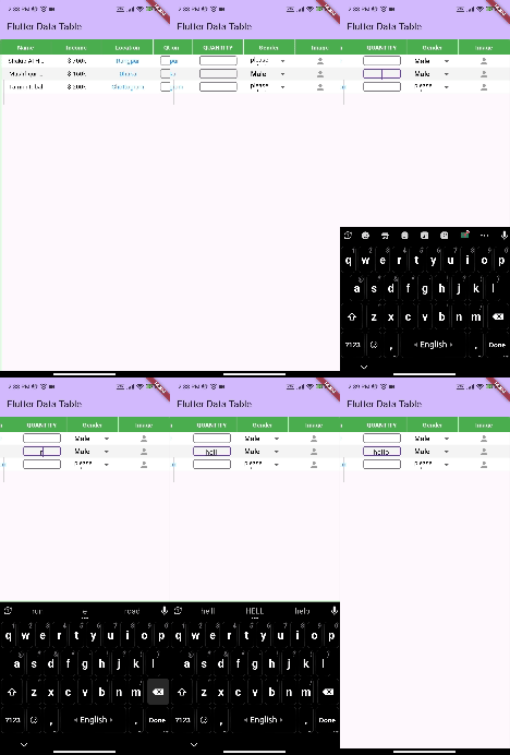
- Table has in-built functionality for Read only text field, Edit text field, Clickable text field, Dropdown field and also Any custom Widget field.
Demo #
Example:

With the auto sort functionality set to true
Add this to your code.
isSortAllowed = true

With serial number added to the each row
Add this to your code.
isSerialNumberColumnAllowed = true

With multi select with checkbox enabled
Add this to your code.
isCheckBoxMultiSelectAllowed = true

Getting started #
Install #
add this in your pubspec.yaml
flutter_data_table: ^latest_version
Widget Constructor #
Here all the constructors will be discussed with details.
FlutterDataTable
This is the constructor of the class.
     FlutterDataTable(
      {required this.columnModel,
        required this.rowsData,
        this.colors,
        this.isCheckBoxMultiSelectAllowed = false,
        this.sort,
        this.padding,
        this.isLoadMoreDataAllowed = true,
        this.onLoadMoreData,
        this.rowHeight,
        this.columnHeight,
        this.verticalController,
        this.noDataWidget,
        this.onSave,
        this.isRefreshAllowed = false,
        this.onRefresh,
        this.onRowSelectBuilder,
        this.tableDecoration,
        this.isSortAllowed = false,
        this.isSerialNumberColumnAllowed = false,
        this.slNoColumnName,
        this.selectedRowColor,
      });
Where:
- columnModel is required and it is a ColumnWidgetModel type. This is the column model class.
- rowsData is also required and it is a List of RowWidgetModel type. This is the list of the rows of the table.
- colors is a RowColor type. To separate 2 adjacent row by 2 different color.
- isCheckBoxMultiSelectAllowed is a boolean value indicates if multiselect rows allowed with checkbox.
- sort is a Function. This gives a global sort mechanism for the data table. This is not mandatory as the table has it's own dynamic sort mechanism.
- padding is a EdgeInsetsGeometry type which gives a padding for the data table.
- isLoadMoreDataAllowed is a boolean value. By making this True, data table will get an infinite scroll.
- onLoadMoreData is a Function. This function will be called when the data table reach the end of the scroll and if isLoadMoreDataAllowed is True.
- rowHeight is a double value. Which gives all the row a fixed height.
- columnHeight is a double value which gives the headers a fixed height.
- verticalController accepts a ScrollController. Which is basically the controller of the vertical scroll widget.
- onSave is a Function. This function has a parameter List of RowWidgetModel. This function is been called when this whole Widget is disposed. It only gives the List of rows where values are changed by user. The changes can be done by EditText or Dropdown value.
- isRefreshAllowed accepts a boolean. This flag indicate if pull to refresh is allowed. If this is true then we must provide onRefresh function.
- onRefresh is a Function. This is a async function. This function is called on pull to refresh.
- tableDecoration accepts an BoxDecoration. With this you can decorate the Container of the table.
- isSortAllowed is a boolean. This indicates if you want to have sorting mechanism in your table. Sort is done by the table it self. Sort function is very dynamic here.
- isSerialNumberColumnAllowed is a boolean value. Which indicates if you want to have serial number in the table.
- slNoColumnName is a String value. This is basically the column name of serial number column. By default it is "Sl No".
- serialNumColumnWidth accepts a double value. This will allow you to provide the width of Serial number column width.
- selectedRowColor accepts a Color type value. If the multi-select enabled, this color will be used as a highlighter color for the selected row.
- noDataWidget accepts a Widget type value. This widget is called when there is no data in the table.
- onRowSelectBuilder is a Builder function. If multi-select mode is enabled, then after selecting each row this function is called. You can get selected rows by this builder function.
RowFieldWidgetType
This is a enum.
enum RowFieldWidgetType {textWidget, editText, dropdown, clickable, currency, customWidget, empty}
Where
- textWidget => For simple readonly text field
- editText => For editable text field (TextFormField)
- dropdown => For simple dropdown widget
- clickable => For clickable widget (TextButton)
- currency => For simple readonly text field with $ sign before
- customWidget => For a different custom widget. You can put any widget in the value of the RowFieldWidget.
ColumnHeaderModel
This is the constructor of the class. Here T is the Generic Type. Each ColumnHeaderModel is the the header cell of each Column Header.
     ColumnHeaderModel({
        this.id,
        required this.slug,
        required this.label,
        this.orderNumber = -1,
        this.textAlign,
        this.fixedWidth,
        this.columnType = RowFieldWidgetType.textWidget,
        this.otherData
      });
Where:
- id is a int type and not required. This can be a unique number if you want to use this.
- slug is a String. This is required. This is a unique string for each column. This is the main thing on which each column and it's values are separated.
- label is a String type field. This is a required field. label will be shown on the column header UI.
- orderNumber is a int. This is recommended but not required. Base on this orderNumber the column and the row's fields are arranged.
- textAlign is a TextAlign type value. This field not required.
- fixedWidth is a double type value and it's not required as well. This gives the column a fixed width.
- columnType is a RowFieldWidgetType. This is by default textWidget type.
- otherData is a Generic type. You can put any other data to any particular column object. This data type is initialized when the object is declared. You can use any kind of data type for this field.
ColumnWidgetModel
This is the constructor of the ColumnWidgetModel. This class initializes the column headers along with all info of columns.
     ColumnWidgetModel({
      required this.columnsList,
      this.checkBoxWidgetStyle,
      this.headerBorder = true,
      this.headerBorderColor,
      this.backgroundColor,
      this.style
     });
Where:
- columnsList is a List of ColumnHeaderModel type enum. This is not required. This is the list where you will put all the column model objects.
- checkBoxWidgetStyle is not required and it only accepts a CheckBoxWidgetStyle. This gives a style for the checkbox in the multiselect mode.
- headerBorder is a boolean type field. This indicates if you want to have border on column header.
- headerBorderColor is a Color. This is a header border color.
- style is a TextStyle.
RowFieldWidgetModel
This is the constructor of the class. Here T is the Generic Type. Each RowFieldWidgetModel is the the cell of each row.
     RowFieldWidgetModel({
        this.type,
        required this.columnHeaderModel,
        required this.value,
        this.dropDownOptionsList = const [],
        this.onRowFieldClick,
        this.textAlign,
        this.style,
        this.other,
        this.onDropDownValueChange,
        this.onEditTextValueChange,
        this.inputType = InputType.string
     });
Where:
- type is a RowFieldWidgetType type enum. This is not required. This field is initialized by the ColumnHeaderWidget. So you can ignore it when building row widgets.
- columnHeaderModel is also required and it only accepts a ColumnHeaderModel. This should the same column header model object on which the particular cell this under.
- value is a dynamic type field. This required field accepts all kind of data type including Int, Double, String, DateTime when the cell is text widget or clickable widget or edit text widget. The Sort function mentioned above works according to this value. Again this value can be CustomTableDropDownModel if the cell is dropdown type. value can also be any Widget type is the cell is custom widget type. These cell is based on it's column header's columnType.
- dropDownOptionsList is a List of CustomTableDropDownModel. This is required when the field or cell is dropdown type.
- onRowFieldClick is a Function. If the type of the field or cell is "Clickable", then this function is called on when user click on the field or cell.
- textAlign is a TextAlign type value. This field not required. ColumnHeaderModel will initialize it. But only If you want your row's value in a different alignment than column header text, then you can change it. Otherwise you don not have to care about this.
- style is a TextStyle type value an it's not required as well. This gives a style of you text typed field or cell. This also initialized by the ColumnHeaderModel. But you can change it if you want.
- other is a Generic Type. This field for if anyone wants to put some other information about this field to use it later. You may put any type of data here. All you need is just to put the Generic Data type when initializing the widget.
- onDropDownValueChange is a Function. This function is used when the field or cell is Dropdown type. This function has 2 parameter. One is CustomTableDropDownModel this is the selected value. And another one is RowFieldWidgetModel type, which is the particular field or cell model object.
- onEditTextValueChange is also a Function. Which is used when the field or the cell is a EditText type. This function also has 2 parameter. One is String type, which is the updated String value which is written in the edit text field and another one is the another one is RowFieldWidgetModel type, which is the particular field or cell model object. When the user "Submit" or press "Done" or in a word "Un-focus" the keyboard, this function will be called by returning the new edited text String. Please see the Example section for better understanding.
- verticalController accepts a ScrollController. Which is basically the controller of the vertical scroll widget.
- inputType is a InputType type. This is used when the particular field or cell is EditText type. This indicates if the input type of the edit text field.
RowWidgetModel
This is the constructor of the class. Here T is the Generic Type. Each RowWidgetModel is the the each Row of the table. This class is the single row model class of the table.
     RowWidgetModel({
        required this.rowFieldList,
        this.others,
        this.checkBoxWidgetStyle,
        this.rowClickable = false,
        this.onRowClick,
        this.canBeSelected = true,
     });
Where:
- rowFieldList is a List of RowFieldWidgetModel. This is a required field. This field indicates the list of row cell for a single row.
- other is a Generic Type. if anyone wants to put some other information about this row to use it later, he/she may put any type of data here. All you need is just to put the Generic Data type when initializing the widget.
- checkBoxWidgetStyle is a CheckBoxWidgetStyle type. If the multiselect mode is enabled then this field is for the style of the checkbox.
- rowClickable is a boolean type field. If you want to make your row clickable, then make this field "true". This field is "false" by default.
- onRowClick is a Function. this function is called when the particular row is tapped.
- canBeSelected is a boolean. This indicates if this row can be selected if multi select mode is on for the table by setting isCheckBoxMultiSelectAllowed to true. By default it is true.
See Example to use the sample code to run a sample table #
Read this before implementation #
- Try to use orderNumber in ColumnHeaderModel for each column. It will still work if ou don't. The table will take it's orderNumber from the index of the given column header list.
- Try not to use the in-built sort function. This function is well written for any type of value given in value field in RowFieldWidgetModel only if the the field is text widget, currency widget or clickable widget.
- If there is any edit text field in the table, the sort mechanism won't work.
- If there are less than or equal 4 columns in the table, the table will take the whole screen and each of the column will take equal amount of space from the screen, if you do not provide the fixed width in any column.
- If you use this table under any scroll view then provide a fixed height to the table.
Known Limitations #
- Sort doesn't work when there is any edit text field in the table.
- Does not work when the table is under any scroll view without fixed height.
- It does not automatically calculate the height of the parent widget.
- Have to write extra codes to get the rows and column data.