flutter_constraintlayout 1.1.0-stable  flutter_constraintlayout: ^1.1.0-stable copied to clipboard
A super powerful Stack, build flexible layouts with constraints. Similar to ConstraintLayout for Android and AutoLayout for iOS.
Flutter ConstraintLayout #
A super powerful Stack, build flexible layouts with constraints. Similar to ConstraintLayout for Android and AutoLayout for iOS. But the code implementation is much more efficient, it has O(n) layout time complexity and no linear equation solving is required.
Greatly improve Flutter development experience and efficiency. Improve application performance #
No matter how complex the layout is and how deep the constraints are, it has almost the same performance as a single Flex or Stack. When facing complex layouts, it provides better performance, flexibility, and a very flat code hierarchy than Flex and Stack. Say no to 'nested hell'.
In short, once you use it, you can't go back.
Improving "nested hell" is one of my original intentions for developing Flutter ConstraintLayout, but I don't advocate the ultimate pursuit of one level of nesting, which is unnecessary. So features like chains are already well supported by Flex itself, so ConstraintLayout will not actively support it.
View Flutter Web Online Example
Flutter ConstraintLayout has extremely high layout performance. It does not require linear equations to solve. At any time, each child element will only be laid out once. When its own width or height is set to wrapContent, some child elements may calculate the offset twice. The layout process of ConstraintLayout consists of the following three steps:
- Constraint calculation
- Layout
- Draw
The performance of layout and drawing is almost equivalent to a single Flex or Stack, and the performance of constraint calculation is roughly 0.01 milliseconds (layout of general complexity, 20 child elements). Constraints are only recalculated after they have changed.
ConstraintLayout itself can be arbitrarily nested without performance issues, each child element in the render tree is only laid out once, and the time complexity is O(n) instead of O(2n) or worse.
A smaller Widget tree leads to less build time and a smaller Element tree. A very flat layout structure results in a smaller RenderObject tree and less rendering time. One thing most people tend to overlook is that complex nesting can cause build times to sometimes exceed render times.
It is recommended to use ConstraintLayout at the top level. For extremely complex layout(one thousand child elements, two thousand constraints), layout and drawing total time within 5 milliseconds(debug mode on Windows 10,release mode take less time), the frame rate can be easily reached 200 fps.
If not necessary, try to be relative to the parent layout, so that you can define less id. Or use relative id.
Warning: For layout performance considerations, constraints are always one-way, and there should be no two child elements directly or indirectly restrain each other(for example, the right side of A is constrained to the left side of B, and the left side of B is in turn constrained to A right). Each constraint should describe exactly where the child elements are located. Although constraints can only be one-way, you can still better handle things that were previously (Android ConstraintLayout) two-way constraints, such as chains(not yet supported, please use with Flex).
Feature #
- build flexible layouts with constraints
- leftToLeft
- leftToRight
- rightToLeft
- rightToRight
- topToTop
- topToBottom
- bottomToTop
- bottomToBottom
- baselineToTop
- baselineToBottom
- baselineToBaseline
- margin and goneMargin(when the visibility of the dependent element is gone or the actual size of one side is 0, the goneMargin will take effect, otherwise the margin will take effect, even if its own visibility is gone)
- clickPadding(quickly expand the click area of child elements without changing their actual size. This means that you can completely follow the layout of the UI prototype without having to think about the click area of the element. This also means that the click area can be shared between child elements without increasing nesting. Sometimes it may be necessary to combine with e-index)
- visibility control
- visible
- invisible
- gone(sometimes it may be better to use a conditional expression to keep the element from being created)
- constraint integrity hint
- bias(when there are constraints left and right or top and bottom, horizontalBias and verticalBias can be used to adjust the offset. The default value is 0.5, which means centering)
- z-index(drawing order, default is child index)
- translate
- percentage layout(when size is set to matchConstraint, the percentage layout will take effect, the default percentage is 1 (100%). The relevant properties are widthPercent, heightPercent, widthPercentageAnchor, heightPercentageAnchor)
- guideline
- constraints and widgets separation
- barrier
- dimension ratio
- widthHeightRatio: 1 / 3,
- ratioBaseOnWidth: true, (the default value is null, which means automatic inference. The size of the undetermined side will be calculated using the determined side based on the aspect ratio. The undetermined side must be matchConstraint, and the determined side can be matchParent, fixed size(>=0), matchConstraint)
- relative id(if an id is defined for a child element, it cannot be referenced using a relative
id)
- rId(3) represents the 3th child element, and so on
- sId(-1) represents the previous sibling element, and so on
- sId(1) represents the next sibling element, and so on
- wrapper constraints
- topLeftTo
- topCenterTo
- topRightTo
- centerLeftTo
- centerTo
- centerRightTo
- bottomLeftTo
- bottomCenterTo
- bottomRightTo
- centerHorizontalTo
- centerVerticalTo
- outTopLeftTo
- outTopCenterTo
- outTopRightTo
- outCenterLeftTo
- outCenterRightTo
- outBottomLeftTo
- outBottomCenterTo
- outBottomRightTo
- centerTopLeftTo
- centerTopCenterTo
- centerTopRightTo
- centerCenterLeftTo
- centerCenterRightTo
- centerBottomLeftTo
- centerBottomCenterTo
- centerBottomRightTo
- staggered grid、grid、list(list is a special staggered grid, grid is also a special staggered grid)
- circle position
- pinned position
- e-index(event dispatch order, default is z-index)
- the size of child widgets can be set to:
- fixed size(>=0)
- matchParent
- wrapContent(default, minimum and maximum supported)
- matchConstraint
- the size of itself can be set to:
- fixed size(>=0)
- matchParent(default)
- wrapContent(minimum and maximum are temporarily not supported)
Coming soon:
- chain
- constraints visualization
- more...
Support platform:
- Android
- iOS
- Mac
- Windows
- Linux
- Web
Import #
Null-safety
dependencies:
  flutter_constraintlayout:
    git:
      url: 'https://github.com/hackware1993/Flutter-ConstraintLayout.git'
      ref: 'v1.1.0-stable'
dependencies:
  flutter_constraintlayout: ^1.1.0-stable
import 'package:flutter_constraintlayout/flutter_constraintlayout.dart';
Example Flutter Web Online Example #
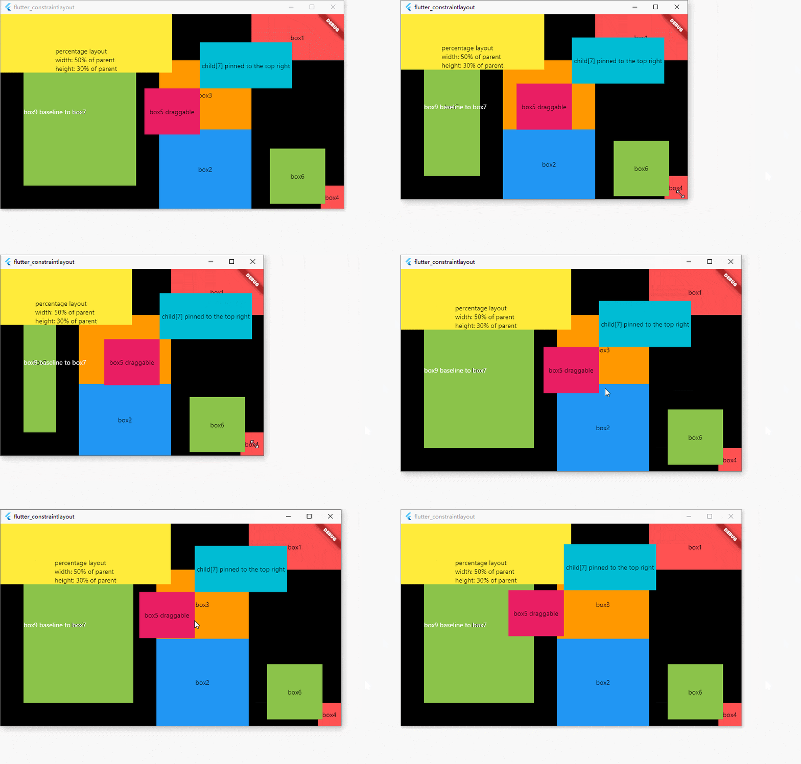
class ExampleState extends State<Example> {
  double x = 0;
  double y = 0;

  ConstraintId box0 = ConstraintId('box0');
  ConstraintId box1 = ConstraintId('box1');
  ConstraintId box2 = ConstraintId('box2');
  ConstraintId box3 = ConstraintId('box3');
  ConstraintId box4 = ConstraintId('box4');
  ConstraintId box5 = ConstraintId('box5');
  ConstraintId box6 = ConstraintId('box6');
  ConstraintId box7 = ConstraintId('box7');
  ConstraintId box8 = ConstraintId('box8');
  ConstraintId box9 = ConstraintId('box9');
  ConstraintId box10 = ConstraintId('box10');
  ConstraintId box11 = ConstraintId('box11');

  @override
  Widget build(BuildContext context) {
    return MaterialApp(
      home: Scaffold(
        backgroundColor: Colors.black,
        body: ConstraintLayout(
          // Constraints can be separated from widgets
          childConstraints: [
            Constraint(
              id: box0,
              width: 200,
              height: 200,
              bottomLeftTo: parent,
              zIndex: 20,
            )
          ],
          children: [
            Container(
              color: Colors.redAccent,
              alignment: Alignment.center,
              child: const Text('box0'),
            ).applyConstraintId(
              id: box0, // Constraints can be separated from widgets
            ),
            Container(
              color: Colors.redAccent,
              alignment: Alignment.center,
              child: const Text('box1'),
            ).apply(
              constraint: Constraint(
                // Constraints set with widgets
                id: box1,
                width: 200,
                height: 100,
                topRightTo: parent,
              ),
            ),
            Container(
              color: Colors.blue,
              alignment: Alignment.center,
              child: const Text('box2'),
            ).applyConstraint(
              // Constraints set with widgets easy way
              id: box2,
              width: matchConstraint,
              height: matchConstraint,
              centerHorizontalTo: box3,
              top: box3.bottom,
              bottom: parent.bottom,
            ),
            Container(
              color: Colors.orange,
              width: 200,
              height: 150,
              alignment: Alignment.center,
              child: const Text('box3'),
            ).applyConstraint(
              id: box3,
              width: wrapContent,
              height: wrapContent,
              right: box1.left,
              top: box1.bottom,
            ),
            Container(
              color: Colors.redAccent,
              alignment: Alignment.center,
              child: const Text('box4'),
            ).applyConstraint(
              id: box4,
              width: 50,
              height: 50,
              bottomRightTo: parent,
            ),
            GestureDetector(
              child: Container(
                color: Colors.pink,
                alignment: Alignment.center,
                child: const Text('box5 draggable'),
              ),
              onPanUpdate: (details) {
                setState(() {
                  x += details.delta.dx;
                  y += details.delta.dy;
                });
              },
            ).applyConstraint(
              id: box5,
              width: 120,
              height: 100,
              centerTo: parent,
              zIndex: 100,
              translate: Offset(x, y),
              translateConstraint: true,
            ),
            Container(
              color: Colors.lightGreen,
              alignment: Alignment.center,
              child: const Text('box6'),
            ).applyConstraint(
              id: box6,
              width: 120,
              height: 120,
              centerVerticalTo: box2,
              verticalBias: 0.8,
              left: box3.right,
              right: parent.right,
            ),
            Container(
              color: Colors.lightGreen,
              alignment: Alignment.center,
              child: const Text('box7'),
            ).applyConstraint(
              id: box7,
              width: matchConstraint,
              height: matchConstraint,
              left: parent.left,
              right: box3.left,
              centerVerticalTo: parent,
              margin: const EdgeInsets.all(50),
            ),
            Container(
              color: Colors.cyan,
              alignment: Alignment.center,
              child: const Text('child[7] pinned to the top right'),
            ).applyConstraint(
              width: 200,
              height: 100,
              left: box5.right,
              bottom: box5.top,
            ),
            const Text(
              'box9 baseline to box7',
              style: TextStyle(
                color: Colors.white,
              ),
            ).applyConstraint(
              id: box9,
              width: wrapContent,
              height: wrapContent,
              baseline: box7.baseline,
              left: box7.left,
            ),
            ...horizontalChain(
              centerHorizontalTo: parent,
              hChainList: [
                Container(
                  color: Colors.redAccent,
                  alignment: Alignment.center,
                  child: const Text('chain item 1'),
                ).applyConstraint(
                  id: box10,
                  width: matchConstraint,
                  height: 200,
                  top: parent.top,
                ),
                Container(
                  color: Colors.redAccent,
                  alignment: Alignment.center,
                  child: const Text('chain item 2'),
                ).applyConstraint(
                  id: box11,
                  width: matchConstraint,
                  height: 200,
                  top: parent.top,
                ),
              ],
            ),
            Container(
              color: Colors.yellow,
              alignment: Alignment.bottomCenter,
              child: const Text(
                  'percentage layout\nwidth: 50% of parent\nheight: 30% of parent'),
            ).applyConstraint(
              width: matchConstraint,
              height: matchConstraint,
              widthPercent: 0.5,
              heightPercent: 0.3,
              horizontalBias: 0,
              verticalBias: 0,
              centerTo: parent,
            ),
          ],
        ),
      ),
    );
  }
}
Advanced usage #
- guideline Flutter Web Online Example

class GuidelineExample extends StatelessWidget {
  const GuidelineExample({Key? key}) : super(key: key);

  @override
  Widget build(BuildContext context) {
    ConstraintId guideline = ConstraintId('guideline');
    return MaterialApp(
      home: Scaffold(
        body: ConstraintLayout(
          children: [
            Container(
              color: const Color(0xFF005BBB),
            ).applyConstraint(
              width: matchParent,
              height: matchConstraint,
              top: parent.top,
              bottom: guideline.top,
            ),
            Guideline(
              id: guideline,
              horizontal: true,
              guidelinePercent: 0.5,
            ),
            Container(
              color: const Color(0xFFFFD500),
            ).applyConstraint(
              width: matchParent,
              height: matchConstraint,
              top: guideline.bottom,
              bottom: parent.bottom,
            ),
            const Text(
              'Stand with the people of Ukraine',
              style: TextStyle(
                fontSize: 40,
                color: Colors.white,
              ),
            ).applyConstraint(
              width: wrapContent,
              height: wrapContent,
              centerHorizontalTo: parent,
              bottom: guideline.bottom,
            )
          ],
        ),
      ),
    );
  }
}
- barrier Flutter Web Online Example
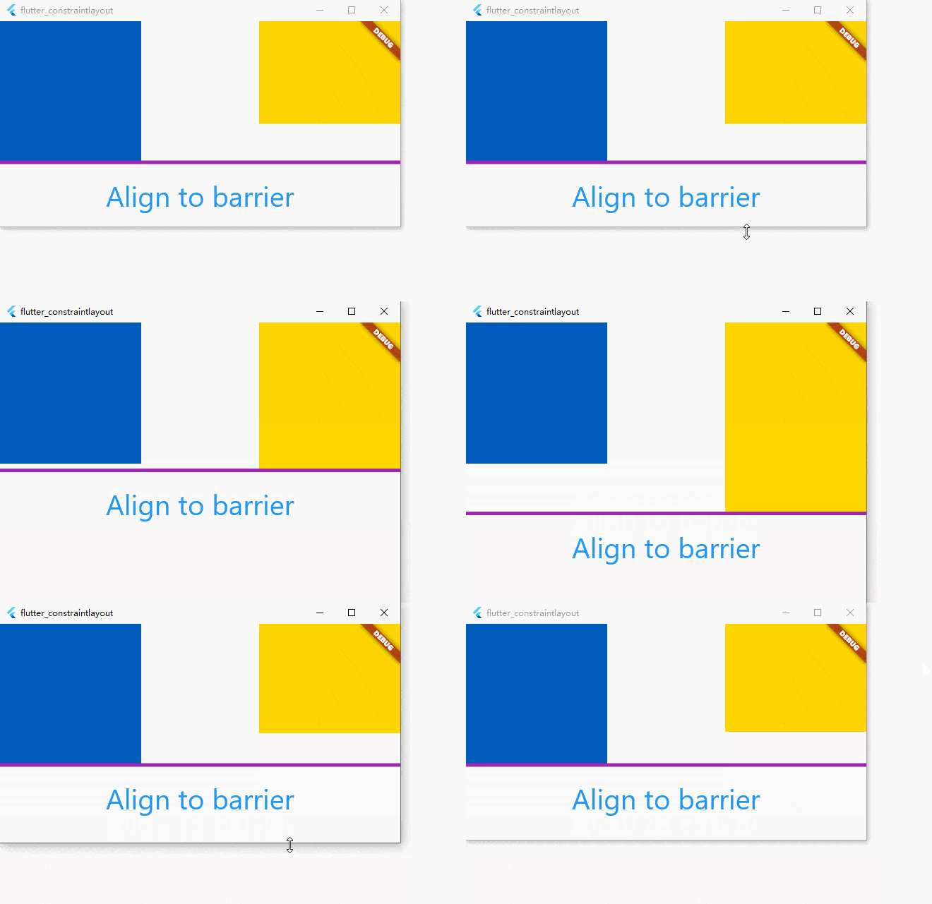
class BarrierExample extends StatelessWidget {
  const BarrierExample({Key? key}) : super(key: key);

  @override
  Widget build(BuildContext context) {
    ConstraintId leftChild = ConstraintId('leftChild');
    ConstraintId rightChild = ConstraintId('rightChild');
    ConstraintId barrier = ConstraintId('barrier');
    return MaterialApp(
      home: Scaffold(
        body: ConstraintLayout(
          debugShowGuideline: true,
          children: [
            Container(
              color: const Color(0xFF005BBB),
            ).applyConstraint(
              id: leftChild,
              width: 200,
              height: 200,
              top: parent.top,
              left: parent.left,
            ),
            Container(
              color: const Color(0xFFFFD500),
            ).applyConstraint(
              id: rightChild,
              width: 200,
              height: matchConstraint,
              right: parent.right,
              top: parent.top,
              bottom: parent.bottom,
              heightPercent: 0.5,
              verticalBias: 0,
            ),
            Barrier(
              id: barrier,
              direction: BarrierDirection.bottom,
              referencedIds: [leftChild, rightChild],
            ),
            const Text(
              'Align to barrier',
              style: TextStyle(
                fontSize: 40,
                color: Colors.blue,
              ),
            ).applyConstraint(
              width: wrapContent,
              height: wrapContent,
              centerHorizontalTo: parent,
              top: barrier.bottom,
              goneMargin: const EdgeInsets.only(top: 20),
            )
          ],
        ),
      ),
    );
  }
}
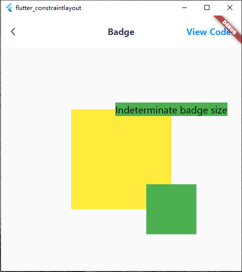
class BadgeExample extends StatelessWidget {
  const BadgeExample({Key? key}) : super(key: key);

  @override
  Widget build(BuildContext context) {
    ConstraintId anchor = ConstraintId('anchor');
    return Scaffold(
      body: ConstraintLayout(
        children: [
          Container(
            color: Colors.yellow,
          ).applyConstraint(
            width: 200,
            height: 200,
            centerTo: parent,
            id: anchor,
          ),
          Container(
            color: Colors.green,
            child: const Text(
              'Indeterminate badge size',
              style: TextStyle(
                color: Colors.black,
                fontSize: 20,
              ),
            ),
          ).applyConstraint(
            left: anchor.right,
            bottom: anchor.top,
            translate: const Offset(-0.5, 0.5),
            percentageTranslate: true,
          ),
          Container(
            color: Colors.green,
          ).applyConstraint(
            width: 100,
            height: 100,
            left: anchor.right,
            right: anchor.right,
            top: anchor.bottom,
            bottom: anchor.bottom,
          )
        ],
      ),
    );
  }
}
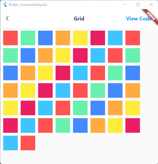
class GridExample extends StatelessWidget {
  const GridExample({Key? key}) : super(key: key);

  @override
  Widget build(BuildContext context) {
    List<Color> colors = [
      Colors.redAccent,
      Colors.greenAccent,
      Colors.blueAccent,
      Colors.orangeAccent,
      Colors.yellow,
      Colors.pink,
      Colors.lightBlueAccent
    ];
    return Scaffold(
      body: ConstraintLayout(
        children: [
          ...constraintGrid(
              id: ConstraintId('grid'),
              left: parent.left,
              top: parent.top,
              itemCount: 50,
              columnCount: 8,
              itemWidth: 50,
              itemHeight: 50,
              itemBuilder: (index) {
                return Container(
                  color: colors[index % colors.length],
                );
              },
              itemMarginBuilder: (index) {
                return const EdgeInsets.only(
                  left: 10,
                  top: 10,
                );
              })
        ],
      ),
    );
  }
}
- staggered grid Flutter Web Online Example
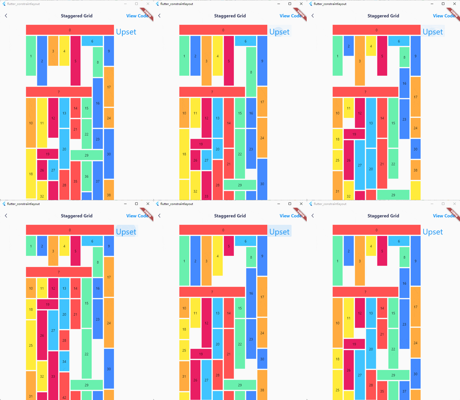
class StaggeredGridExample extends StatelessWidget {
  const StaggeredGridExample({Key? key}) : super(key: key);

  @override
  Widget build(BuildContext context) {
    List<Color> colors = [
      Colors.redAccent,
      Colors.greenAccent,
      Colors.blueAccent,
      Colors.orangeAccent,
      Colors.yellow,
      Colors.pink,
      Colors.lightBlueAccent
    ];
    const double smallestSize = 40;
    const int columnCount = 8;
    Random random = Random();
    return Scaffold(
      body: ConstraintLayout(
        children: [
          TextButton(
            onPressed: () {
              (context as Element).markNeedsBuild();
            },
            child: const Text(
              'Upset',
              style: TextStyle(
                fontSize: 32,
                height: 1.5,
              ),
            ),
          ).applyConstraint(
            left: ConstraintId('horizontalList').right,
            top: ConstraintId('horizontalList').top,
          ),
          ...constraintGrid(
              id: ConstraintId('horizontalList'),
              left: parent.left,
              top: parent.top,
              margin: const EdgeInsets.only(
                left: 100,
              ),
              itemCount: 50,
              columnCount: columnCount,
              itemBuilder: (index) {
                return Container(
                  color: colors[index % colors.length],
                  alignment: Alignment.center,
                  child: Text('$index'),
                );
              },
              itemSizeBuilder: (index) {
                if (index == 0) {
                  return const Size(
                      smallestSize * columnCount + 35, smallestSize);
                }
                if (index == 6) {
                  return const Size(smallestSize * 2 + 5, smallestSize);
                }
                if (index == 7) {
                  return const Size(smallestSize * 6 + 25, smallestSize);
                }
                if (index == 19) {
                  return const Size(smallestSize * 2 + 5, smallestSize);
                }
                if (index == 29) {
                  return const Size(smallestSize * 3 + 10, smallestSize);
                }
                return Size(
                    smallestSize, (2 + random.nextInt(4)) * smallestSize);
              },
              itemSpanBuilder: (index) {
                if (index == 0) {
                  return columnCount;
                }
                if (index == 6) {
                  return 2;
                }
                if (index == 7) {
                  return 6;
                }
                if (index == 19) {
                  return 2;
                }
                if (index == 29) {
                  return 3;
                }
                return 1;
              },
              itemMarginBuilder: (index) {
                return const EdgeInsets.only(
                  left: 5,
                  top: 5,
                );
              })
        ],
      ),
    );
  }
}
- circle position Flutter Web Online Example
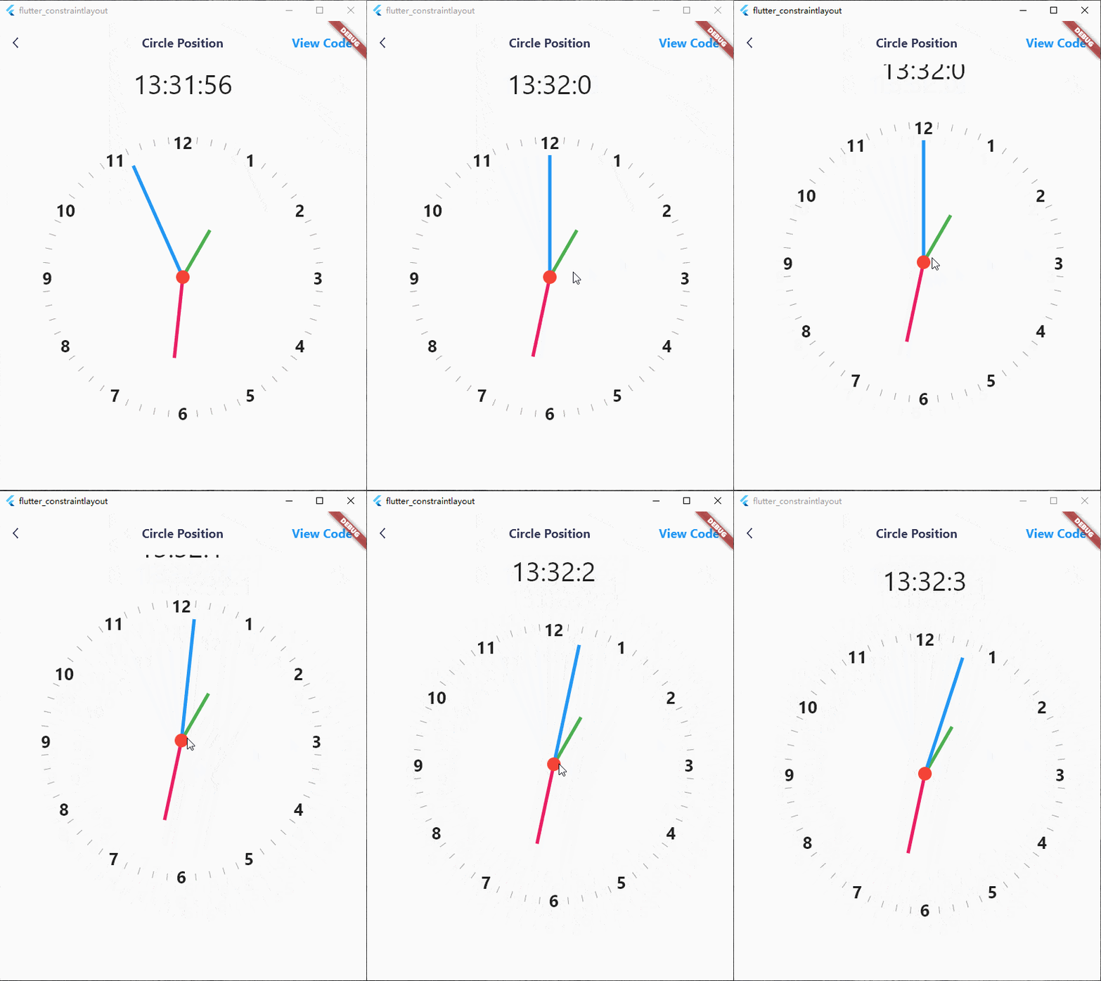
class CirclePositionExampleState extends State<CirclePositionExample> {
  late Timer timer;
  late int hour;
  late int minute;
  late int second;

  double centerTranslateX = 0;
  double centerTranslateY = 0;

  @override
  void initState() {
    super.initState();
    calculateClockAngle();
    timer = Timer.periodic(const Duration(seconds: 1), (_) {
      calculateClockAngle();
    });
  }

  void calculateClockAngle() {
    setState(() {
      DateTime now = DateTime.now();
      hour = now.hour;
      minute = now.minute;
      second = now.second;
    });
  }

  @override
  void dispose() {
    super.dispose();
    timer.cancel();
  }

  @override
  Widget build(BuildContext context) {
    return Scaffold(
      body: ConstraintLayout(
        children: [
          GestureDetector(
            child: Container(
              decoration: const BoxDecoration(
                color: Colors.red,
                borderRadius: BorderRadius.all(
                  Radius.circular(1000),
                ),
              ),
            ),
            onPanUpdate: (details) {
              setState(() {
                centerTranslateX += details.delta.dx;
                centerTranslateY += details.delta.dy;
              });
            },
          ).applyConstraint(
            width: 20,
            height: 20,
            centerTo: parent,
            zIndex: 100,
            translate: Offset(centerTranslateX, centerTranslateY),
            translateConstraint: true,
          ),
          for (int i = 0; i < 12; i++)
            Text(
              '${i + 1}',
              style: const TextStyle(
                fontWeight: FontWeight.bold,
                fontSize: 25,
              ),
            ).applyConstraint(
              centerTo: rId(0),
              translate: circleTranslate(
                radius: 205,
                angle: (i + 1) * 30,
              ),
            ),
          for (int i = 0; i < 60; i++)
            if (i % 5 != 0)
              Transform.rotate(
                angle: pi + pi * (i * 6 / 180),
                child: Container(
                  color: Colors.grey,
                  margin: const EdgeInsets.only(
                    top: 405,
                  ),
                ),
              ).applyConstraint(
                width: 1,
                height: 415,
                centerTo: rId(0),
              ),
          Transform.rotate(
            angle: pi + pi * (hour * 30 / 180),
            alignment: Alignment.topCenter,
            child: Container(
              color: Colors.green,
            ),
          ).applyConstraint(
            width: 5,
            height: 80,
            centerTo: rId(0),
            translate: const Offset(0, 0.5),
            percentageTranslate: true,
          ),
          Transform.rotate(
            angle: pi + pi * (minute * 6 / 180),
            alignment: Alignment.topCenter,
            child: Container(
              color: Colors.pink,
            ),
          ).applyConstraint(
            width: 5,
            height: 120,
            centerTo: rId(0),
            translate: const Offset(0, 0.5),
            percentageTranslate: true,
          ),
          Transform.rotate(
            angle: pi + pi * (second * 6 / 180),
            alignment: Alignment.topCenter,
            child: Container(
              color: Colors.blue,
            ),
          ).applyConstraint(
            width: 5,
            height: 180,
            centerTo: rId(0),
            translate: const Offset(0, 0.5),
            percentageTranslate: true,
          ),
          Text(
            '$hour:$minute:$second',
            style: const TextStyle(
              fontSize: 40,
            ),
          ).applyConstraint(
            outTopCenterTo: rId(0),
            margin: const EdgeInsets.only(
              bottom: 250,
            ),
          )
        ],
      ),
    );
  }
}
- margin Flutter Web Online Example
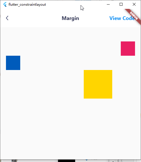
class MarginExample extends StatelessWidget {
  const MarginExample({Key? key}) : super(key: key);

  @override
  Widget build(BuildContext context) {
    return Scaffold(
      body: ConstraintLayout(
        children: [
          Container(
            color: const Color(0xFF005BBB),
          ).applyConstraint(
            size: 50,
            topLeftTo: parent,
            margin: const EdgeInsets.only(
              left: 20,
              top: 100,
            ),
          ),
          Container(
            color: const Color(0xFFFFD500),
          ).applyConstraint(
            size: 100,
            top: sId(-1).bottom,
            right: parent.right.margin(100),
          ),
          Container(
            color: Colors.pink,
          ).applyConstraint(
            size: 50,
            topRightTo: parent.rightMargin(20).topMargin(50),
          ),
        ],
      ),
    );
  }
}
Performance optimization #
- When the layout is complex, if the child elements need to be repainted frequently, it is recommended to use RepaintBoundary to improve performance.
class OffPaintExample extends StatelessWidget {
  const OffPaintExample({Key? key}) : super(key: key);

  @override
  Widget build(BuildContext context) {
    return MaterialApp(
      home: Scaffold(
        body: ConstraintLayout(
          children: [
            Container(
              color: Colors.orangeAccent,
            ).offPaint().applyConstraint(
              width: 200,
              height: 200,
              topRightTo: parent,
            )
          ],
        ),
      ),
    );
  }
}
- Try to use const Widget. If you can't declare a child element as const and it won't change, you can use OffBuildWidget to avoid the rebuilding of the child element.
class OffBuildExample extends StatelessWidget {
  const OffBuildExample({Key? key}) : super(key: key);

  @override
  Widget build(BuildContext context) {
    return MaterialApp(
      home: Scaffold(
        body: ConstraintLayout(
          children: [

            /// subtrees that do not change
            Container(
              color: Colors.orangeAccent,
            ).offBuild(id: 'id').applyConstraint(
              width: 200,
              height: 200,
              topRightTo: parent,
            )
          ],
        ),
      ),
    );
  }
}
-
Child elements will automatically become RelayoutBoundary unless width or height is wrapContent. The use of wrapContent can be reasonably reduced, because after the size of ConstraintLayout changes (usually the size of the window changes), all child elements whose width or height is wrapContent will be re-layout. And since the constraints passed to other child elements won't change, no real re-layout will be triggered.
-
If you use Guideline or Barrier in the children list, Element and RenderObject will inevitably be generated for them, which will be laid out but not drawn. At this point you can use GuidelineDefine or BarrierDefine to optimize it, no Element and RenderObject will be generated anymore:
class BarrierExample extends StatelessWidget {
  const BarrierExample({Key? key}) : super(key: key);

  @override
  Widget build(BuildContext context) {
    ConstraintId leftChild = ConstraintId('leftChild');
    ConstraintId rightChild = ConstraintId('rightChild');
    ConstraintId barrier = ConstraintId('barrier');
    return Scaffold(
      body: ConstraintLayout(
        childConstraints: [
          BarrierDefine(
            id: barrier,
            direction: BarrierDirection.bottom,
            referencedIds: [leftChild, rightChild],
          ),
        ],
        children: [
          Container(
            color: const Color(0xFF005BBB),
          ).applyConstraint(
            id: leftChild,
            width: 200,
            height: 200,
            topLeftTo: parent,
          ),
          Container(
            color: const Color(0xFFFFD500),
          ).applyConstraint(
            id: rightChild,
            width: 200,
            height: matchConstraint,
            centerRightTo: parent,
            heightPercent: 0.5,
            verticalBias: 0,
          ),
          const Text(
            'Align to barrier',
            style: TextStyle(
              fontSize: 40,
              color: Colors.blue,
            ),
          ).applyConstraint(
            centerHorizontalTo: parent,
            top: barrier.bottom,
          )
        ],
      ),
    );
  }
}
Support me #
If it helps you a lot, consider sponsoring me a cup of milk tea.
Paypal

Contact #
License #
MIT License

Copyright (c) 2022 hackware1993

Permission is hereby granted, free of charge, to any person obtaining a copy of this software and
associated documentation files (the "Software"), to deal in the Software without restriction,
including without limitation the rights to use, copy, modify, merge, publish, distribute,
sublicense, and/or sell copies of the Software, and to permit persons to whom the Software is
furnished to do so, subject to the following conditions:

The above copyright notice and this permission notice shall be included in all copies or substantial
portions of the Software.

THE SOFTWARE IS PROVIDED "AS IS", WITHOUT WARRANTY OF ANY KIND, EXPRESS OR IMPLIED, INCLUDING BUT
NOT LIMITED TO THE WARRANTIES OF MERCHANTABILITY, FITNESS FOR A PARTICULAR PURPOSE AND
NONINFRINGEMENT. IN NO EVENT SHALL THE AUTHORS OR COPYRIGHT HOLDERS BE LIABLE FOR ANY CLAIM, DAMAGES
OR OTHER LIABILITY, WHETHER IN AN ACTION OF CONTRACT, TORT OR OTHERWISE, ARISING FROM, OUT OF OR IN
CONNECTION WITH THE SOFTWARE OR THE USE OR OTHER DEALINGS IN THE SOFTWARE.