flutter_better_ui 1.0.5  flutter_better_ui: ^1.0.5 copied to clipboard
A modern Flutter UI component library that provides beautiful and easy-to-use widgets, with theme customization and responsive design. Actively maintained.
Better UI #
A modern Flutter UI component library that provides beautiful and easy-to-use widgets, with theme customization and responsive design. Actively maintained.
✨ Features #
- 🎨 Modern design - Built with Material Design 3
- 🌙 Theming - Light/Dark theme switching
- 📱 Responsive - Adapts to different screen sizes
- ⚡ High performance - Optimized rendering
- 🛠️ Extensible - Modular and easy to customize
🎥 Preview #
If it cannot be played directly, you can click on the link below to view or download:
📦 Components #
Basic Components #
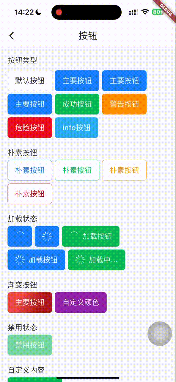
- BetterButton - Enhanced button with multiple styles and states
- BetterTextButton - Text button
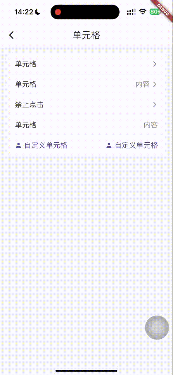
- BetterCell - List cell item
Feedback Components #
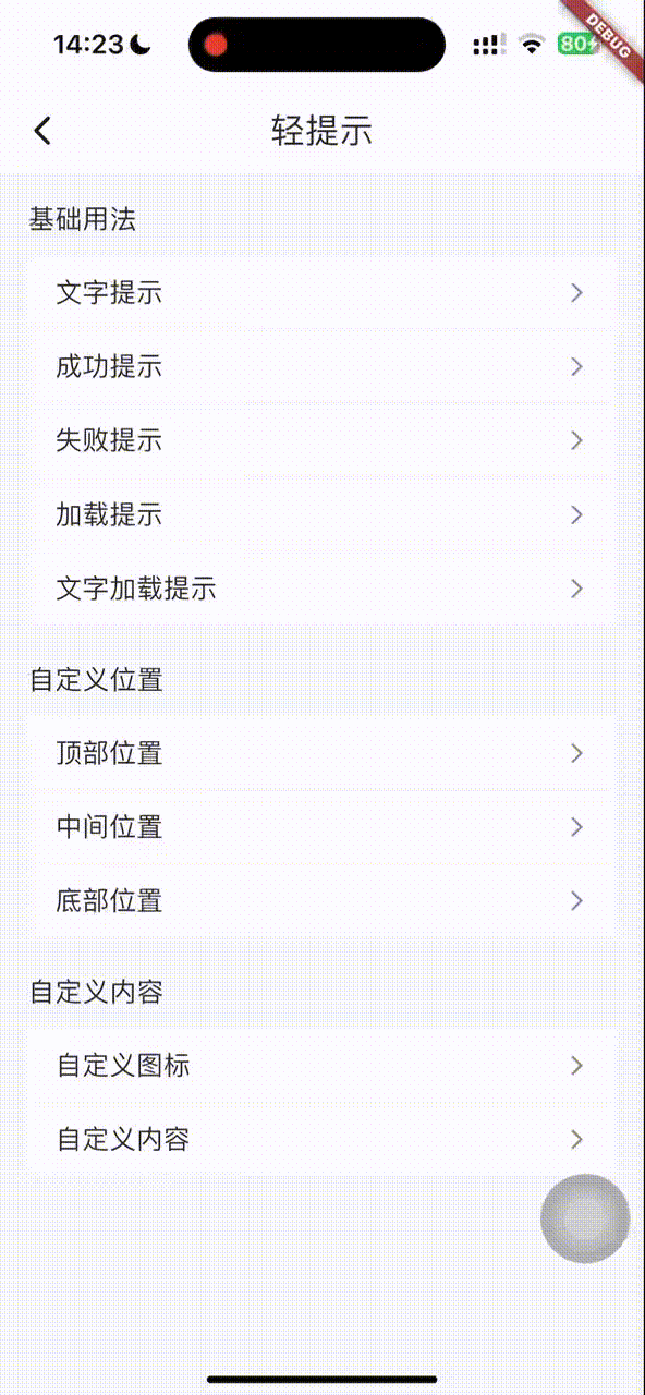
- BetterToast - Lightweight toast with multiple positions and styles
- BetterPopup - Popup layer with multiple presentation styles
Form Components #
- BetterPicker - Picker supporting single, multiple, and cascading selections
- BetterSwitch - Customizable switch with loading state and async control
Utilities #
- BetterScreenUtil - Screen adaptation utilities
- ColorUtil - Color utilities
🚀 Quick Start #
Installation #
Add the dependency in pubspec.yaml:
dependencies:
  better_ui: ^lastversion
Initialize #
void main() async {
  runApp(const MyApp());
}

class MyApp extends StatelessWidget {
  const MyApp({super.key});
  @override
  Widget build(BuildContext context) {
    //init Better UI,mast be first line
     BetterUtil.init(context, designWidth: 375, designHeight: 812);
    return MaterialApp(
       body: HomePage();
    );
  }
}
📖 Usage Guide #
BetterButton - Button #
// Basic button
BetterButton(
  text: "Click me",
  onClick: () {
    print("Button clicked");
  },
)

// Primary button
BetterButton(
  type: BetterButtonType.primary,
  text: "Primary Button",
  onClick: () {},
)

// Loading state button
BetterButton(
  text: "Loading",
  loading: true,
  onClick: () {},
)

// Plain button
BetterButton(
  type: BetterButtonType.primary,
  plain: true,
  text: "Plain Button",
  onClick: () {},
)
BetterToast - Toast #
// Basic toast
BetterToast.show(
  context,
  message: "Operation succeeded",
);

// Custom style
BetterToast.show(
  context,
  message: "Custom toast",
  backgroundColor: Colors.blue,
  textColor: Colors.white,
  position: BetterToastPosition.center,
  duration: Duration(seconds: 3),
);

// Loading toast
BetterToast.showLoading(context);
BetterToast.hideLoading();
BetterPopup - Popup #
// Bottom popup
BetterPopup.show(
  context,
  position: BetterPopupPosition.bottom,
  child: Container(
    height: 300,
    child: Center(child: Text("Bottom popup content")),
  ),
);

// Center popup
BetterPopup.show(
  context,
  position: BetterPopupPosition.center,
  child: Container(
    width: 300,
    height: 200,
    child: Center(child: Text("Centered popup content")),
  ),
);
BetterPicker - Picker #
// Single-column picker
BetterPicker.show(
  context,
  columns: [
    BetterPickerItem(text: 'Option 1', value: 'option1'),
    BetterPickerItem(text: 'Option 2', value: 'option2'),
    BetterPickerItem(text: 'Option 3', value: 'option3'),
  ],
  onConfirm: (items) {
    print("Selected: ${items.first.text}");
  },
);

// Multi-column picker
BetterPicker.show(
  context,
  columns: [
    [
      BetterPickerItem(text: 'Monday', value: 'Monday'),
      BetterPickerItem(text: 'Tuesday', value: 'Tuesday'),
      BetterPickerItem(text: 'Wednesday', value: 'Wednesday'),
    ],
    [
      BetterPickerItem(text: 'Morning', value: 'Morning'),
      BetterPickerItem(text: 'Afternoon', value: 'Afternoon'),
      BetterPickerItem(text: 'Evening', value: 'Evening'),
    ],
  ],
  onConfirm: (items) {
    print("Selected: ${items.map((item) => item.text).join(', ')}");
  },
);

// Cascading picker
BetterPicker.show(
  context,
  columns: [
    BetterPickerItem(
      text: 'Zhejiang',
      value: 'Zhejiang',
      children: [
        BetterPickerItem(
          text: 'Hangzhou',
          value: 'Hangzhou',
          children: [
            BetterPickerItem(text: 'Xihu District', value: 'Xihu'),
            BetterPickerItem(text: 'Yuhang District', value: 'Yuhang'),
          ],
        ),
        BetterPickerItem(
          text: 'Wenzhou',
          value: 'Wenzhou',
          children: [
            BetterPickerItem(text: 'Lucheng District', value: 'Lucheng'),
            BetterPickerItem(text: 'Ouhai District', value: 'Ouhai'),
          ],
        ),
      ],
    ),
  ],
  onConfirm: (items) {
    print("Selected: ${items.map((item) => item.text).join(' - ')}");
  },
);
BetterCell - List Cell #
BetterCell(
    height: 44.bw,
    titleText: 'Cell'.tr,
    isShowBorder: true,
    isShowArrowRight: true,
    onClick(){
        print("on click")
    }
),
BetterSwitch - Switch #
// Basic switch
BetterSwitch(
  defaultValue: false,
  onChanged: (value) {
    print("Switch value: $value");
  },
)

// Loading state switch
BetterSwitch(
  loading: true,
  onChanged: (value) {
    print("Switch value: $value");
  },
)

// Custom size and colors
BetterSwitch(
  width: 44.bw,
  height: 26.bw,
  defaultValue: true,
  activeBackgroundColor: Colors.red,
  inactiveBackgroundColor: Colors.grey,
  onChanged: (value) {
    print("Switch value: $value");
  },
)

// Custom ball widget
BetterSwitch(
  width: 50.bw,
  height: 30.bw,
  ballWidget: Container(
    width: 26.bw,
    height: 26.bw,
    decoration: BoxDecoration(
      color: Colors.white,
      shape: BoxShape.circle,
    ),
    child: Icon(
      Icons.check,
      color: Theme.of(context).primaryColor,
      size: 16.bw,
    ),
  ),
  onChanged: (value) {
    print("Switch value: $value");
  },
)

// Disabled switch
BetterSwitch(
  disabled: true,
  onChanged: (value) {
    print("Switch is disabled");
  },
)

// Async control switch
BetterSwitch(
  onUpdateChange: () async {
    // Show confirmation dialog
    final result = await showDialog<bool>(
      context: context,
      builder: (context) => AlertDialog(
        title: Text('Confirm'),
        content: Text('Do you want to toggle the switch?'),
        actions: [
          TextButton(
            onPressed: () => Navigator.pop(context, false),
            child: Text('Cancel'),
          ),
          TextButton(
            onPressed: () => Navigator.pop(context, true),
            child: Text('Confirm'),
          ),
        ],
      ),
    );
    return result ?? false;
  },
)
🔧 Utilities #
BetterScreenUtil - Screen Adaptation #
// Get screen information
double screenWidth = BetterScreenUtil.screenWidth;
double screenHeight = BetterScreenUtil.screenHeight;
double statusBarHeight = BetterScreenUtil.statusBarHeight;

// Responsive sizes
double responsiveWidth = 100.bw;
double responsiveHeight = 50.bh;
double responsiveFont = 16.bsp;
ColorUtil - Color Utilities #
// Color conversion
Color hexColor = ColorUtil.hexToColor("#FF0000");
📋 Example Project #
See the example/ directory for full usage examples:
better_button_page.dart- Button examplesbetter_toast_page.dart- Toast examplesbetter_popup_page.dart- Popup examplesbetter_picker_page.dart- Picker examplesbetter_switch_page.dart- Switch examplesbetter_cell_page.dart- List cell examples
🤝 Contributing #
Issues and Pull Requests are welcome!
📄 License #
This project is licensed under the MIT License — see the LICENSE file for details.
🔗 Links #
Metadata
Publisher
unverified uploader
Weekly Downloads
Metadata
A modern Flutter UI component library that provides beautiful and easy-to-use widgets, with theme customization and responsive design. Actively maintained.
Repository (GitHub)
View/report issues
License
 unknown (license)