flow_stepper_widget 0.0.4  flow_stepper_widget: ^0.0.4 copied to clipboard
Published 9 months ago •  danials.space
danials.spaceA lightweight, highly-customizable Flutter stepper/indicator widget with modern design and full styling control.
Flow Stepper Widget #
A lightweight, highly-customizable Flutter stepper/indicator widget with modern design and full styling control.
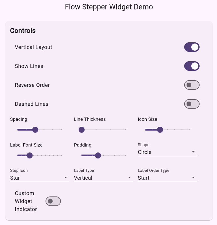
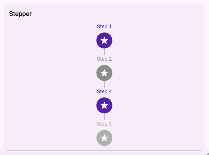
Screenshots #
 |
 |
|---|
Features #
- Vertical and horizontal layouts with flexible label positioning
- Customizable step indicators and labels
- Animated state transitions with configurable duration
- Dashed or solid connecting lines with adjustable thickness
- RTL/LTR support for internationalization
- Full accessibility support with semantic labels
- Material Design 3 ready
- Extensive customization options for colors, sizes, and shapes
- Support for custom builders for indicators, labels, and icons
- Custom line painter support for advanced line styling
Installation #
Add this to your package's pubspec.yaml file:
dependencies:
  flow_stepper_widget: any
Usage #
import 'package:flow_stepper_widget/flow_stepper_widget.dart';

FlowStepperWidget(
  steps: [
    FlowStep(
      id: 'step1',
      label: 'Step 1',
      icon: Icons.check,
      active: true,
    ),
    FlowStep(
      id: 'step2',
      label: 'Step 2',
      icon: Icons.check,
      active: false,
    ),
    // Add more steps...
  ],
  direction: Axis.vertical,
  labelType: LabelType.vertical,
  labelOrderType: LabelOrderType.start,
)
Customization Options #
Basic Properties #
steps: List of steps to displaydirection: Layout direction (vertical or horizontal)labelType: Label fitting typelabelOrderType: Label order typespacing: Spacing between stepsreverse: Whether to reverse the order of steps
Styling #
activeStepColor: Color for active stepsinactiveStepColor: Color for inactive stepsdisabledStepColor: Color for disabled stepsstepIconSize: Size for step iconsstepTextStyle: Text style for step labelsstepShape: Shape for step containersstepPadding: Padding for step containers
Line Customization #
lineActiveColor: Active color of connecting lineslineInactiveColor: Inactive color of connecting lineslineThickness: Thickness of connecting linesdashPattern: Pattern for dashed linesshowLines: Whether to show connecting lineslinePainter: Custom painter for connecting lines
Callbacks #
onStepTap: Callback when a step is tappedonStepLongPress: Callback when a step is long-pressed
Custom Builders #
indicatorBuilder: Custom builder for step indicatorslabelBuilder: Custom builder for step labelsstepIconBuilder: Custom builder for step icons
Animation #
stepAnimationDuration: Animation duration for state changes
Localization #
textDirection: Text direction for RTL/LTR support
Example #
FlowStepperWidget(
  steps: [
    FlowStep(
      id: 'step1',
      label: 'First Step',
      icon: Icons.check,
      active: true,
      enabled: true,
    ),
    FlowStep(
      id: 'step2',
      label: 'Second Step',
      icon: Icons.check,
      active: false,
      enabled: true,
    ),
  ],
  direction: Axis.vertical,
  labelType: LabelType.vertical,
  labelOrderType: LabelOrderType.start,
  spacing: 24.0,
  activeStepColor: Colors.blue,
  inactiveStepColor: Colors.grey,
  stepIconSize: 32.0,
  onStepTap: (id, newState) {
    // Handle step tap
  },
)
Contributing #
Contributions are welcome! Please feel free to submit a Pull Request.
License #
This project is licensed under the MIT License - see the LICENSE file for details.
Metadata
3
likes
155
points
47
downloads
Publisher
Weekly Downloads
Metadata
A lightweight, highly-customizable Flutter stepper/indicator widget with modern design and full styling control.
Repository (GitHub)
View/report issues
Documentation
License
 MIT (license)