field_suggestion 0.1.0  field_suggestion: ^0.1.0 copied to clipboard
 insolite.io
FieldSuggestion help us to make beautiful type ahead fields. By listening values of given TextEditingController and checking if the given value is in the given suggestion list or not.
Field Suggestion #

Installing #
Depend on it #
Add this to your package's pubspec.yaml file:
dependencies:
  field_suggestion: ^0.1.0
Install it #
You can install packages from the command line:
$ flutter pub get
Import it #
Now in your Flutter code, you can use:
import 'package:field_suggestion/field_suggestion.dart';
Usage and overview #
Require to create a TextEditingController and suggestions list, e.g:
final emailEditingController = TextEditingController();
// And
List<String> suggestionList = [
 'test@gmail.com',
 'test1@gmail.com',
 'test2@gmail.com',
];
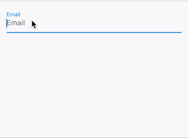
Basic/Default usage. #
FieldSuggestion(
  textController: emailEditingController,
  suggestionList: suggestionList,
  hint: 'Email',
),
Parameters: #
| parameter | description | default |
|---|---|---|
onTap |
It makes able to set custom onTap method. e.g you need open a page, when item selected. Then you should use [onTap] as Navigator. | Changes value of field with title of selected item |
onIconTap |
It makes able to set custom method when we press on tralling of SuggestionItem. | Removes tapped item which are in [suggestionList] and private [matchers] list. |
sizeByItem |
Makes able to set size of SuggestionsBox by calculating count of SuggestionItem. | We do not use that property to set size of SuggestionBox. |
suggestionBoxStyle |
Custom style option of [SuggestionBox], Makes able to customize SuggestionBox. | SuggestionBoxStyle.DefaultStyle |
wDivider |
if it equeals true, you would see a simple line, every suggestionItem's front. |
false, so it's diabled. |
divider |
If wDivider is enabled, then user can use this property to show a widget every suggestionItem's front |
Divider() widget. |
suggestionItemStyle |
Custom style option for SuggestionItem. Makes able to customize Suggestion Item With following properties: backgroundColor, titleStyle, icon, iconSize, iconColor, border, borderRadius, gradient, boxShadow, margin. |
It takes, [SuggestionItemStyle.DefaultStyle] as default. |
hint |
Field hint property to set it without fieldDecoration property. |
null |
fieldDecoration |
Custom InputDecoration of Field |
InputDecoration(hintText: hint, labelText: hint), |
fieldType |
TextInputType of field. |
null |
focusNode |
FocusNode of field. |
null |
onChanged |
onChanged so Function(String) method of Field |
null |
maxLines |
maxLines of field |
null |
disabledDefaultOnTap |
To dissable default onTap method of SuggestionItem. |
false, so it's diabled |
disabledDefaultOnIconTap |
To dissable default onIconTap method of SuggestionItem. |
false, so it's diabled |
closeBoxAfterSelect |
If it's equals false (so disabled) then when you select item suggestion box won't close. |
true, so it's enabled |
scrollController |
The scroll controller for suggestionList. | null |
spacer |
To set size between field and suggestionsBox. | 5.0 |
wOpacityAnimation |
To disable or enable opacity animation. | false, so it's diabled |
animationDuration |
Customize duration of suggestion Box animation. | Duration(milliseconds: 400) |
wSlideAnimation |
To enable or disable slide animtaion of suggestions box. | false, so it's diabled |
slideAnimationStyle |
Custom enum to set tween offset of slide animation, by: Rigth to left [RTL], Left to right [LTR], Bottom to up [BTU], Up to down [UTD]. | SlideAnimationStyle.RTL |
slideCurve |
To initilaze custom transition curve. | null |
slideTweenOffset |
Offset with Tween for Slide animation. Note: when you use slideTweenOffset, otomaticly slideAnimationStyle would be disabled. |
null |
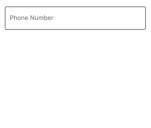
Custom usage. #
FieldSuggestion(
  textController: secondTextController,
  suggestionList: suggestionList,
  fieldDecoration: InputDecoration(
    hintText: "Email",
    enabledBorder: OutlineInputBorder(),
    focusedBorder: OutlineInputBorder(),
  ),
  wDivider: true,
  divider: SizedBox(height: 5),
  wSlideAnimation: true,
  slideAnimationStyle: SlideAnimationStyle.LTR,
  slideCurve: Curves.linearToEaseOut,
  animationDuration: Duration(milliseconds: 300),
  suggestionItemStyle: SuggestionItemStyle.WhiteNeumorphismedStyle,
  suggestionBoxStyle: SuggestionBoxStyle(
    backgroundColor: Colors.white,
    borderRadius: BorderRadius.circular(15),
    boxShadow: [
      BoxShadow(
        color: Colors.blue.withOpacity(.2),
        spreadRadius: 5,
        blurRadius: 10,
        offset: Offset(0, 5),
      ),
    ],
  ),
)
Contributions #
Feel free to contribute to this project.
If you find a bug or want a feature, but don't know how to fix/implement it, please fill an issue.
If you fixed a bug or implemented a new feature, please send a pull request.
Metadata
Publisher
Metadata
FieldSuggestion help us to make beautiful type ahead fields. By listening values of given TextEditingController and checking if the given value is in the given suggestion list or not.
Repository (GitHub)
View/report issues
License
 unknown (LICENSE)