faabul_color_picker 1.1.0  faabul_color_picker: ^1.1.0 copied to clipboard
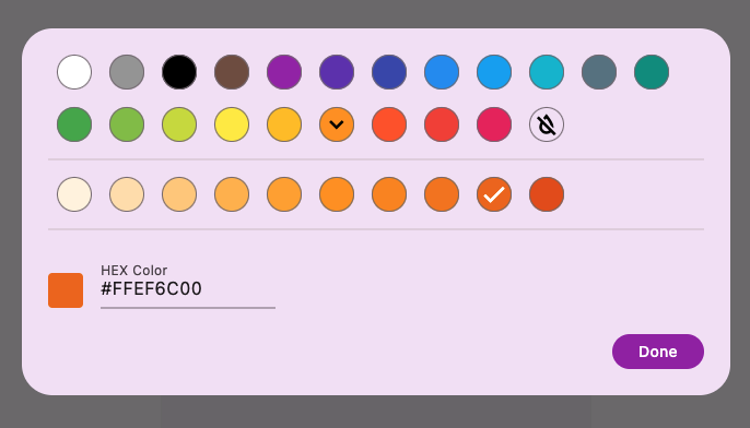
A simple color picker with focus on good UX. Work with Material colors and parses custom colors in hex format.
faabul_color_picker #
 faabul_color_picker is developed and used by Faabul Live Quizzes
Getting Started #
Call showColorPickerDialog() to show the color picker dialog and await the result.
final color = await showColorPickerDialog(context: context);
In most cases you want to specify the currently selected color. If you want to allow the user to unselect the color, set allowUnselectButton to true.
final color = await showColorPickerDialog(
  context: context,
  selected: selectedColor,
  allowUnselectButton: true,
);
Custom colors #
If you want to use custom colors, pass them to the colors parameter.
final color = await showColorPickerDialog(
  context: context,
  selected: selectedColor,
  colors: [
    FaabulColorShades(color: Colors.red, shades: [
       Colors.red,
       Colors.redAccent,
    ]),
    FaabulColorShades(color: Colors.green, shades: [
       Colors.lightGreen,
       Colors.green,
       Colors.lightGreenAccent,
       Colors.greenAccent,
    ]),
    FaabulColorShades(color: Colors.blue, shades: [
        Colors.lightBlue,
        Colors.blue,
        Colors.lightBlueAccent,
        Colors.blueAccent,
    ]),
  ],
);
Other exposed classes #
FaabulColorPicker is the widget that shows inside the showColorPickerDialog. It can be used directly if you want to select the color in a different way.
FaabulColorButton is the button widget used to represent an individual Color.
FaabulColorSample is a widget that presents the Color as a circle.
