expandable_search_bar_plus 1.0.2  expandable_search_bar_plus: ^1.0.2 copied to clipboard
A modern, customizable, and smooth expandable search bar widget for Flutter. Supports tap and hover (for web/desktop), with full controller access to open or close programmatically.
Expandable Search Bar Plus #
A Flutter widget that provides a beautiful and smooth expandable search bar animation. This package is an improved version of the original expandable_search_bar package, with enhanced flexibility and new features such as programmatic control via a controller.
This widget is based on and inspired by the original
expandable_search_barpackage. The core logic and design pattern were adapted and extended to include more customization and better developer experience.
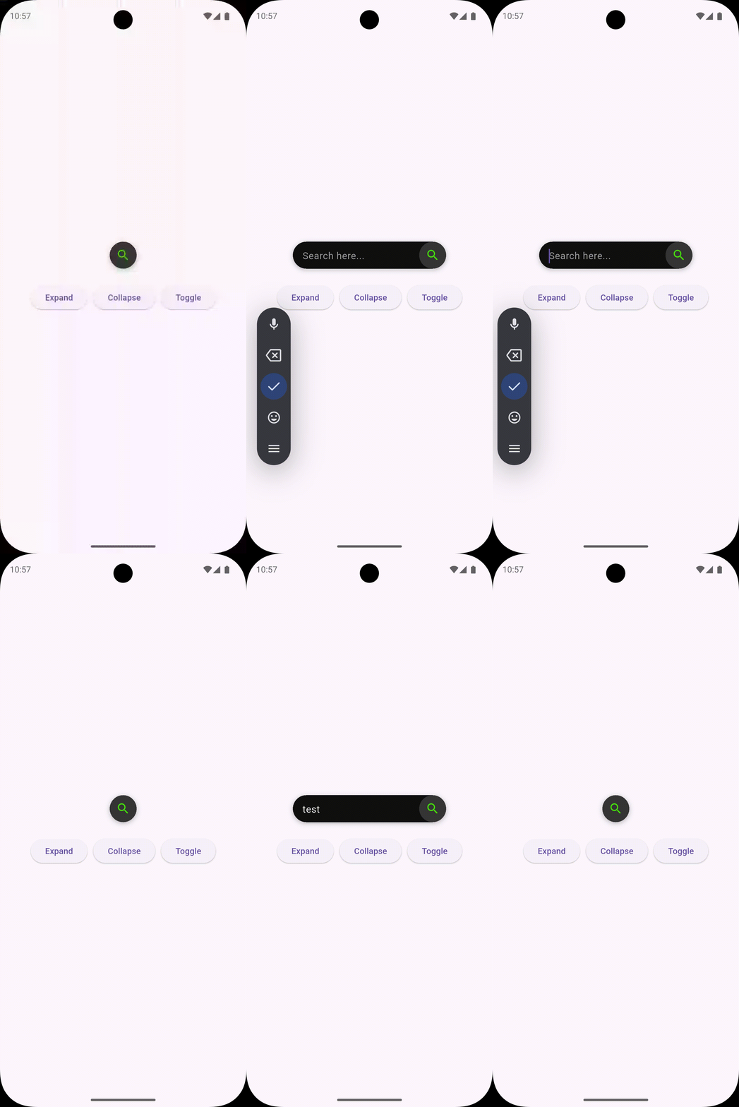
📱 Mobile Preview #

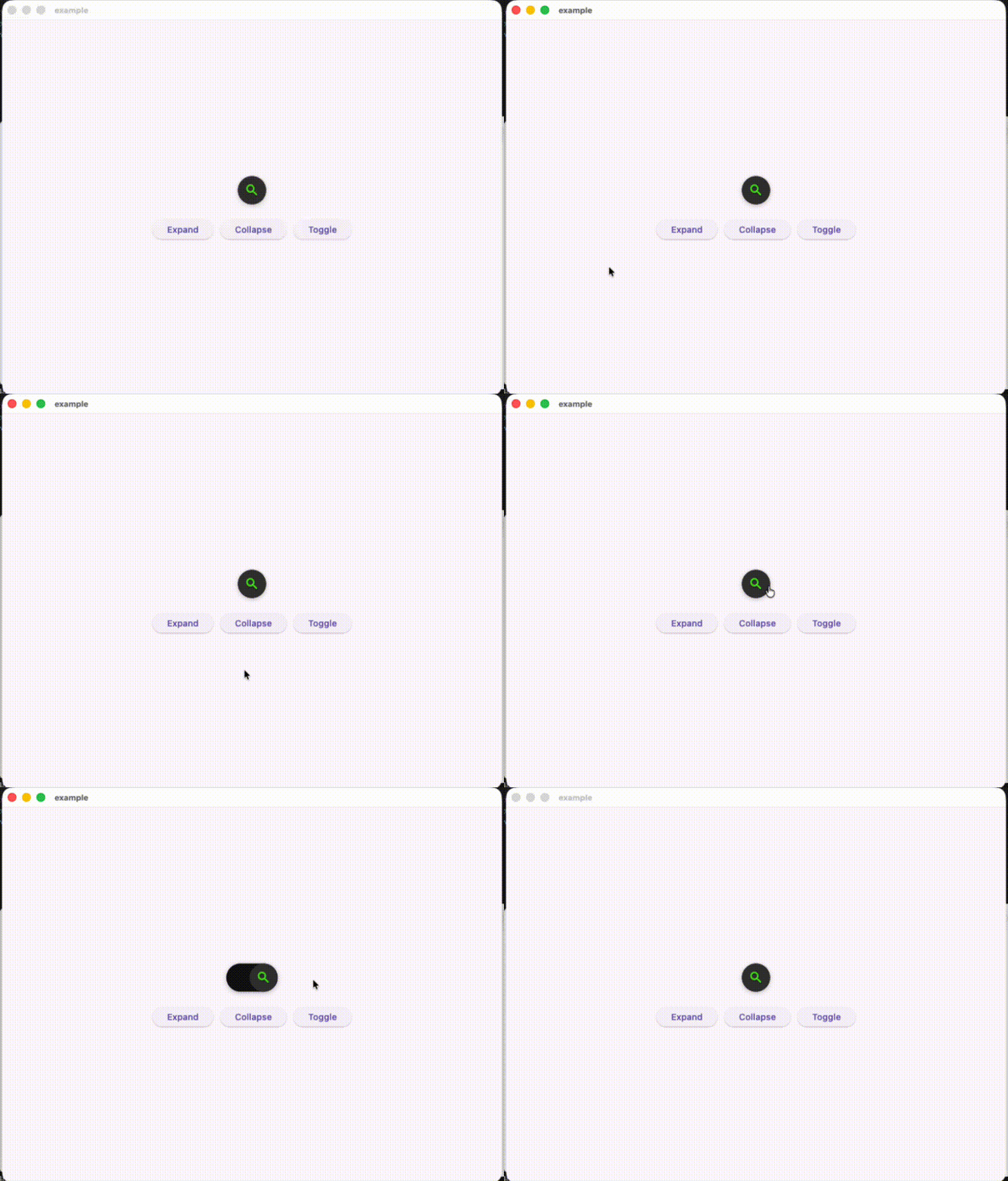
🖥️ Desktop Preview #

Features #
- Smooth expand/collapse animation.
- Fully customizable appearance (colors, radius, width, shadow, icon, etc.).
- Programmatic control using a custom controller.
- Mouse hover support (for web/desktop).
- Optional callbacks for tap and text changes.
Example Usage #
ExpandableSearchBarPlus(
  controller: TextEditingController(),
  hintText: 'Search something...',
  onTap: (isExpanded) {
    print('Search bar expanded: $isExpanded');
  },
  onChanged: (value) {
    print('Search text: $value');
  },
)
Constructor Parameters #
| Parameter | Type | Default | Description |
|---|---|---|---|
| key | Key? |
– | Widget key. |
| hintText | String? |
– | Hint text inside the TextField. |
| controller | TextEditingController |
– | Controller for the text field. |
| barController | ExpandableSearchBarPlusController? |
– | Controller to programmatically control expand/collapse state. |
| onTap | void Function(bool isExpanded)? |
– | Called when the icon is tapped. Returns true when expanded. |
| onChanged | ValueChanged<String>? |
– | Called whenever the user types in the field. |
| width | double |
240 |
Width of the expanded search bar. |
| iconSize | double |
45 |
Diameter of the search icon container. |
| gutter | double |
16 |
Space between the icon and text field. |
| radius | double |
30 |
Corner radius of the search bar. |
| animationDuration | Duration |
400ms |
Duration of the main expand/collapse animation. |
| animationCurve | Curve |
Curves.fastOutSlowIn |
Curve for the expand/collapse animation. |
| textFieldAnimationDuration | Duration |
200ms |
Duration of the text field width animation. |
| textFieldAnimationCurve | Curve |
Curves.easeInOut |
Curve for text field width animation. |
| iconBoxShadow | List<BoxShadow>? |
– | Custom shadow for the search icon. |
| iconColor | Color |
Color(0xff47E10C) |
Color of the search icon. |
| iconBackgroundColor | Color |
Color(0xff353535) |
Background color of the search icon. |
| boxShadow | List<BoxShadow>? |
[BoxShadow(...)] |
Box shadow of the expanded search bar. |
| backgroundColor | Color |
Color(0xff101010) |
Background color of the search bar. |
| textStyle | TextStyle |
TextStyle(color: Colors.white, fontSize: 16) |
Style for the input text. |
| hintStyle | TextStyle |
TextStyle(color: Colors.grey, fontSize: 16) |
Style for the hint text. |
| supportMouse | bool |
false |
Whether to support hover expand/collapse (for web/desktop). |
| icon | Widget |
Icon(Icons.search_rounded) |
Custom icon widget displayed in the circular button. |
Programmatic Control #
You can control the expand/collapse state programmatically using the ExpandableSearchBarPlusController.
final barController = ExpandableSearchBarPlusController();

ExpandableSearchBarPlus(
  controller: TextEditingController(),
  barController: barController,
);

// Expand programmatically
barController.expand();

// Collapse programmatically
barController.collapse();
Credits #
This package is an improved version of expandable_search_bar. The base animation and concept were adapted and refactored to provide more flexibility and control for developers.