expandable_card 0.0.3+1  expandable_card: ^0.0.3+1 copied to clipboard
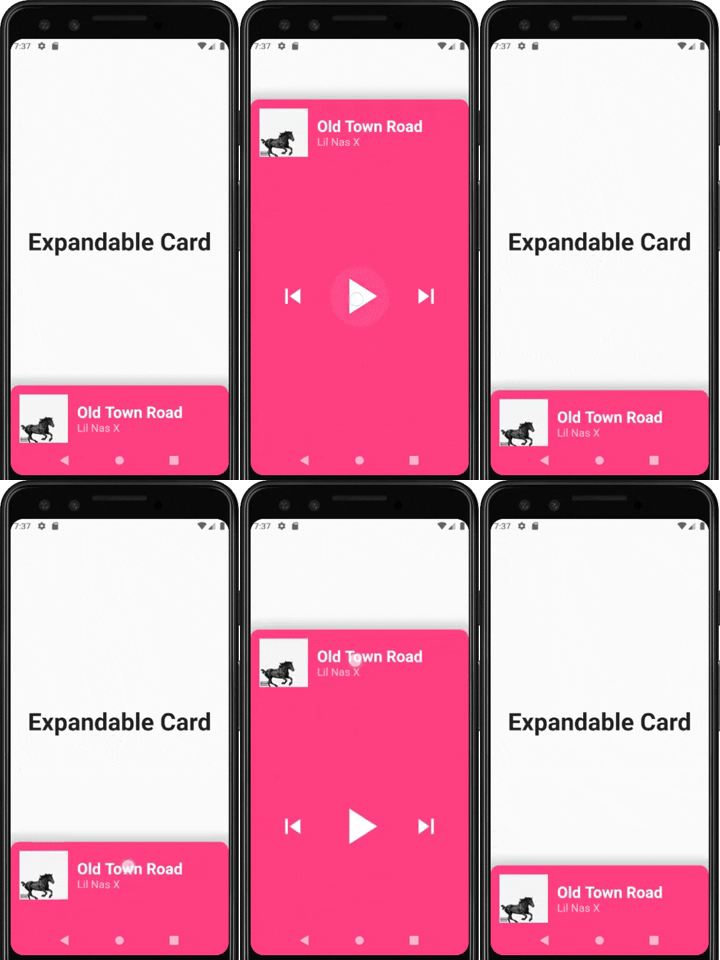
a Flutter Widget that makes it easy to build a page with a bottom Card that can be expanded on user drag.
Expandable Card #
This is a Flutter Widget that makes it easy to build a page with a bottom Card that can be expanded on user drag.

How to use it #
Use ExpandableCardPage for the body of your Scaffold. This widget will take two attributes:
Widget page: which is the default page in the backgroundExpandableCard expandableCard: which is the bottom card itself. You can call theExpandableCardconstructor to build one.
ExpandableCard constructor has a few attributes:
EdgeInsetsGeometry padding: padding inside the card. Default value isEdgeInsets.all(15)double minHeight: default height of the card when it's not expanded. Default value is200double maxHeight: height of the card when it's fully expanded. Default value is500bool hasShadow: determines whether the card has box shadow or not. Default istrueColor backgroundColor: background color of the card. Default isColors.blueGreybool hasRoundedCorners: determines whether the card has rounded corners or not. Default isfalsebool hasHandle: will add a little handle icon. Default istrueList<Widget> Children: Widgets that make the actual content of the card
Future Implementations: #
AnimatedExpandableCard: will allow animation between closed state and expanded state.- Add suport for scrolling card when its fully expanded