easy_popover 0.0.3  easy_popover: ^0.0.3 copied to clipboard
 nflabs.org
A Popover can be used to display some content on top of another.
easy_popover #


The Popover package provides a customizable popover widget for Flutter applications. It allows developers to display contextual content tied to a specific widget, with various alignment options, animations, and styles.
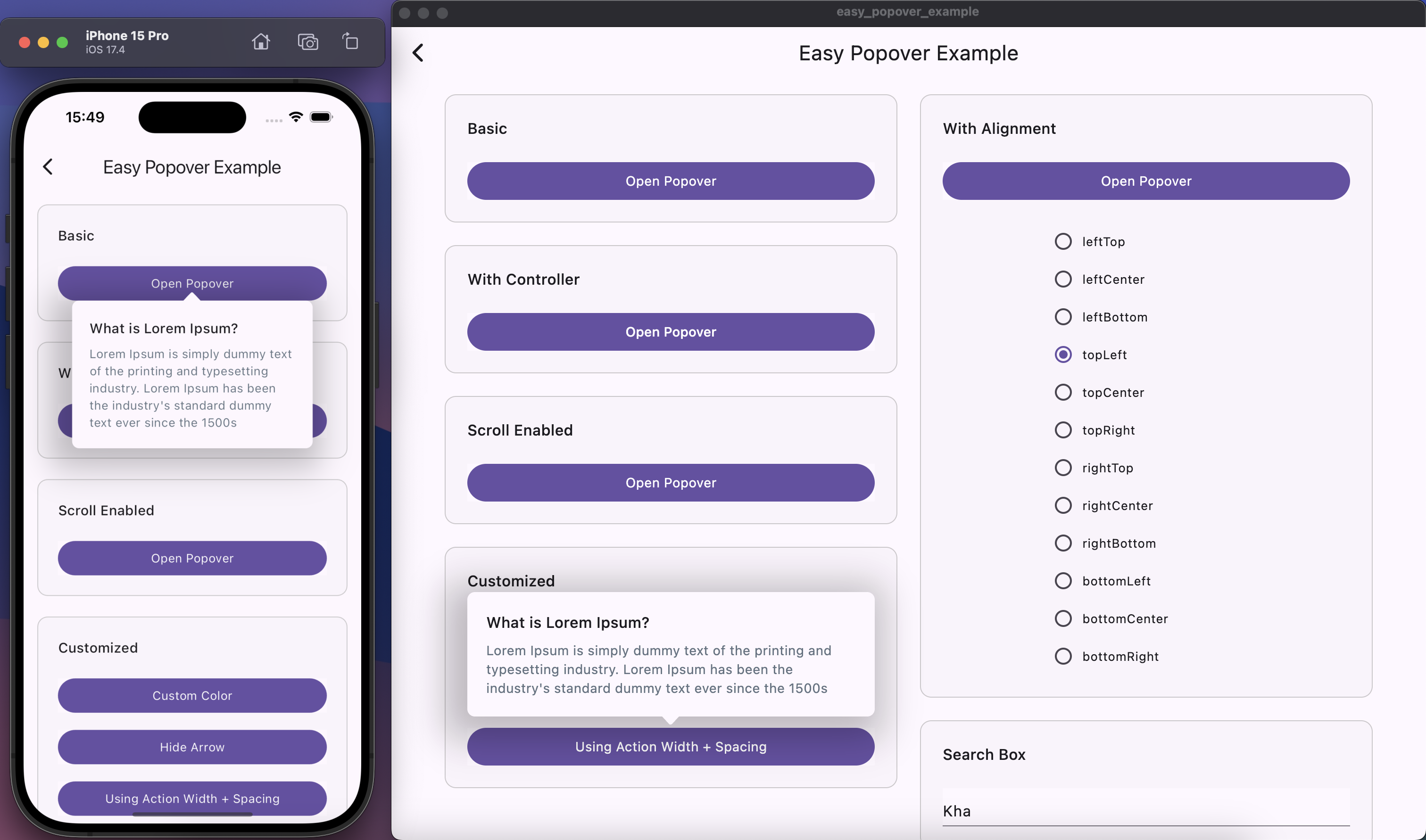
Table of Contents #
Features #
- ✅ Customizable alignment for the popover relative to the action widget.
- ✅ Optional arrow pointing to the action widget.
- ✅ Configurable dimensions, border radius, box shadow, and background color.
- ✅ Animation for showing and hiding the popover.
- ✅ Overlay support for capturing taps outside the popover to close it.
- ✅ Allow full-screen scrolling capability when opening the popover.
Installation #
flutter pub add easy_popover
Or add the following to your pubspec.yaml file:
dependencies:
  easy_popover: ^1.0.0
API Reference #
- Popover - The main widget to display a popover.
- PopoverController - Controller to manage the state of the popover.
- PopoverAlignment - Defines the alignment of the popover relative to the action widget.
Examples #
- See Example for details
- Or run the example app included with this package:
- Clone the repository from GitHub:
git clone https://github.com/axnguyenit/easy-popover.git
- Navigate to the example directory:
cd example
- Ensure dependencies are installed:
flutter pub get
- Run the app:
flutter run
This will launch the example app demonstrating various uses of the Popover widget.
Contributing #
Contributions are welcome! Please fork the repository and submit a pull request with your changes. Ensure that your code follows the existing style and includes tests for new features or bug fixes.
Issue Tracker #
If you encounter any issues or have suggestions for improvements, please feel free to open an issue on GitHub.
License #
This project is licensed under the MIT License - see the LICENSE file for details.
Metadata
Publisher
Weekly Downloads
Metadata
A Popover can be used to display some content on top of another.
Repository (GitHub)
View/report issues
License
 unknown (license)