easy_flutter_charts 1.1.0  easy_flutter_charts: ^1.1.0 copied to clipboard
is a simple, lightweight, and customizable library for creating charts in Flutter.
easy_flutter_charts #
easy_flutter_charts is a simple, lightweight, and customizable library for creating charts in Flutter. It provides chart components ideal for dashboards, statistical visualizations, and more. You can integrate elegant and responsive data visualizations in just a few minutes.
📦 Installation #
Add the latest version of easy_flutter_charts to your pubspec.yaml:
dependencies:
  easy_flutter_charts: latest version
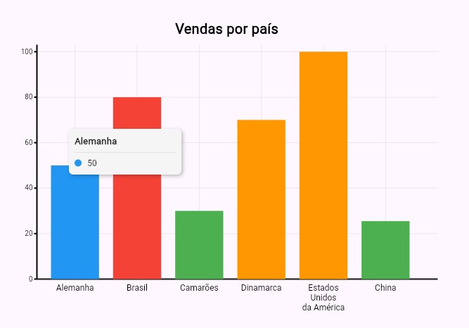
BarChart #
Example #
Center(
      child: SizedBox(
        height: 400,
        width: 600,
        child: BarChart(
          title: 'Vendas por país',
          titleStyle: const TextStyle(
            fontSize: 20,
            color: Colors.black,
            fontWeight: FontWeight.w600,
          ),
          data: [
            BarChartData(label: 'Alemanha', value: 50, color: Colors.blue),
            BarChartData(label: 'Brasil', value: 80, color: Colors.red),
            BarChartData(label: 'Camarões', value: 30, color: Colors.green),
            BarChartData(label: 'Dinamarca', value: 70, color: Colors.orange),
            BarChartData(
              label: ['Estados', 'Unidos', 'da América'],
              value: 100,
              color: Colors.orange,
            ),
            BarChartData(label: 'China', value: 25.5, color: Colors.green),
          ],
        ),
      ),
    );
| Property | Type | Description |
|---|---|---|
data |
List<BarChartData> |
List of objects representing the data to be displayed in the chart. |
spacing |
double |
Horizontal spacing between bars (default: 20). |
title |
String? |
Title of the chart. |
titleStyle |
TextStyle? |
Text style for the chart title. |
xAxisLabelStyle |
TextStyle? |
Text style for the X-axis labels. |
yAxisLabelStyle |
TextStyle? |
Text style for the Y-axis labels. |
yAxisLabelFormatter |
String Function(double value)? |
Function to format the values displayed on the Y-axis. |
xAxisLabelFormatter |
String Function(dynamic label)? |
Function to format the labels displayed on the X-axis. |
onBarTap |
void Function(BarChartData)? |
Callback triggered when a specific bar is tapped. |
barTooltipBuilder |
String Function(BarChartData)? |
Function to customize the tooltip content when a bar is tapped. |
yAxisMargin |
double |
Left margin for displaying Y-axis labels (default: 30). |
xAxisMargin |
double |
Bottom margin for X-axis labels (default: 30). |
LineChart #
Example #

Center(
      child: SizedBox(
        height: 300,
        width: 600,
        child: LineChart(
          title: 'Temperatura Diária',
          titleStyle: const TextStyle(
            fontSize: 20,
            color: Colors.black,
            fontWeight: FontWeight.w600,
          ),
          series: [
            LineChartSeries(
              name: 'Máxima',
              color: Colors.red,
              data: [
                LineChartData(label: 'Segunda', value: 30),
                LineChartData(label: 'Terça', value: 32),
                LineChartData(label: 'Quarta', value: 31),
                LineChartData(label: 'Quinta', value: 33),
                LineChartData(label: 'Sexta', value: 29),
              ],
            ),
            LineChartSeries(
              name: 'Média',
              color: Colors.orange,
              data: [
                LineChartData(label: 'Segunda', value: 27),
                LineChartData(label: 'Terça', value: 25),
                LineChartData(label: 'Quarta', value: 21),
                LineChartData(label: 'Quinta', value: 29),
              ],
            ),
            LineChartSeries(
              name: 'Mínima',
              color: Colors.blue,
              data: [
                LineChartData(label: 'Segunda', value: 20),
                LineChartData(label: 'Terça', value: 21),
                LineChartData(label: 'Quarta', value: 19),
              ],
            ),
          ],
          yAxisLabelFormatter: (v) => '${v.toStringAsFixed(0)}°C',
          yAxisLabelStyle: TextStyle(fontSize: 10),
          xAxisLabelFormatter: (label) => label.toString(),
          xAxisLabelStyle: TextStyle(fontSize: 10),
          showDots: true,
          showGrid: true,
          xAxis: [
            'Segunda',
            'Terça',
            ['Quarta', 'feira'],
            ['Quinta', 'feira'],
            ['Sexta', 'feira']
          ],
          // lineTooltipBuilder: (serie, point) =>
          //     '${serie.name}: ${point.label}: ${point.value} °C',
        ),
      ),
    );
| Property | Type | Description |
|---|---|---|
series |
List<LineChartSeries> |
List of series (lines) to be drawn in the chart. Each series represents a line with its own points and color. |
xAxis |
List<dynamic> |
Required. List of X-axis labels. Defines the number of visible points and their respective labels. |
spacing |
double |
Horizontal spacing between line points (default: 20). |
title |
String? |
Title of the chart. |
titleStyle |
TextStyle? |
Style for the chart title. |
xAxisLabelStyle |
TextStyle? |
Style for the X-axis labels. |
yAxisLabelStyle |
TextStyle? |
Style for the Y-axis labels. |
yAxisLabelFormatter |
String Function(double value)? |
Function to format Y-axis values. |
xAxisLabelFormatter |
String Function(dynamic label)? |
Function to format X-axis labels. |
onPointTap |
void Function(LineChartData)? |
Callback triggered when a point on the line is tapped. |
yAxisMargin |
double |
Left margin for Y-axis labels (default: 30). |
xAxisMargin |
double |
Bottom margin for X-axis labels (default: 30). |
showDots |
bool |
Show or hide dots at the vertices of the lines (default: true). |
showGrid |
bool |
Show or hide background grid (default: true). |
lineTooltipBuilder |
String Function(LineChartSeries series, LineChartData)? |
Function to customize tooltip content when a point is tapped. |
dotRadius |
double |
Radius of visible dots (if showDots is true) (default: 4.0). |
strokeWidth |
double |
Stroke width of the line drawn on the chart (default: 2.0). |
yMin |
double? |
Optional minimum value for the Y-axis. If not set, it will be automatically calculated based on the data. |
yMax |
double? |
Optional maximum value for the Y-axis. If not set, it will be automatically calculated based on the data. |
PieChart #
Example #

Center(
      child: PieChart(
        title: 'Distribuição de Vendas',
        titleStyle: const TextStyle(
          fontSize: 20,
          color: Colors.black,
          fontWeight: FontWeight.w600,
        ),
        data: [
          PieChartData(label: 'Brasil', value: 60, color: Colors.green),
          PieChartData(label: 'Alemanha', value: 76, color: Colors.blue),
          PieChartData(label: 'Japão', value: 90, color: Colors.red),
          PieChartData(label: 'EUA', value: 150, color: Colors.orange),
        ],
        aspectRatio: 3,
        pieTooltipBuilder: (data) =>
            '${data.label}: ${data.value.toStringAsFixed(1)} unidades',
      ),
    );
| Property | Type | Description |
|---|---|---|
data |
List<PieChartData> |
List containing the chart data. |
title |
String? |
Title of the chart. |
titleStyle |
TextStyle? |
Text style for the chart title. |
aspectRatio |
double |
Width/height ratio of the chart. (default: 3.0). |
legendPosition |
LegendPosition |
Legend position: top, bottom. (default: bottom). |
pieTooltipBuilder |
String Function(PieChartData)? |
Function to customize tooltip content on hover or touch. |
RadialBarChart #
Example #

Center(
      child: RadialBarChart(
        data: [
          RadialBarData(value: 40, color: Colors.blue, label: 'Azul'),
          RadialBarData(value: 30, color: Colors.green, label: 'Verde'),
          RadialBarData(value: 20, color: Colors.orange, label: 'Laranja'),
          RadialBarData(value: 60, color: Colors.red, label: 'Vermelho'),
        ],
        centerTextBuilder: (data) => '${data.label}\n${data.value} unidades',
        centerTextStyle: const TextStyle(
          fontSize: 12,
          fontWeight: FontWeight.w600,
        ),
        aspectRatio: 1.5,
      );
| Property | Type | Description |
|---|---|---|
data |
List<RadialBarData> |
List of objects that represent the chart values. |
legendPosition |
LegendPosition |
Legend position: top or bottom. Defaults to bottom. |
centerTextBuilder |
String Function(RadialBarData)? |
Optional function to customize the center text based on hovered segment. |
centerTextStyle |
TextStyle? |
Text style for the center label. |
aspectRatio |
double |
Aspect ratio of the chart. Defaults to 2.0. |
📁 Examples #
For full usage examples with real charts, check out the /example directory in this repository.
There you'll find practical demonstrations of all chart types with customizations and interactions.
📮 Contribution #
Contributions are welcome!
Feel free to open an issue or submit a pull request. 😊
📝 License #
Distributed under the MIT License.
See the LICENSE file for more information.
👨💻 Author #
Developed by Rômulo Rodrigues.
Questions or suggestions? Open an issue.
Metadata
Publisher
unverified uploader
Weekly Downloads
Metadata
is a simple, lightweight, and customizable library for creating charts in Flutter.
Repository (GitHub)
View/report issues
License
 unknown (license)