easy_date_timeline 2.0.5  easy_date_timeline: ^2.0.5 copied to clipboard
The "easy_date_timeline" package is a customizable Flutter library that displays a timeline of dates in a horizontal view.
EasyDateTimelinePicker #
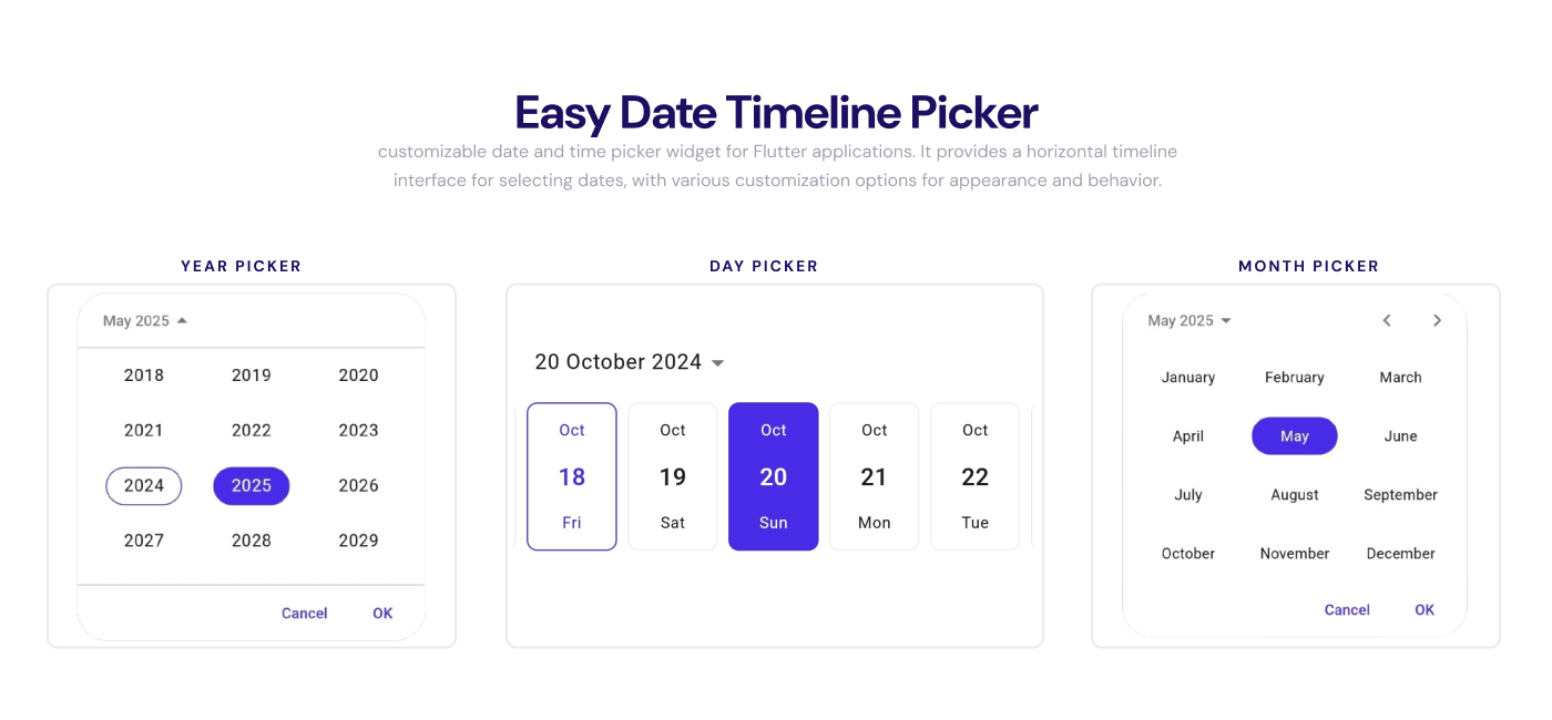
EasyDateTimeLinePicker is a customizable date and time picker widget for Flutter applications. It provides a horizontal timeline interface for selecting dates, with various customization options for appearance and behavior.
Contents #
- EasyDateTimelinePicker
- Additional information
(Legacy)- EasyDateTimelinePicker (Legacy)
- 📦 Other Packages
- How To Use
EasyInfiniteDateTimeLine - Usage
- How To Use
EasyDateTimeLine - EasyDateTimeLine Usage
- Features
EasyInfiniteDateTimeLineitemBuilder example:- Custom background
- Change current day highlight color and style
- Change day structure
- Locale support
- Landscape view
- Change header appearance
- Customize day appearance
- Constructor
Getting Started #
Add the easy_date_timeline package to pubspec.yaml:
flutter pub add easy_date_timeline
Import the package to use it:
import 'package:easy_date_timeline/easy_date_timeline.dart';
Basic Usage #
Use the EasyDateTimeLinePicker widget to display the date and time picker:
EasyDateTimeLinePicker(
  focusedDate: _selectedDate,
  firstDate: DateTime(2024, 3, 18),
  lastDate: DateTime(2030, 3, 18),
  onDateChange: (date) {
    // Handle the selected date.
  },
);
Constructors #
Default Constructor #
The default constructor provides a pre-defined layout with three day parts (top, middle, and bottom), which can be reordered or customized.
EasyDateTimeLinePicker(
  firstDate: DateTime(2025, 1, 1),
  lastDate: DateTime(2030, 3, 18),
  focusedDate: DateTime(2025, 6, 15),
  onDateChange: (date) {
    // Handle the selected date.
  },
);
Custom Item Builder #
The itemBuilder constructor allows you to fully customize each day item in the picker.
EasyDateTimeLinePicker.itemBuilder(
  firstDate: DateTime(2025, 1, 1),
  lastDate: DateTime(2030, 3, 18),
  focusedDate: _selectedDate,
  itemExtent: 64.0,
  itemBuilder: (context, date, isSelected, isDisabled, isToday, onTap) {
    return InkResponse(
      onTap: onTap,
      child: CircleAvatar(
        backgroundColor: isSelected ? Colors.blue : null,
        child: Text(date.day.toString()),
      ),
    );
  },
  onDateChange: (date) {
    setState(() {
      _selectedDate = date;
    });
  },
)
Properties #
| Property | Type | Description |
|---|---|---|
controller |
EasyDatePickerController? |
Controller for the date picker. Can be used to programmatically control the picker. |
firstDate |
DateTime |
The earliest date the user is permitted to pick. |
lastDate |
DateTime |
The latest date the user is permitted to pick. |
focusedDate |
DateTime? |
The date to focus on when the picker is first displayed. |
currentDate |
DateTime |
The current date. Defaults to today's date if not provided. |
itemExtent |
double |
The width of each day item in the picker. |
daySeparatorPadding |
double |
The padding between day separators. |
_itemBuilder |
ItemBuilderPickerCallBack? |
Custom builder for day items. Only used when created with EasyDateTimeLinePicker.itemBuilder. |
headerBuilder |
EasyPickerHeaderBuilderCallBack? |
Custom builder for the header of the picker. |
onDateChange |
OnDateChangeCallBack? |
Callback that is called when the selected date changes. |
selectionMode |
SelectionMode? |
Determines how the selected date is positioned in the picker. |
locale |
Locale? |
The locale to use for formatting dates, default locale is en_US. |
physics |
ScrollPhysics? |
The scroll physics to use for the picker. |
disableStrategy |
DisableStrategy |
Strategy for disabling certain dates in the picker. |
dayElementsOrder |
List<DayElement> |
The order of day elements to display. Only used when created with the default constructor. |
ignoreUserInteractionOnAnimating |
bool? |
Whether to ignore user interaction while the picker is animating, default is true. |
timelineOptions |
TimelineOptions? |
Additional options for customizing the timeline appearance. |
headerType |
HeaderType |
Defines the behavior and display of the header in the date timeline picker. |
monthYearPickerOptions |
MonthYearPickerOptions |
Defines the options for the MonthYearPicker widget. |
Examples #
Selection Modes #
The selectionMode property determines how the selected date is positioned in the picker.
EasyDateTimeLinePicker(
  // ... other properties
  selectionMode: SelectionMode.autoCenter(),
);
The available selection modes are:
-
SelectionMode.autoCenter(): Automatically centers the selected date in the picker. -
SelectionMode.alwaysFirst(): Always displays the selected date as the first item in the picker. -
SelectionMode.none(): The timeline does not animate the selection.
Localization #
The locale property allows you to specify the locale to use for formatting dates in the picker.
EasyDateTimeLinePicker(
  // ... other properties
  locale: Locale('ar'), // Arabic locale
);
Disable Strategy #
The disableStrategy property allows you to define a strategy for disabling certain dates in the picker.
EasyDateTimeLinePicker(
  // ... other properties
  disableStrategy: DisableStrategy.beforeToday(),
);
The available disable strategies are:
DisableStrategy.after(dateTime): Disable dates after the specified date.DisableStrategy.afterToday(): Disable dates after today.DisableStrategy.before(dateTime): Disable dates before the specified date.DisableStrategy.beforeToday(): Disable dates before today.DisableStrategy.all(): Disable all dates.DisableStrategy.none(): Disable no dates.DisableStrategy.list(List<DateTime>): Disable specific dates.DisableStrategy.inRange(dateTimeRange): Disable dates between two dates.DisableStrategy.ranges(ranges): Disable dates in a list of ranges.DisableStrategy.compose([DisableStrategy, DisableStrategy]): Disable dates using multiple strategies.
Note that:
You can make your own custom
DisableStrategyby extending theDisableStrategyclass and implementing theisDisabledmethod.class CustomDisableStrategy extends DisableStrategy { @override bool isDisabled(DateTime date) { // Your custom logic here return false; } }
Day Elements Customization #
The dayElementsOrder property allows you to customize the order of day elements in the picker.
EasyDateTimeLinePicker(
  // ... other properties
  dayElementsOrder: const [DayElement.top(), DayElement.middle()],
);
The available day parts are:
DayElement.top(): The top part of the day item.DayElement.middle(): The middle part of the day item.DayElement.bottom(): The bottom part of the day item.
Note that: You can change the format of the day part by passing the format to the
DayPartsconstructor.DayParts.top('EEE') // Displays the day name abbreviation.
Header Options #
The headerOptions property allows you to customize the header of the picker.
EasyDateTimeLinePicker(
  // ... other properties
  headerOptions: HeaderOptions(
    headerType: HeaderType.picker, // default
  ),
);
The available header types are:
HeaderType.picker: A clickable header that opens a month/year picker.HeaderType.viewOnly: A non-interactive header that just displays the date.HeaderType.none: No header is displayed.
You can also provide a custom header builder using the headerBuilder property:
EasyDateTimeLinePicker(
  // ... other properties
  headerOptions: HeaderOptions(
    headerBuilder: (context, date, onTap){
      return InkWell(onTap: onTap, child: Text(DateFormat.yMMMM().format(date)));
    }
  ),
);
Note that: If you provide a custom header builder, the
headerTypeproperty will be ignored.
Timeline Options #
The timelineOptions property allows you to customize the timeline of the picker.
EasyDateTimeLinePicker(
  // ... other properties
  timelineOptions: TimelineOptions(
    height: 200, // the height of the timeline
  ),
);
MonthYearPicker Options #
The monthYearPickerOptions property allows you to customize the monthYearPicker dialog.
EasyDateTimeLinePicker(
  // ... other properties
  monthYearPickerOptions: MonthYearPickerOptions(
    initialCalendarMode: EasyDatePickerMode.month, // default
    cancelText: 'Cancel',
    confirmText: 'Confirm',
    // ... other properties
  ),
);
Controller #
The controller property allows you to programmatically control the picker.
EasyDatePickerController controller = EasyDatePickerController();

EasyDateTimeLinePicker(
  // ... other properties
  controller: controller,
);

// Don't forget to dispose the controller when it's no longer needed.
@override
void dispose() {
  controller.dispose();
  super.dispose();
}
- controller methods:
controller.jumpToDate(): Jumps to a specific date.controller.animateToDate(): Animates to a specific date.controller.jumpToFocusDate(): Jumps to the focused date.controller.animateToFocusDate(): Animates to the focused date.controller.jumpToCurrentDate(): Jumps to the current date.controller.animateToCurrentDate(): Animates to the current date.
Themes #
The EasyDateTimeLinePicker widget supports theming to customize the appearance of the picker.
Change primary color #
The primary color of the picker can be changed by wrapping the widget with a Theme widget and setting the primaryColor property.
Theme(
  data: Theme.of(context).copyWith(
    colorScheme: ColorScheme.fromSeed(seedColor: Colors.teal),
  ),
  child: EasyDateTimeLinePicker(
    // ... other properties
  ),
);
Change day backgroundColor #
First way Using copyWith
The background color of the day items can be customized using the EasyTheme widget. You can provide different colors for different widget states (selected, disabled, normal) using WidgetStateProperty:
EasyTheme(
  data: EasyTheme.of(context).copyWith(
    dayBackgroundColor: WidgetStateProperty.resolveWith((states) {
      if (states.contains(WidgetState.selected)) {
        // return the background color of the selected day
        return Colors.teal;
      } else if (states.contains(WidgetState.disabled)) {
        // return the background color of the disabled day
        return Colors.grey.shade100;
      }
      // return the background color of the normal day
      return Colors.white;
    }),
  ),
  child: EasyDateTimeLinePicker(
    // ... other properties
  ),
);
For more information about WidgetStateProperty and how to use it effectively, see:
Note that: You can change the background color of day in a different way by using the
copyWithStatemethod.
Second way Using copyWithState
EasyTheme(
 data: EasyTheme.of(context).copyWithState(
    selectedDayTheme: const DayThemeData(
      backgroundColor: Colors.teal,
    ),
    unselectedDayTheme: const DayThemeData(
      backgroundColor: Colors.white,
    ),
    disabledDayTheme: DayThemeData(
      backgroundColor: Colors.grey.shade100,
    ),
  ),
  child: EasyDateTimeLinePicker(
    // ... other properties
  ),
);
Note that: The
dayBackgroundColordoes not apply to the current day. to change the current day background color, use thecurrentDayBackgroundColorproperty. in the example below:
Change current day backgroundColor #
- First way Using
copyWith
EasyTheme(
  data: EasyTheme.of(context).copyWith(
    currentDayBackgroundColor: WidgetStateProperty.resolveWith((states) {
      if (states.contains(WidgetState.selected)) {
        // return the background color of the selected current day
        return Colors.teal;
      } else if (states.contains(WidgetState.disabled)) {
        // return the background color of the disabled day
        return Colors.grey.shade100;
      }
      // return the background color of the normal current day
      return Colors.white;
    }),
  ),
  child: EasyDateTimeLinePicker(
    // ... other properties
  ),
);
- Second way Using
copyWithState
EasyTheme(
  data: EasyTheme.of(context).copyWithState(
    selectedCurrentDayTheme: const DayThemeData(
      backgroundColor: Colors.teal,
    ),
    unselectedCurrentDayTheme: const DayThemeData(
      backgroundColor: Colors.white,
    ),
    disabledCurrentDayTheme: DayThemeData(
      backgroundColor: Colors.grey.shade100,
    ),
  child: EasyDateTimeLinePicker(
    // ... other properties
    ),
  ),
);
Change border color #
- First way Using
copyWithThe border color of the picker can be changed by wrapping the widget with aThemewidget and setting thedividerColorproperty.
EasyTheme(
  data: EasyTheme.of(context).copyWith(
    dayBorder: WidgetStatePropertyAll(
      BorderSide(color: Colors.grey.shade100),
    ),
  ),
  child: EasyDateTimeLinePicker(
    // ... other properties
  ),
);
- Second way Using
copyWithState
EasyTheme(
  data: EasyTheme.of(context).copyWithState(
     selectedCurrentDayTheme: DayThemeData(
       border: BorderSide(color: Colors.grey.shade100),
     ),
     unselectedCurrentDayTheme: DayThemeData(
       border: BorderSide(color: Colors.grey.shade100),
     ),
     disabledCurrentDayTheme: DayThemeData(
       border: BorderSide(color: Colors.grey.shade100),
     ),
  ),
  child: EasyDateTimeLinePicker(
    // ... other properties
  ),
);
How to use Theme with EasyTheme #
In case you want to use Theme with EasyTheme, here's an example:
Theme(
  data: Theme.of(context).copyWith(
    colorScheme: ColorScheme.fromSeed(seedColor: Colors.teal),
  ),
  child: Builder( // Don't forget to wrap the EasyTheme with Builder
    builder: (context) => EasyTheme(
      data: EasyTheme.of(context).copyWithState(
        // ... other properties
      ),
      child: EasyDateTimeLinePicker(
        // ... other properties
      ),
    ),
  ),
);
EasyThemeData class #
The EasyThemeData class contains many properties to customize the appearance of the date picker. Here's a comprehensive list:
| Property | Type | Description |
|---|---|---|
dayBackgroundColor |
WidgetStateProperty<Color?> |
Background color for regular days |
currentDayBackgroundColor |
WidgetStateProperty<Color?> |
Background color for the current day |
monthBackgroundColor |
WidgetStateProperty<Color?> |
Background color for month items |
currentMonthBackgroundColor |
WidgetStateProperty<Color?> |
Background color for current month |
yearBackgroundColor |
WidgetStateProperty<Color?> |
Background color for year items |
currentYearBackgroundColor |
WidgetStateProperty<Color?> |
Background color for current year |
dayForegroundColor |
WidgetStateProperty<Color?> |
Text color for regular days |
currentDayForegroundColor |
WidgetStateProperty<Color?> |
Text color for current day |
monthForegroundColor |
WidgetStateProperty<Color?> |
Text color for months |
currentMonthForegroundColor |
WidgetStateProperty<Color?> |
Text color for current month |
yearForegroundColor |
WidgetStateProperty<Color?> |
Text color for years |
currentYearForegroundColor |
WidgetStateProperty<Color?> |
Text color for current year |
dayShape |
WidgetStateProperty<OutlinedBorder?> |
Shape of day items |
currentDayShape |
WidgetStateProperty<OutlinedBorder?> |
Shape of current day item |
monthShape |
WidgetStateProperty<OutlinedBorder?> |
Shape of month items |
currentMonthShape |
WidgetStateProperty<OutlinedBorder?> |
Shape of current month item |
yearShape |
WidgetStateProperty<OutlinedBorder?> |
Shape of year items |
currentYearShape |
WidgetStateProperty<OutlinedBorder?> |
Shape of current year item |
overlayColor |
WidgetStateProperty<Color?> |
Color of the overlay effect on interaction |
dayBorder |
WidgetStateProperty<BorderSide?> |
Border style for regular days |
currentDayBorder |
WidgetStateProperty<BorderSide?> |
Border style for current day |
monthBorder |
WidgetStateProperty<BorderSide?> |
Border style for months |
currentMonthBorder |
WidgetStateProperty<BorderSide?> |
Border style for current month |
yearBorder |
WidgetStateProperty<BorderSide?> |
Border style for years |
currentYearBorder |
WidgetStateProperty<BorderSide?> |
Border style for current year |
dayMiddleElementStyle |
WidgetStateProperty<TextStyle?> |
Text style for middle element of days |
currentDayMiddleElementStyle |
WidgetStateProperty<TextStyle?> |
Text style for middle element of current day |
dayTopElementStyle |
WidgetStateProperty<TextStyle?> |
Text style for top element of days |
currentDayTopElementStyle |
WidgetStateProperty<TextStyle?> |
Text style for top element of current day |
dayBottomElementStyle |
WidgetStateProperty<TextStyle?> |
Text style for bottom element of days |
currentDayBottomElementStyle |
WidgetStateProperty<TextStyle?> |
Text style for bottom element of current day |
monthStyle |
WidgetStateProperty<TextStyle?> |
Text style for months |
currentMonthStyle |
WidgetStateProperty<TextStyle?> |
Text style for current month |
yearStyle |
WidgetStateProperty<TextStyle?> |
Text style for years |
currentYearStyle |
WidgetStateProperty<TextStyle?> |
Text style for current year |
locale |
Locale |
Localization settings |
selectionMode |
SelectionMode |
Mode for date selection behavior |
ignoreUserInteractionOnAnimating |
bool |
Whether to ignore user input during animations |
timelineOptions |
TimelineOptions |
Configuration options for timeline display |
Additional information #
- Contributing: Contributions to the Easy Date Timeline package are welcome! GitHub repository.
- Filing issues: If you encounter any issues with the Easy Date Timeline package, please file an issue on the GitHub repository.
- Support: If you have any questions or need help using the Easy Date Timeline package, please feel free to reach out to the package authors on GitHub.
We hope you find the Easy Date Timeline package helpful!
(Legacy) #
Show
EasyDateTimelinePicker (Legacy) #
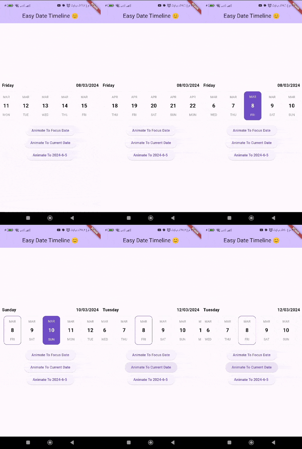
EasyDateTimeLinePicker is a customizable date and time picker widget for Flutter applications. It provides a horizontal timeline interface for selecting dates, with various customization options for appearance and behavior.
The "easy_date_timeline" package is a customizable Flutter library that displays a timeline of dates in a horizontal view.
| Image Preview | Gif Preview |
|---|---|
 |
 |
📦 Other Packages #
-
easy_infinite_pagination : The Easy Infinite Pagination package provides a simple and customizable way to implement infinite pagination in your Flutter applications.
-
flutter_easy_validator: package designed to simplify the process of validating strings in your applications.
-
easy_radio: EasyRadio is a customizable radio button widget for Flutter that offers consistent animation, easy customization of sizes, shape, inner dot shape.
How To Use EasyInfiniteDateTimeLine #
Import the following package in your dart file
import 'package:easy_date_timeline/easy_date_timeline.dart';
Usage #
Use the EasyInfiniteDateTimeLine Widget
 final EasyInfiniteDateTimelineController _controller =
      EasyInfiniteDateTimelineController();

        EasyInfiniteDateTimeLine(
          controller: _controller,
          firstDate: DateTime(2023),
          focusDate: _focusDate,
          lastDate: DateTime(2023, 12, 31),
          onDateChange: (selectedDate) {
            setState(() {
              _focusDate = selectedDate;
            });
          },
        ),
How To Use EasyDateTimeLine #
Import the following package in your dart file
import 'package:easy_date_timeline/easy_date_timeline.dart';
EasyDateTimeLine Usage #
Use the EasyDateTimeLine Widget
    EasyDateTimeLine(
      initialDate: DateTime.now(),
      onDateChange: (selectedDate) {
        //`selectedDate` the new date selected.
      },
    ),
Features #
-
Dynamic Text Color: The "easy_date_timeline" package automatically adjusts the text color of the active day based on the active color. If the active color is a dark color, the text color will be light, and if the active color is a light color, the text color will be dark. This ensures that the text is always easy to read and contrasts well with the background color. -
Customizable Item Builder: The "easy_date_timeline" package provides an item builder that allows for full customization of the timeline items. With the item builder, developers can customize the appearance and behavior of each date item in the timeline, including the text, background color,etc..IMPORTANT NOTE:
When utilizing the
itemBuilder, it is essential to provide the width of each day for the date timeline widget.For example:
dayProps: const EasyDayProps( // You must specify the width in this case. width: 124.0, ), -
Locale Support: The "easy_date_timeline" package supports locale, allowing developers to display the timeline in different languages and formats based on the user's device settings. This feature ensures that the package can be used in a variety of international contexts and provides a seamless user experience for users around the world.
EasyInfiniteDateTimeLine itemBuilder example: #
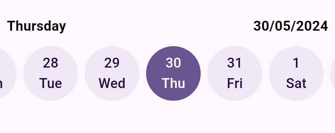
You can use the itemBuilder to customize the appearance of the day widget.
The itemBuilder provides the following:
BuildContext context: The context of the widget.DateTime date: The date of the day widget.bool isSelected: Whether the day widget is selected or not.VoidCallback onTap: The callback that triggers when the day widget is tapped.
    return EasyInfiniteDateTimeLine(
      selectionMode: const SelectionMode.autoCenter(),
      firstDate: DateTime(2024),
      focusDate: _focusDate,
      lastDate: DateTime(2024, 12, 31),
      onDateChange: (selectedDate) {
        setState(() {
          _focusDate = selectedDate;
        });
      },
      dayProps: const EasyDayProps(
        // You must specify the width in this case.
        width: 64.0,
        // The height is not required in this case.
        height: 64.0,
      ),
      itemBuilder: (
        BuildContext context,
        DateTime date,
        bool isSelected,
        VoidCallback onTap,
      ) {
        return InkResponse(
          // You can use `InkResponse` to make your widget clickable.
          // The `onTap` callback responsible for triggering the `onDateChange`
          // callback and animating to the selected date if the `selectionMode` is
          // SelectionMode.autoCenter() or SelectionMode.alwaysFirst().
          onTap: onTap,
          child: CircleAvatar(
            // use `isSelected` to specify whether the widget is selected or not.
            backgroundColor:
                isSelected ? fillColor : fillColor.withOpacity(0.1),
            radius: 32.0,
            child: Column(
              mainAxisAlignment: MainAxisAlignment.center,
              children: [
                Flexible(
                  child: Text(
                    date.day.toString(),
                    style: TextStyle(
                      color: isSelected ? Colors.white : null,
                    ),
                  ),
                ),
                Flexible(
                  child: Text(
                    EasyDateFormatter.shortDayName(date, "en_US"),
                    style: TextStyle(
                      color: isSelected ? Colors.white : null,
                    ),
                  ),
                ),
              ],
            ),
          ),
        );
      },
    )
Custom background #
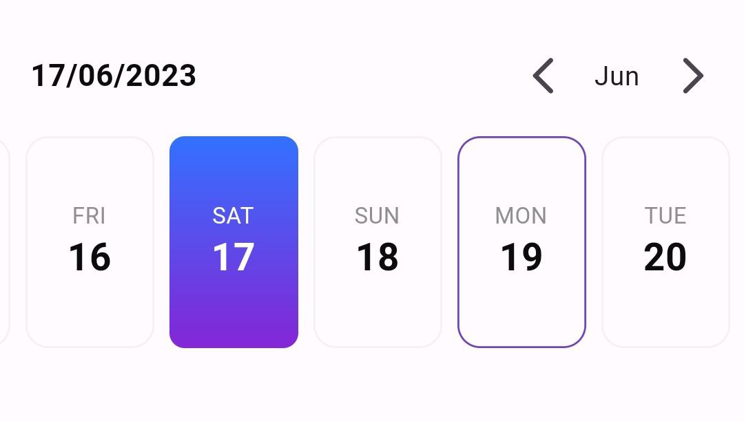
Use the activeDayProps in dayProps that contains decoration
for the active day.
    EasyDateTimeLine(
      initialDate: DateTime.now(),
      onDateChange: (selectedDate) {
        //`selectedDate` the new date selected.
      },
      headerProps: const EasyHeaderProps(
        monthPickerType: MonthPickerType.switcher,
        dateFormatter: DateFormatter.fullDateDMY(),
      ),
      dayProps: const EasyDayProps(
        dayStructure: DayStructure.dayStrDayNum,
        activeDayStyle: DayStyle(
          decoration: BoxDecoration(
            borderRadius: BorderRadius.all(Radius.circular(8)),
            gradient: LinearGradient(
              begin: Alignment.topCenter,
              end: Alignment.bottomCenter,
              colors: [
                Color(0xff3371FF),
                Color(0xff8426D6),
              ],
            ),
          ),
        ),
      ),
    )
Change current day highlight color and style #
in the dayProps you can set todayHighlightStyle to :
TodayHighlightStyle.withBackground: Set a background color for the current day.TodayHighlightStyle.withBorder: Set just a colored border for the current day.TodayHighlightStyle.none: Remove the highlight from the current day. by default the highlight color equal to primary color with opacity of 20%. to change the highlight color you can usetodayHighlightColorand set your own color.
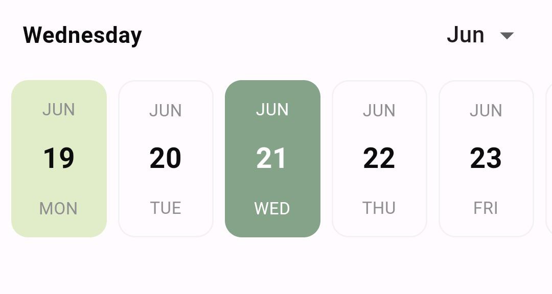
    EasyDateTimeLine(
      initialDate: DateTime.now(),
      onDateChange: (selectedDate) {
        //`selectedDate` the new date selected.
      },
      activeColor: const Color(0xff85A389),
      dayProps: const EasyDayProps(
        todayHighlightStyle: TodayHighlightStyle.withBackground,
        todayHighlightColor: Color(0xffE1ECC8),
      ),
    )
NOTE: When you provide an
inactiveDay.decorationto the EasyDateTimeline widget, it will override the current day highlight feature.
Change day structure #
In the dayProps change the dayStructure to:
DayStructure.dayNumDayStr: show the current day number then current day name.DayStructure.dayStrDayNum: show the current name then current day number.DayStructure.monthDayNumDayStr: show current month name then the current day number finally current day name.DayStructure.dayNumberOnly: show only current day number.DayStructure.dayNameOnly: show only current day name.DayStructure.dayStrDayNumMonth: show current day name then the current day number finally current moth name.
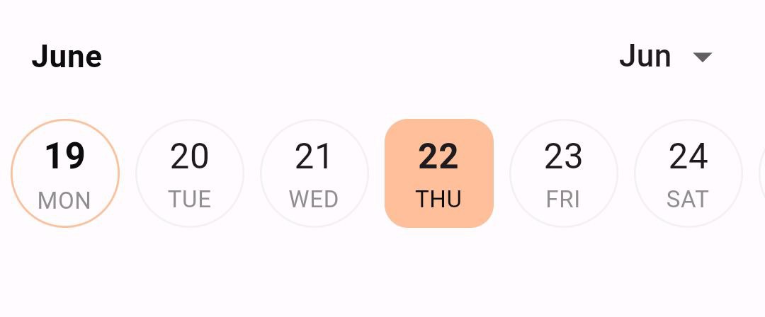
    EasyDateTimeLine(
      initialDate: DateTime.now(),
      onDateChange: (selectedDate) {
        //`selectedDate` the new date selected.
      },
      activeColor: const Color(0xffFFBF9B),
      headerProps: const EasyHeaderProps(
        dateFormatter: DateFormatter.monthOnly(),
      ),
      dayProps: const EasyDayProps(
        height: 56.0,
        width: 56.0,
        dayStructure: DayStructure.dayNumDayStr,
        inactiveDayStyle: DayStyle(
          borderRadius: 48.0,
          dayNumStyle: TextStyle(
            fontSize: 18.0,
          ),
        ),
        activeDayStyle: DayStyle(
          dayNumStyle: TextStyle(
            fontSize: 18.0,
            fontWeight: FontWeight.bold,
          ),
        ),
      ),
    )
Locale support #
With easy_date_timeline, you can display dates and timelines in your preferred language and format. Simply pass the locale parameter with the appropriate language code and region as a value. For example, if you want to display the dates in Arabic, you can set the locale parameter to "ar". The package's support for localization allows you to provide a better user experience for users around the world by displaying text and information in their preferred language and format.
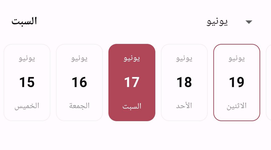
    EasyDateTimeLine(
      initialDate: DateTime.now(),
      onDateChange: (selectedDate) {
        //`selectedDate` the new date selected.
      },
      activeColor: const Color(0xffB04759),
      locale: "ar",
    );
Landscape view #
With easy_date_timeline, you can display dates and timelines in landscape view just set
landScapeMode to true in dayProps.
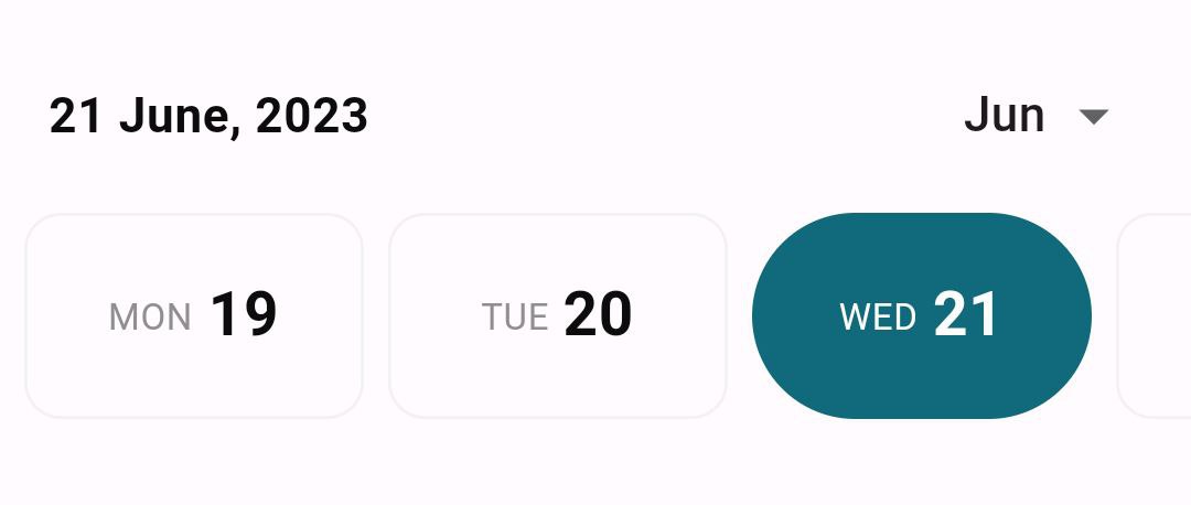
    EasyDateTimeLine(
      initialDate: DateTime.now(),
      onDateChange: (selectedDate) {
        //`selectedDate` the new date selected.
      },
      activeColor: const Color(0xff116A7B),
      dayProps: const EasyDayProps(
        landScapeMode: true,
        activeDayStyle: DayStyle(
          borderRadius: 48.0,
        ),
        dayStructure: DayStructure.dayStrDayNum,
      ),
      headerProps: const EasyHeaderProps(
        dateFormatter: DateFormatter.fullDateDMonthAsStrY(),
      ),
    )
Change header appearance #
In the headerProps change the monthPickerType to:
MonthPickerType.switcher: show the month and you can change month by clicking the arrow buttons.MonthPickerType.dropDown: show the month and you can change month from a dropdown menu.- also in the
headerPropschange thedateFormatterto: DateFormatter.dayOnly(): Formats the date with only the day of the week for example "Monday".DateFormatter.monthOnly(): Formats the date with only the month for example "January".DateFormatter.fullDateDMY(): Formats the date as "day/month/year" (e.g., "01/01/2022"), You can also specify a custom separator to use between the day, month, and year. default separator is "/".DateFormatter.fullDateMDY(): Formats the date as "month/day/year" (e.g., "01/25/2022"), You can also specify a custom separator to use between the day, month, and year. default separator is "/".DateFormatter.fullDateDayAsStrMY(): Formats the date as "day month, year" (e.g., "Monday 12, 2022"), You can also specify a custom separator. default separator is ", ".DateFormatter.fullDateDMonthAsStrY(): Formats the date as "day month year" (e.g., "1 January, 2022"), You can also specify a custom separator. default separator is ", ".DateFormatter.fullDateMonthAsStrDY(): Formats the date as "month day, year" (e.g., "January 1, 2022"), You can also specify a custom separator. default separator is ", ".DateFormatter.custom(): Formats the date using a custom formatter.
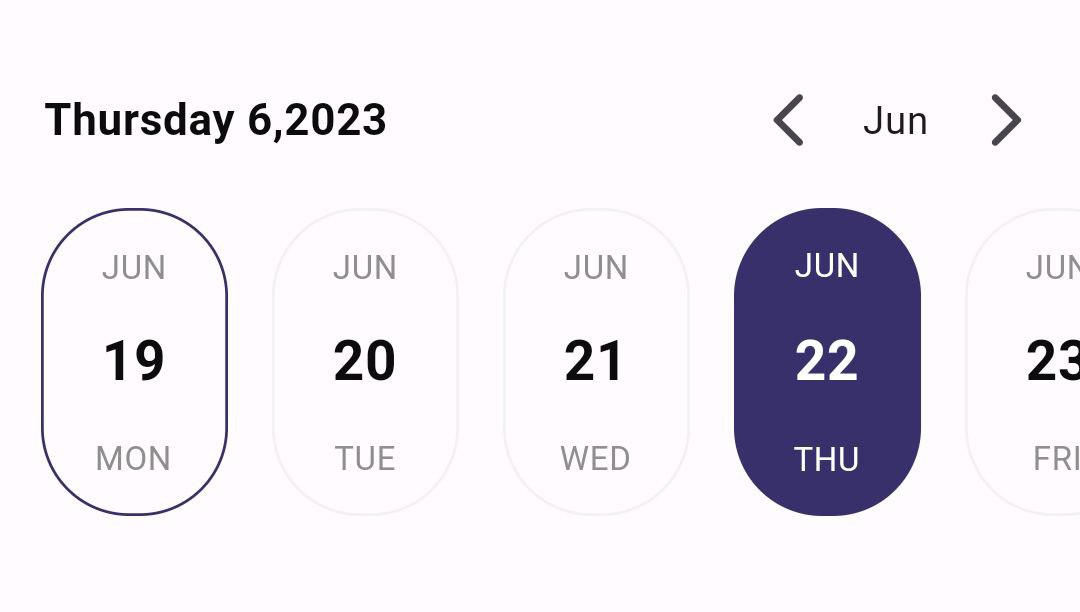
    EasyDateTimeLine(
      initialDate: DateTime.now(),
      onDateChange: (selectedDate) {
        //`selectedDate` the new date selected.
      },
      activeColor: const Color(0xff37306B),
      headerProps: const EasyHeaderProps(
        monthPickerType: MonthPickerType.switcher,
        dateFormatter: DateFormatter.fullDateDayAsStrMY(),
      ),
      dayProps: const EasyDayProps(
        activeDayStyle: DayStyle(
          borderRadius: 32.0,
        ),
        inactiveDayStyle: DayStyle(
          borderRadius: 32.0,
        ),
      ),
      timeLineProps: const EasyTimeLineProps(
        hPadding: 16.0, // padding from left and right
        separatorPadding: 16.0, // padding between days
      ),
    )
Customize day appearance #
IMPORTANT NOTE:
When utilizing the
itemBuilder, it is essential to provide the width of each day for the date timeline widget.
- For example:
  dayProps: const EasyDayProps(
   // You must specify the width in this case.
   width: 124.0,
  ),
You can use the itemBuilder to customize the appearance of the day widget.
The itemBuilder provides the following:
BuildContext context.String dayNumber: the day number ex: "11".String dayName: the day name ex: "Sunday".String monthName: the month name ex: "June".DateTime fullDate: the full date of the day for fully customization.bool isSelected: whether the day is selected or not.
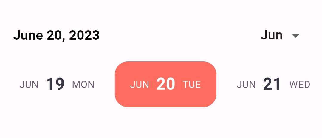
    EasyDateTimeLine(
      initialDate: DateTime.now(),
      onDateChange: (selectedDate) {
        //`selectedDate` the new date selected.
      },
      dayProps: const EasyDayProps(
        height: 56.0,
        // You must specify the width in this case.
        width: 124.0,
      ),
      headerProps: const EasyHeaderProps(
        dateFormatter: DateFormatter.fullDateMonthAsStrDY(),
      ),
      itemBuilder: (context, date, isSelected, onTap) {
        return InkWell(
          // You can use `InkResponse` to make your widget clickable.
          // The `onTap` callback responsible for triggering the `onDateChange`
          // callback.
          onTap: onTap,
          borderRadius: BorderRadius.circular(16.0),
          child: Container(
            //the same width that provided previously.
            width: 124.0,
            padding: const EdgeInsets.symmetric(horizontal: 8.0),
            decoration: BoxDecoration(
              color: isSelected ? const Color(0xffFF6D60) : null,
              borderRadius: BorderRadius.circular(16.0),
            ),
            child: Row(
              mainAxisAlignment: MainAxisAlignment.center,
              children: [
                Text(
                  EasyDateFormatter.shortMonthName(date, "en_US"),
                  style: TextStyle(
                    fontSize: 12,
                    color: isSelected ? Colors.white : const Color(0xff6D5D6E),
                  ),
                ),
                const SizedBox(
                  width: 8.0,
                ),
                Text(
                  date.day.toString(),
                  style: TextStyle(
                    fontSize: 20,
                    fontWeight: FontWeight.bold,
                    color: isSelected ? Colors.white : const Color(0xff393646),
                  ),
                ),
                const SizedBox(
                  width: 8.0,
                ),
                Text(
                  EasyDateFormatter.shortDayName(date, "en_US"),
                  style: TextStyle(
                    fontSize: 12,
                    color: isSelected ? Colors.white : const Color(0xff6D5D6E),
                  ),
                ),
              ],
            ),
          ),
        );
      },
    )
Constructor #
  EasyDateTimeLine({
    super.key,
    required this.initialDate,
    this.disabledDates,
    this.headerProps = const EasyHeaderProps(),
    this.timeLineProps = const EasyTimeLineProps(),
    this.dayProps = const EasyDayProps(),
    this.onDateChange,
    this.itemBuilder,
    this.activeColor,
    this.locale = "en_US",
  });
  EasyInfiniteDateTimeLine({
    super.key,
    this.disabledDates,
    this.timeLineProps = const EasyTimeLineProps(),
    this.dayProps = const EasyDayProps(),
    this.onDateChange,
    this.itemBuilder,
    this.activeColor,
    this.locale = "en_US",
    required this.firstDate,
    required this.focusDate,
    required this.lastDate,
    this.controller,
    this.showTimelineHeader = true,
    this.headerBuilder,
  });


