easy_autocomplete 1.1.0  easy_autocomplete: ^1.1.0 copied to clipboard
 4inka.com
A simple but flexible autocomplete TextFormField to help you display suggestions to your users while typing
Easy Autocomplete #

A Flutter plugin to handle input autocomplete suggestions
Preview #

ToDo #
- Add validation functionality
- Add asynchronous suggestions fetch
- Add possibility to show empty message when no suggestion is found
Usage #
In the pubspec.yaml of your flutter project, add the following dependency:
dependencies:
  ...
  easy_autocomplete: ^1.1.0
You can create a simple autocomplete input widget with the following example:
import 'package:easy_autocomplete/easy_autocomplete.dart';
import 'package:flutter/material.dart';

void main() {
  runApp(MyApp());
}

class MyApp extends StatelessWidget {
  @override
  Widget build(BuildContext context) {
    return MaterialApp(
      title: 'Example',
      theme: ThemeData(
        primarySwatch: Colors.blue,
      ),
      home: SafeArea(
        child: Scaffold(
          appBar: AppBar(
            title: Text('Example')
          ),
          body: Container(
            padding: EdgeInsets.all(10),
            alignment: Alignment.center,
            child: EasyAutocomplete(
              suggestions: ['Afeganistan', 'Albania', 'Algeria', 'Australia', 'Brazil', 'German', 'Madagascar', 'Mozambique', 'Portugal', 'Zambia'],
              onChanged: (value) => print(value)
            )
          )
        )
      )
    );
  }
}
You can customize other aspects of the autocomplete widget such as the suggestions text style, background color and others as shown in example below:
import 'package:easy_autocomplete/easy_autocomplete.dart';
import 'package:flutter/material.dart';

void main() {
  runApp(MyApp());
}

class MyApp extends StatelessWidget {
  @override
  Widget build(BuildContext context) {
    return MaterialApp(
      title: 'Example',
      theme: ThemeData(
        primarySwatch: Colors.blue,
      ),
      home: SafeArea(
        child: Scaffold(
          appBar: AppBar(
            title: Text('Example')
          ),
          body: Container(
            padding: EdgeInsets.all(10),
            alignment: Alignment.center,
            child: EasyAutocomplete(
              suggestions: ['Afeganistan', 'Albania', 'Algeria', 'Australia', 'Brazil', 'German', 'Madagascar', 'Mozambique', 'Portugal', 'Zambia'],
              cursorColor: Colors.purple,
              suggestionBackgroundColor: Colors.purple,
              decoration: InputDecoration(
                contentPadding: EdgeInsets.symmetric(vertical: 0, horizontal: 10),
                focusedBorder: OutlineInputBorder(
                  borderRadius: BorderRadius.circular(5),
                  borderSide: BorderSide(
                    color: Colors.purple,
                    style: BorderStyle.solid
                  )
                ),
                enabledBorder: OutlineInputBorder(
                  borderRadius: BorderRadius.circular(5),
                  borderSide: BorderSide(
                    color: Colors.purple,
                    style: BorderStyle.solid
                  )
                )
              ),
              suggestionTextStyle: TextStyle(
                color: Colors.white,
                fontStyle: FontStyle.italic,
                fontSize: 16
              ),
              onChanged: (value) => print(value)
            )
          )
        )
      )
    );
  }
}
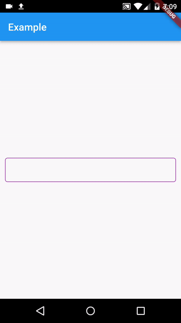
The above example will generate something like below preview:
API #
| Attribute | Type | Required | Description | Default value |
|---|---|---|---|---|
| suggestions | List<String> |
✔️ | The list of suggestions to be displayed | |
| controller | TextEditingController |
❌ | Text editing controller | |
| decoration | InputDecoration |
❌ | Can be used to decorate the input | |
| onChanged | Function(String) |
❌ | Function that handles the changes to the input | |
| inputFormatter | List<TextInputFormatter> |
❌ | Can be used to set custom inputFormatters to field | |
| initialValue | String |
❌ | Can be used to set the textfield initial value | |
| textCapitalization | TextCapitalization |
❌ | Can be used to set the text capitalization type | TextCapitalization.sentences |
| autofocus | bool |
❌ | Determines if should gain focus on screen open | false |
| keyboardType | TextInputType |
❌ | Can be used to set different keyboardTypes to your field | TextInputType.text |
| cursorColor | Color |
❌ | Can be used to set a custom color to the input cursor | Colors.blue |
| suggestionTextStyle | TextStyle |
❌ | Can be used to set custom style to the suggestions list text | |
| suggestionBackgroundColor | Color |
❌ | Can be used to set custom background color to suggestions list |
Issues & Suggestions #
If you encounter any issue you or want to leave a suggestion you can do it by filling an issue.
Thank you for the support! #
Metadata
57
likes
0
pub points
94%
popularity
Publisher
Metadata
A simple but flexible autocomplete TextFormField to help you display suggestions to your users while typing
Repository (GitHub)
View/report issues
License
 unknown (LICENSE)