dynamic_stack_card_swiper 1.0.1  dynamic_stack_card_swiper: ^1.0.1 copied to clipboard
The awesome fully customisable Tinder Card Swiper provided by Appinio's team, now supporting dynamic cards adding.
dynamic_stack_card_swiper is a Flutter package for a dynamic Tinder Card Swiper, based on appinio_swiper.
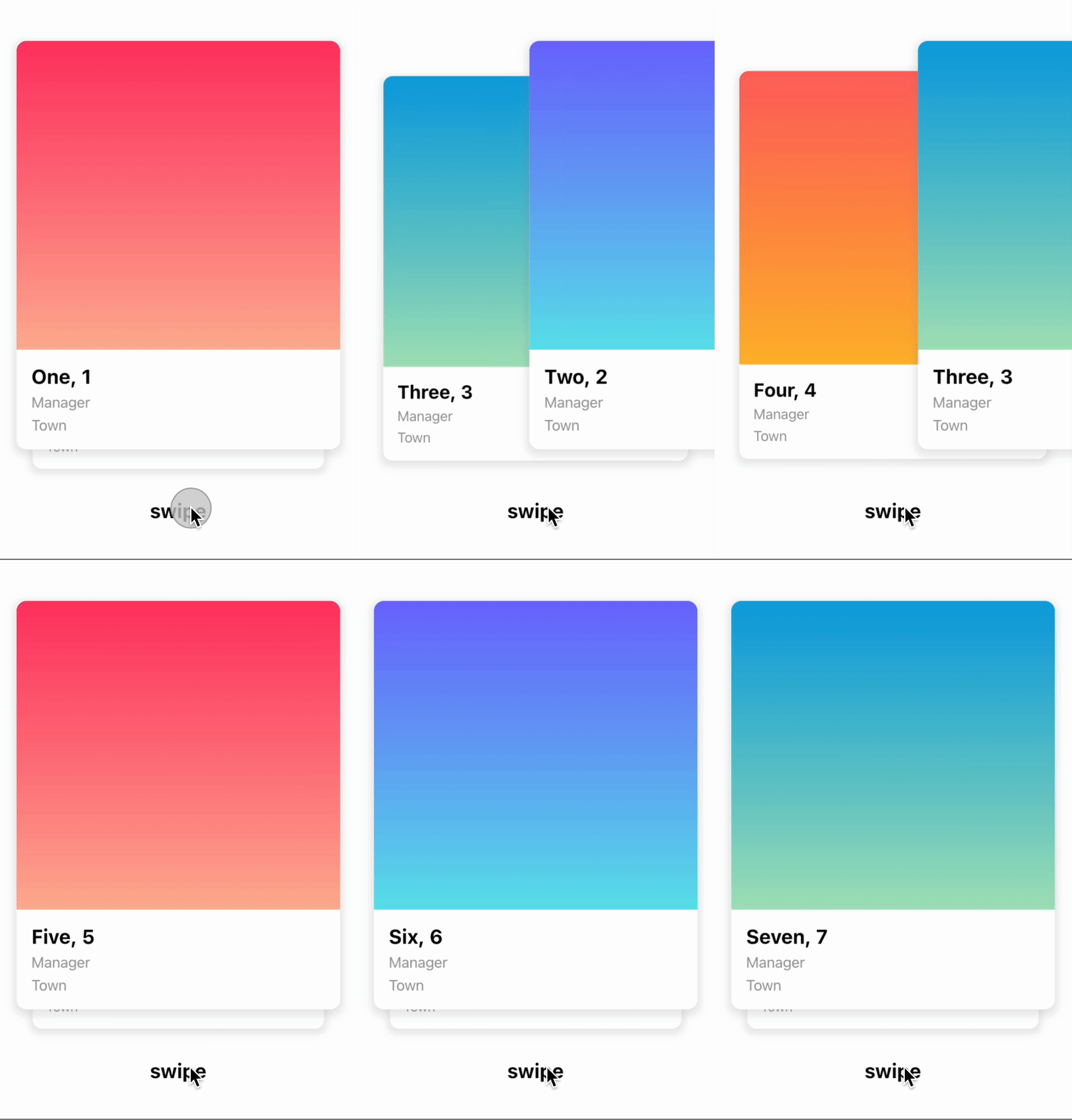
As for appinio_swiper, it allows swiping in all directions with any Custom Widget (Stateless or Statefull) with very smooth animations supporting Android, iOS & WebApp. The difference is you can now also dynamically add new item(s) on top of the existing stack.
Why? #
I built this package because I wanted to be able to add new cards on top of the existing stack, even after user already swiped a few items, or even already emptied the stack. It had a cost: indeed, I had to remove some features from the original package (such as unswipe), but it can obviously be re-coded outside of the plugin (by adding on top of the stack the items you kept in some place).
How to use it? #
Add an item on top of the stack #
Now you can add an item on top of the stack using DynamicStackCardSwiperController<MyModel>.addCardOnTop(modelItem, direction) (direction being an AxisDirection allowing you to choose from which side of the screen the item will come from to join the stack).
AppinioSwiper's original Show Cases #


Trigger swipe right and swipe left however you want...

Customize the angle...

Customize the threshold of the swiper, when the card should slide away...

Installation #
Create a new project with the command
flutter create MyApp
Add
dynamic_stack_card_swiper: ...
to your pubspec.yaml of your flutter project.
OR
run
flutter pub add dynamic_stack_card_swiper
in your project's root directory.
In your library add the following import:
import 'package:dynamic_stack_card_swiper/dynamic_stack_card_swiper.dart';
For help getting started with Flutter, view the online documentation.
Usage #
You can place your DynamicStackCardSwiper inside of a Scaffold or CupertinoPageScaffold like you would with Appinio's version. Optional
parameters can be defined to enable different features. See the following example..
import 'package:dynamic_stack_card_swiper/dynamic_stack_card_swiper.dart';
import 'package:flutter/cupertino.dart';

class Example extends StatelessWidget {

  @override
  Widget build(BuildContext context) {
    return CupertinoPageScaffold(
      child: SizedBox(
        height: MediaQuery.of(context).size.height * 0.75,
        child: DynamicStackCardSwiper<String>(
          cardsBuilder: (BuildContext context, String item) {
            return Container(
              alignment: Alignment.center,
              child: Text(item),
              color: CupertinoColors.activeBlue,
            );
          },
        ),
      ),
    );
  }
}
Constructor #
Basic
| Parameter | Default | Description | Required |
|---|---|---|---|
| backgroundCardCount | 1 | Number of cards you want to render in background. | false |
| backgroundCardScale | .9 | Scale factor for the background card. | false |
| backgroundCardOffset | - | Offset for the background card. | false |
| cardBuilder | - | Callback of the type CardsBuilder. | true |
| swipeOptions | - | value of type AppinioSwipeOptions to restrict swipes. | false |
| invertAngleOnBottomDrag | true | Sets whether the card should angle in the opposite direction when it is dragged from the bottom half. | false |
| controller | - | Trigger swipe, unSwipe and animateTo. | false |
| padding | EdgeInsets.symmetric(horizontal: 20, vertical: 25) | Control swiper padding | false |
| duration | 200 milliseconds | The duration that every animation should last | false |
| cardsSpacing | 40 | The spacing between background cards. | false |
| maxAngle | 30 | Maximum angle the card reaches while swiping | false |
| threshold | 50 | Threshold from which the card is swiped away | false |
| isDisabled | false | Set to true if swiping should be disabled, has no impact when triggered from the outside |
false |
| onTapDisabled | - | Function that get triggered when the swiper is disabled | false |
| onSwipeBegin | - | Called when user starts to swipe a card. | false |
| onSwipeEnd | - | Called swipe action completes. | false |
| onCardPositionChanged | - | Called when card position changes. | false |
| onEnd | - | Called when there is no Widget left to be swiped away | false |
| defaultDirection | right | Direction in which the card is swiped away when triggered from the outside | false |
| onSwipeCancelled | - | Gets called when the user leaves the card before the threshold is reached | false |
Controller
The Controller is used to control the swipeDefault, swipeLeft, swipeRight, swipeUp
, swipeDown , addCardOnTop and animateTo function of the swiper from outside of the widget. You can create a controller
called DynamicStackCardSwiperController and save the instance for further usage. Please have a closer look to our Example
for the usage.
| Method | Description |
|---|---|
| swipe | Swipes the card in your selected direction and removes it from the stack. |
| swipeLeft | Swipes the card to the left side and removes it from the stack. |
| swipeRight | Swipes the card to the right side and removes it from the stack. |
| swipeUp | Swipes the card to the up side and removes it from the stack. |
| swipeDown | Swipes the card to the down side and removes it from the stack. |
| addCardOnTop | Adds a new card to the top of the stack. |
| animateTo | Animates the current offset of the card on top to the required Offset in a given duration. |
Made with ❤ by Lionel Mennig (L10.be) based on work kindly provided by the Flutter team at Appinio GmbH