drag_speed_dial 1.2.0  drag_speed_dial: ^1.2.0 copied to clipboard
Flutter package to implement a FAB and dynamic Material Design Speed Dial, draggable, multi-directional children and much more.
🎯 Drag Speed Dial #
A highly customizable and interactive Flutter floating action button (FAB) with drag-to-position functionality and speed dial menu. Perfect for apps seeking to enhance navigation efficiency and user engagement without compromising on aesthetics.
✨ Features #
- 🎯 Draggable FAB - Move the FAB anywhere on screen with smooth animations
- 📍 Smart Positioning - Automatically snaps to edges or stays where you drag it
- 🎨 Fully Customizable - Custom colors, icons, and styles
- 📱 Speed Dial Menu - Expandable menu with multiple action items
- ⚡ Simple Action Mode - Use as a regular FAB with a single action
- 🔄 Flexible Alignment - Horizontal or vertical menu layouts
- 🎭 Smooth Animations - Beautiful transitions and bounce effects
- 📐 Screen-Aware - Intelligent positioning that respects screen boundaries
💻 Installation #
Add this to your package's pubspec.yaml file:
dependencies:
  drag_speed_dial: <latest_version>
Then run:
flutter pub get
🚀 Quick Start #
Import the package:
import 'package:drag_speed_dial/drag_speed_dial.dart';
📖 Usage Examples #
1. Speed Dial with Multiple Actions #
Create a draggable FAB with expandable menu items:
DragSpeedDial(
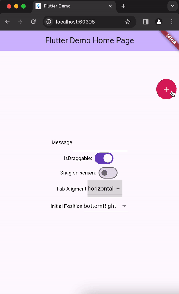
isDraggable: true,
snagOnScreen: false, // Snaps to left/right edges
fabBgColor: Colors.blue,
fabIcon: const Icon(Icons.menu, color: Colors.white),
alignment: DragSpeedDialChildrenAlignment.horizontal,
dragSpeedDialChildren: [
DragSpeedDialChild(
onPressed: () => print("Favorites"),
bgColor: Colors.red,
icon: const Icon(Icons.favorite, color: Colors.white),
),
DragSpeedDialChild(
onPressed: () => print("Share"),
bgColor: Colors.green,
icon: const Icon(Icons.share, color: Colors.white),
),
DragSpeedDialChild(
onPressed: () => print("Settings"),
bgColor: Colors.orange,
icon: const Icon(Icons.settings, color: Colors.white),
),
],
)
2. Simple Action FAB #
Use as a regular FAB with a single action:
DragSpeedDial(
  isDraggable: true,
  snagOnScreen: true, // Stays where you drag it
  fabBgColor: Colors.purple,
  fabIcon: const Icon(Icons.add, color: Colors.white),
  actionOnPress: () {
    print("Add button pressed!");
  },
)
3. Fixed Position FAB #
Create a non-draggable FAB at a specific position:
DragSpeedDial(
  isDraggable: false,
  offsetPosition: const Offset(20, 100), // Fixed position
  fabBgColor: Colors.teal,
  fabIcon: const Icon(Icons.chat, color: Colors.white),
  dragSpeedDialChildren: [
    DragSpeedDialChild(
      onPressed: () => print("New chat"),
      bgColor: Colors.blue,
      icon: const Icon(Icons.message),
    ),
  ],
)
4. Vertical Menu Alignment #
Display menu items vertically:
DragSpeedDial(
  isDraggable: true,
  alignment: DragSpeedDialChildrenAlignment.vertical,
  fabBgColor: Colors.indigo,
  fabIcon: const Icon(Icons.apps, color: Colors.white),
  dragSpeedDialChildren: [
    DragSpeedDialChild(
      onPressed: () => print("Action 1"),
      bgColor: Colors.pink,
      icon: const Icon(Icons.star),
    ),
    DragSpeedDialChild(
      onPressed: () => print("Action 2"),
      bgColor: Colors.amber,
      icon: const Icon(Icons.bookmark),
    ),
  ],
)
📋 API Reference #
DragSpeedDial Properties #
| Property | Type | Default | Description |
|---|---|---|---|
isDraggable |
bool |
true |
Whether the FAB can be dragged around the screen |
snagOnScreen |
bool |
false |
If true, FAB stays where dragged. If false, snaps to nearest edge |
fabBgColor |
Color? |
Theme color | Background color of the FAB |
fabIcon |
Widget? |
null |
Icon widget displayed in the FAB |
actionOnPress |
VoidCallback? |
null |
Callback for simple FAB action (mutually exclusive with dragSpeedDialChildren) |
dragSpeedDialChildren |
List<DragSpeedDialChild>? |
null |
List of speed dial menu items (mutually exclusive with actionOnPress) |
alignment |
DragSpeedDialChildrenAlignment |
horizontal |
Layout direction for menu items (horizontal or vertical) |
initialPosition |
DragSpeedDialPosition? |
null |
Starting position using predefined positions |
offsetPosition |
Offset? |
null |
Starting position using custom offset |
childrenStyle |
DragSpeedDialChildrenStyle? |
null |
Custom styling for menu items |
DragSpeedDialChild Properties #
| Property | Type | Default | Description |
|---|---|---|---|
onPressed |
VoidCallback |
required | Callback when the child item is pressed |
bgColor |
Color? |
null |
Background color of the child FAB |
icon |
Widget? |
null |
Icon widget for the child FAB |
label |
String? |
null |
Text label for the child item |
Enums #
DragSpeedDialChildrenAlignment
horizontal- Menu items appear horizontallyvertical- Menu items appear vertically
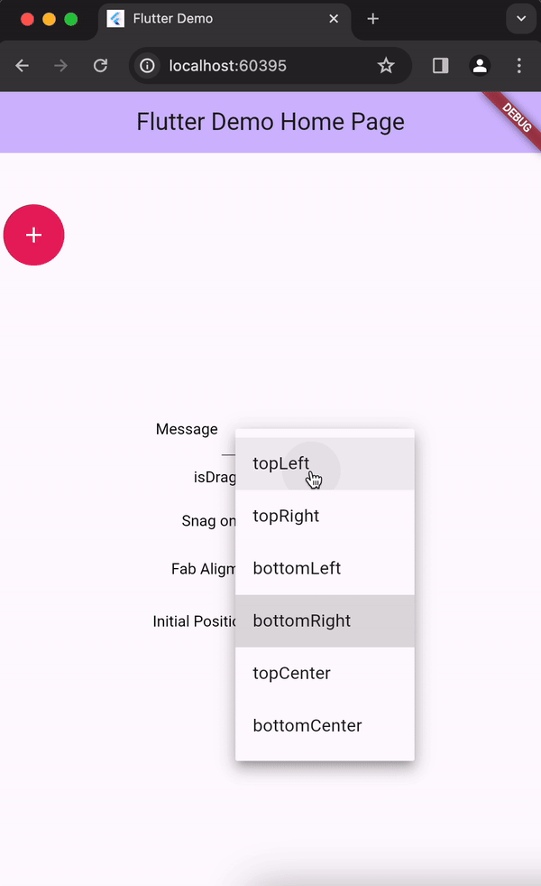
DragSpeedDialPosition
topLeft- Top left cornertopRight- Top right cornerbottomLeft- Bottom left cornerbottomRight- Bottom right corner
🎨 Customization Tips #
Custom Styling #
DragSpeedDial(
  fabBgColor: Colors.deepPurple,
  fabIcon: const Icon(Icons.star, color: Colors.amber, size: 30),
  childrenStyle: DragSpeedDialChildrenStyle(
    backgroundColor: Colors.white,
    elevation: 8.0,
  ),
  dragSpeedDialChildren: [
    DragSpeedDialChild(
      bgColor: Colors.red.shade400,
      icon: const Icon(Icons.favorite, color: Colors.white, size: 24),
      label: "Like",
      onPressed: () {},
    ),
  ],
)
Positioning Strategies #
Snap to Edges (snagOnScreen: false):
- FAB automatically moves to the nearest left or right edge
- Great for consistent positioning
- Recommended for most use cases
Free Positioning (snagOnScreen: true):
- FAB stays exactly where you drag it
- Provides maximum flexibility
- Maintains minimum padding from screen edges
⚠️ Important Notes #
- You must provide either
actionOnPressordragSpeedDialChildren, but not both - You must provide either
initialPositionoroffsetPosition - The FAB automatically respects screen boundaries with proper padding
- Vertical alignment intelligently positions items above or below based on FAB location
🐛 Troubleshooting #
FAB not dragging?
- Ensure
isDraggable: true - Check that you're not wrapping it in a widget that blocks gestures
Menu items not showing?
- Verify
dragSpeedDialChildrenis not empty - Ensure you're not also providing
actionOnPress
Position not updating?
- Make sure you're not using a
constconstructor for the parent widget - Try hot restart instead of hot reload
📄 License #
This project is licensed under the MIT License - see the LICENSE file for details.
🤝 Contributing #
Contributions are welcome! Please feel free to submit a Pull Request.
💬 Support #
If you find this package useful, please give it a ⭐️ on GitHub!
For issues and feature requests, please visit the issue tracker.
Metadata
Publisher
unverified uploader
Weekly Downloads
Metadata
Flutter package to implement a FAB and dynamic Material Design Speed Dial, draggable, multi-directional children and much more.
Repository (GitHub)
View/report issues
Documentation
License
 MIT (license)