division 0.6.3  division: ^0.6.3 copied to clipboard
A simple to use yet powerfull styling widget with syntax inspired by CSS.
Division #
A simple to use yet powerfull styling widget with syntax inspired by CSS.
Built with Division #
App designer
Code #
Getting Started #
The Division widget has 3 properties. A style property, a gesture property and a child property. As simple as that!
Division(
  style: StyleClass,
  gesture: GestureClass,
  child: Widget,
);
Having all style gathered at one place has alot of advantages. For example
- It is easy to outsource the style into variables or to a completely different place.
- It is easy to read and understand
- Easy to learn if you already know CSS
- Much more
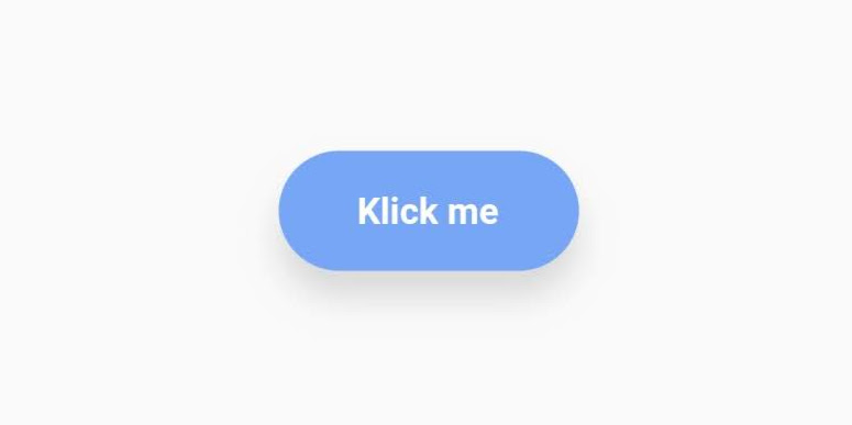
Simple example #
Import
import 'package:division/division.dart';
Code
Division(
  style: StyleClass()
    .padding(horizontal: 30, vertical: 15)
    .backgroundColor('#77A6F7')
    .borderRadius(all: 30)
    .align('center')
    .elevation(10, color: rgb(150,150,150)),

  gesture: GestureClass()
    .onTap(() => print('Button pressed')),

  child: Text('Klick me', style: myTextStyle),
)
The result
Style property #
The style property expects a StyleClass which is a class holding all the styling for the widget.
StyleClass #
To add a style to the StyleClass, call the style methods: .[style]
On construction, choose to use radians or not when giving circular values.
Styleclass({bool useRadians = false})
Align
.align(dynamic alignment)
Alignment of the widget itself, not the child.
alignment parameters support [String] value ('center', 'left', 'bottomRight'...), ([dx, dy]) value, [double] value (same value for dx and dy) and [Alignment].
Align child
.alignChild(dynamic alignment)
Alignment of the child.
alignment parameters support [String] value ('center', 'left', 'bottomRight'...), ([dx, dy]) value, [double] value (same value for dx and dy) and [Alignment].
Padding
.padding({double all,
      double horizontal,
      double vertical,
      double top,
      double bottom,
      double left,
      double right})
All properties work together. padding(all: 10, top: 30) is valid
Margin
.margin({double all,
      double horizontal,
      double vertical,
      double top,
      double bottom,
      double left,
      double right})
All properties work together. margin(all: 10, top: 30) is valid
Background color
.backgroundColor(dynamic color)
color parameter supports HEX '#xxxxxx', rgb(int, int, int), rgba(int, int, int, double) and [Color].
Background image
.backgroundImage(
      {String url,
      String path,
      ColorFilter colorFilter,
      BoxFit fit,
      dynamic alignment = Alignment.center,
      ImageRepeat repeat = ImageRepeat.noRepeat})
Eighter the [url] or the [path] has to be specified.
[url] is for network images and [path] is for local images.
alignment parameters support [String] value ('center', 'left', 'bottomRight'...), ([dx, dy]) value, [double] value (same value for dx and dy) and [Alignment].
Background blur
.backgroundBlur(double blur)
Blurs the background. Can be used for example to achieve a "frosted glass" effect:
StyleClass()
  .backgroundBlur(10)
  .backgroundColor(rgba(255,255,255,0.15))
Does not work together with ..rotate().
Gradient
.linearGradient({dynamic beginAlign = 'left',
      dynamic endAlign = 'right',
      @required List<dynamic> colors,
      TileMode tileMode = TileMode.clamp,
      List<double> stops})

.radialGradient(
      {dynamic centerAlign = 'center',
      double radius = 0.5,
      @required List<dynamic> colors,
      TileMode tileMode = TileMode.clamp,
      List<double> stops})

.sweepGradient(
      {dynamic centerAlign = 'center',
      double startAngle = 0.0,
      double endAngle, // default to 1.0 or 2 * pi, depending on if radians is enabled or not
      @required List<dynamic> colors,
      TileMode tileMode = TileMode.clamp,
      List<double> stops})
Choose between 3 gradient variants.
sweepGradient() by default does not use radians for the startAngle and the endAngle. By default 0.25 equals 45 degrees, 1 equals one full turn etc.
To change to use radians do: StyleClass(useRadians: true)...
color parameter supports HEX '#xxxxxx', rgb(int, int, int), rgba(int, int, int, double) and [Color].
alignment parameters support [String] value ('center', 'left', 'bottomRight'...), ([dx, dy]) value, [double] value (same value for dx and dy) and [Alignment].
Opacity
.opacity(double opacity)
Opacity applied on the whole widget.
Value must not be negative.
Border
.border(
      {double all,
      double left,
      double right,
      double top,
      double bottom,
      dynamic color = const Color(0xFF000000),
      BorderStyle style = BorderStyle.solid})
Choose between all, left, right, top and bottom. all works together with the other properties.
color parameter supports HEX '#xxxxxx', rgb(int, int, int), rgba(int, int, int, double) and [Color].
Border radius
.borderRadius(
      {double all,
      double topLeft,
      double topRight,
      double bottomLeft,
      double bottomRight})
It is valid to use all together with single sided properties. Single sided properties will trump over the all property.
Box shadow
.boxShadow(
      {dynamic color = const Color(0x33000000),
      double blur,
      List<double> offset,
      double spread})
color parameter supports HEX '#xxxxxx', rgb(int, int, int), rgba(int, int, int, double) and [Color].
If defined while the elevation property is defined, the last one defined will be the style applied.
offset is given in the format [double dx, double dy]
Elevation
.elevation(
      double elevation,
      {double angle = 0.0,
      dynamic color = const Color(0x33000000)})
Elevates the widget with a boxShadow. If the elevation property is used at the same time as the boxShadow property, the last one defined will be the applied style.
color parameter supports HEX '#xxxxxx', rgb(int, int, int), rgba(int, int, int, double) and [Color].
angle parameter takes a circular value. Eighter radians or not, depending on what is specified in the StyleClass constructor. 0.0 is down.
If angle equals [null] the shadow will be directly under the widget.
Scale
.scale(double ratio)
Scale the widget
Offset
.offset([double dx, double dy])
Offsets the widget
Rotate
.rotate(double angle)
Rotates the widget.
By default one turn equals the value 1.0. To change to radians: StyleClass(useRadians: true)...
Ripple
.ripple(bool enable, {dynamic splashColor, dynamic highlightColor})
Material ripple effect.
onTap does not work if ripple is defined. You may use onTapDown, onTapUp or onTapCancel instead.
Overflow
.overflow(
      String overflow,
      {Axis direction = Axis.vertical})
Change child overflow behaviour.
Compatible overflow values: scroll, hidden and visible. See documentation for a full overview on how they behave.
Choose the overflow direction with the [direction] parameter.
Does not support animation.
Animate
.animate([int duration, Curve curve = Curves.linear])
Animates the widget when one of its style properties changes.
duration is given in milliseconds.
Add
.add(StyleClass styleClass, {bool override = false})
Adds a StyleClass to a StyleClass.
By default the added StyleClass does not override already set style. Change override to true, to override already set style.
Width, minWidth, maxWidth, Height, minHeight, maxHeight
.[type](double dimension)
Gesture property #
The gesture property expects a GestureClass which is a class containing all the gestures for the widget.
GestureClass #
To add a style to the GestureClass, use the ..[gesture] syntax. The two dots is used to not return the [gesture], but the GestureClass
.onTap()
.onTapUp()
.onTapCancel()
.onDoubleTap()
.onTapDown()
.onLongPress()
.onLongPressStart()
.onLongPressEnd()
.onLongPressMoveUpdate()
.onLongPressUp()
.onVerticalDragStart()
.onVerticalDragEnd()
.onVerticalDragDown()
.onVerticalDragCancel()
.onVerticalDragUpdate()
.onHorizontalDragStart()
.onHorizontalDragEnd()
.onHorizontalDragCancel()
.onHorizontalDragUpdate()
.onHorizontalDragDown()
.onForcePressStart()
.onForcePressEnd()
.onForcePressPeak()
.onForcePressUpdate()
.onPanStart()
.onPanEnd()
.onPanCancel()
.onPanDown()
.onPanUpdate()
.onScaleStart()
.onScaleEnd()
.onScaleUpdate()
Child property #
Widget child
Metadata
Publisher
unverified uploader
Metadata
A simple to use yet powerfull styling widget with syntax inspired by CSS.
Repository (GitHub)
View/report issues
License
 unknown (LICENSE)