dialogs 0.0.6  dialogs: ^0.0.6 copied to clipboard
This flutter package provides carefully designed dialogs with customization options.
Dialogs - dialogs #
This flutter package provides aesthetically designed dialog box with customization options.
Now comes with legacy_progress_dialog #
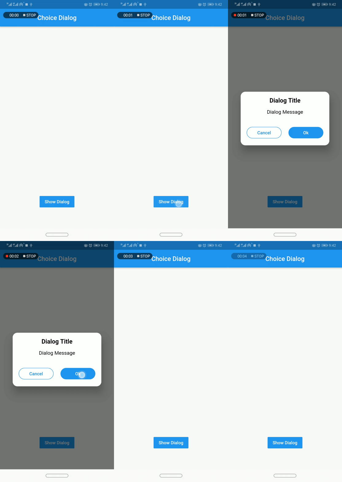
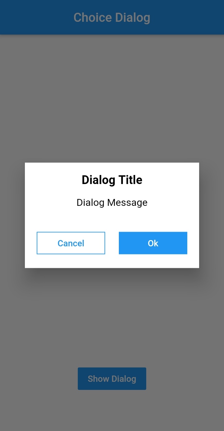
Choice Dialog #

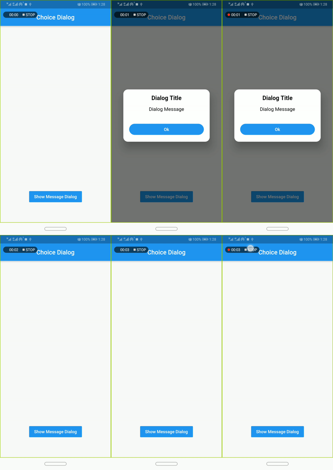
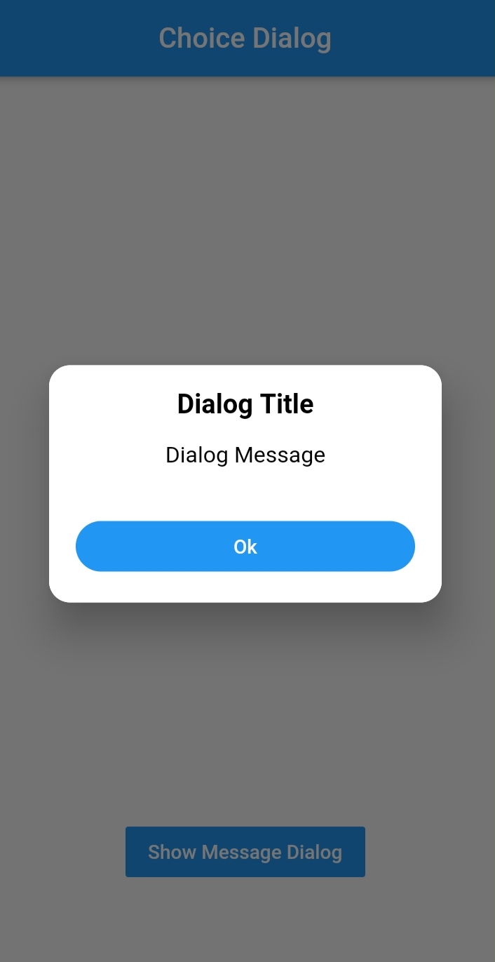
Message Dialog #
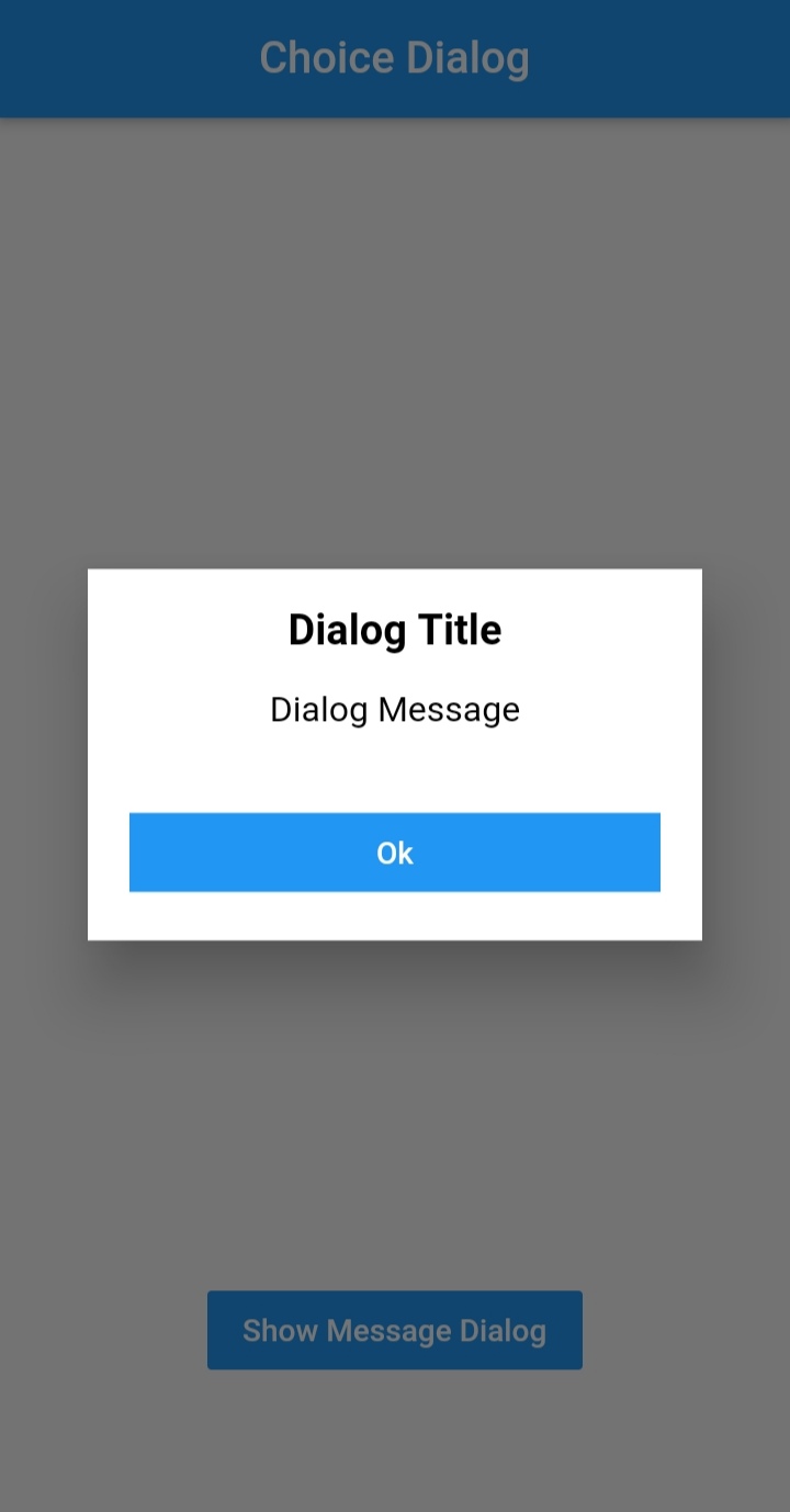
Simple Usage #
To use this plugin, add dialogs as a
dependency in your pubspec.yaml file.
Implementation: #
import 'package:dialogs/dialogs.dart';
ChoiceDialog #
- use
ChoiceDialog().show()function to display the dialog.
ChoiceDialog().show(context);
##OR
final choiceDialog = ChoiceDialog();
choiceDialog.show(context);
MessageDialog #
- use
MessageDialog().show()function and call the Choice Dialog .
MessageDialog().show(context);
OR #
final messageDialog = MessageDialog();
choiceDialog.show(context);
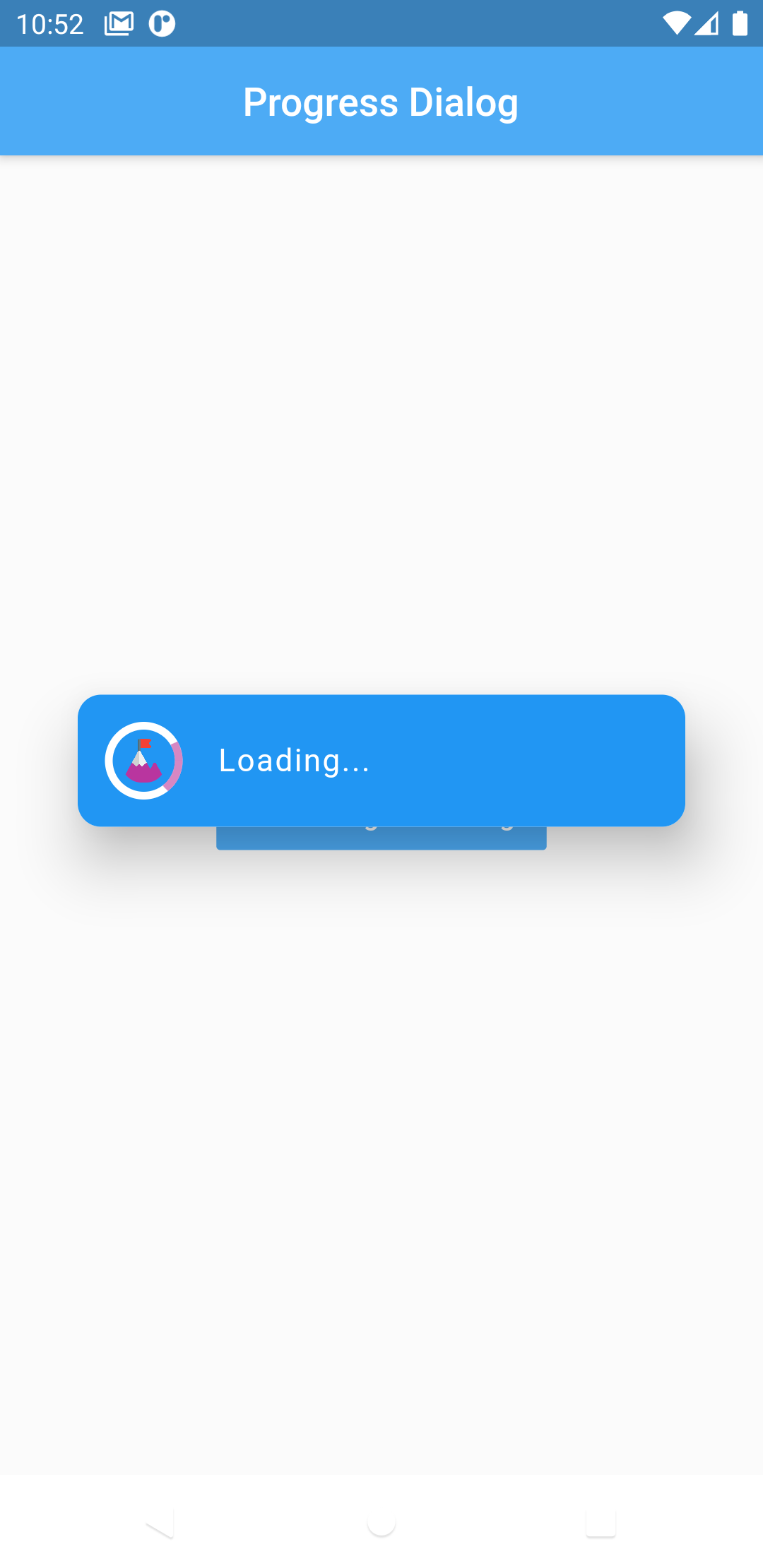
Show progress dialog : #
//Create an instance of ProgressDialog
ProgressDialog progressDialog = ProgressDialog(
                  context: context,
                  backgroundColor: Colors.blue,
                  textColor: Colors.White,
                );
// show dialog
progressDialog.show();

//close dialog
progressDialog.dismiss();
You are good to go 💯 #
In order to add the ChoiceDialog, MessageDialog to your app, there are several attributes that are important parameters that you might need frequently:
| Attribute | Type | Default | Required | Description |
|---|---|---|---|---|
buttonOkOnPressed |
Function() |
Navigator.pop(context) |
No |
This function will be registered as the callback of 'Ok' button. |
buttonCancelOnPressed |
Function() |
Navigator.pop(context) |
No |
This function will be registered as the callback of 'Cancel' button. |
dialogRadius |
double |
15.0 |
No |
Determines the borderRadius of dialog box. |
buttonRadius |
double |
18.0 |
No |
Determines the borderRadius of action buttons. |
iconButtonOk |
Icon |
null |
No |
Renders a FlatButton with the provided icon for positive action. |
iconButtonCancel |
Icon |
null |
No |
Renders a FlatButton with the provided icon for negative action. |
show() also provides some useful parameters of showDialog() function
| Attribute | Type | Default | Required | Description |
|---|---|---|---|---|
context |
BuildContext |
Null |
Yes |
The context argument is used to look up the Navigator and Theme for the dialog. |
barrierDismissible |
bool |
true |
No |
Indicates whether tapping on the barrier will dismiss the dialog. |
barrierColor |
Color |
Colors.black54 |
No |
Specifies the color of the modal barrier that darkens everything below the dialog. |
CREDITS #
Contributors #
Made with contributors-img.


