dialog_alert_transition 2.0.0  dialog_alert_transition: ^2.0.0 copied to clipboard
Creating a dialog is simpler and easier with the dialog_alert_transition package since it has transitions into and out of the dialog, it has a multilevel dialog handler. Available for android, ios, wi [...]
Dialog alert transition #
Creating a dialog is simpler and easier with the dialog_alert_transition package since it has transitions into and out of the dialog, it has a multilevel dialog handler. Available for android, ios, windows, linux, mac, web.
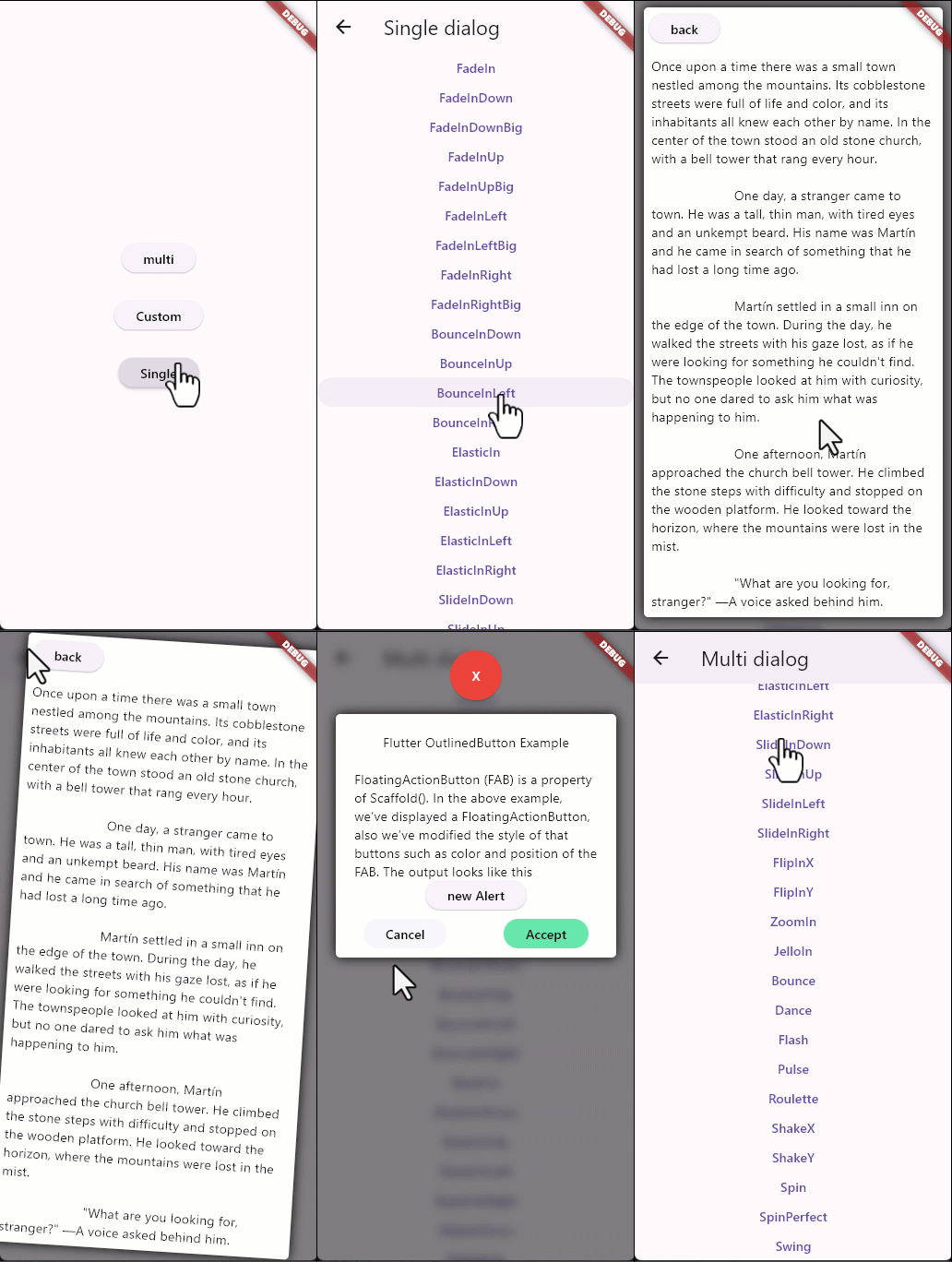
Screenshots #

Link Oficial PUB #
Link Oficial GITHUB #
Example #
import 'package:dialog_alert_transition/dialog_alert_transition.dart';
import 'package:flutter/material.dart';

class singleAlert extends StatefulWidget {
  const singleAlert({super.key});

  @override
  State<singleAlert> createState() => _multiAlert();
}

class _multiAlert extends State<singleAlert> {
  String stas = 'text old';

  @override
  Widget build(BuildContext context) {
    return Scaffold(
      appBar: AppBar(
        title: const Text('Single dialog'),
      ),
      body: Center(
        child: ListView(
          children: [
            for (transitionType e in transitionType.values) ...[
              TextButton(
                onPressed: () {
                  int token = controlAlertGo.generate();
                  dialogAlertTransion(
                      context: context,
                      title: const Text('Flutter OutlinedButton Example'),
                      content: const Column(
                        children: [
                          Text(
                              'FloatingActionButton (FAB) is a property of Scaffold(). In the above example, we’ve displayed a FloatingActionButton, also we’ve modified the style of that buttons such as color and position of the FAB. The output looks like this'),
                        ],
                      ),
                      alignment: Alignment.topCenter,
                      blur: true,
                      duration: 1000,
                      backgroundColor: Colors.black,
                      transitionType: e,
                      token: token,
                      rejectString: 'Close alert',
                      acceptString: 'Confirm this alert',
                      rejectFunc: () {
                        print('this function use is reject alert');
                      },
                      acceptFunc: () {
                        print('this function use in accept alert');
                      },
                      closeFunc: () {
                        setState(() {
                          stas = 'new string';
                        });
                      });
                },
                child: Text(e.name),
              ),
            ]
          ],
        ),
      ),
    );
  }
}
The transitions are as follows: #
The transition list is enumerated in an emun named transitionType.
FadeIn,

FadeInDown,

FadeInDownBig,

FadeInUp,

FadeInUpBig,

FadeInLeft,

FadeInLeftBig,

FadeInRight,

FadeInRightBig,

BounceInDown,

BounceInUp,

BounceInLeft,

BounceInRight,

ElasticIn,

ElasticInDown,

ElasticInUp,

ElasticInLeft,

ElasticInRight,

SlideInDown,

SlideInUp,

SlideInLeft,

SlideInRight,

FlipInX,

FlipInY,

ZoomIn,

JelloIn,

Bounce,

Dance,

Flash,

Pulse,

Roulette,

ShakeX,

ShakeY,

Spin,

SpinPerfect,

Swing,
Select transition #
way to select the transition
                  dialogAlertTransion(
                      context: context,
                      title: const Text('Flutter OutlinedButton Example'),
                      transitionType: transitionType.Bounce,
                      content: const Column(
                        children: [
                          Text(
                              'FloatingActionButton (FAB) is a property of Scaffold(). In the above example, we’ve displayed a FloatingActionButton, also we’ve modified the style of that buttons such as color and position of the FAB. The output looks like this'),
                        ],
                      ),
                      );
multi dialogo and close #
To send a custom dialog you must create a token and refer to the dialog handler with the variable name controlAlertGo and thus be able to close the dialog
Example #
  int token = controlAlertGo.generate();
   dialogAlertTransion(
                      context: context,
                      title: const Text('Flutter OutlinedButton Example'),
                      content: Column(
                        children: [
                          const Text(
                              'FloatingActionButton (FAB) is a property of Scaffold(). In the above example, we’ve displayed a FloatingActionButton, also we’ve modified the style of that buttons such as color and position of the FAB. The output looks like this'),
                          ElevatedButton(
                            onPressed: () {
                              int token = controlAlertGo.generate();
                              dialogAlertTransion(
                                context: context,
                                title: const Text(
                                    'Flutter OutlinedButton Example'),
                                content: Column(
                                  children: [
                                    const Text(
                                        'FloatingActionButton (FAB) is a property of Scaffold(). In the above example, we’ve displayed a FloatingActionButton, also we’ve modified the style of that buttons such as color and position of the FAB. The output looks like this'),
                                    ElevatedButton(
                                      onPressed: () {
                                        controlAlertGo.close(
                                            token: token, context: context);
                                      },
                                      child: const Text('back'),
                                    ),
                                  ],
                                ),
                                alignment: Alignment.topCenter,
                                blur: true,
                                transitionType: transitionType.ElasticIn,
                                duration: 1000,
                                backgroundColor: Colors.black,
                                token: token,
                                closeFunc: () {
                                  setState(() {
                                    stas = 'New  String';
                                  });
                                },
                              );
                            },
                            child: const Text('new Alert'),
                          ),
                        ],
                      ),
                      alignment: Alignment.topCenter,
                      blur: true,
                      duration: 1000,
                      backgroundColor: Colors.black,
                      transitionType: e,
                      closeFunc: () {
                        setState(() {
                          stas = 'New string';
                        });
                      });
Position #
Change the position of the dialog with the positions right, left, bottom up by default has the value of 0
##example
                  dialogAlertTransion(
                      top: 15,
                      left: 25,
                      bottom: 25,
                      rigth: 50,
                      context: context,
                      title: const Text('Flutter OutlinedButton Example'),s
                      content: const Column(
                        children: [
                          Text(
                              'FloatingActionButton (FAB) is a property of Scaffold(). In the above example, we’ve displayed a FloatingActionButton, also we’ve modified the style of that buttons such as color and position of the FAB. The output looks like this'),
                        ],
                      ),);
Custom dialog #
In order to get used to your dialog you must pass a generated token and thus be able to manipulate the dialog controller in your own way
 TextButton(
                onPressed: () {
                  int tk = controlDialogGO.generate();
                  dialogAlertTransion(
                    transitionType: e,
                    token: tk,
                    context: context,
                    designer: true,
                    alertWd: customWidget(token: tk),
                  );
                },
                child: Text(e.name),
              )
blur #
disable or enabled is true or false value
 dialogAlertTransion(
                      blur: true ||false,...);