diagonal_wipe_icon 0.1.0  diagonal_wipe_icon: ^0.1.0 copied to clipboard
Polished wipe-style icon transitions for Flutter with diagonal, horizontal, and vertical directions.
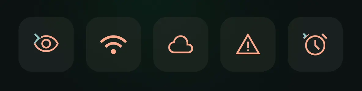
Overview #
Apple's SF Symbols make wipe-style icon transitions feel built in. Flutter does not ship that interaction out of the box, so it is easier to skip the animation entirely, which makes the UI feel cheaper and less polished.
Diagonal Wipe Icon packages that interaction into a reusable Flutter component. It blends two icon states with a moving mask and supports diagonal, horizontal, and vertical wipe directions.
Good fits:
- toggle controls like
mute,favorite,visible, andenabled - settings rows with stateful icons
- media controls and playback affordances
- any icon swap that should feel more refined than a hard cut or cross-fade
No runtime dependencies beyond Flutter. The core implementation also lives in a single Dart file, so you can vendor it directly into your own codebase if you prefer.
Quick Start #
flutter pub add diagonal_wipe_icon
Or add it manually to pubspec.yaml:
dependencies:
  diagonal_wipe_icon: ^0.1.0
Minimal example:
import 'package:diagonal_wipe_icon/diagonal_wipe_icon.dart';
import 'package:flutter/material.dart';

class FavoriteButton extends StatefulWidget {
  const FavoriteButton({super.key});

  @override
  State<FavoriteButton> createState() => _FavoriteButtonState();
}

class _FavoriteButtonState extends State<FavoriteButton> {
  bool isFavorite = false;

  @override
  Widget build(BuildContext context) {
    return IconButton(
      onPressed: () => setState(() => isFavorite = !isFavorite),
      icon: AnimatedDiagonalWipeIcon(
        isWiped: isFavorite,
        baseIcon: Icons.favorite_border,
        wipedIcon: Icons.favorite,
        semanticsLabel: 'Favorite',
      ),
    );
  }
}
Choose The Right API #
| If you have... | Use |
|---|---|
two IconData values and a boolean state |
AnimatedDiagonalWipeIcon(...) |
| two already-built widgets and a boolean state | AnimatedDiagonalWipeIcon.raw(...) |
an existing Animation<double> |
DiagonalWipeTransition(...) |
Most apps should start with AnimatedDiagonalWipeIcon(...). Reach for raw(...) when your two states are already widgets, and use DiagonalWipeTransition(...) when another controller should drive the wipe directly.
Animation Style #
AnimatedDiagonalWipeIcon already animates by default. Use animationStyle only when you want different timing or easing:
AnimatedDiagonalWipeIcon(
  isWiped: isMuted,
  baseIcon: Icons.volume_up,
  wipedIcon: Icons.volume_off,
  baseTint: Colors.teal,
  animationStyle: const AnimationStyle(
    duration: Duration(milliseconds: 220),
    reverseDuration: Duration(milliseconds: 300),
    curve: Curves.fastOutSlowIn,
    reverseCurve: Curves.linearToEaseOut,
  ),
)
If you do nothing, the widget uses its built-in default style. If you need to disable the implicit animation entirely, pass AnimationStyle.noAnimation.
You can still customize the wipe direction or use different tints when needed:
AnimatedDiagonalWipeIcon(
  isWiped: isMuted,
  baseIcon: Icons.volume_up,
  wipedIcon: Icons.volume_off,
  baseTint: Colors.teal,
  wipedTint: Colors.orange,
  direction: WipeDirection.bottomLeftToTopRight,
)
Raw Widgets #
When your two states are already widgets, use raw(...):
AnimatedDiagonalWipeIcon.raw(
  isWiped: isLoading,
  baseChild: const Icon(Icons.download),
  wipedChild: const SizedBox.square(
    dimension: 18,
    child: CircularProgressIndicator(strokeWidth: 2),
  ),
  size: 24,
  animationStyle: const AnimationStyle(
    duration: Duration(milliseconds: 220),
    reverseDuration: Duration(milliseconds: 300),
    curve: Curves.fastOutSlowIn,
    reverseCurve: Curves.linearToEaseOut,
  ),
)
Raw children are centered, clipped to the wipe bounds, and wrapped in an IconTheme. Icon-like widgets inherit the resolved size and tint automatically, while explicitly styled widgets keep their own styling.
Controller-Driven Transition #
Use DiagonalWipeTransition(...) when the animation is driven elsewhere:
class PlayerIcon extends StatefulWidget {
  const PlayerIcon({super.key});

  @override
  State<PlayerIcon> createState() => _PlayerIconState();
}

class _PlayerIconState extends State<PlayerIcon>
    with SingleTickerProviderStateMixin {
  late final AnimationController controller = AnimationController(
    vsync: this,
    duration: const Duration(milliseconds: 300),
  );

  @override
  void dispose() {
    controller.dispose();
    super.dispose();
  }

  @override
  Widget build(BuildContext context) {
    return IconButton(
      onPressed: () {
        if (controller.status == AnimationStatus.completed) {
          controller.reverse();
        } else {
          controller.forward();
        }
      },
      icon: DiagonalWipeTransition(
        progress: controller,
        baseChild: const Icon(Icons.play_arrow),
        wipedChild: const Icon(Icons.pause),
      ),
    );
  }
}
Use this when the wipe should follow a scroll position, gesture, or custom AnimationController exactly.
Wipe Directions #
Available WipeDirection values:
topLeftToBottomRightbottomRightToTopLefttopRightToBottomLeftbottomLeftToTopRighttopToBottombottomToTopleftToRightrightToLeft
Performance #
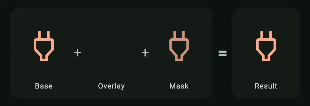
The effect works by revealing one layer while clipping the other across a shared square box.
| Scenario | Cost |
|---|---|
| At rest | Equivalent to a single visible layer |
| During transition | Two clipped layers plus path updates |
| Typical usage | Smooth on modern devices for normal icon counts |
- settled states render only one visible layer
- active transitions draw two clipped layers and update the wipe path each frame
- reduce-motion accessibility settings jump directly to the final state
FAQ #
-
Why use this instead of
AnimatedSwitcheror a cross-fade?
Use it when you want an icon transition to feel like a state change rather than a widget swap. If a simple fade is enough,AnimatedSwitcheris still a good fit. -
Is it expensive to use in lists or toolbars?
Usually no. At rest it behaves like a single visible layer, and the extra work only happens while the wipe is animating. It is intended for normal UI counts like toggles, settings rows, and media controls. -
Do I need the package dependency, or can I just copy the source?
Either works. You can depend on the package, or copylib/diagonal_wipe_icon.dartdirectly into your project since the core implementation lives in a single file.
Example App #
The repository includes a full demo app in example/, with controls for direction, timing, and icon pairs.
Try the hosted version: Live Demo.
Run it locally:
cd example
flutter pub get
flutter run -d chrome
The main demo entry point is example/lib/main.dart.
Copy Into Your Project #
If you prefer copying the implementation into your own project, the core widget lives in a single file with no package dependencies beyond Flutter itself: lib/diagonal_wipe_icon.dart.
Local import:
import 'diagonal_wipe_icon.dart';
Also Available For Compose #
A Compose Multiplatform version lives in the companion repository:
Metadata
Publisher
unverified uploader
Weekly Downloads
Metadata
Polished wipe-style icon transitions for Flutter with diagonal, horizontal, and vertical directions.
Repository (GitHub)
View/report issues
Topics
#animation #icons #flutter #transitions
License
 unknown (license)