date_strip_report 1.0.1  date_strip_report: ^1.0.1 copied to clipboard
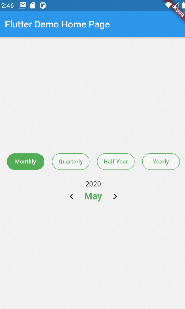
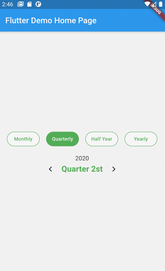
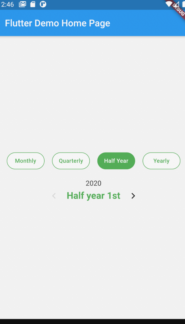
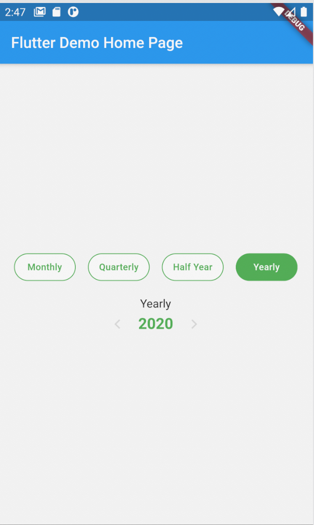
A Flutter package able show DateTime Report Control, Date range can also be set between 2 date to disable selection of irrevelant dates.
Flutter DateTime Strip Report
Easy to use and beautiful datetime strip control for Flutter.
If this project has helped you out, please support us with a star. 🌟 #
Install #
dependencies:
          ...
          date_strip_report: ^1.0.0
Usage Example #
    Container(
        child: DateStripReport(
          onDateSelected: onSelect,
          isShowMonth: true,
          isShowHalfYear: true,
          isShowQuarter: true,
          isShowYear: true,
          startDate: new DateTime(2020,1,1),
          endDate: new DateTime(2021,1,1),
          selectedColor: Colors.green,
          unSelectedColor: Colors.white,
          locale: LocaleType.en,
        )
      )
Full Example #
import 'package:date_strip_report/date_strip_report.dart';
import 'package:date_strip_report/i18n_calendar_strip.dart';
import 'package:flutter/material.dart';

void main() => runApp(MyApp());

class MyApp extends StatelessWidget {
  // This widget is the root of your application.
  @override
  Widget build(BuildContext context) {
    return MaterialApp(
      title: 'Flutter Demo',
      theme: ThemeData(
            primarySwatch: Colors.blue,
      ),
      home: MyHomePage(title: 'Flutter Demo Home Page'),
    );
  }
}

class MyHomePage extends StatefulWidget {
  MyHomePage({Key key, this.title}) : super(key: key);
  final String title;

  @override
  _MyHomePageState createState() => _MyHomePageState();
}

class _MyHomePageState extends State<MyHomePage> {
  int _counter = 0;

  void _incrementCounter() {
    setState(() {
     });
  }

  @override
  Widget build(BuildContext context) {

    onSelect(data) {
      print("Selected Date -> $data");
    }

    return Scaffold(
      appBar: AppBar(
        title: Text(widget.title),
      ),
      body: Container(
        padding: EdgeInsets.all(20),
        child: DateStripReport(
          startDate: new DateTime(2020,1,1),
          endDate: new DateTime(2021,1,1),
          isShowMonth: true,
          isShowHalfYear: true,
          isShowQuarter: true,
          isShowYear: true,
          textColor: Colors.green,
          leftIcon: Icon(Icons.arrow_back_ios),
          rightIcon: Icon(Icons.arrow_forward_ios),
          selectedColor: Colors.green,
          unSelectedColor: Colors.white,
          locale: LocaleType.en,
          onDateSelected: onSelect,
        )
      ), // This trailing comma makes auto-formatting nicer for build methods.
    );
  }
}
Widget Properties #
Initial data and onDateSelected handler #
| Prop | Description | Type | Default |
|---|---|---|---|
startDate |
Date to be used for setting starting date in a date range. | DateTime |
- |
endDate |
Date to be used for setting ending date in a date range. | DateTime |
- |
isShowMonth |
Show or Hide DateTime type month. | bool |
true |
isShowHalfYear |
Show or Hide DateTime type half year | bool |
true |
isShowQuarter |
Show or Hide DateTime type quarter | bool |
true |
isShowYear |
Show or Hide DateTime type year | bool |
true |
textColor |
Color of text info control. | Color |
- |
rightIcon |
Icon for next navigation | Icon |
Icon(Icons.arrow_back_ios) |
leftIcon |
Icon for previous navigation | Icon |
Icon(Icons.arrow_forward_ios) |
selectedColor |
Color of button round selected. | Color |
Colors.blue |
unSelectedColor |
Color of button round unselected. | Color |
Colors.white |
navigationColor |
Color of navigation icon | Color |
Colors.black |
navigationDisableColor |
Color of navigation icon is disable | Color |
Colors.black12 |
locale |
localization of language | LocaleType |
LocaleType.en |
onDateSelected |
Function that is called on selection of a date. (Required) | Function |
Required |
Metadata
0
likes
40
points
21
downloads
Publisher
unverified uploader
Weekly Downloads
Metadata
A Flutter package able show DateTime Report Control, Date range can also be set between 2 date to disable selection of irrevelant dates.
Repository (GitHub)
View/report issues
License
 MIT (license)