customizable_cards_slider 1.0.0  customizable_cards_slider: ^1.0.0 copied to clipboard
A Customizable cards slider widget
Customizable Slider #
A Customizable gallery slider widget. Complete with background color transitions and customizable buttons with customizable animations.
Getting Started #
In the pubspec.yaml of your flutter project, add the following dependency:
dependencies:
custommizable_slider: ^1.0.0
Import it:
import 'package:customizable_slider/customizable_slider.dart';
Usage Examples #
Basic slider #
The pages parameter takes a a list of widgets to display as pages. For this example we will use a basic text widget:
CustomizableSlider(
	pages: const [Text("Page 0"), Text("Page 1"), Text("Page 2"), 		Text("Page 3"), Text("Page 4"),
)
The slider will resize to fill the parent widget and center the page widget. The default background is transparent.
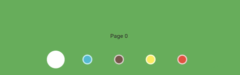
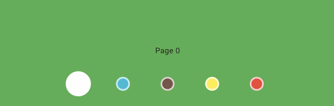
Backgrounds #
For smooth background color transitions you can provide the backgroundColors parameter with a list of Color. The length of pages should match the length of backgroundColors
CustomizableSlider(
	pages: const [Text("Page 0"), Text("Page 1"), Text("Page 2"), 		Text("Page 3"), Text("Page 4")],
	backgroundColors: [
		Colors.green,
		Colors.cyan,
		Colors.brown,
		Colors.yellow,
		Colors.red,
	];
)

Custom button animations #
You can provide the widget with the buttonBuilder function. This is a powerful way to customize the slider's buttons.
This function should return a widget and gets called during animation. It exposes some of the slider's state parameters for you to use.
anim - A double ranging from 0 to 1. This value is 1 when the current page displayed is the same as the index of the button. This value changes even when the page is just passing through during a transition so it can be used to create nice wavey animations.
backgroundColors - The background colors as defined in the widget. If no background colors are provided, backgroundColors will have a list of transparent colors.
index - The index of the current button.
currPage - Currently displayed page.
Examples #
In this example we use the anim parameter to animate the size and color of the button. We are also using the backgroundColors parameter to color the button.
CustomizableSlider(
	pages: const [Text("Page 0"), Text("Page 1"), Text("Page 2"), 		Text("Page 3"), Text("Page 4")],
	backgroundColors: const [
		Colors.green,
		Colors.cyan,
		Colors.brown,
		Colors.yellow,
		Colors.red,
	],
	buttonBuilder: (anim, backgroundColors, index, currPage) {
		return  Container(
			width: 80,
			height: 80,
			color: Colors.transparent,
			child: Center(
			child: Container(
				width: 25 + 20 * anim,
				height: 25 + 20 * anim,
				decoration: BoxDecoration(
					shape: BoxShape.circle,
					color: Color.lerp(backgroundColors[index], 	Colors.white, anim),
					border: Border.all(color: const  Color.fromARGB(186, 255, 255, 255), width: 3),
				),
			),
		),
	);
},
Result:
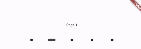
Let's say we don't want the size animation to pass through all the buttons, we can use index and currPage to achieve desired results:
buttonBuilder: (anim, backgroundColors, index, currPage) {
	return  Container(
		width: 80,
		height: 80,
		color: Colors.transparent,
		child: Center(
			child: Container(
				width: 25 + (currPage == index ? 20 * anim : 0),
				height: 25 + (currPage == index ? 20 * anim : 0),
				decoration: BoxDecoration(
					shape: BoxShape.circle,
					color: Color.lerp(backgroundColors[index], Colors.white, anim),
					border: Border.all(color: const  Color.fromARGB(186, 255, 255, 255), width: 3),
				),
			),
		),
	);
}
Result:
In this example we disabled the size animation for buttons where index is not equal to currPage. The color transition remains the same and the animation "passes through" all the buttons.
More examples #

In this example we use anim with a transform widget to rotate the button.
Notice we also give each button a bottom margin of 140 to place the buttons on top of the page.
CustomizableSlider(
	backgroundColors: [
		Colors.yellow.shade900,
		Colors.yellow.shade800,
		Colors.yellow.shade700,
		Colors.yellow.shade600,
		Colors.yellow.shade500
	],
	pages: const [Text("Page 0"), Text("Page 1"), Text("Page 2"),Text("Page 3"), Text("Page 4")],
	buttonBuilder: (anim, backgroundColors, index, currPage) =>
		Container(
			width: 50,
			height: 50,
			color: Colors.transparent, //to register clicks around the button
			margin: const  EdgeInsets.fromLTRB(0, 0, 0, 140),
			child: Center(
				child: Transform.rotate(
					origin: const  Offset(0, -10),
					angle: anim * pi / 4 - 2,
					child: Container(
						width: 10,
						height: 30,
						decoration: BoxDecoration(
							color: Colors.black87,
							borderRadius: BorderRadius.circular(10)
									),
							),
					),
				),
		),
)
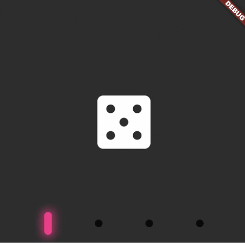
Using the buttonBuilder you can get quite creative, here's another examples:
SizedBox(
	height: 400,
	width: 600,
	child: CustomizableSlider(
	backgroundColors: const [
		Color.fromARGB(255, 45, 45, 45),
		Color.fromARGB(255, 74, 74, 74),
		Color.fromARGB(255, 84, 84, 84),
		Color.fromARGB(255, 123, 123, 123),
	],

	pages: const [
		Icon(
		Icons.casino_rounded,
		color: Colors.white,
		size: 112,
		),
		Icon(
		Icons.yard_rounded,
		color: Colors.white,
		size: 112,
		),
		Icon(
		Icons.wine_bar,
		color: Colors.white,
		size: 112,
		),
		Icon(
		Icons.whatshot_rounded,
		color: Colors.white,
		size: 112,
		),
	],
	buttonBuilder: (anim, backgroundColors, index, currPage) {
		late  Color  btnColor;

		switch (index) {
			case  0:
			btnColor = Color.fromARGB(255, 255, 35, 138);
			break;

			case  1:
			btnColor = Color.fromARGB(255, 105, 218, 255);
			break;

			case  2:
			btnColor = Color.fromARGB(255, 86, 255, 125);
			break;

			case  3:
			btnColor = Color.fromARGB(255, 244, 255, 86);
			break;
		}

		return  Container(
			width: 80,
			height: 80,
			color: Colors.transparent, //to register clicks around the button
			child: Center(
				child: Container(
					width: 12,
					height: 12 + anim * 24,
					transformAlignment: Alignment.center,
					decoration: BoxDecoration(
						color: Color.lerp(Color.fromARGB(199, 0, 0, 0), btnColor, anim),
						borderRadius: BorderRadius.circular(12),
						boxShadow: [
							BoxShadow(
								color: btnColor.withAlpha((anim * 150).toInt()),
								blurRadius: 10,
								spreadRadius: anim * 5,
								),
							],
						),
					),
				),
			);
		},
	),
),
Result:
Metadata
Publisher
unverified uploader
Metadata
A Customizable cards slider widget
Repository (GitHub)
View/report issues
License
 unknown (license)