cupertino_rounded_corners 2.1.1  cupertino_rounded_corners: ^2.1.1 copied to clipboard
A widget and border to make cupertino rounded corners also refrered to as squircles using a bezier path and having the two points in the corners.
cupertino_rounded_corners #
A widget and border to make cupertino rounded corners also refrered to as squircles using a bezier path and having the two points in the corners.
Getting Started #
For help getting started with Flutter, view our online documentation.
For help on editing package code, view the documentation.
Import it #
import 'package:cupertino_rounded_corners/cupertino_rounded_corners.dart';
To make your own card #
new Container(
  decoration: new BoxDecoration(
    color: Colors.transparent,
    borderRadius: new BorderRadius.all(
      new Radius.circular(4.0),
    ),
  ),
  margin: margin,
  child: new Material(
    color: color,
    shape: new SquircleBorder(
      radius: BorderRadius.all(
        new Radius.circular(40.0),
      ),
    ),
    elevation: elevation,
    child: new Padding(padding: padding, child: child),
  ),
);
Use the card #
CupertinoCard(
  child: const Text("HELLO WORLD"),
  elevation: 2.0,
  margin: const EdgeInsets.all(4.0),
  padding: const EdgeInsets.all(0.0),
  color: Colors.white,
  radius: BorderRadius.all(
    new Radius.circular(40.0),
  ),
);
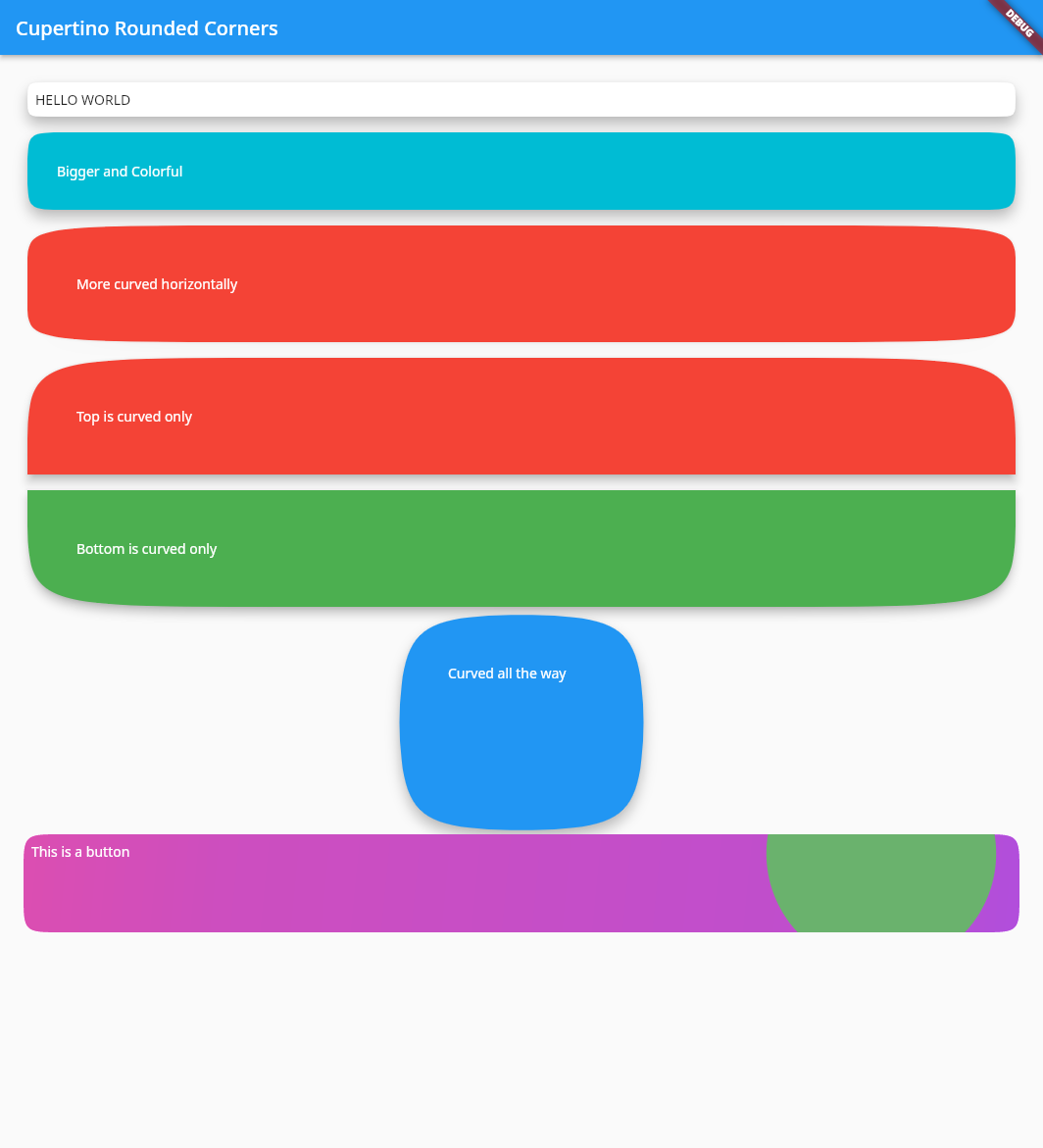
To achieve the bottom last button in the second example.
CupertinoCard(
  splashColor: Colors.green,
  child: Container(
    constraints: BoxConstraints.expand(
      height: 100.0,
    ),
    child: Padding(
      padding: EdgeInsets.all(8.0),
      child: const Text(
        'This is a button',
        style: TextStyle(color: Colors.white),
      ),
    ),
  ),
  decoration: BoxDecoration(
    gradient: LinearGradient(
      begin: Alignment.topLeft,
      end: Alignment.bottomRight,
      stops: [0.0, 0.2, 0.8, 1.0],
      colors: [
        Color.fromRGBO(240, 40, 180, 1.0),
        Color.fromRGBO(220, 40, 200, 1.0),
        Color.fromRGBO(200, 40, 220, 1.0),
        Color.fromRGBO(180, 40, 240, 1.0),
      ],
    ),
  ),
  elevation: 2.0,
  margin: const EdgeInsets.all(4.0),
  padding: const EdgeInsets.all(0.0),
  radius: BorderRadius.all(
    new Radius.circular(40.0),
  ),
  onPressed: () {
    print("Clicked");
  },
);
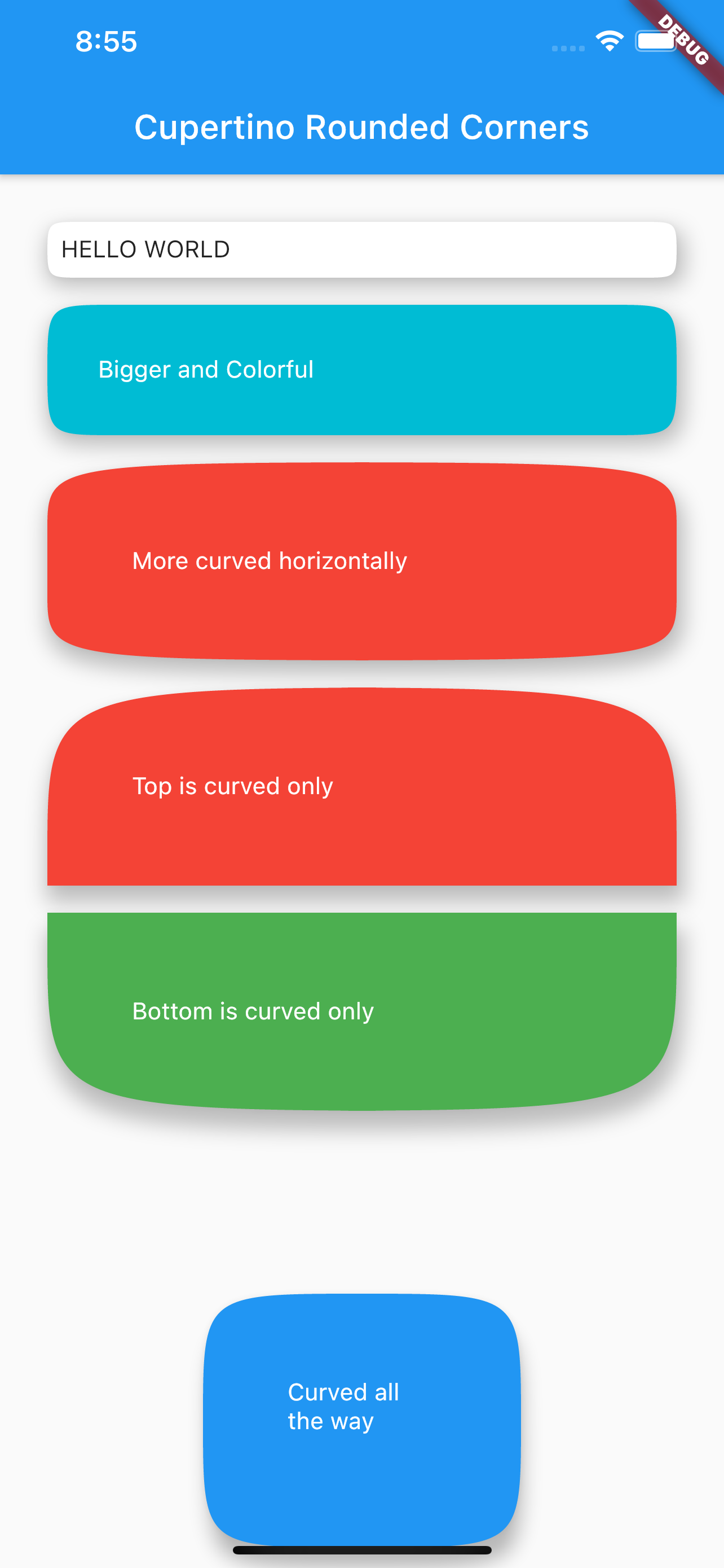
Example Image Mobile #

Example Image Linux #
